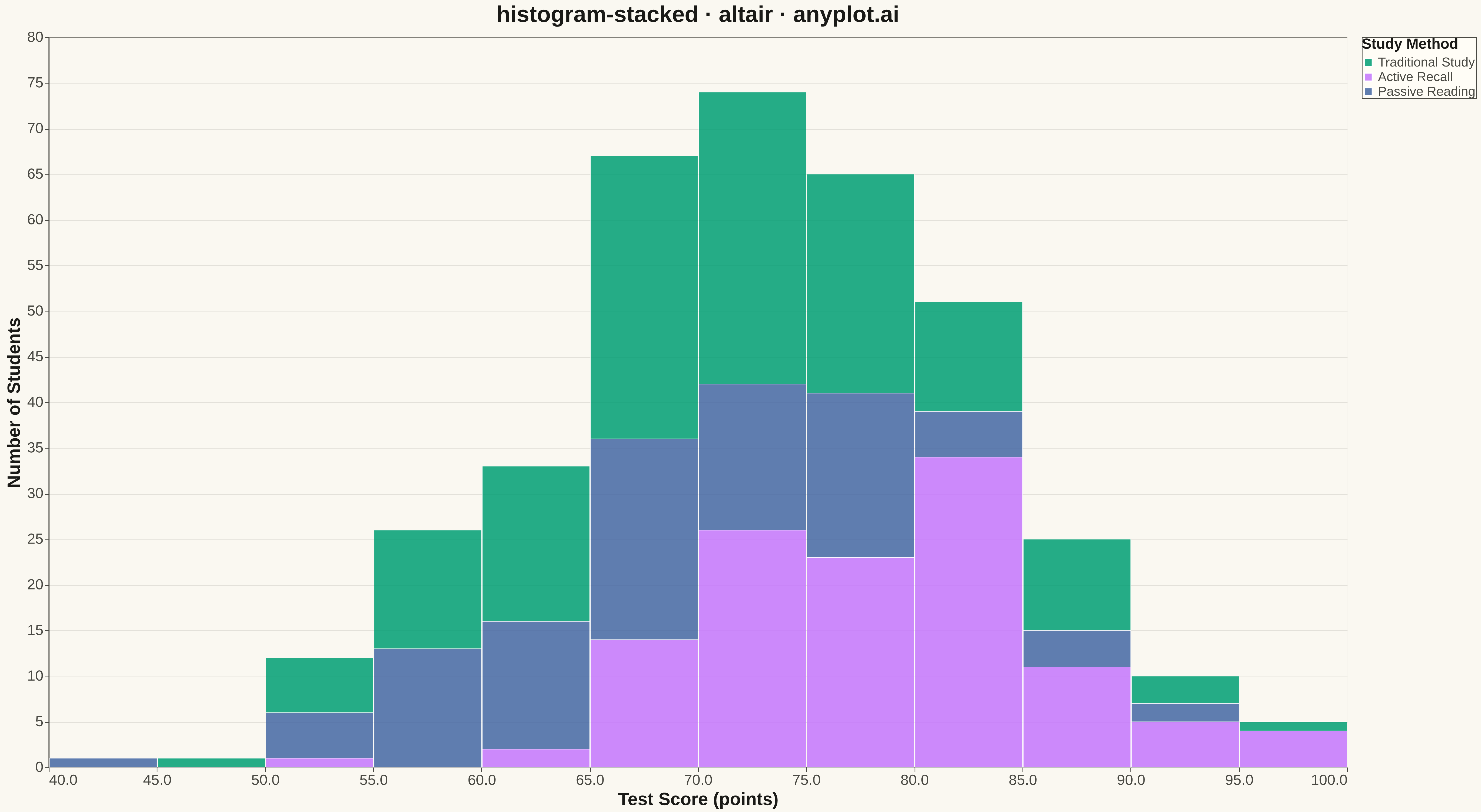
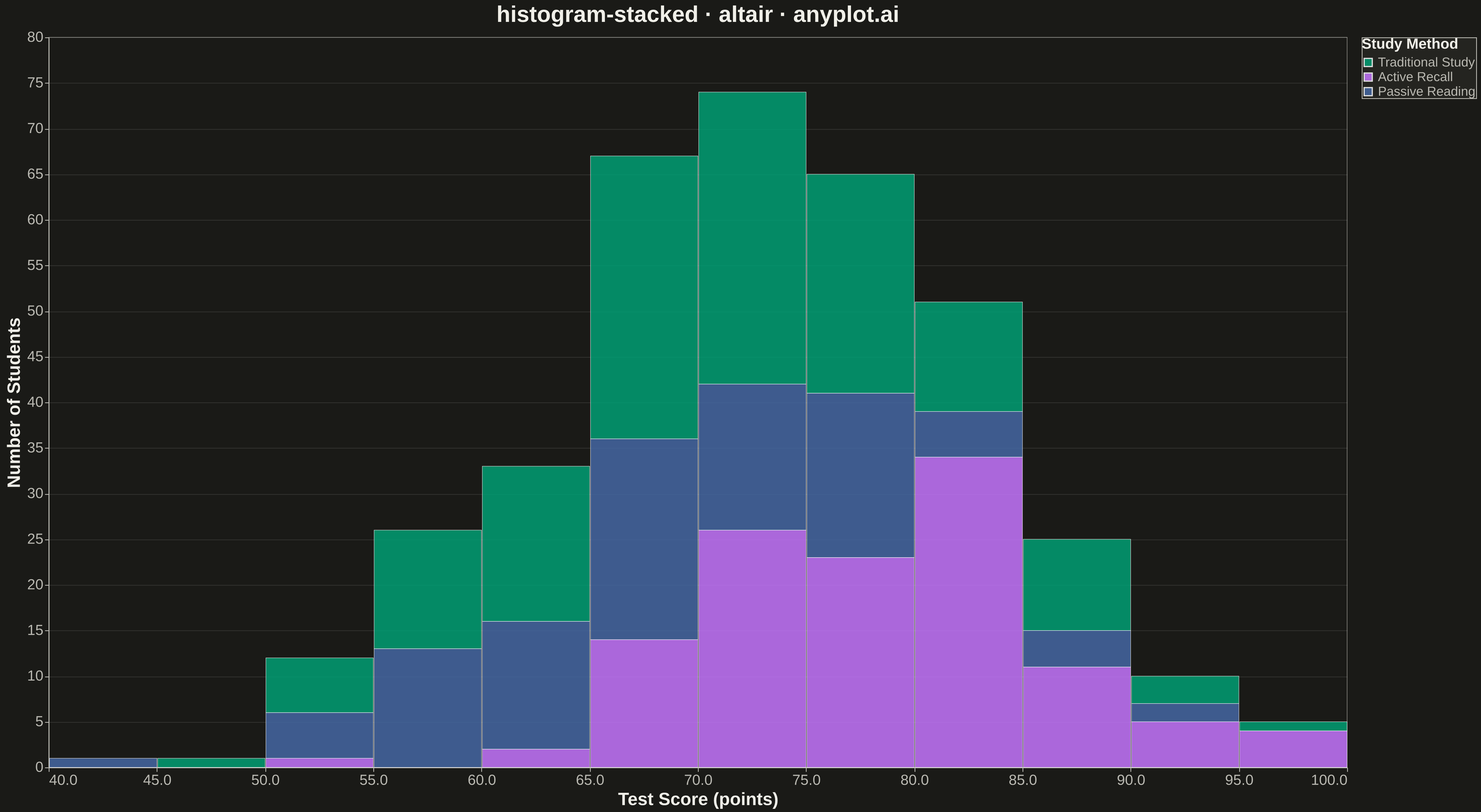
A histogram showing multiple groups stacked on top of each other within each bin. The total bar height represents the combined frequency, while colored segments show individual group contributions.
""" anyplot.ai
histogram-stacked: Stacked Histogram
Library: altair 6.1.0 | Python 3.13.13
Quality: 94/100 | Updated: 2026-05-12
"""

import os

import altair as alt
import numpy as np
import pandas as pd


THEME = os.getenv("ANYPLOT_THEME", "light")
PAGE_BG = "#FAF8F1" if THEME == "light" else "#1A1A17"
ELEVATED_BG = "#FFFDF6" if THEME == "light" else "#242420"
INK = "#1A1A17" if THEME == "light" else "#F0EFE8"
INK_SOFT = "#4A4A44" if THEME == "light" else "#B8B7B0"

IMPRINT = ["#009E73", "#C475FD", "#4467A3"]

# Data - Test scores from three different study methods
np.random.seed(42)

method_a = np.random.normal(loc=72, scale=10, size=150)
method_b = np.random.normal(loc=78, scale=8, size=120)
method_c = np.random.normal(loc=68, scale=12, size=100)

method_a = np.clip(method_a, 0, 100)
method_b = np.clip(method_b, 0, 100)
method_c = np.clip(method_c, 0, 100)

df = pd.DataFrame(
    {
        "Score": np.concatenate([method_a, method_b, method_c]),
        "Study Method": (
            ["Traditional Study"] * len(method_a)
            + ["Active Recall"] * len(method_b)
            + ["Passive Reading"] * len(method_c)
        ),
    }
)

# Plot
chart = (
    alt.Chart(df)
    .mark_bar(opacity=0.85, stroke="white", strokeWidth=0.5)
    .encode(
        x=alt.X(
            "Score:Q",
            bin=alt.Bin(maxbins=20),
            title="Test Score (points)",
            axis=alt.Axis(labelFontSize=18, titleFontSize=22),
        ),
        y=alt.Y(
            "count():Q", title="Number of Students", stack="zero", axis=alt.Axis(labelFontSize=18, titleFontSize=22)
        ),
        color=alt.Color(
            "Study Method:N",
            scale=alt.Scale(domain=["Traditional Study", "Active Recall", "Passive Reading"], range=IMPRINT),
            legend=alt.Legend(title="Study Method", titleFontSize=18, labelFontSize=16, orient="right"),
        ),
        order=alt.Order("Study Method:N", sort="ascending"),
    )
    .properties(
        width=1600,
        height=900,
        background=PAGE_BG,
        title=alt.Title("histogram-stacked · altair · anyplot.ai", fontSize=28, anchor="middle"),
    )
    .configure_view(fill=PAGE_BG, stroke=INK_SOFT, strokeWidth=0.5)
    .configure_axis(
        domainColor=INK_SOFT, tickColor=INK_SOFT, gridColor=INK, gridOpacity=0.10, labelColor=INK_SOFT, titleColor=INK
    )
    .configure_title(color=INK, fontSize=28)
    .configure_legend(fillColor=ELEVATED_BG, strokeColor=INK_SOFT, labelColor=INK_SOFT, titleColor=INK)
)

chart.save(f"plot-{THEME}.png", scale_factor=3.0)
chart.save(f"plot-{THEME}.html")
Runnable source as JSON, for any HTTP client: https://api.anyplot.ai/specs/histogram-stacked/altair/code. Any spec id and library id listed in llms-full.txt fit the same URL shape; every URL below is complete and callable.
{
  "spec_id": "histogram-stacked",
  "language": "python",
  "library": "altair",
  "page": "https://anyplot.ai/histogram-stacked/python/altair",
  "hub": "https://anyplot.ai/histogram-stacked",
  "code_json": "https://api.anyplot.ai/specs/histogram-stacked/altair/code",
  "spec_json": "https://api.anyplot.ai/specs/histogram-stacked",
  "render_light_png": "https://storage.googleapis.com/anyplot-images/plots/histogram-stacked/python/altair/plot-light.png",
  "render_dark_png": "https://storage.googleapis.com/anyplot-images/plots/histogram-stacked/python/altair/plot-dark.png",
  "interactive_light_html": "https://storage.googleapis.com/anyplot-images/plots/histogram-stacked/python/altair/plot-light.html",
  "interactive_dark_html": "https://storage.googleapis.com/anyplot-images/plots/histogram-stacked/python/altair/plot-dark.html",
  "quality_score": 94.0,
  "license": "MIT",
  "guide": "https://anyplot.ai/llms.txt"
}
Part of Stacked Histogram on anyplot.ai.