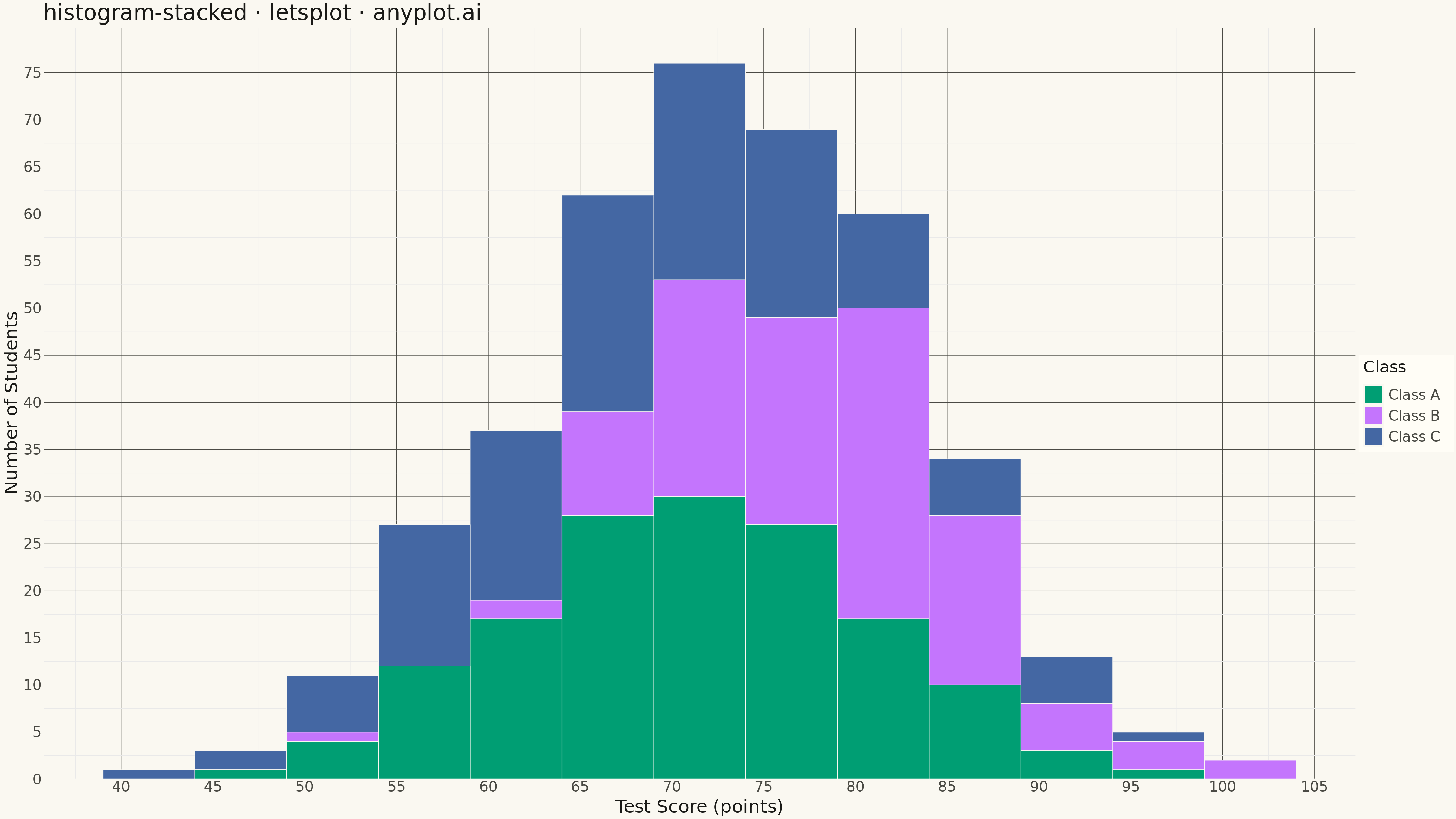
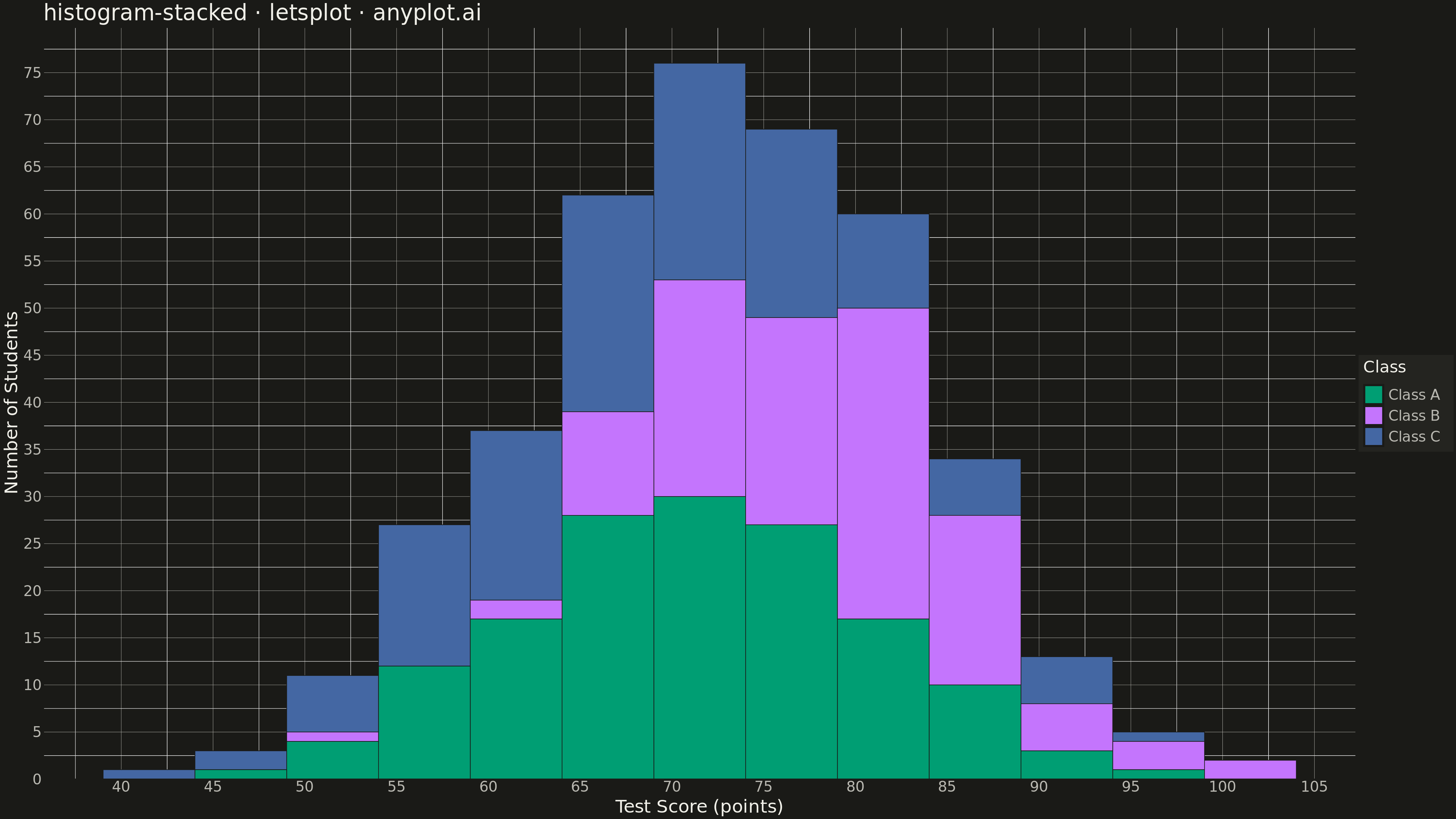
A histogram showing multiple groups stacked on top of each other within each bin. The total bar height represents the combined frequency, while colored segments show individual group contributions.
""" anyplot.ai
histogram-stacked: Stacked Histogram
Library: letsplot 4.9.0 | Python 3.13.13
Quality: 90/100 | Updated: 2026-05-12
"""

import os

import numpy as np
import pandas as pd
from lets_plot import *


LetsPlot.setup_html()

# Theme tokens
THEME = os.getenv("ANYPLOT_THEME", "light")
PAGE_BG = "#FAF8F1" if THEME == "light" else "#1A1A17"
ELEVATED_BG = "#FFFDF6" if THEME == "light" else "#242420"
INK = "#1A1A17" if THEME == "light" else "#F0EFE8"
INK_SOFT = "#4A4A44" if THEME == "light" else "#B8B7B0"

# Okabe-Ito palette - first series is always #009E73
IMPRINT = ["#009E73", "#C475FD", "#4467A3"]

# Data - Test scores from three different classes
np.random.seed(42)

# Generate scores for three classes with different distributions
class_a = np.random.normal(loc=72, scale=10, size=150)  # Average performers
class_b = np.random.normal(loc=78, scale=8, size=120)  # Above average
class_c = np.random.normal(loc=68, scale=12, size=130)  # More varied

# Combine into DataFrame
df = pd.DataFrame(
    {
        "score": np.concatenate([class_a, class_b, class_c]),
        "class": ["Class A"] * 150 + ["Class B"] * 120 + ["Class C"] * 130,
    }
)

# Clip scores to realistic range [0, 100]
df["score"] = df["score"].clip(0, 100)

# Plot - Stacked histogram
plot = (
    ggplot(df, aes(x="score", fill="class"))
    + geom_histogram(binwidth=5, position="stack", color=PAGE_BG, size=0.3)
    + scale_fill_manual(values=IMPRINT)
    + labs(
        x="Test Score (points)", y="Number of Students", title="histogram-stacked · letsplot · anyplot.ai", fill="Class"
    )
    + theme_minimal()
    + theme(
        plot_background=element_rect(fill=PAGE_BG, color=PAGE_BG),
        panel_background=element_rect(fill=PAGE_BG, color=PAGE_BG),
        panel_grid_major=element_line(color=INK_SOFT, size=0.3),
        axis_title=element_text(color=INK, size=20),
        axis_text=element_text(color=INK_SOFT, size=16),
        axis_line=element_line(color=INK_SOFT, size=0.5),
        plot_title=element_text(color=INK, size=24, face="medium"),
        legend_title=element_text(color=INK, size=18),
        legend_text=element_text(color=INK_SOFT, size=16),
        legend_background=element_rect(fill=ELEVATED_BG, color=INK_SOFT),
        legend_position="right",
    )
    + ggsize(1600, 900)
)

# Save as PNG (scale 3x for 4800x2700)
ggsave(plot, f"plot-{THEME}.png", scale=3, path=".")

# Save interactive HTML
ggsave(plot, f"plot-{THEME}.html", path=".")
Runnable source as JSON, for any HTTP client: https://api.anyplot.ai/specs/histogram-stacked/letsplot/code. Any spec id and library id listed in llms-full.txt fit the same URL shape; every URL below is complete and callable.
{
  "spec_id": "histogram-stacked",
  "language": "python",
  "library": "letsplot",
  "page": "https://anyplot.ai/histogram-stacked/python/letsplot",
  "hub": "https://anyplot.ai/histogram-stacked",
  "code_json": "https://api.anyplot.ai/specs/histogram-stacked/letsplot/code",
  "spec_json": "https://api.anyplot.ai/specs/histogram-stacked",
  "render_light_png": "https://storage.googleapis.com/anyplot-images/plots/histogram-stacked/python/letsplot/plot-light.png",
  "render_dark_png": "https://storage.googleapis.com/anyplot-images/plots/histogram-stacked/python/letsplot/plot-dark.png",
  "interactive_light_html": "https://storage.googleapis.com/anyplot-images/plots/histogram-stacked/python/letsplot/plot-light.html",
  "interactive_dark_html": "https://storage.googleapis.com/anyplot-images/plots/histogram-stacked/python/letsplot/plot-dark.html",
  "quality_score": 90.0,
  "license": "MIT",
  "guide": "https://anyplot.ai/llms.txt"
}
Part of Stacked Histogram on anyplot.ai.