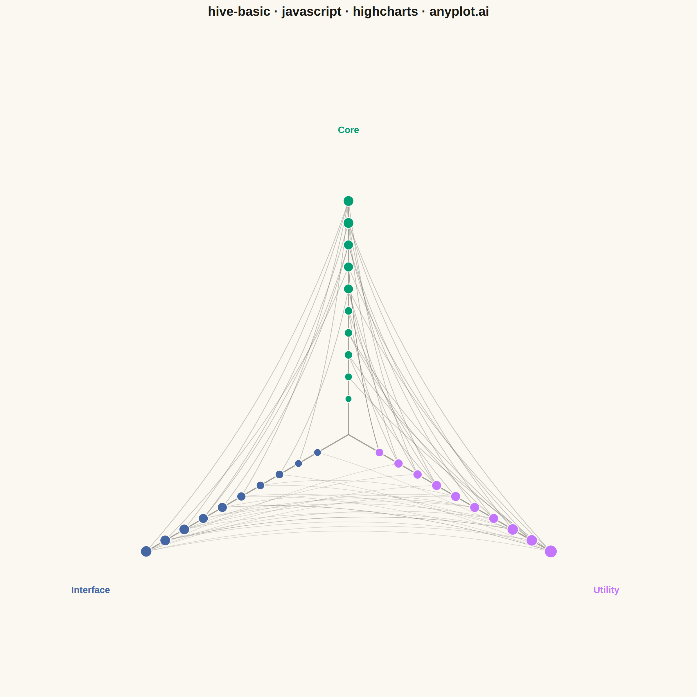
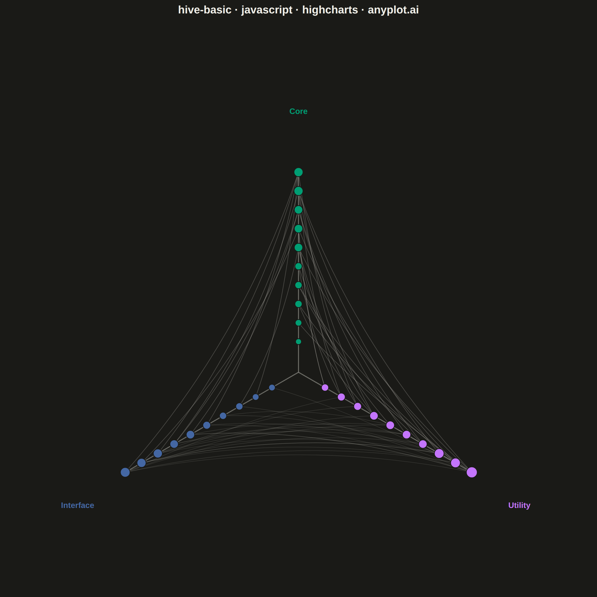
The same plot in 14 other libraries — JavaScript: Chart.js, D3.js, Apache ECharts, MUI X Charts; Python: Altair, Bokeh, lets-plot, Matplotlib, Plotly, plotnine, Pygal, Seaborn; R: ggplot2; Julia: Makie.jl. Compare all 15 side by side: Basic Hive Plot in Python, R, Julia and JavaScript.
A hive plot arranges network nodes on radial axes based on node properties (such as degree, category, or other attributes), enabling reproducible and directly comparable network visualizations. Unlike force-directed layouts which can produce different arrangements for identical networks, hive plots always render the same network identically, solving the "hairball" problem of traditional network graphs and making structural comparisons reliable.
// anyplot.ai
// hive-basic: Basic Hive Plot
// Library: highcharts 12.6.0 | JavaScript 22.23.2
// Quality: 88/100 | Created: 2026-09-05
//# anyplot-orientation: square
// anyplot.ai
// hive-basic: Basic Hive Plot
// Library: Highcharts 12.6.0 | Node 22
// License: Highcharts — commercial license, free for non-commercial use (highcharts.com/license)
// Quality: pending | Created: 2026-09-05

const t = window.ANYPLOT_TOKENS;

// --- Deterministic PRNG (LCG) — Math.random() is not reproducible ----------
let seed = 42;
function rand() {
  seed = (seed * 1103515245 + 12345) & 0x7fffffff;
  return seed / 0x7fffffff;
}
function pick(arr) {
  return arr[Math.floor(rand() * arr.length)];
}

// --- Data: software module dependency network -------------------------------
// Nodes are assigned to one of 3 radial axes by module type. Position along
// each axis encodes degree (how many dependencies touch the module) so the
// layout is fully reproducible — identical input always renders identically.
const AXES = ["Core", "Utility", "Interface"];
const NODES_PER_AXIS = 10;

const nodes = [];
AXES.forEach((axisName, axisIdx) => {
  for (let i = 0; i < NODES_PER_AXIS; i++) {
    nodes.push({ id: nodes.length, axis: axisIdx, name: `${axisName[0]}${i + 1}`, degree: 0 });
  }
});

// Dependency edges follow a typical layered architecture: Interface calls
// Utility, Utility calls Core, and a few Interface modules call Core directly.
// Only cross-axis edges are drawn — hive plots encode structure *between*
// axes, so same-axis pairs are omitted for clarity.
const edges = [];
function connect(fromAxis, toAxis, count) {
  const fromNodes = nodes.filter((n) => n.axis === fromAxis);
  const toNodes = nodes.filter((n) => n.axis === toAxis);
  for (let i = 0; i < count; i++) {
    const source = pick(fromNodes);
    const target = pick(toNodes);
    edges.push({ source: source.id, target: target.id, pairCount: count });
    source.degree += 1;
    target.degree += 1;
  }
}
connect(2, 1, 24); // Interface -> Utility
connect(1, 0, 20); // Utility -> Core
connect(2, 0, 9); // Interface -> Core (direct)
const busiestPairCount = Math.max(...edges.map((e) => e.pairCount));

const maxDegree = Math.max(...nodes.map((n) => n.degree), 1);

// --- Chart -------------------------------------------------------------------
Highcharts.chart("container", {
  chart: {
    backgroundColor: "transparent",
    animation: false,
    style: { fontFamily: "inherit" },
    spacing: [10, 10, 10, 10],
    events: {
      load: function () {
        const chart = this;
        const renderer = chart.renderer;
        const cx = chart.plotLeft + chart.plotWidth / 2;
        const plotCy = chart.plotTop + chart.plotHeight / 2;
        const half = Math.min(chart.plotWidth, chart.plotHeight) / 2;
        const axisLen = half * 0.72; // leave room for axis-name labels
        const labelLen = half * 0.9;
        const rMin = axisLen * 0.15;
        const rMax = axisLen * 0.98;

        // angleDeg=0 points straight up; the three axes are 120° apart —
        // the classic hive-plot fan (up / lower-right / lower-left).
        function axisAngleRad(axisIdx) {
          return ((axisIdx * 120 - 90) * Math.PI) / 180;
        }

        // The fan is not vertically symmetric: one axis reaches a full
        // radius above center while the other two only reach half that
        // radius below it (their angles are 30deg/150deg off horizontal).
        // Centering on the plot's raw geometric center therefore leaves a
        // large empty band under the shape. Instead, recenter cy so the
        // vertical bounding box of the axis tips is centered in the plot
        // area — this generalizes to any axis-count/angle choice.
        const sines = AXES.map((_, axisIdx) => Math.sin(axisAngleRad(axisIdx)));
        const verticalBalance = (Math.min(...sines) + Math.max(...sines)) / 2;
        const cy = plotCy - labelLen * verticalBalance;

        function pointAt(axisIdx, radius) {
          const rad = axisAngleRad(axisIdx);
          return { x: cx + radius * Math.cos(rad), y: cy + radius * Math.sin(rad) };
        }

        // Axis spokes + labels (label color mirrors its axis's node color,
        // doubling as the legend — a separate legend box would be redundant).
        AXES.forEach((name, axisIdx) => {
          const tip = pointAt(axisIdx, axisLen);
          renderer
            .path(["M", cx, cy, "L", tip.x, tip.y])
            .attr({ stroke: t.inkSoft, "stroke-width": 2, opacity: 0.5 })
            .add();

          const labelPos = pointAt(axisIdx, labelLen);
          const dy = Math.sin(axisAngleRad(axisIdx)) < -0.3 ? -6 : 16;
          renderer
            .text(name, labelPos.x, labelPos.y + dy)
            .attr({ align: "center", zIndex: 5 })
            .css({ color: t.palette[axisIdx], fontSize: "16px", fontWeight: "600" })
            .add();
        });

        // Node pixel positions — farther from center means more dependencies.
        // Nodes are ranked (not placed at a raw degree value) within their own
        // axis so ties never collapse onto the same point; the property still
        // reads left-to-right along the axis, low degree near the hub.
        const position = {};
        AXES.forEach((_, axisIdx) => {
          const onAxis = nodes.filter((n) => n.axis === axisIdx).sort((a, b) => a.degree - b.degree);
          onAxis.forEach((n, rank) => {
            const radius = onAxis.length > 1 ? rMin + (rank / (onAxis.length - 1)) * (rMax - rMin) : rMin;
            position[n.id] = pointAt(axisIdx, radius);
          });
        });

        // Edges as gentle bezier curves bowed toward the center, which keeps
        // dense connections readable instead of a straight-line hairball.
        // The busiest axis-pair (most edges) gets a thinner, more transparent
        // stroke so its near-parallel curves don't fuse into a solid band.
        edges.forEach((e) => {
          const p1 = position[e.source];
          const p2 = position[e.target];
          const midX = (p1.x + p2.x) / 2;
          const midY = (p1.y + p2.y) / 2;
          const ctrlX = midX + (cx - midX) * 0.35;
          const ctrlY = midY + (cy - midY) * 0.35;
          const isBusiest = e.pairCount === busiestPairCount;
          renderer
            .path(["M", p1.x, p1.y, "Q", ctrlX, ctrlY, p2.x, p2.y])
            .attr({
              stroke: t.inkSoft,
              "stroke-width": isBusiest ? 0.9 : 1.2,
              fill: "none",
              opacity: isBusiest ? 0.2 : 0.3,
            })
            .add();
        });

        // Nodes on top of the edges.
        nodes.forEach((n) => {
          const p = position[n.id];
          const radius = 6 + 5 * (n.degree / maxDegree);
          renderer
            .circle(p.x, p.y, radius)
            .attr({ fill: t.palette[n.axis], stroke: t.pageBg, "stroke-width": 1.5 })
            .add();
        });
      },
    },
  },
  title: {
    text: "hive-basic · javascript · highcharts · anyplot.ai",
    style: { color: t.ink, fontSize: "22px", fontWeight: "600" },
  },
  credits: { enabled: false },
  xAxis: { visible: false },
  yAxis: { visible: false },
  legend: { enabled: false },
  tooltip: { enabled: false },
  series: [],
});
Runnable source as JSON, for any HTTP client: https://api.anyplot.ai/specs/hive-basic/highcharts/code. Any spec id and library id listed in llms-full.txt fit the same URL shape; every URL below is complete and callable.
{
  "spec_id": "hive-basic",
  "language": "javascript",
  "library": "highcharts",
  "page": "https://anyplot.ai/hive-basic/javascript/highcharts",
  "hub": "https://anyplot.ai/hive-basic",
  "code_json": "https://api.anyplot.ai/specs/hive-basic/highcharts/code",
  "spec_json": "https://api.anyplot.ai/specs/hive-basic",
  "render_light_png": "https://storage.googleapis.com/anyplot-images/plots/hive-basic/javascript/highcharts/plot-light.png",
  "render_dark_png": "https://storage.googleapis.com/anyplot-images/plots/hive-basic/javascript/highcharts/plot-dark.png",
  "interactive_light_html": "https://storage.googleapis.com/anyplot-images/plots/hive-basic/javascript/highcharts/plot-light.html",
  "interactive_dark_html": "https://storage.googleapis.com/anyplot-images/plots/hive-basic/javascript/highcharts/plot-dark.html",
  "quality_score": 88.0,
  "license": "MIT",
  "guide": "https://anyplot.ai/llms.txt"
}
Part of Basic Hive Plot on anyplot.ai.