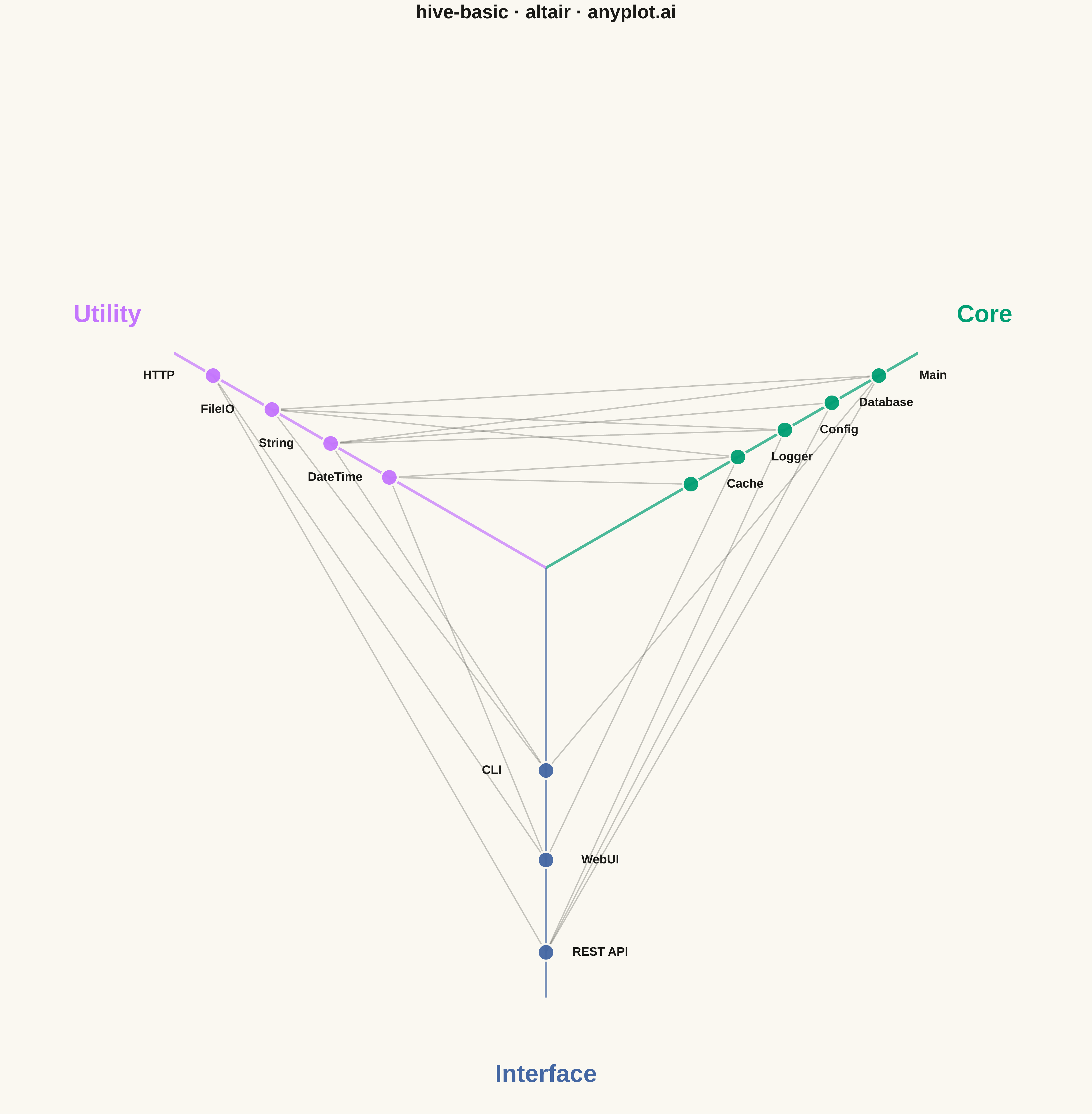
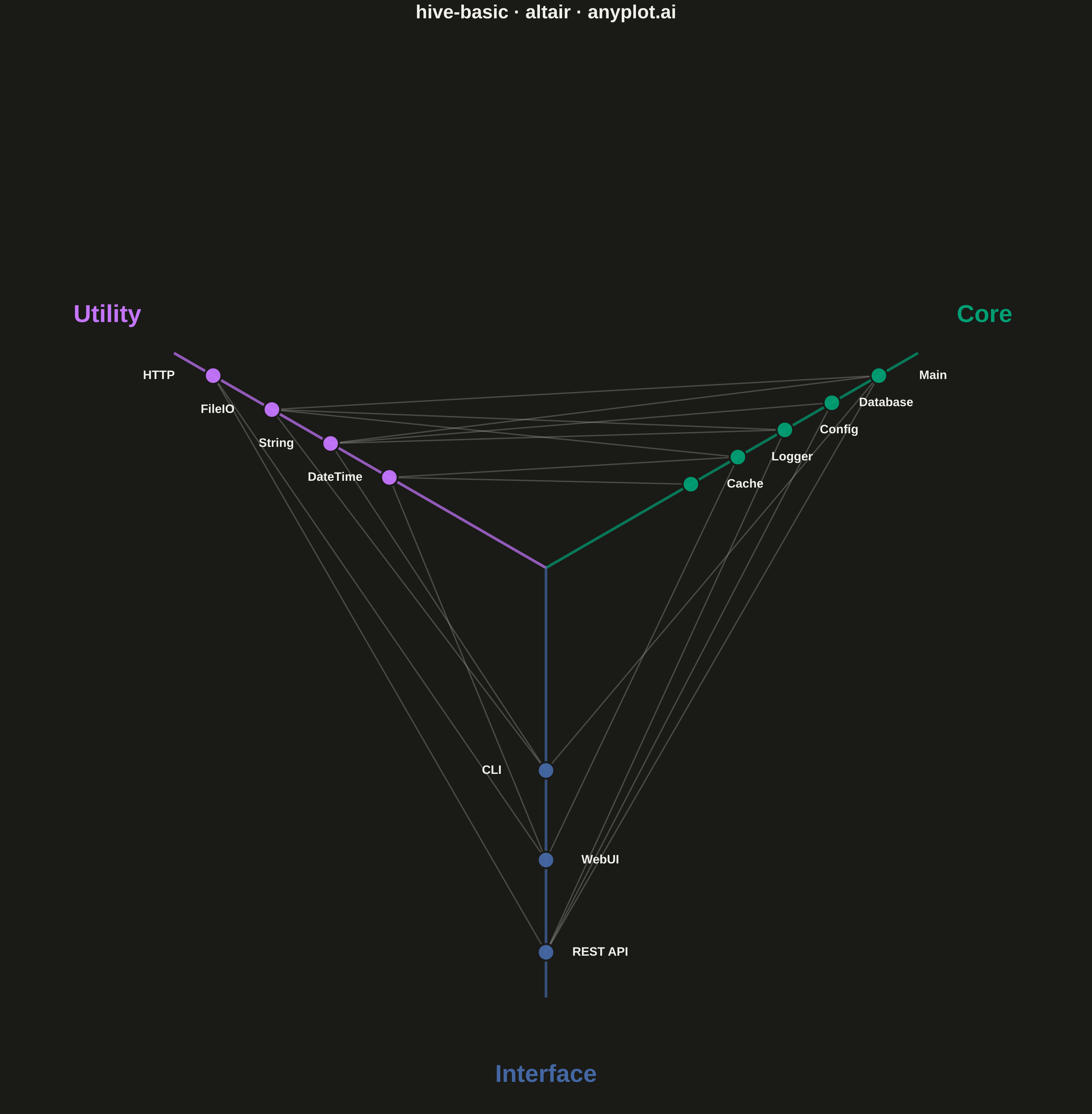
A hive plot arranges network nodes on radial axes based on node properties (such as degree, category, or other attributes), enabling reproducible and directly comparable network visualizations. Unlike force-directed layouts which can produce different arrangements for identical networks, hive plots always render the same network identically, solving the "hairball" problem of traditional network graphs and making structural comparisons reliable.
""" anyplot.ai
hive-basic: Basic Hive Plot
Library: altair 6.1.0 | Python 3.13.13
Quality: 94/100 | Updated: 2026-05-07
"""

import os

import altair as alt
import numpy as np
import pandas as pd


# Theme tokens
THEME = os.getenv("ANYPLOT_THEME", "light")
PAGE_BG = "#FAF8F1" if THEME == "light" else "#1A1A17"
ELEVATED_BG = "#FFFDF6" if THEME == "light" else "#242420"
INK = "#1A1A17" if THEME == "light" else "#F0EFE8"
INK_SOFT = "#4A4A44" if THEME == "light" else "#B8B7B0"
BRAND = "#009E73"  # Okabe-Ito position 1 — first categorical series
IMPRINT = ["#009E73", "#C475FD", "#4467A3"]

# Data: Software module dependency network
nodes_data = [
    # Core modules (axis 0) — foundational components
    {"id": "core_main", "name": "Main", "axis": "Core", "importance": 1.0},
    {"id": "core_db", "name": "Database", "axis": "Core", "importance": 0.80},
    {"id": "core_config", "name": "Config", "axis": "Core", "importance": 0.60},
    {"id": "core_logger", "name": "Logger", "axis": "Core", "importance": 0.40},
    {"id": "core_cache", "name": "Cache", "axis": "Core", "importance": 0.20},
    # Utility modules (axis 1) — helper components
    {"id": "util_http", "name": "HTTP", "axis": "Utility", "importance": 1.0},
    {"id": "util_file", "name": "FileIO", "axis": "Utility", "importance": 0.75},
    {"id": "util_string", "name": "String", "axis": "Utility", "importance": 0.50},
    {"id": "util_date", "name": "DateTime", "axis": "Utility", "importance": 0.25},
    # Interface modules (axis 2) — external-facing components
    {"id": "iface_api", "name": "REST API", "axis": "Interface", "importance": 1.0},
    {"id": "iface_web", "name": "WebUI", "axis": "Interface", "importance": 0.66},
    {"id": "iface_cli", "name": "CLI", "axis": "Interface", "importance": 0.33},
]

edges_data = [
    # Core to Utility connections
    ("core_main", "util_string"),
    ("core_main", "util_file"),
    ("core_config", "util_file"),
    ("core_config", "util_string"),
    ("core_logger", "util_date"),
    ("core_logger", "util_file"),
    ("core_cache", "util_date"),
    ("core_db", "util_string"),
    # Core to Interface connections
    ("core_main", "iface_api"),
    ("core_main", "iface_cli"),
    ("core_config", "iface_api"),
    ("core_db", "iface_api"),
    ("core_logger", "iface_web"),
    # Utility to Interface connections
    ("util_http", "iface_api"),
    ("util_http", "iface_web"),
    ("util_string", "iface_cli"),
    ("util_file", "iface_cli"),
    ("util_date", "iface_web"),
]

# Axis configuration: three axes at 120-degree separation using Okabe-Ito
axis_config = {
    "Core": {"angle": 30, "color": IMPRINT[0]},  # Bluish green
    "Utility": {"angle": 150, "color": IMPRINT[1]},  # Vermillion
    "Interface": {"angle": 270, "color": IMPRINT[2]},  # Blue
}

# Build node DataFrame with positions
nodes_df = pd.DataFrame(nodes_data)
min_radius = 0.25
max_radius = 0.85

node_positions = {}
nodes_df["x"] = 0.0
nodes_df["y"] = 0.0

for idx, row in nodes_df.iterrows():
    axis = row["axis"]
    angle_rad = np.radians(axis_config[axis]["angle"])
    radius = min_radius + (max_radius - min_radius) * row["importance"]
    nodes_df.at[idx, "x"] = radius * np.cos(angle_rad)
    nodes_df.at[idx, "y"] = radius * np.sin(angle_rad)
    nodes_df.at[idx, "color"] = axis_config[axis]["color"]
    node_positions[row["id"]] = (nodes_df.at[idx, "x"], nodes_df.at[idx, "y"])

# Build edges DataFrame with coordinates
edges_list = []
for source, target in edges_data:
    if source in node_positions and target in node_positions:
        x1, y1 = node_positions[source]
        x2, y2 = node_positions[target]
        source_axis = nodes_df[nodes_df["id"] == source]["axis"].values[0]
        target_axis = nodes_df[nodes_df["id"] == target]["axis"].values[0]
        edges_list.append(
            {
                "x": x1,
                "y": y1,
                "x2": x2,
                "y2": y2,
                "source": source,
                "target": target,
                "connection": f"{source_axis} → {target_axis}",
            }
        )

edges_df = pd.DataFrame(edges_list)

# Axis lines (from center outward)
axis_lines = []
for axis_name, config in axis_config.items():
    angle_rad = np.radians(config["angle"])
    axis_lines.append(
        {"x": 0, "y": 0, "x2": 0.95 * np.cos(angle_rad), "y2": 0.95 * np.sin(angle_rad), "axis": axis_name}
    )
axis_df = pd.DataFrame(axis_lines)

# Axis labels positioned at the end of axes
axis_labels = []
for axis_name, config in axis_config.items():
    angle_rad = np.radians(config["angle"])
    label_dist = 1.12
    axis_labels.append({"x": label_dist * np.cos(angle_rad), "y": label_dist * np.sin(angle_rad), "label": axis_name})
axis_labels_df = pd.DataFrame(axis_labels)

# Plot layers: edges, axes, nodes, labels

# Edge lines with transparency
edges_chart = (
    alt.Chart(edges_df)
    .mark_rule(strokeWidth=2, opacity=0.30)
    .encode(
        x=alt.X("x:Q", scale=alt.Scale(domain=[-1.2, 1.2]), axis=None),
        y=alt.Y("y:Q", scale=alt.Scale(domain=[-1.2, 1.2]), axis=None),
        x2="x2:Q",
        y2="y2:Q",
        color=alt.value(INK_SOFT),
        tooltip=["source:N", "target:N", "connection:N"],
    )
)

# Axis lines (radial axes)
axis_chart = (
    alt.Chart(axis_df)
    .mark_rule(strokeWidth=4, opacity=0.7)
    .encode(
        x="x:Q",
        y="y:Q",
        x2="x2:Q",
        y2="y2:Q",
        color=alt.Color(
            "axis:N", scale=alt.Scale(domain=["Core", "Utility", "Interface"], range=IMPRINT), legend=None
        ),
    )
)

# Node circles
nodes_chart = (
    alt.Chart(nodes_df)
    .mark_circle(size=600, opacity=0.95, stroke=PAGE_BG, strokeWidth=3)
    .encode(
        x="x:Q",
        y="y:Q",
        color=alt.Color(
            "axis:N", scale=alt.Scale(domain=["Core", "Utility", "Interface"], range=IMPRINT), legend=None
        ),
        tooltip=["name:N", "axis:N", "importance:Q"],
    )
)

# Node labels with proper positioning
node_labels_data = nodes_df.copy()
label_offset = 0.12

for idx, row in node_labels_data.iterrows():
    axis = row["axis"]
    if axis == "Core":
        # Right side labels
        node_labels_data.at[idx, "label_x"] = row["x"] + label_offset
        node_labels_data.at[idx, "label_y"] = row["y"]
    elif axis == "Utility":
        # Left side labels
        node_labels_data.at[idx, "label_x"] = row["x"] - label_offset
        node_labels_data.at[idx, "label_y"] = row["y"]
    else:  # Interface
        # Bottom — alternate sides
        node_labels_data.at[idx, "label_x"] = row["x"] + (label_offset if row["importance"] > 0.5 else -label_offset)
        node_labels_data.at[idx, "label_y"] = row["y"]

node_labels = (
    alt.Chart(node_labels_data)
    .mark_text(fontSize=18, fontWeight="bold")
    .encode(x="label_x:Q", y="label_y:Q", text="name:N", color=alt.value(INK))
)

# Axis labels (Core, Utility, Interface)
axis_label_chart = (
    alt.Chart(axis_labels_df)
    .mark_text(fontSize=36, fontWeight="bold")
    .encode(
        x="x:Q",
        y="y:Q",
        text="label:N",
        color=alt.Color(
            "label:N", scale=alt.Scale(domain=["Core", "Utility", "Interface"], range=IMPRINT), legend=None
        ),
    )
)

# Combine all layers
hive_chart = (
    (edges_chart + axis_chart + nodes_chart + node_labels + axis_label_chart)
    .properties(width=1600, height=1600, background=PAGE_BG)
    .configure_view(strokeWidth=0, fill=PAGE_BG)
    .configure_axis(grid=False)
)

# Add title
chart = hive_chart.properties(
    title=alt.Title(text="hive-basic · altair · anyplot.ai", fontSize=28, anchor="middle", color=INK)
)

# Save to both PNG and HTML with theme suffix
chart.save(f"plot-{THEME}.png", scale_factor=3.0)
chart.save(f"plot-{THEME}.html")
Runnable source as JSON, for any HTTP client: https://api.anyplot.ai/specs/hive-basic/altair/code. Any spec id and library id listed in llms-full.txt fit the same URL shape; every URL below is complete and callable.
{
  "spec_id": "hive-basic",
  "language": "python",
  "library": "altair",
  "page": "https://anyplot.ai/hive-basic/python/altair",
  "hub": "https://anyplot.ai/hive-basic",
  "code_json": "https://api.anyplot.ai/specs/hive-basic/altair/code",
  "spec_json": "https://api.anyplot.ai/specs/hive-basic",
  "render_light_png": "https://storage.googleapis.com/anyplot-images/plots/hive-basic/python/altair/plot-light.png",
  "render_dark_png": "https://storage.googleapis.com/anyplot-images/plots/hive-basic/python/altair/plot-dark.png",
  "interactive_light_html": "https://storage.googleapis.com/anyplot-images/plots/hive-basic/python/altair/plot-light.html",
  "interactive_dark_html": "https://storage.googleapis.com/anyplot-images/plots/hive-basic/python/altair/plot-dark.html",
  "quality_score": 94.0,
  "license": "MIT",
  "guide": "https://anyplot.ai/llms.txt"
}
Part of Basic Hive Plot on anyplot.ai.