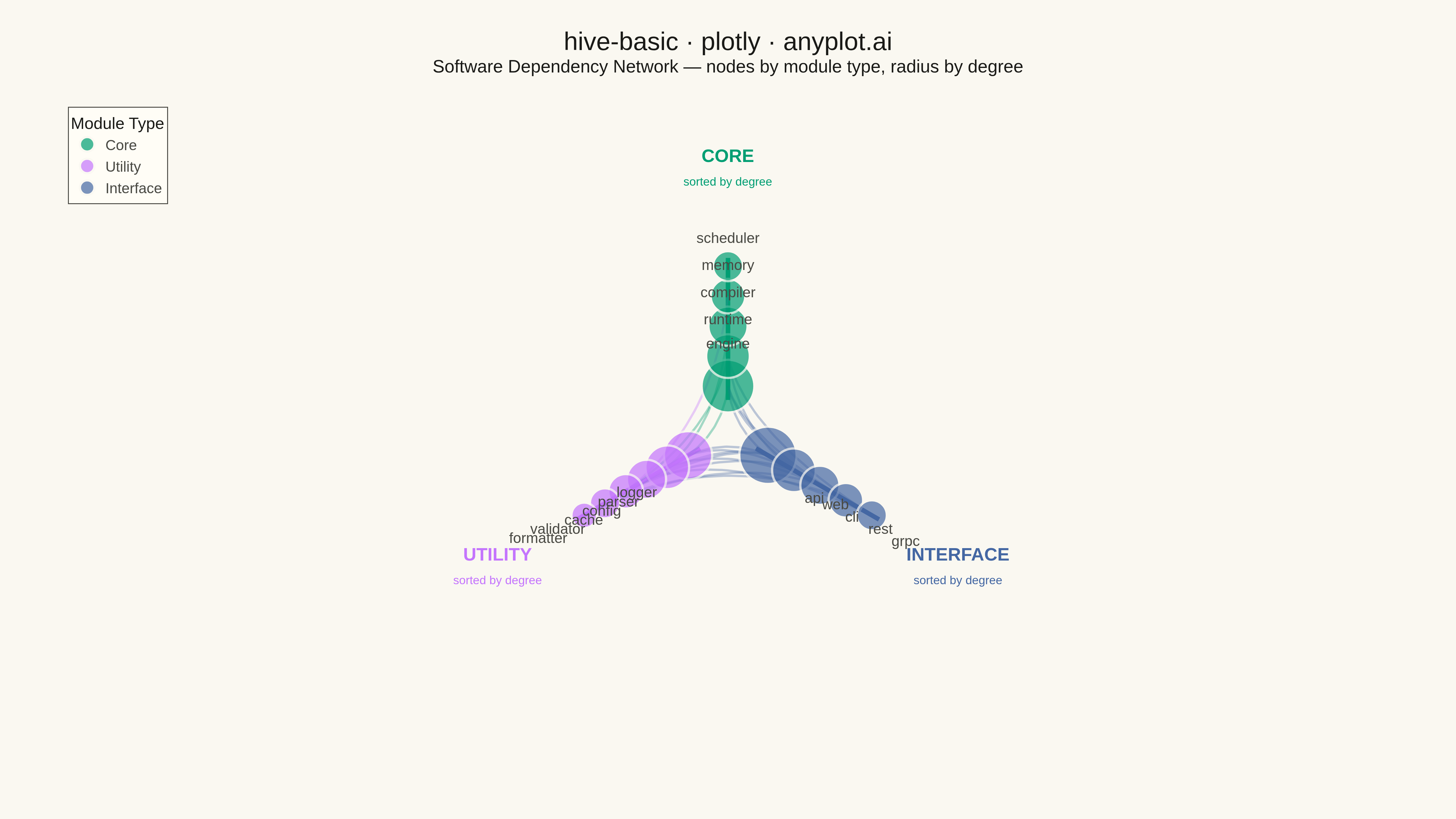
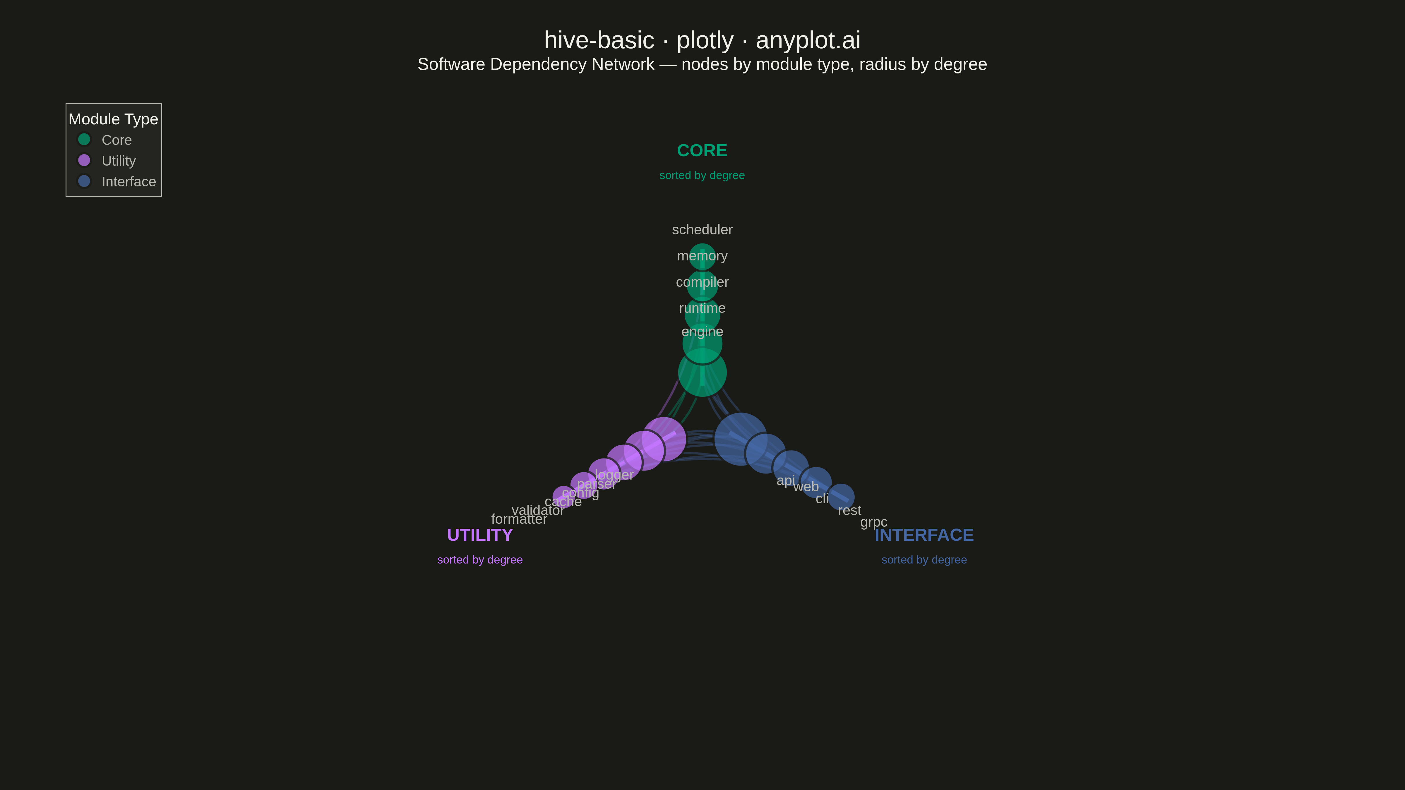
A hive plot arranges network nodes on radial axes based on node properties (such as degree, category, or other attributes), enabling reproducible and directly comparable network visualizations. Unlike force-directed layouts which can produce different arrangements for identical networks, hive plots always render the same network identically, solving the "hairball" problem of traditional network graphs and making structural comparisons reliable.
""" anyplot.ai
hive-basic: Basic Hive Plot
Library: plotly 6.7.0 | Python 3.13.13
Quality: 81/100 | Updated: 2026-05-09
"""

import os

import numpy as np
import plotly.graph_objects as go


# Theme tokens
THEME = os.getenv("ANYPLOT_THEME", "light")
PAGE_BG = "#FAF8F1" if THEME == "light" else "#1A1A17"
ELEVATED_BG = "#FFFDF6" if THEME == "light" else "#242420"
INK = "#1A1A17" if THEME == "light" else "#F0EFE8"
INK_SOFT = "#4A4A44" if THEME == "light" else "#B8B7B0"

# Okabe-Ito for the 3 axes (positions 1, 2, 3)
AXIS_COLORS = {"core": "#009E73", "utility": "#C475FD", "interface": "#4467A3"}

# Data: Software module dependency network
np.random.seed(42)

nodes = [
    # Core modules (axis 0)
    {"id": "engine", "category": "core", "degree": 8},
    {"id": "runtime", "category": "core", "degree": 6},
    {"id": "compiler", "category": "core", "degree": 5},
    {"id": "memory", "category": "core", "degree": 4},
    {"id": "scheduler", "category": "core", "degree": 3},
    # Utility modules (axis 1)
    {"id": "logger", "category": "utility", "degree": 7},
    {"id": "parser", "category": "utility", "degree": 6},
    {"id": "config", "category": "utility", "degree": 5},
    {"id": "cache", "category": "utility", "degree": 4},
    {"id": "validator", "category": "utility", "degree": 3},
    {"id": "formatter", "category": "utility", "degree": 2},
    # Interface modules (axis 2)
    {"id": "api", "category": "interface", "degree": 9},
    {"id": "web", "category": "interface", "degree": 6},
    {"id": "cli", "category": "interface", "degree": 5},
    {"id": "rest", "category": "interface", "degree": 4},
    {"id": "grpc", "category": "interface", "degree": 3},
]

edges = [
    ("api", "engine"),
    ("api", "logger"),
    ("api", "config"),
    ("api", "cache"),
    ("cli", "engine"),
    ("cli", "parser"),
    ("cli", "formatter"),
    ("web", "runtime"),
    ("web", "logger"),
    ("web", "cache"),
    ("rest", "engine"),
    ("rest", "validator"),
    ("grpc", "runtime"),
    ("grpc", "config"),
    ("engine", "memory"),
    ("engine", "scheduler"),
    ("engine", "logger"),
    ("runtime", "memory"),
    ("runtime", "cache"),
    ("compiler", "parser"),
    ("compiler", "memory"),
    ("logger", "config"),
    ("cache", "memory"),
    ("parser", "validator"),
]

# Axis layout: 3 axes evenly spaced
categories = ["core", "utility", "interface"]
axis_angles = [90, 210, 330]  # degrees
inner_radius = 0.25
outer_radius = 0.90

node_lookup = {n["id"]: n for n in nodes}

# Group and sort by degree (descending → innermost = highest degree)
nodes_by_category = {cat: [] for cat in categories}
for node in nodes:
    nodes_by_category[node["category"]].append(node)
for cat in categories:
    nodes_by_category[cat].sort(key=lambda x: x["degree"], reverse=True)

# Compute polar positions (inline, no functions)
node_positions = {}
for node in nodes:
    cat_idx = categories.index(node["category"])
    angle_rad = np.radians(axis_angles[cat_idx])
    cat_nodes = nodes_by_category[node["category"]]
    rank = cat_nodes.index(node)
    n_nodes = len(cat_nodes)
    t = rank / (n_nodes - 1) if n_nodes > 1 else 0.5
    radius = inner_radius + t * (outer_radius - inner_radius)
    node_positions[node["id"]] = (radius * np.cos(angle_rad), radius * np.sin(angle_rad))

# Plot
fig = go.Figure()

# Axes (radial spokes)
for i, cat in enumerate(categories):
    angle_rad = np.radians(axis_angles[i])
    x0 = inner_radius * 0.7 * np.cos(angle_rad)
    y0 = inner_radius * 0.7 * np.sin(angle_rad)
    x1 = outer_radius * 1.05 * np.cos(angle_rad)
    y1 = outer_radius * 1.05 * np.sin(angle_rad)
    fig.add_trace(
        go.Scatter(
            x=[x0, x1],
            y=[y0, y1],
            mode="lines",
            line={"color": AXIS_COLORS[cat], "width": 5},
            showlegend=False,
            hoverinfo="skip",
        )
    )

# Edges (quadratic bezier curves, pulled toward center)
for source, target in edges:
    if source not in node_positions or target not in node_positions:
        continue
    x0, y0 = node_positions[source]
    x1, y1 = node_positions[target]
    cx, cy = (x0 + x1) / 2 * 0.25, (y0 + y1) / 2 * 0.25
    t_vals = np.linspace(0, 1, 40)
    curve_x = (1 - t_vals) ** 2 * x0 + 2 * (1 - t_vals) * t_vals * cx + t_vals**2 * x1
    curve_y = (1 - t_vals) ** 2 * y0 + 2 * (1 - t_vals) * t_vals * cy + t_vals**2 * y1
    edge_color = AXIS_COLORS[node_lookup[source]["category"]]
    fig.add_trace(
        go.Scatter(
            x=curve_x,
            y=curve_y,
            mode="lines",
            line={"color": edge_color, "width": 2.5},
            opacity=0.35,
            showlegend=False,
            hoverinfo="skip",
        )
    )

# Nodes (per category for legend grouping)
label_positions = {"core": "top center", "utility": "bottom left", "interface": "bottom right"}
for cat in categories:
    cat_nodes = nodes_by_category[cat]
    xs = [node_positions[n["id"]][0] for n in cat_nodes]
    ys = [node_positions[n["id"]][1] for n in cat_nodes]
    labels = [n["id"] for n in cat_nodes]
    degrees = [n["degree"] for n in cat_nodes]
    sizes = [d * 5 + 18 for d in degrees]
    fig.add_trace(
        go.Scatter(
            x=xs,
            y=ys,
            mode="markers+text",
            marker={"size": sizes, "color": AXIS_COLORS[cat], "line": {"color": PAGE_BG, "width": 2.5}},
            text=labels,
            textposition=label_positions[cat],
            textfont={"size": 16, "color": INK_SOFT},
            name=cat.capitalize(),
            hovertemplate="<b>%{text}</b><br>Degree: %{customdata}<extra></extra>",
            customdata=degrees,
        )
    )

# Axis category labels — placed well beyond outermost nodes to avoid overlap
for i, cat in enumerate(categories):
    angle_rad = np.radians(axis_angles[i])
    label_r = outer_radius * 1.6
    fig.add_annotation(
        x=label_r * np.cos(angle_rad),
        y=label_r * np.sin(angle_rad),
        text=f"<b>{cat.upper()}</b><br><span style='font-size:13px'>sorted by degree</span>",
        showarrow=False,
        font={"size": 20, "color": AXIS_COLORS[cat]},
    )

# Style
fig.update_layout(
    title={
        "text": (
            "hive-basic · plotly · anyplot.ai"
            "<br><sup>Software Dependency Network — nodes by module type, radius by degree</sup>"
        ),
        "font": {"size": 28, "color": INK},
        "x": 0.5,
        "xanchor": "center",
    },
    showlegend=True,
    legend={
        "title": {"text": "Module Type", "font": {"size": 18, "color": INK}},
        "font": {"size": 16, "color": INK_SOFT},
        "x": 0.01,
        "y": 0.99,
        "bgcolor": ELEVATED_BG,
        "bordercolor": INK_SOFT,
        "borderwidth": 1,
    },
    xaxis={"showgrid": False, "zeroline": False, "showticklabels": False, "range": [-2.0, 2.0]},
    yaxis={
        "showgrid": False,
        "zeroline": False,
        "showticklabels": False,
        "range": [-1.8, 1.8],
        "scaleanchor": "x",
        "scaleratio": 1,
    },
    paper_bgcolor=PAGE_BG,
    plot_bgcolor=PAGE_BG,
    font={"color": INK},
    margin={"l": 60, "r": 60, "t": 110, "b": 60},
)

# Save
fig.write_image(f"plot-{THEME}.png", width=1600, height=900, scale=3)
fig.write_html(f"plot-{THEME}.html", include_plotlyjs="cdn")
Runnable source as JSON, for any HTTP client: https://api.anyplot.ai/specs/hive-basic/plotly/code. Any spec id and library id listed in llms-full.txt fit the same URL shape; every URL below is complete and callable.
{
  "spec_id": "hive-basic",
  "language": "python",
  "library": "plotly",
  "page": "https://anyplot.ai/hive-basic/python/plotly",
  "hub": "https://anyplot.ai/hive-basic",
  "code_json": "https://api.anyplot.ai/specs/hive-basic/plotly/code",
  "spec_json": "https://api.anyplot.ai/specs/hive-basic",
  "render_light_png": "https://storage.googleapis.com/anyplot-images/plots/hive-basic/python/plotly/plot-light.png",
  "render_dark_png": "https://storage.googleapis.com/anyplot-images/plots/hive-basic/python/plotly/plot-dark.png",
  "interactive_light_html": "https://storage.googleapis.com/anyplot-images/plots/hive-basic/python/plotly/plot-light.html",
  "interactive_dark_html": "https://storage.googleapis.com/anyplot-images/plots/hive-basic/python/plotly/plot-dark.html",
  "quality_score": 81.0,
  "license": "MIT",
  "guide": "https://anyplot.ai/llms.txt"
}
Part of Basic Hive Plot on anyplot.ai.