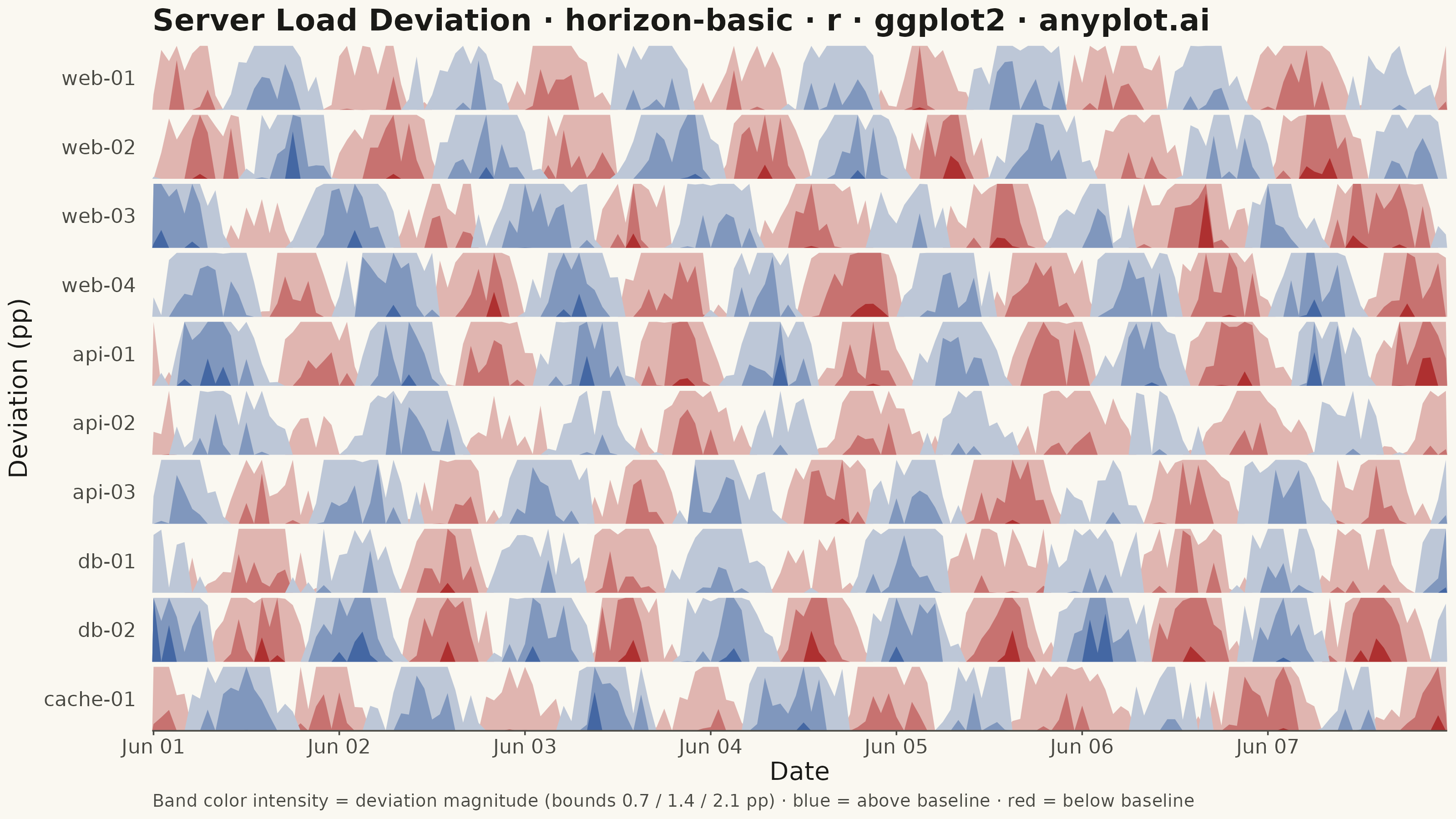
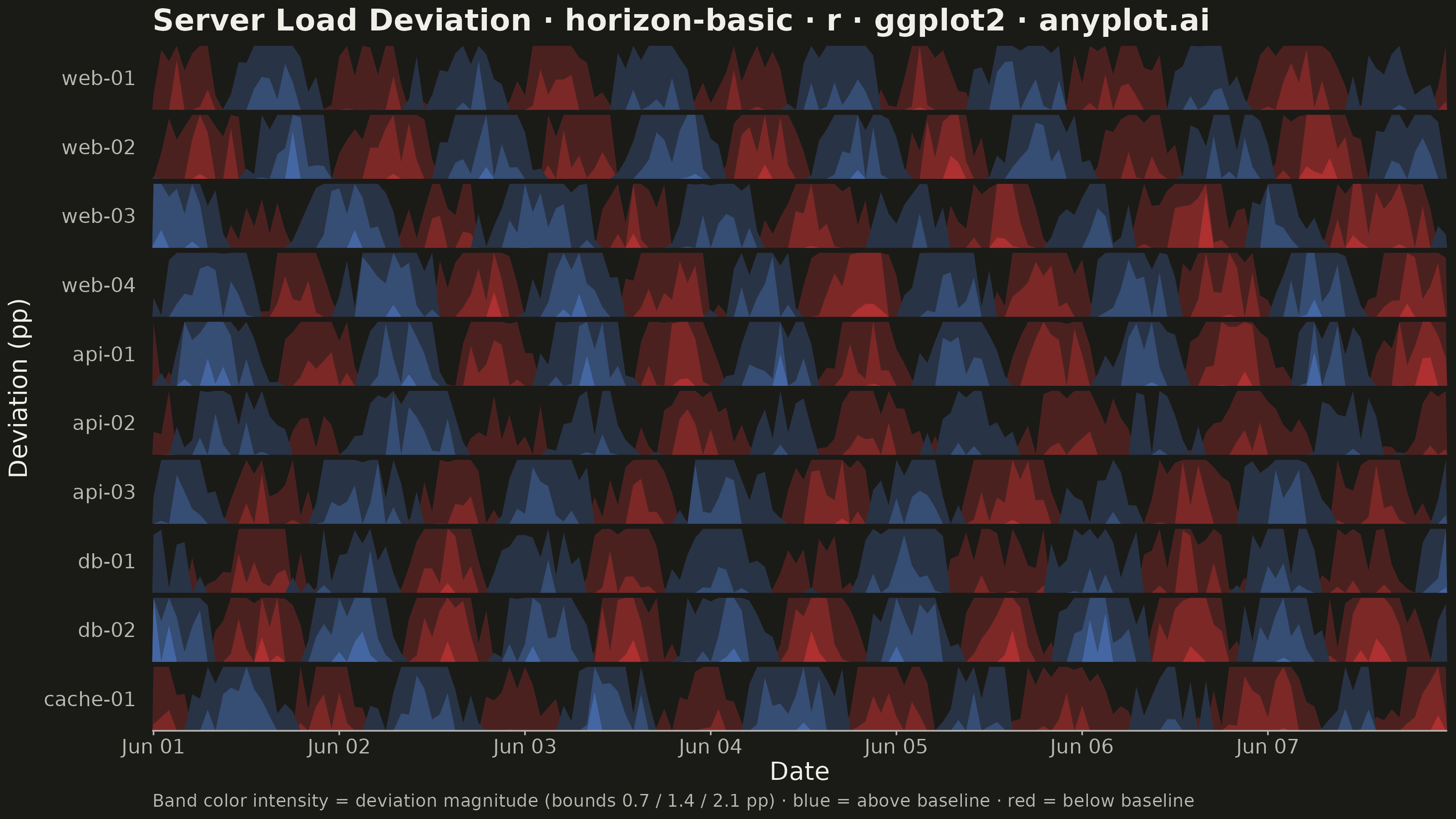
The same plot in 14 other libraries — Python: Altair, Bokeh, lets-plot, Matplotlib, Plotly, plotnine, Pygal, Seaborn; Julia: Makie.jl; JavaScript: Chart.js, D3.js, Apache ECharts, Highcharts, MUI X Charts. Compare all 15 side by side: Horizon Chart in Python, R, Julia and JavaScript.
A horizon chart displays many time series compactly by folding values into color-coded bands, preserving local resolution while minimizing vertical space. It divides the y-axis into bands and uses color intensity to encode magnitude, allowing dozens of series to be compared in limited space. This technique is particularly effective when monitoring many metrics simultaneously where traditional line charts would become unreadable.
#' anyplot.ai
#' horizon-basic: Horizon Chart
#' Library: ggplot2 3.5.1 | R 4.4.1
#' Quality: 89/100 | Created: 2026-08-19

library(ggplot2)
library(dplyr)
library(tidyr)
library(ragg)

set.seed(42)

# --- Theme tokens -------------------------------------------------------
THEME       <- Sys.getenv("ANYPLOT_THEME", "light")
PAGE_BG     <- if (THEME == "light") "#FAF8F1" else "#1A1A17"
INK         <- if (THEME == "light") "#1A1A17" else "#F0EFE8"
INK_SOFT    <- if (THEME == "light") "#4A4A44" else "#B8B7B0"

# Imprint diverging colormap stops (bad/loss red <-> midpoint <-> blue) — used
# here as two sequential ramps (midpoint -> red, midpoint -> blue) so each
# horizon band gets a progressively more saturated color with magnitude.
IMPRINT_DIV_LOW  <- "#AE3030"
IMPRINT_DIV_HIGH <- "#4467A3"

# --- Data -----------------------------------------------------------------
# CPU load deviation (percentage points) from each server's 7-day rolling
# baseline, sampled hourly. Mean-centered per server so 0 = "typical load".
n_points <- 168 # 7 days of hourly readings
n_bands  <- 3   # fold width — anyplot.ai default 2-4 bands

servers <- c(
  "web-01", "web-02", "web-03", "web-04",
  "api-01", "api-02", "api-03",
  "db-01", "db-02", "cache-01"
)

timestamps <- seq(as.POSIXct("2026-06-01", tz = "UTC"), by = "hour", length.out = n_points)

df <- bind_rows(lapply(servers, function(server) {
  drift    <- cumsum(rnorm(n_points, 0, 0.12))
  seasonal <- sin(seq_len(n_points) / 24 * 2 * pi + runif(1, 0, 2 * pi)) * runif(1, 0.6, 1.6)
  noise    <- rnorm(n_points, 0, 0.25)
  raw      <- drift * 0.3 + seasonal + noise
  tibble::tibble(timestamp = timestamps, server = server, deviation = raw - mean(raw))
}))

# --- Fold into horizon bands ----------------------------------------------
# Each band re-uses the same [0, band_size] vertical space; magnitude beyond
# a band spills into the next one, drawn on top in a darker shade. Negative
# deviations are mirrored (abs value) into their own red-shaded bands so the
# whole panel stays a single band_size tall regardless of sign.
band_size <- max(abs(df$deviation)) / n_bands

fold_bands <- function(magnitude) {
  sapply(seq_len(n_bands), function(k) {
    top     <- k * band_size
    clipped <- pmin(pmax(magnitude, 0), top)
    pmax(clipped - (k - 1) * band_size, 0)
  })
}

pos_bands <- as_tibble(fold_bands(pmax(df$deviation, 0)), .name_repair = ~ paste0("pos_", seq_len(n_bands)))
neg_bands <- as_tibble(fold_bands(pmax(-df$deviation, 0)), .name_repair = ~ paste0("neg_", seq_len(n_bands)))

folded_df <- bind_cols(df %>% select(timestamp, server), pos_bands, neg_bands) %>%
  pivot_longer(
    cols      = c(starts_with("pos_"), starts_with("neg_")),
    names_to  = "tier",
    values_to = "folded"
  ) %>%
  mutate(
    server = factor(server, levels = servers),
    # Draw order (ascending): widest/lightest band first, narrowest/darkest last.
    tier   = factor(tier, levels = c("neg_1", "neg_2", "neg_3", "pos_1", "pos_2", "pos_3"))
  ) %>%
  arrange(server, tier, timestamp)

pos_colors <- grDevices::colorRampPalette(c(PAGE_BG, IMPRINT_DIV_HIGH))(n_bands + 1)[-1]
neg_colors <- grDevices::colorRampPalette(c(PAGE_BG, IMPRINT_DIV_LOW))(n_bands + 1)[-1]
tier_colors <- setNames(
  c(neg_colors[1], neg_colors[2], neg_colors[3], pos_colors[1], pos_colors[2], pos_colors[3]),
  c("neg_1", "neg_2", "neg_3", "pos_1", "pos_2", "pos_3")
)

# --- Title (fontsize scales with title length, see plot-generator.md) -----
plot_title  <- "Server Load Deviation · horizon-basic · r · ggplot2 · anyplot.ai"
title_ratio <- if (nchar(plot_title) > 67) 67 / nchar(plot_title) else 1.0
title_size  <- max(8, round(12 * title_ratio))

# Numeric band-boundary key for the caption, e.g. "1.2 / 2.4 / 3.6 pp".
band_bounds  <- round(seq_len(n_bands) * band_size, 1)
plot_caption <- sprintf(
  "Band color intensity = deviation magnitude (bounds %s pp) · blue = above baseline · red = below baseline",
  paste(band_bounds, collapse = " / ")
)

# --- Plot -------------------------------------------------------------------
p <- ggplot(folded_df, aes(x = timestamp, y = folded, fill = tier, group = tier)) +
  geom_area(position = "identity") +
  facet_wrap(~server, ncol = 1, strip.position = "left") +
  scale_fill_manual(values = tier_colors, guide = "none") +
  scale_x_datetime(date_breaks = "1 day", date_labels = "%b %d", expand = c(0, 0)) +
  scale_y_continuous(expand = c(0, 0)) +
  labs(
    title   = plot_title,
    x       = "Date",
    y       = "Deviation (pp)",
    caption = plot_caption
  ) +
  theme_minimal(base_size = 7) +
  theme(
    plot.background   = element_rect(fill = PAGE_BG, color = PAGE_BG),
    panel.background  = element_rect(fill = PAGE_BG, color = NA),
    panel.grid        = element_blank(),
    panel.spacing.y   = unit(2, "pt"),
    strip.background  = element_blank(),
    strip.placement   = "outside",
    strip.text.y.left = element_text(color = INK_SOFT, size = 8, angle = 0, hjust = 1),
    axis.title.x      = element_text(color = INK, size = 10),
    axis.title.y      = element_text(color = INK, size = 10),
    axis.text.x       = element_text(color = INK_SOFT, size = 8),
    axis.text.y       = element_blank(),
    axis.ticks.y      = element_blank(),
    axis.ticks.x      = element_line(color = INK_SOFT, linewidth = 0.3),
    axis.line.x       = element_line(color = INK_SOFT, linewidth = 0.3),
    plot.title        = element_text(color = INK, size = title_size, face = "bold"),
    plot.caption      = element_text(color = INK_SOFT, size = 7, hjust = 0)
  )

# --- Save -------------------------------------------------------------------
ggsave(
  filename = sprintf("plot-%s.png", THEME),
  plot     = p,
  device   = ragg::agg_png,
  width    = 8,
  height   = 4.5,
  units    = "in",
  dpi      = 400
)
Runnable source as JSON, for any HTTP client: https://api.anyplot.ai/specs/horizon-basic/ggplot2/code. Any spec id and library id listed in llms-full.txt fit the same URL shape; every URL below is complete and callable.
{
  "spec_id": "horizon-basic",
  "language": "r",
  "library": "ggplot2",
  "page": "https://anyplot.ai/horizon-basic/r/ggplot2",
  "hub": "https://anyplot.ai/horizon-basic",
  "code_json": "https://api.anyplot.ai/specs/horizon-basic/ggplot2/code",
  "spec_json": "https://api.anyplot.ai/specs/horizon-basic",
  "render_light_png": "https://storage.googleapis.com/anyplot-images/plots/horizon-basic/r/ggplot2/plot-light.png",
  "render_dark_png": "https://storage.googleapis.com/anyplot-images/plots/horizon-basic/r/ggplot2/plot-dark.png",
  "quality_score": 89.0,
  "license": "MIT",
  "guide": "https://anyplot.ai/llms.txt"
}
Part of Horizon Chart on anyplot.ai.