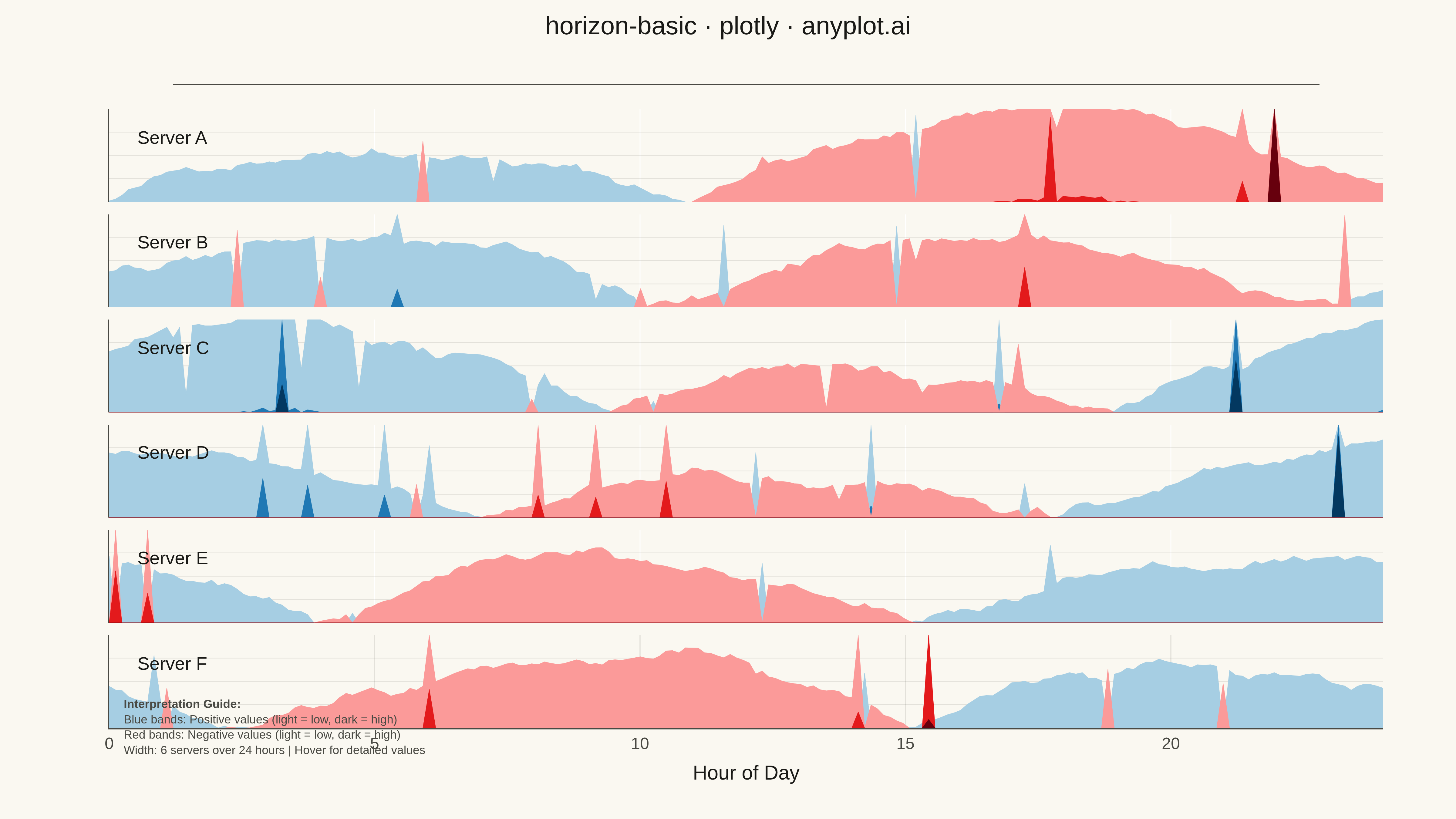
A horizon chart displays many time series compactly by folding values into color-coded bands, preserving local resolution while minimizing vertical space. It divides the y-axis into bands and uses color intensity to encode magnitude, allowing dozens of series to be compared in limited space. This technique is particularly effective when monitoring many metrics simultaneously where traditional line charts would become unreadable.
""" anyplot.ai
horizon-basic: Horizon Chart
Library: plotly 6.7.0 | Python 3.13.13
Quality: 92/100 | Updated: 2026-05-07
"""

import os

import numpy as np
import plotly.graph_objects as go
from plotly.subplots import make_subplots


THEME = os.getenv("ANYPLOT_THEME", "light")
PAGE_BG = "#FAF8F1" if THEME == "light" else "#1A1A17"
ELEVATED_BG = "#FFFDF6" if THEME == "light" else "#242420"
INK = "#1A1A17" if THEME == "light" else "#F0EFE8"
INK_SOFT = "#4A4A44" if THEME == "light" else "#B8B7B0"
GRID = "rgba(26,26,23,0.10)" if THEME == "light" else "rgba(240,239,232,0.10)"

# Data: Server metrics over 24 hours for 6 servers
np.random.seed(42)
n_points = 200
n_series = 6
series_names = ["Server A", "Server B", "Server C", "Server D", "Server E", "Server F"]

# Generate time points over 24 hours
hours = np.linspace(0, 24, n_points)

# Generate realistic CPU usage patterns with variations from baseline (50%)
data = []
for i, name in enumerate(series_names):
    # Different patterns for each server
    base = np.sin(hours * np.pi / 12 + i * 0.5) * 15  # Daily cycle
    noise = np.cumsum(np.random.randn(n_points) * 0.5)  # Random walk
    spikes = np.random.choice([0, 1], n_points, p=[0.95, 0.05]) * np.random.randn(n_points) * 20
    values = base + noise + spikes
    data.append({"series": name, "hours": hours, "values": values})

# Horizon chart parameters
n_bands = 3
colors_pos = ["#a6cee3", "#1f78b4", "#033860"]  # Light to dark blue
colors_neg = ["#fb9a99", "#e31a1c", "#67000d"]  # Light to dark red

# Create subplots - one row per series
fig = make_subplots(rows=n_series, cols=1, shared_xaxes=True, vertical_spacing=0.02, row_heights=[1] * n_series)

# Calculate global max for consistent band sizing
all_values = np.concatenate([d["values"] for d in data])
band_size = np.max(np.abs(all_values)) / n_bands

# Build horizon chart for each series
for row_idx, series_data in enumerate(data, 1):
    values = series_data["values"]
    x = series_data["hours"]
    name = series_data["series"]

    # Create bands for positive values (folded)
    for band in range(n_bands):
        band_min = band * band_size
        band_max = (band + 1) * band_size

        # Clip positive values to this band
        y_pos = np.clip(values, band_min, band_max) - band_min
        y_pos = np.where(values > band_min, y_pos, 0)

        fig.add_trace(
            go.Scatter(
                x=x,
                y=y_pos,
                fill="tozeroy",
                fillcolor=colors_pos[band],
                line=dict(width=0),
                mode="lines",
                showlegend=False,
                hoverinfo="skip",
            ),
            row=row_idx,
            col=1,
        )

    # Create bands for negative values (folded, mirrored to positive)
    for band in range(n_bands):
        band_min = band * band_size
        band_max = (band + 1) * band_size

        # Clip negative values (absolute) to this band and mirror
        neg_values = np.abs(np.minimum(values, 0))
        y_neg = np.clip(neg_values, band_min, band_max) - band_min
        y_neg = np.where(neg_values > band_min, y_neg, 0)

        fig.add_trace(
            go.Scatter(
                x=x,
                y=y_neg,
                fill="tozeroy",
                fillcolor=colors_neg[band],
                line=dict(width=0),
                mode="lines",
                showlegend=False,
                hoverinfo="skip",
            ),
            row=row_idx,
            col=1,
        )

    # Add series label with larger font size
    fig.add_annotation(
        x=0.5,
        y=band_size * 0.7,
        xref=f"x{row_idx}" if row_idx > 1 else "x",
        yref=f"y{row_idx}" if row_idx > 1 else "y",
        text=name,
        showarrow=False,
        font=dict(size=20, color=INK),
        xanchor="left",
    )

# Update layout with theme-aware colors
fig.update_layout(
    title=dict(text="horizon-basic · plotly · anyplot.ai", font=dict(size=28, color=INK), x=0.5, xanchor="center"),
    paper_bgcolor=PAGE_BG,
    plot_bgcolor=PAGE_BG,
    font=dict(color=INK),
    showlegend=False,
    margin=dict(l=100, r=50, t=100, b=80),
)

# Update x-axes with theme-aware colors and larger tick font
fig.update_xaxes(
    title_text="Hour of Day",
    title_font=dict(size=22, color=INK),
    tickfont=dict(size=18, color=INK_SOFT),
    gridcolor=GRID,
    linecolor=INK_SOFT,
    row=n_series,
    col=1,
)

# Update y-axes - hide tick labels but keep consistent range
for i in range(1, n_series + 1):
    fig.update_yaxes(
        range=[0, band_size], showticklabels=False, showgrid=False, zeroline=False, linecolor=INK_SOFT, row=i, col=1
    )

# Add more prominent legend for color interpretation
fig.add_annotation(
    x=0.98,
    y=1.02,
    xref="paper",
    yref="paper",
    text="<b>Positive:</b> Blue (light→dark) | <b>Negative:</b> Red (light→dark)",
    showarrow=False,
    font=dict(size=16, color=INK),
    xanchor="right",
)

# Save as PNG (4800x2700) and HTML with theme-suffixed filenames
fig.write_image(f"plot-{THEME}.png", width=1600, height=900, scale=3)
fig.write_html(f"plot-{THEME}.html", include_plotlyjs="cdn")
Runnable source as JSON, for any HTTP client: https://api.anyplot.ai/specs/horizon-basic/plotly/code. Any spec id and library id listed in llms-full.txt fit the same URL shape; every URL below is complete and callable.
{
  "spec_id": "horizon-basic",
  "language": "python",
  "library": "plotly",
  "page": "https://anyplot.ai/horizon-basic/python/plotly",
  "hub": "https://anyplot.ai/horizon-basic",
  "code_json": "https://api.anyplot.ai/specs/horizon-basic/plotly/code",
  "spec_json": "https://api.anyplot.ai/specs/horizon-basic",
  "render_light_png": "https://storage.googleapis.com/anyplot-images/plots/horizon-basic/python/plotly/plot-light.png",
  "render_dark_png": "https://storage.googleapis.com/anyplot-images/plots/horizon-basic/python/plotly/plot-dark.png",
  "interactive_light_html": "https://storage.googleapis.com/anyplot-images/plots/horizon-basic/python/plotly/plot-light.html",
  "interactive_dark_html": "https://storage.googleapis.com/anyplot-images/plots/horizon-basic/python/plotly/plot-dark.html",
  "quality_score": 92.0,
  "license": "MIT",
  "guide": "https://anyplot.ai/llms.txt"
}
Part of Horizon Chart on anyplot.ai.