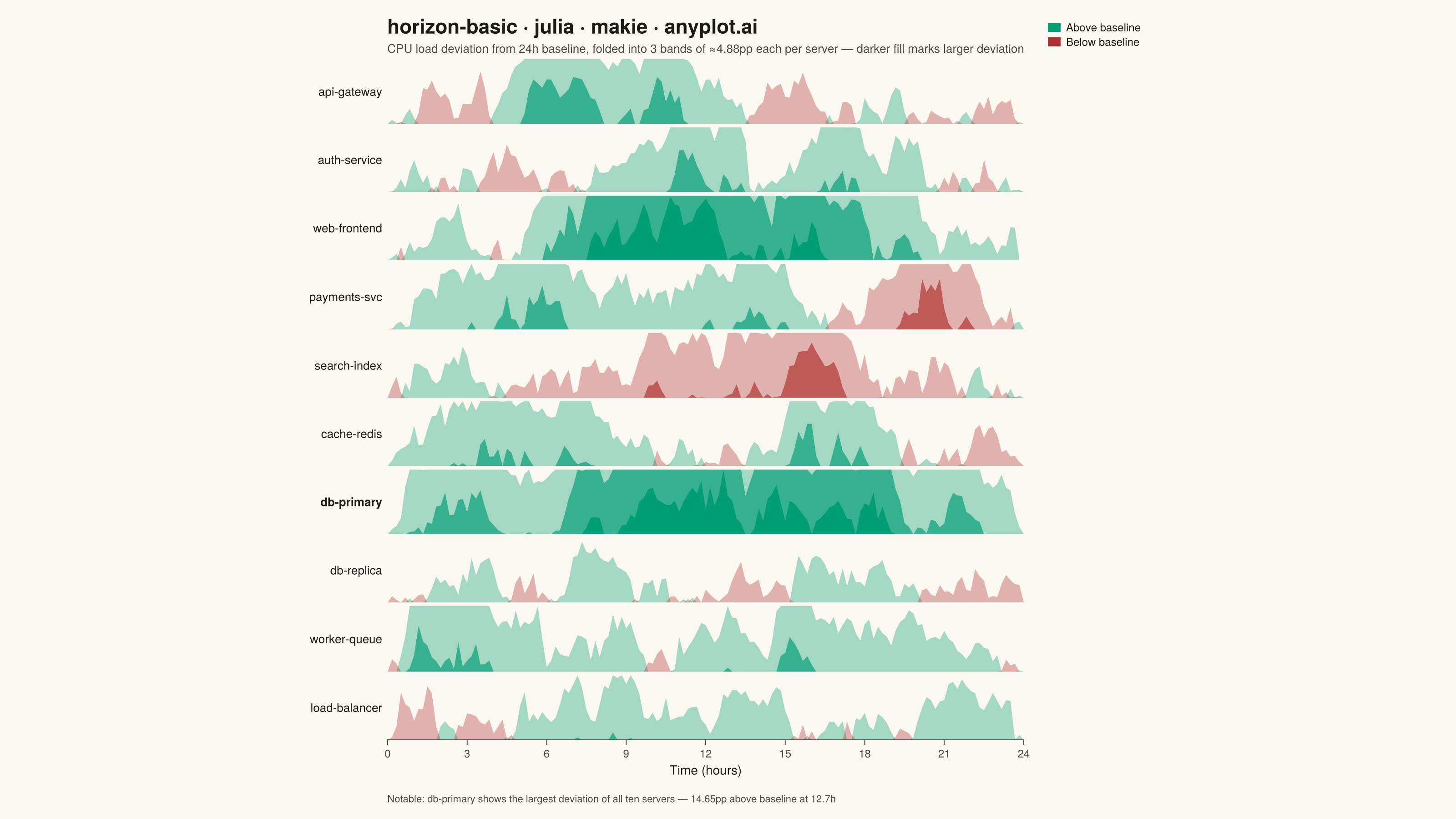
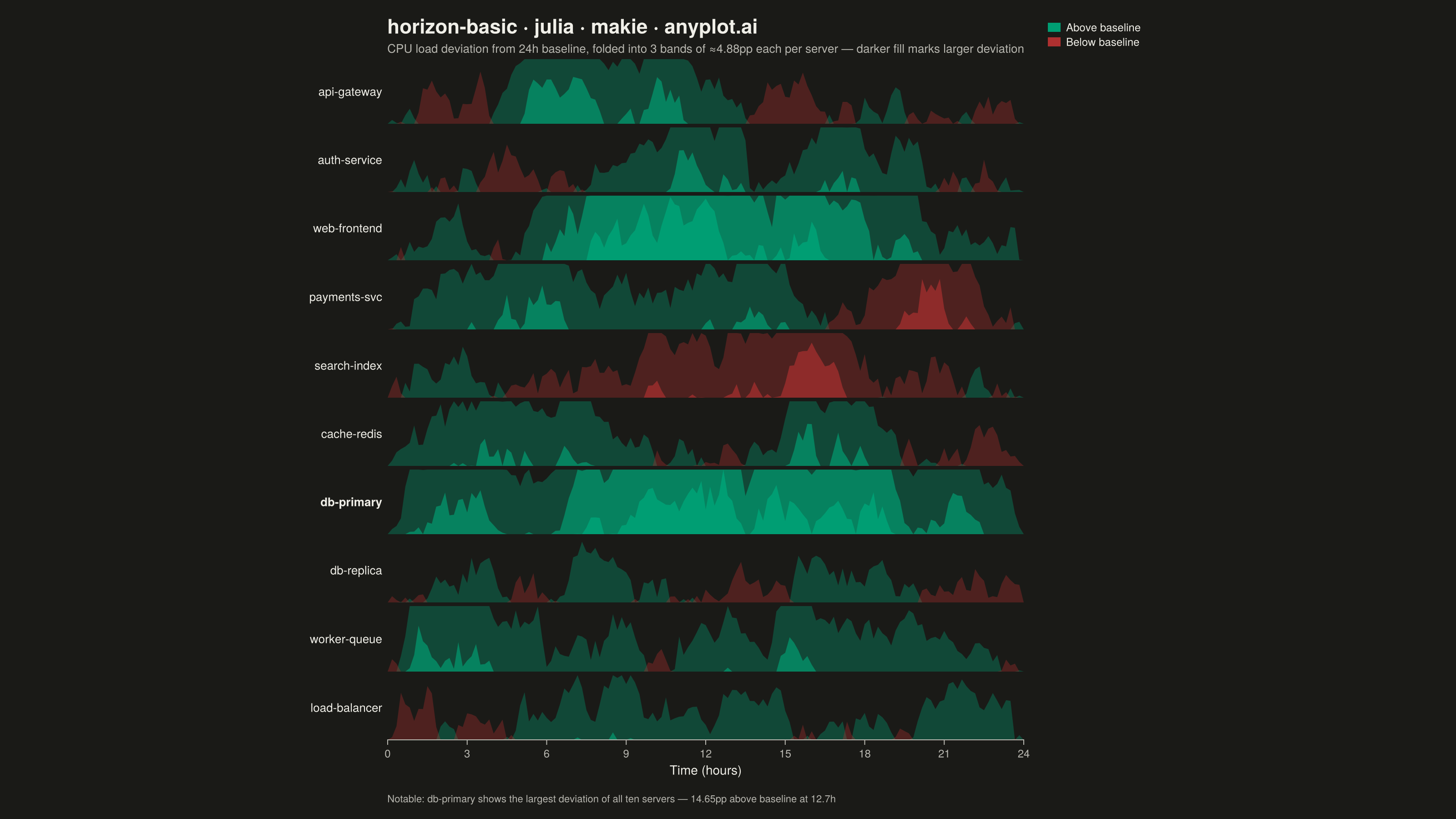
The same plot in 14 other libraries — Python: Altair, Bokeh, lets-plot, Matplotlib, Plotly, plotnine, Pygal, Seaborn; R: ggplot2; JavaScript: Chart.js, D3.js, Apache ECharts, Highcharts, MUI X Charts. Compare all 15 side by side: Horizon Chart in Python, R, Julia and JavaScript.
A horizon chart displays many time series compactly by folding values into color-coded bands, preserving local resolution while minimizing vertical space. It divides the y-axis into bands and uses color intensity to encode magnitude, allowing dozens of series to be compared in limited space. This technique is particularly effective when monitoring many metrics simultaneously where traditional line charts would become unreadable.
# anyplot.ai
# horizon-basic: Horizon Chart
# Library: makie 0.21.9 | Julia 1.11.9
# Quality: 91/100 | Created: 2026-08-20

using CairoMakie
using Colors
using Random

Random.seed!(42)

# --- Theme tokens -----------------------------------------------------------
const THEME    = get(ENV, "ANYPLOT_THEME", "light")
const PAGE_BG  = THEME == "light" ? colorant"#FAF8F1" : colorant"#1A1A17"
const INK      = THEME == "light" ? colorant"#1A1A17" : colorant"#F0EFE8"
const INK_SOFT = THEME == "light" ? colorant"#4A4A44" : colorant"#B8B7B0"
const IMPRINT_PALETTE = [
    colorant"#009E73", colorant"#C475FD", colorant"#4467A3", colorant"#BD8233",
    colorant"#AE3030", colorant"#2ABCCD", colorant"#954477", colorant"#99B314",
]
const POS_COLOR = IMPRINT_PALETTE[1]  # brand green — above-baseline deviation
const NEG_COLOR = IMPRINT_PALETTE[5]  # matte red — below-baseline deviation

# --- Data ---------------------------------------------------------------
# Ten server CPU-load deviations (percentage points) from a 24h rolling
# baseline, sampled every 10 minutes — a typical horizon-chart dashboard use.
const N_POINTS = 145
const N_BANDS  = 3

server_names = [
    "api-gateway", "auth-service", "web-frontend", "payments-svc",
    "search-index", "cache-redis", "db-primary", "db-replica",
    "worker-queue", "load-balancer",
]
n_series = length(server_names)

t = collect(range(0.0, 24.0; length = N_POINTS))

series_values = Vector{Vector{Float64}}(undef, n_series)
for i in 1:n_series
    walk = cumsum(randn(N_POINTS) .* 0.9)
    trend = range(walk[1], walk[end]; length = N_POINTS)
    series_values[i] = walk .- collect(trend)
end

band_height = maximum(maximum(abs.(v)) for v in series_values) / N_BANDS
band_alphas = range(0.35, 1.0; length = N_BANDS)

# Most notable anomaly, for an explicit storytelling callout below the chart.
peak_series_idx = argmax([maximum(abs.(v)) for v in series_values])
peak_series_name = server_names[peak_series_idx]
peak_values = series_values[peak_series_idx]
peak_idx = argmax(abs.(peak_values))
peak_time = t[peak_idx]
peak_value = peak_values[peak_idx]
peak_sign = peak_value >= 0 ? "above" : "below"

# --- Plot -----------------------------------------------------------------
fig = Figure(
    resolution      = (1600, 900),
    fontsize        = 14,
    backgroundcolor = PAGE_BG,
)

Label(
    fig[1, 1], "horizon-basic · julia · makie · anyplot.ai";
    fontsize = 22, color = INK, font = :bold, halign = :left,
)
Label(
    fig[2, 1],
    "CPU load deviation from 24h baseline, folded into $(N_BANDS) bands of ≈$(round(band_height, digits = 2))pp each per server — darker fill marks larger deviation";
    fontsize = 13, color = INK_SOFT, halign = :left,
)

Legend(
    fig[1:2, 2],
    [PolyElement(color = POS_COLOR), PolyElement(color = NEG_COLOR)],
    ["Above baseline", "Below baseline"];
    framevisible = false,
    labelsize = 12,
    labelcolor = INK,
    patchsize = (14, 10),
    patchlabelgap = 6,
    rowgap = 2,
    tellheight = false,
    valign = :center,
    halign = :left,
)

zero_line = zeros(N_POINTS)
for (i, name) in enumerate(server_names)
    row = 2 + i
    ax = Axis(
        fig[row, 1];
        ylabel              = name,
        ylabelsize          = 13,
        ylabelcolor         = INK,
        ylabelfont          = (i == peak_series_idx ? :bold : :regular),
        ylabelrotation      = 0,
        backgroundcolor     = PAGE_BG,
        xgridvisible        = false,
        ygridvisible        = false,
        topspinevisible     = false,
        rightspinevisible   = false,
        leftspinevisible    = false,
        bottomspinevisible  = (i == n_series),
        bottomspinecolor    = INK_SOFT,
    )

    values = series_values[i]
    for b in 1:N_BANDS
        folded_pos = clamp.(values .- (b - 1) * band_height, 0.0, band_height)
        band!(ax, t, zero_line, folded_pos; color = (POS_COLOR, band_alphas[b]))

        folded_neg = clamp.(.-values .- (b - 1) * band_height, 0.0, band_height)
        band!(ax, t, zero_line, folded_neg; color = (NEG_COLOR, band_alphas[b]))
    end

    limits!(ax, (0.0, 24.0), (0.0, band_height))
    hideydecorations!(ax; label = false)

    if i == n_series
        ax.xlabel = "Time (hours)"
        ax.xlabelsize = 14
        ax.xlabelcolor = INK
        ax.xticklabelsize = 12
        ax.xticklabelcolor = INK_SOFT
        ax.xtickcolor = INK_SOFT
    else
        hidexdecorations!(ax)
    end
end

rowgap!(fig.layout, 4)
colgap!(fig.layout, 20)

Label(
    fig[n_series + 3, 1:2],
    "Notable: $(peak_series_name) shows the largest deviation of all ten servers — " *
    "$(round(abs(peak_value), digits = 2))pp $(peak_sign) baseline at $(round(peak_time, digits = 1))h";
    fontsize = 11, color = INK_SOFT, halign = :left,
)

# --- Save -------------------------------------------------------------------
save("plot-$(THEME).png", fig; px_per_unit = 2)
Runnable source as JSON, for any HTTP client: https://api.anyplot.ai/specs/horizon-basic/makie/code. Any spec id and library id listed in llms-full.txt fit the same URL shape; every URL below is complete and callable.
{
  "spec_id": "horizon-basic",
  "language": "julia",
  "library": "makie",
  "page": "https://anyplot.ai/horizon-basic/julia/makie",
  "hub": "https://anyplot.ai/horizon-basic",
  "code_json": "https://api.anyplot.ai/specs/horizon-basic/makie/code",
  "spec_json": "https://api.anyplot.ai/specs/horizon-basic",
  "render_light_png": "https://storage.googleapis.com/anyplot-images/plots/horizon-basic/julia/makie/plot-light.png",
  "render_dark_png": "https://storage.googleapis.com/anyplot-images/plots/horizon-basic/julia/makie/plot-dark.png",
  "quality_score": 91.0,
  "license": "MIT",
  "guide": "https://anyplot.ai/llms.txt"
}
Part of Horizon Chart on anyplot.ai.