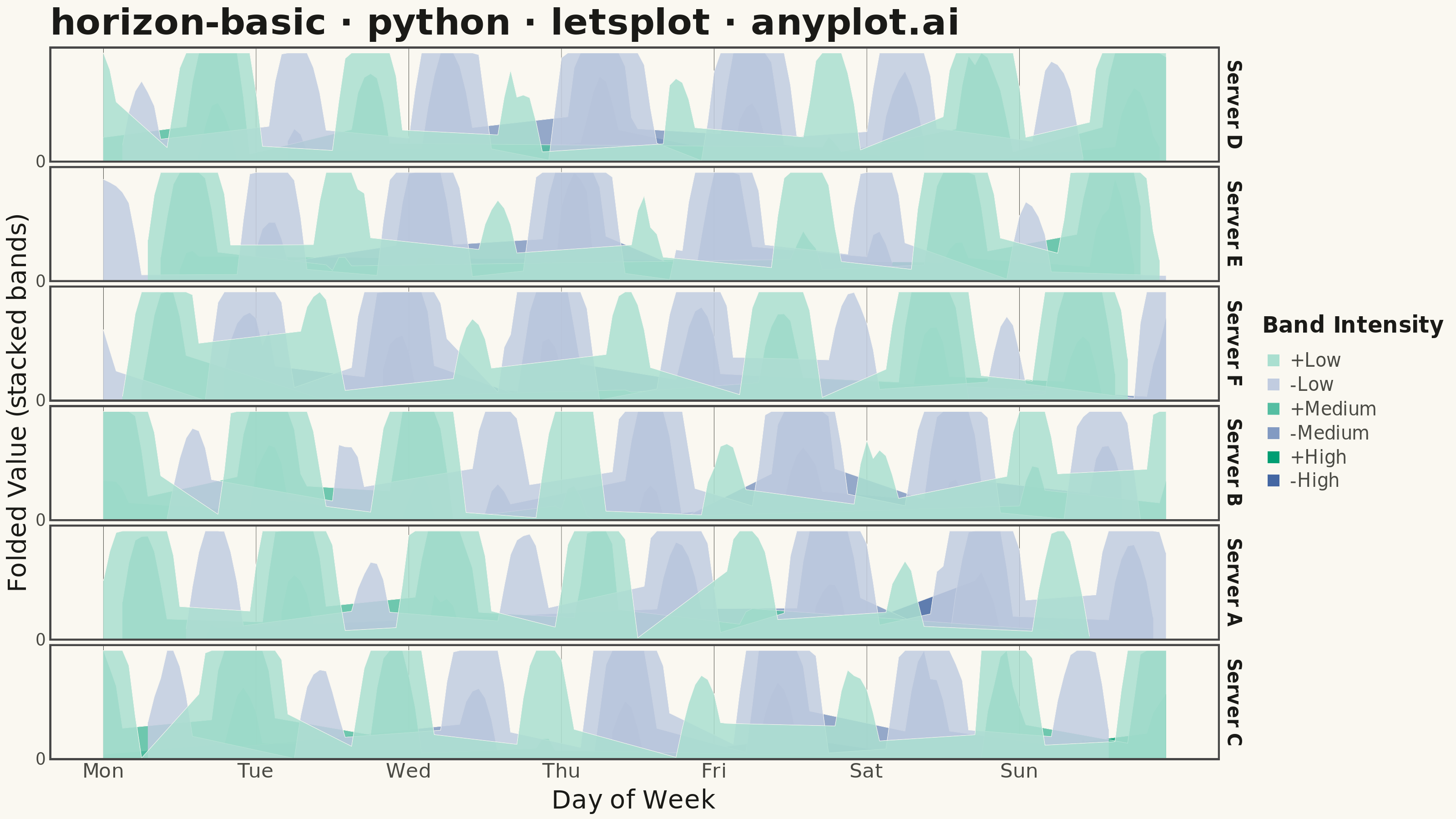
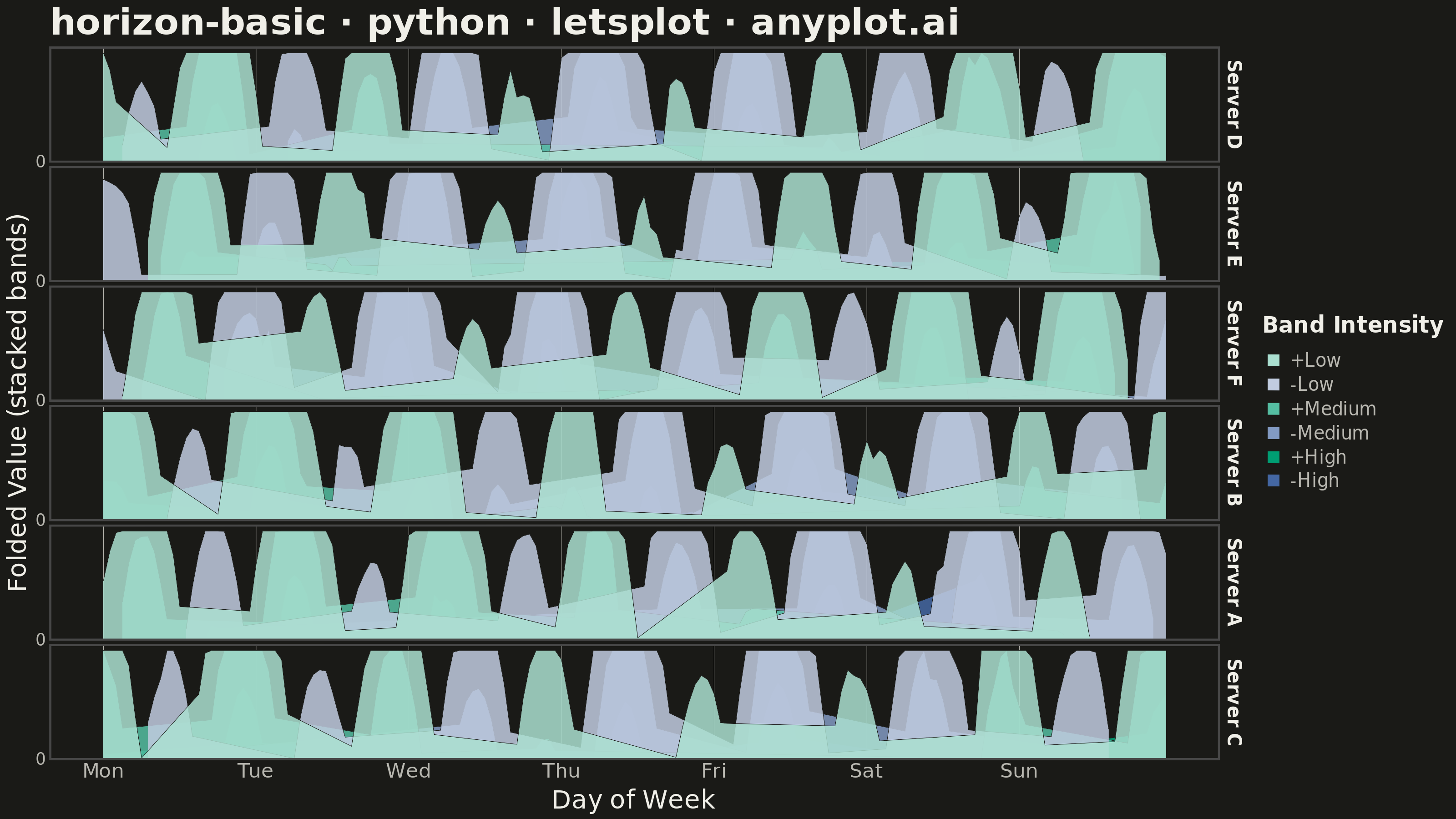
A horizon chart displays many time series compactly by folding values into color-coded bands, preserving local resolution while minimizing vertical space. It divides the y-axis into bands and uses color intensity to encode magnitude, allowing dozens of series to be compared in limited space. This technique is particularly effective when monitoring many metrics simultaneously where traditional line charts would become unreadable.
""" anyplot.ai
horizon-basic: Horizon Chart
Library: letsplot 4.11.0 | Python 3.13.15
Quality: 84/100 | Updated: 2026-08-18
"""

import os
import shutil

import numpy as np
import pandas as pd
from lets_plot import *


LetsPlot.setup_html()

# Theme tokens
THEME = os.getenv("ANYPLOT_THEME", "light")
PAGE_BG = "#FAF8F1" if THEME == "light" else "#1A1A17"
INK = "#1A1A17" if THEME == "light" else "#F0EFE8"
INK_SOFT = "#4A4A44" if THEME == "light" else "#B8B7B0"

# Imprint palette (first series ALWAYS #009E73)
IMPRINT = ["#009E73", "#C475FD", "#4467A3", "#BD8233", "#AE3030", "#2ABCCD"]

# Data - Server metrics over 7 days for multiple servers
np.random.seed(42)

n_points = 168  # 7 days of hourly data
n_series = 6
series_names = ["Server A", "Server B", "Server C", "Server D", "Server E", "Server F"]

# Create time series data
hours = np.arange(n_points)

# Generate realistic CPU usage deviation data with different patterns per server
data_records = []
for i, name in enumerate(series_names):
    # Base sinusoidal pattern with phase shift per server (daily cycle)
    base = 18 * np.sin(2 * np.pi * hours / 24 + i * np.pi / 3)
    # Add weekly pattern
    weekly = 10 * np.sin(2 * np.pi * hours / 168 + i * 0.5)
    # Add noise
    noise = np.random.randn(n_points) * 1.5
    # Add occasional spikes
    spikes = np.zeros(n_points)
    spike_indices = np.random.choice(n_points, size=4, replace=False)
    spikes[spike_indices] = np.random.choice([-1, 1], size=4) * np.random.uniform(12, 20, size=4)
    raw = base + weekly + noise + spikes
    # Light rolling smoothing so folded bands read as clean intensity
    # mountains instead of a jagged sawtooth
    values = pd.Series(raw).rolling(window=5, center=True, min_periods=1).mean().to_numpy()

    for h, val in zip(hours, values, strict=True):
        data_records.append({"hour": h, "value": val, "series": name})

df = pd.DataFrame(data_records)

# Order facets by descending volatility so the most erratic server leads the grid
series_order = df.groupby("series")["value"].std().sort_values(ascending=False).index.tolist()

# Horizon chart parameters - fold values into bands
n_bands = 3
max_val = df["value"].abs().max()
band_size = max_val / n_bands

# Create horizon-folded data for visualization
# Each band clips values to its range and overlays them
horizon_records = []

# Band labels for legend
band_labels = {"pos0": "+Low", "pos1": "+Medium", "pos2": "+High", "neg0": "-Low", "neg1": "-Medium", "neg2": "-High"}

for series in series_order:
    series_data = df[df["series"] == series]
    values = series_data["value"].values
    hours_arr = series_data["hour"].values

    for band in range(n_bands):
        low = band * band_size

        # Process positive values
        pos = np.clip(np.maximum(values, 0) - low, 0, band_size)
        # Process negative values (mirror to positive for display)
        neg = np.clip(np.maximum(-values, 0) - low, 0, band_size)

        for h, pv, nv in zip(hours_arr, pos, neg, strict=True):
            if pv > 0.01:
                horizon_records.append({"hour": h, "value": pv, "series": series, "band": f"pos{band}"})
            if nv > 0.01:
                horizon_records.append({"hour": h, "value": nv, "series": series, "band": f"neg{band}"})

horizon_df = pd.DataFrame(horizon_records)
horizon_df["series"] = pd.Categorical(horizon_df["series"], categories=series_order, ordered=True)

# Band intensity colors: tints interpolated from the Imprint semantic anchors
# (brand green = positive/gain, brand blue = negative/loss) toward white, so
# band colors stay theme-independent while intensity still reads clearly.
# Blue is used instead of red for the negative direction to avoid a
# red-green color-vision-deficiency pairing against the brand-green positive.
brand_rgb = tuple(int(IMPRINT[0][i : i + 2], 16) for i in (1, 3, 5))
loss_rgb = tuple(int(IMPRINT[2][i : i + 2], 16) for i in (1, 3, 5))

colors = {}
for band_idx in range(n_bands):
    frac = (band_idx + 1) / n_bands
    pos_rgb = tuple(round(255 + (brand_rgb[c] - 255) * frac) for c in range(3))
    neg_rgb = tuple(round(255 + (loss_rgb[c] - 255) * frac) for c in range(3))
    colors[f"pos{band_idx}"] = "#{:02X}{:02X}{:02X}".format(*pos_rgb)
    colors[f"neg{band_idx}"] = "#{:02X}{:02X}{:02X}".format(*neg_rgb)

# Distinctive lets-plot feature: custom tooltip content (unavailable in plotnine)
horizon_tooltips = layer_tooltips().title("@series").format("@value", ".1f").line("Band|@band").line("Deviation|@value")

# Create the horizon chart
plot = (
    ggplot(horizon_df, aes(x="hour", y="value", fill="band"))
    + geom_area(position="identity", alpha=0.85, color=PAGE_BG, size=0.1, tooltips=horizon_tooltips)
    + scale_fill_manual(values=colors, labels=band_labels)
    # Stack every series as a single, full-width, thin horizontal strip
    # (one row per series) rather than a large multi-column grid — this is
    # the defining "minimize vertical space" trait of a horizon chart.
    + facet_grid(y="series", y_order=0)
    # Only the meaningful zero baseline is labeled per row — with six thin
    # stacked strips, a top+bottom tick on every row would collide with the
    # neighboring row's ticks.
    + scale_y_continuous(breaks=[0], labels=["0"])
    + scale_x_continuous(breaks=[0, 24, 48, 72, 96, 120, 144], labels=["Mon", "Tue", "Wed", "Thu", "Fri", "Sat", "Sun"])
    + labs(
        title="horizon-basic · python · letsplot · anyplot.ai",
        x="Day of Week",
        y="Folded Value (stacked bands)",
        fill="Band Intensity",
    )
    + theme_minimal()
    + theme(
        plot_background=element_rect(fill=PAGE_BG, color=PAGE_BG),
        panel_background=element_rect(fill=PAGE_BG),
        panel_border=element_blank(),
        panel_grid_major=element_line(color=INK_SOFT, size=0.2),
        panel_grid_minor=element_blank(),
        panel_spacing_y=3,
        strip_spacing_y=3,
        plot_title=element_text(size=20, face="bold", color=INK),
        axis_title=element_text(size=14, color=INK),
        axis_text_x=element_text(size=11, color=INK_SOFT),
        axis_text_y=element_text(size=9, color=INK_SOFT),
        axis_line=element_line(color=INK_SOFT, size=0.3),
        strip_text=element_text(size=10, face="bold", color=INK),
        legend_position="right",
        legend_background=element_rect(fill=PAGE_BG, color=INK_SOFT),
        legend_title=element_text(size=12, face="bold", color=INK),
        legend_text=element_text(size=10, color=INK_SOFT),
        legend_key_size=12,
    )
    + ggsize(800, 450)
)

# Save as PNG (scale 4x for 3200x1800)
ggsave(plot, f"plot-{THEME}.png", scale=4)

# Save as HTML for interactive version
ggsave(plot, f"plot-{THEME}.html")

# Move files from lets-plot-images subdirectory to current directory
if os.path.exists("lets-plot-images"):
    for filename in [f"plot-{THEME}.png", f"plot-{THEME}.html"]:
        src = os.path.join("lets-plot-images", filename)
        if os.path.exists(src):
            shutil.move(src, filename)
    if not os.listdir("lets-plot-images"):
        shutil.rmtree("lets-plot-images")
Runnable source as JSON, for any HTTP client: https://api.anyplot.ai/specs/horizon-basic/letsplot/code. Any spec id and library id listed in llms-full.txt fit the same URL shape; every URL below is complete and callable.
{
  "spec_id": "horizon-basic",
  "language": "python",
  "library": "letsplot",
  "page": "https://anyplot.ai/horizon-basic/python/letsplot",
  "hub": "https://anyplot.ai/horizon-basic",
  "code_json": "https://api.anyplot.ai/specs/horizon-basic/letsplot/code",
  "spec_json": "https://api.anyplot.ai/specs/horizon-basic",
  "render_light_png": "https://storage.googleapis.com/anyplot-images/plots/horizon-basic/python/letsplot/plot-light.png",
  "render_dark_png": "https://storage.googleapis.com/anyplot-images/plots/horizon-basic/python/letsplot/plot-dark.png",
  "interactive_light_html": "https://storage.googleapis.com/anyplot-images/plots/horizon-basic/python/letsplot/plot-light.html",
  "interactive_dark_html": "https://storage.googleapis.com/anyplot-images/plots/horizon-basic/python/letsplot/plot-dark.html",
  "quality_score": 84.0,
  "license": "MIT",
  "guide": "https://anyplot.ai/llms.txt"
}
Part of Horizon Chart on anyplot.ai.