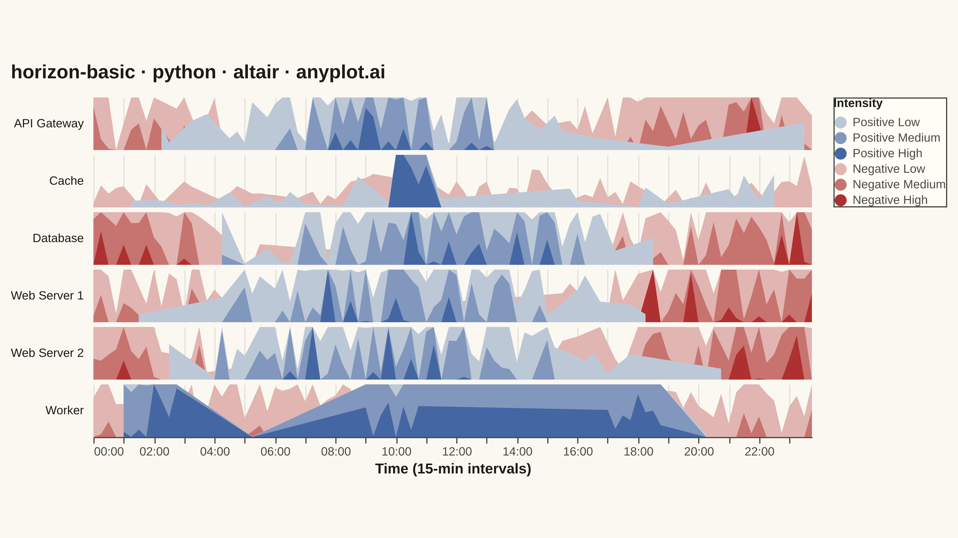
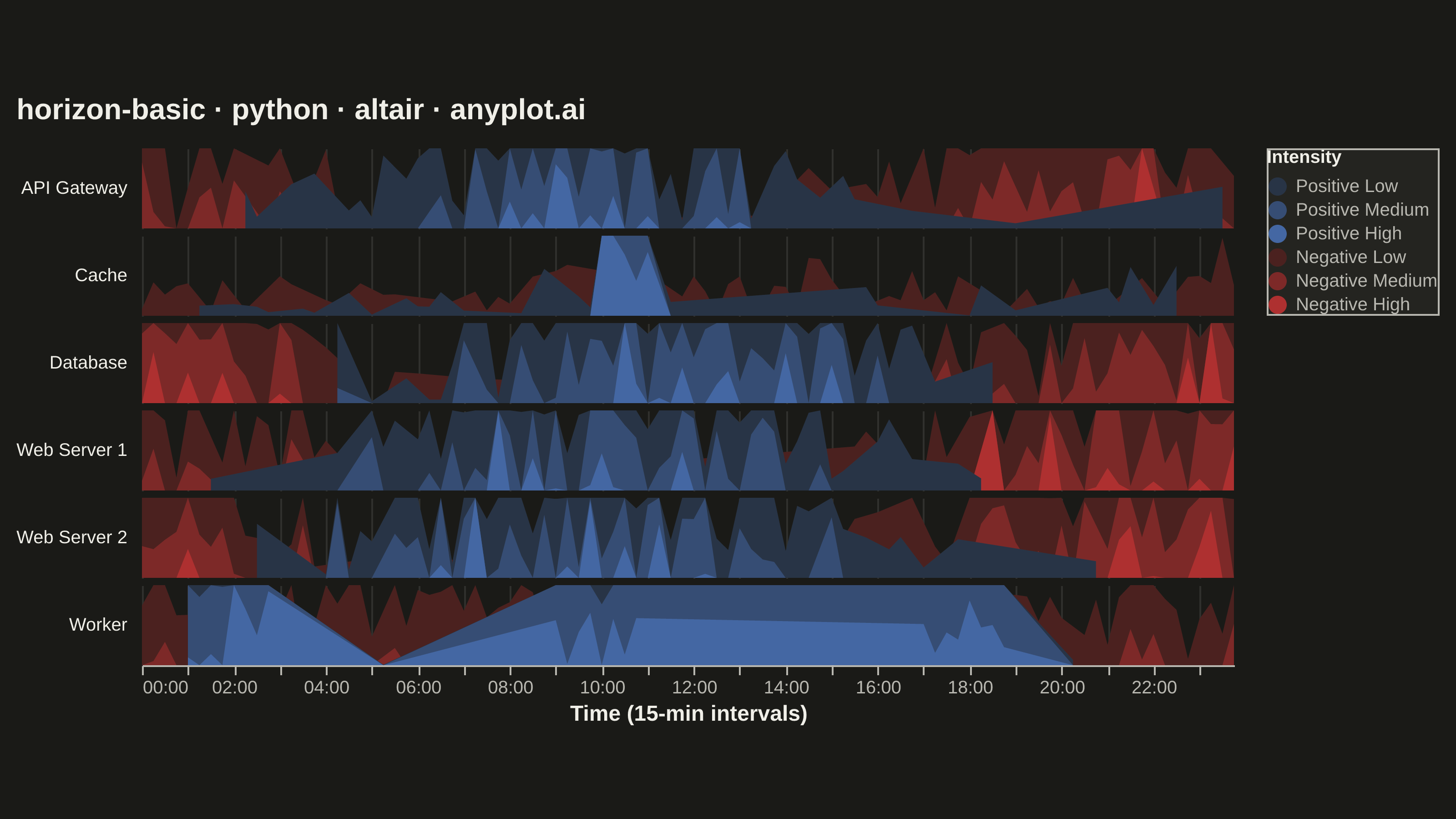
A horizon chart displays many time series compactly by folding values into color-coded bands, preserving local resolution while minimizing vertical space. It divides the y-axis into bands and uses color intensity to encode magnitude, allowing dozens of series to be compared in limited space. This technique is particularly effective when monitoring many metrics simultaneously where traditional line charts would become unreadable.
""" anyplot.ai
horizon-basic: Horizon Chart
Library: altair 6.2.2 | Python 3.13.15
Quality: 90/100 | Updated: 2026-08-18
"""

import os

import altair as alt
import numpy as np
import pandas as pd
from PIL import Image, ImageColor


THEME = os.getenv("ANYPLOT_THEME", "light")
PAGE_BG = "#FAF8F1" if THEME == "light" else "#1A1A17"
ELEVATED_BG = "#FFFDF6" if THEME == "light" else "#242420"
INK = "#1A1A17" if THEME == "light" else "#F0EFE8"
INK_SOFT = "#4A4A44" if THEME == "light" else "#B8B7B0"

# Data: server metrics over 24 hours at 15-minute resolution
np.random.seed(42)

n_points = 96
hours = pd.date_range("2024-01-15 00:00", periods=n_points, freq="15min")

data_list = []
servers = ["Web Server 1", "Web Server 2", "Database", "Cache", "API Gateway", "Worker"]

for server in servers:
    t = np.linspace(0, 2 * np.pi, n_points)
    if server == "Database":
        base = 40 + 30 * np.sin(t - np.pi / 2) + np.random.randn(n_points) * 8
    elif server == "Cache":
        base = 25 + np.random.randn(n_points) * 5
        base[40:45] += 40
    elif server == "Worker":
        base = 20 + 50 * (np.sin(t * 3) > 0.7) + np.random.randn(n_points) * 6
    else:
        base = 30 + 25 * np.sin(t - np.pi / 3) + np.random.randn(n_points) * 10

    values = base - base.mean()

    for hour, val in zip(hours, values, strict=True):
        data_list.append({"date": hour, "value": val, "series": server})

df = pd.DataFrame(data_list)

# Horizon bands: fold magnitude into 3 mirrored intensity bands per polarity.
# band_height is computed per series (not globally) so low-variance series
# like Cache still span the full Low/Medium/High range instead of being
# flattened into "Low" by a shared global max.
n_bands = 3
FIXED_BAND_HEIGHT = 1.0
intensity_labels = {0: "Low", 1: "Medium", 2: "High"}

band_data = []
for _series, group in df.groupby("series"):
    local_band_height = group["value"].abs().max() / n_bands
    for _, row in group.iterrows():
        val = row["value"]
        direction = "positive" if val >= 0 else "negative"
        abs_val = abs(val)
        for band in range(n_bands):
            band_min = band * local_band_height
            band_frac = max(0.0, min(abs_val - band_min, local_band_height) / local_band_height)
            band_data.append(
                {
                    "date": row["date"],
                    "series": row["series"],
                    "band": band,
                    "value": band_frac * FIXED_BAND_HEIGHT,
                    "label": f"{direction.capitalize()} {intensity_labels[band]}",
                }
            )

band_df = pd.DataFrame(band_data)


def _lerp_hex(c1, c2, t):
    """Linear-interpolate two hex colors — builds the imprint_div ramp below."""
    r1, g1, b1 = ImageColor.getrgb(c1)
    r2, g2, b2 = ImageColor.getrgb(c2)
    return "#{:02X}{:02X}{:02X}".format(round(r1 + (r2 - r1) * t), round(g1 + (g2 - g1) * t), round(b1 + (b2 - b1) * t))


# imprint_div gradient: anchors #AE3030 red / #4467A3 blue, theme-adaptive
# midpoint (PAGE_BG). The 3 intensity steps per polarity are interpolated
# from the midpoint toward the anchor, so Low/Medium/High are built from the
# documented gradient rather than hand-picked hexes.
positive_colors = [_lerp_hex(PAGE_BG, "#4467A3", (i + 1) / n_bands) for i in range(n_bands)]
negative_colors = [_lerp_hex(PAGE_BG, "#AE3030", (i + 1) / n_bands) for i in range(n_bands)]

color_scale = alt.Scale(
    domain=["Positive Low", "Positive Medium", "Positive High", "Negative Low", "Negative Medium", "Negative High"],
    range=positive_colors + negative_colors,
)

# Canvas — landscape inner view sized so vl-convert's title/legend/facet-header
# padding still lands the saved PNG within 3200x1800 at scale_factor=4.0.
VIEW_W = 600
ROW_H = 44

chart = (
    alt.Chart(band_df)
    .mark_area(clip=True)
    .encode(
        x=alt.X(
            "date:T", title="Time (15-min intervals)", axis=alt.Axis(format="%H:%M", labelFontSize=10, titleFontSize=12)
        ),
        y=alt.Y("value:Q", title=None, axis=None, stack=None, scale=alt.Scale(domain=[0, FIXED_BAND_HEIGHT])),
        color=alt.Color(
            "label:N",
            scale=color_scale,
            legend=alt.Legend(
                title="Intensity",
                orient="right",
                titleFontSize=10,
                labelFontSize=10,
                symbolSize=100,
                fillColor=ELEVATED_BG,
                strokeColor=INK_SOFT,
                labelColor=INK_SOFT,
                titleColor=INK,
            ),
        ),
        tooltip=["date:T", "series:N", "value:Q"],
        order=alt.Order("band:O"),
    )
    .properties(width=VIEW_W, height=ROW_H)
    .facet(
        row=alt.Row(
            "series:N",
            title=None,
            header=alt.Header(labelFontSize=10, labelAngle=0, labelAlign="left", labelPadding=8, labelColor=INK),
        )
    )
    .properties(
        title=alt.Title("horizon-basic · python · altair · anyplot.ai", fontSize=16, anchor="start", offset=12),
        background=PAGE_BG,
    )
    .configure_facet(spacing=4)
    .configure_view(strokeWidth=0, fill=PAGE_BG)
    .configure_axis(
        domainColor=INK_SOFT, tickColor=INK_SOFT, gridColor=INK, gridOpacity=0.10, labelColor=INK_SOFT, titleColor=INK
    )
    .configure_title(color=INK)
)

chart.save(f"plot-{THEME}.png", scale_factor=4.0)

# PAD-only to the canonical landscape target — never crop (would clip text).
TW, TH = 3200, 1800
_img = Image.open(f"plot-{THEME}.png").convert("RGB")
_w, _h = _img.size
if _w > TW or _h > TH:
    raise SystemExit(
        f"altair vl-convert produced {_w}x{_h}, exceeds target {TW}x{TH}. "
        f"Shrink chart .properties(width=, height=) values and re-render."
    )
if _w < TW or _h < TH:
    _canvas = Image.new("RGB", (TW, TH), PAGE_BG)
    _canvas.paste(_img, ((TW - _w) // 2, (TH - _h) // 2))
    _canvas.save(f"plot-{THEME}.png")

chart.save(f"plot-{THEME}.html")
Runnable source as JSON, for any HTTP client: https://api.anyplot.ai/specs/horizon-basic/altair/code. Any spec id and library id listed in llms-full.txt fit the same URL shape; every URL below is complete and callable.
{
  "spec_id": "horizon-basic",
  "language": "python",
  "library": "altair",
  "page": "https://anyplot.ai/horizon-basic/python/altair",
  "hub": "https://anyplot.ai/horizon-basic",
  "code_json": "https://api.anyplot.ai/specs/horizon-basic/altair/code",
  "spec_json": "https://api.anyplot.ai/specs/horizon-basic",
  "render_light_png": "https://storage.googleapis.com/anyplot-images/plots/horizon-basic/python/altair/plot-light.png",
  "render_dark_png": "https://storage.googleapis.com/anyplot-images/plots/horizon-basic/python/altair/plot-dark.png",
  "interactive_light_html": "https://storage.googleapis.com/anyplot-images/plots/horizon-basic/python/altair/plot-light.html",
  "interactive_dark_html": "https://storage.googleapis.com/anyplot-images/plots/horizon-basic/python/altair/plot-dark.html",
  "quality_score": 90.0,
  "license": "MIT",
  "guide": "https://anyplot.ai/llms.txt"
}
Part of Horizon Chart on anyplot.ai.