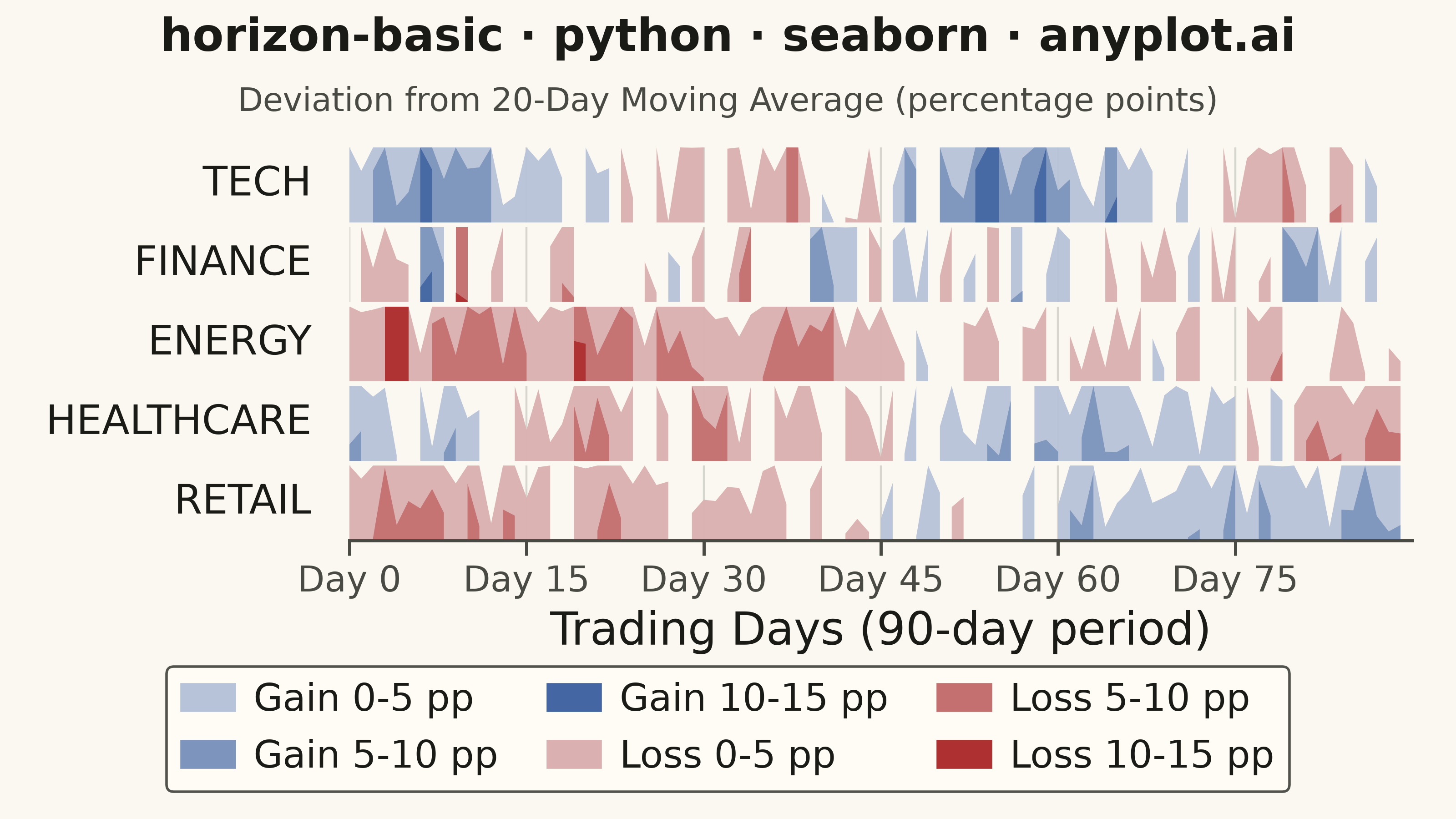
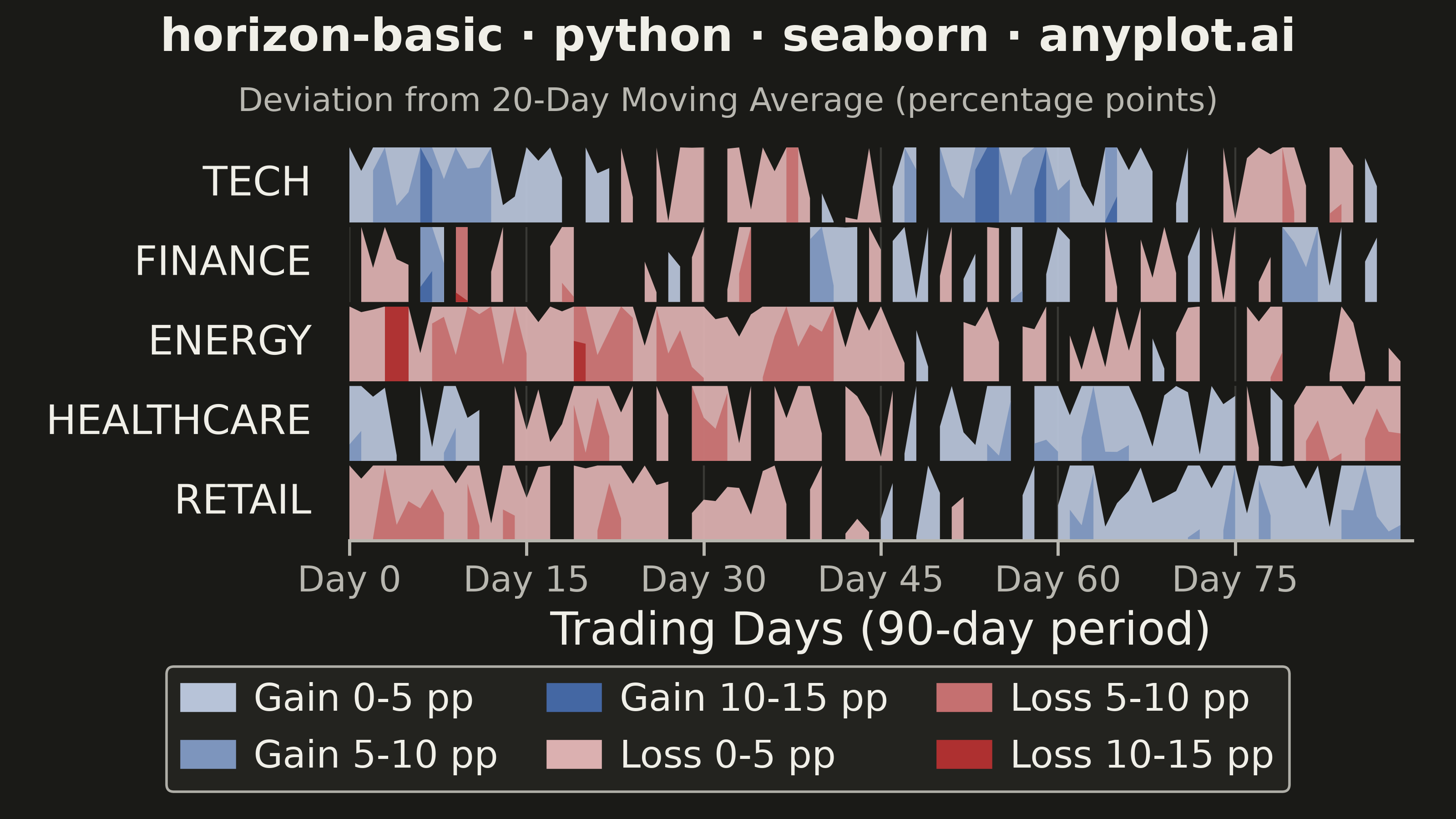
A horizon chart displays many time series compactly by folding values into color-coded bands, preserving local resolution while minimizing vertical space. It divides the y-axis into bands and uses color intensity to encode magnitude, allowing dozens of series to be compared in limited space. This technique is particularly effective when monitoring many metrics simultaneously where traditional line charts would become unreadable.
""" anyplot.ai
horizon-basic: Horizon Chart
Library: seaborn 0.13.2 | Python 3.13.15
Quality: 85/100 | Updated: 2026-08-18
"""

import os

import matplotlib.patches as mpatches
import numpy as np
import pandas as pd
import seaborn as sns


# Theme tokens (see prompts/default-style-guide.md "Background" + "Theme-adaptive Chrome")
THEME = os.getenv("ANYPLOT_THEME", "light")
PAGE_BG = "#FAF8F1" if THEME == "light" else "#1A1A17"
ELEVATED_BG = "#FFFDF6" if THEME == "light" else "#242420"
INK = "#1A1A17" if THEME == "light" else "#F0EFE8"
INK_SOFT = "#4A4A44" if THEME == "light" else "#B8B7B0"

# Imprint palette — blue (gain) vs. matte red (loss) diverging pair; both are
# CVD-distinguishable, unlike a green/red pairing that deuteranopes/protanopes
# cannot tell apart.
IMPRINT_PALETTE = ["#009E73", "#C475FD", "#4467A3", "#BD8233", "#AE3030", "#2ABCCD", "#954477", "#99B314"]
GAIN_BASE = IMPRINT_PALETTE[2]  # blue
LOSS_BASE = IMPRINT_PALETTE[4]  # matte red — semantic anchor for loss

# Data - stock price deviations from 20-day moving average (5 stocks over 90 trading days)
np.random.seed(42)
trading_days = 90
stocks = ["TECH", "FINANCE", "ENERGY", "HEALTHCARE", "RETAIL"]

data = []
for stock_idx, stock in enumerate(stocks):
    np.random.seed(42 + stock_idx)
    if stock == "TECH":
        base = 8 * np.sin(np.linspace(0, 4 * np.pi, trading_days)) + 3
        noise = np.random.randn(trading_days) * 5
        values = base + noise
    elif stock == "FINANCE":
        base = np.zeros(trading_days)
        noise = np.random.randn(trading_days) * 6
        volatility_spikes = np.random.choice([-8, 0, 8], trading_days, p=[0.15, 0.7, 0.15])
        values = base + noise + volatility_spikes
    elif stock == "ENERGY":
        base = -5 * np.ones(trading_days)
        trend = np.linspace(-5, 5, trading_days)
        noise = np.random.randn(trading_days) * 4
        values = base + trend + noise
    elif stock == "HEALTHCARE":
        base = 6 * np.cos(np.linspace(0, 3 * np.pi, trading_days))
        noise = np.random.randn(trading_days) * 4
        values = base + noise
    else:
        drift = np.linspace(-8, 8, trading_days)
        noise = np.random.randn(trading_days) * 3
        values = drift + noise

    values = np.clip(values, -15, 15)
    for day, v in enumerate(values):
        data.append({"day": day, "stock": stock, "deviation": v})

df = pd.DataFrame(data)

# Horizon chart parameters — 3 intensity bands per polarity, generated from the
# Imprint gain/loss anchors via seaborn's own sequential-palette builder.
n_bands = 3
band_height = 15 / n_bands
gain_colors = sns.light_palette(GAIN_BASE, n_colors=n_bands + 1)[1:]
loss_colors = sns.light_palette(LOSS_BASE, n_colors=n_bands + 1)[1:]

# Theme-adaptive chrome via seaborn's rc-based theme context
sns.set_theme(
    style="ticks",
    rc={
        "figure.facecolor": PAGE_BG,
        "axes.facecolor": PAGE_BG,
        "axes.edgecolor": INK_SOFT,
        "axes.labelcolor": INK,
        "text.color": INK,
        "xtick.color": INK_SOFT,
        "ytick.color": INK_SOFT,
        "grid.color": INK,
        "grid.alpha": 0.15,
        "legend.facecolor": ELEVATED_BG,
        "legend.edgecolor": INK_SOFT,
    },
)

# Plot — one row per stock via seaborn's FacetGrid, hand-filled with folded
# horizon bands (see prompts/library/seaborn.md "Canvas — hard rule")
g = sns.FacetGrid(df, row="stock", row_order=stocks, sharex=True, sharey=True, despine=True)
g.fig.set_size_inches(8, 4.5)
g.fig.set_dpi(400)
g.fig.subplots_adjust(hspace=0.06, top=0.82, bottom=0.34, left=0.24, right=0.97)
g.set_titles("")

tick_positions = np.arange(0, trading_days, 15)
tick_labels = [f"Day {i}" for i in tick_positions]

for idx, (stock, ax) in enumerate(zip(stocks, g.axes.flat, strict=True)):
    stock_data = df[df["stock"] == stock]
    x = np.arange(len(stock_data))
    values = stock_data["deviation"].to_numpy()

    ax.set_xlim(0, len(x))
    ax.set_ylim(0, band_height)
    ax.set_xticks(tick_positions)

    gain_vals = np.maximum(values, 0)
    loss_vals = np.abs(np.minimum(values, 0))

    for band_idx in range(n_bands):
        band_min = band_idx * band_height

        loss_folded = np.clip(loss_vals - band_min, 0, band_height)
        loss_mask = (loss_vals > band_min) & (values < 0)
        ax.fill_between(
            x, 0, np.where(loss_mask, loss_folded, np.nan), color=loss_colors[band_idx], alpha=0.95, linewidth=0
        )

        gain_folded = np.clip(gain_vals - band_min, 0, band_height)
        gain_mask = (gain_vals > band_min) & (values > 0)
        ax.fill_between(
            x, 0, np.where(gain_mask, gain_folded, np.nan), color=gain_colors[band_idx], alpha=0.95, linewidth=0
        )

    ax.set_ylabel(stock, fontsize=16, rotation=0, ha="right", va="center", labelpad=15, color=INK)
    ax.set_yticks([])
    ax.grid(True, axis="x", alpha=0.2, linewidth=0.8, color=INK_SOFT)
    ax.set_axisbelow(True)
    for spine in ("top", "right", "left"):
        ax.spines[spine].set_visible(False)
    ax.spines["bottom"].set_visible(idx == len(stocks) - 1)
    is_last = idx == len(stocks) - 1
    ax.tick_params(axis="x", labelsize=14, bottom=is_last, labelbottom=is_last)

# X-axis formatting — labels/ticklabels only on the last facet, but every facet
# shares the same tick_positions (set above) so gridlines align vertically across rows
last_ax = g.axes.flat[-1]
last_ax.set_xticklabels(tick_labels)
last_ax.set_xlabel("Trading Days (90-day period)", fontsize=18, color=INK)

# Title + subtitle clarifying what the bands measure
g.fig.suptitle(
    "horizon-basic · python · seaborn · anyplot.ai", fontsize=18, y=0.98, va="top", fontweight="bold", color=INK
)
g.fig.text(
    0.5,
    0.895,
    "Deviation from 20-Day Moving Average (percentage points)",
    ha="center",
    va="top",
    fontsize=13,
    color=INK_SOFT,
)

# Legend — single row anchored below the x-axis label, entirely clear of every facet's data
legend_patches = [
    mpatches.Patch(color=gain_colors[0], label="Gain 0-5 pp"),
    mpatches.Patch(color=gain_colors[1], label="Gain 5-10 pp"),
    mpatches.Patch(color=gain_colors[2], label="Gain 10-15 pp"),
    mpatches.Patch(color=loss_colors[0], label="Loss 0-5 pp"),
    mpatches.Patch(color=loss_colors[1], label="Loss 5-10 pp"),
    mpatches.Patch(color=loss_colors[2], label="Loss 10-15 pp"),
]
g.fig.legend(
    handles=legend_patches,
    loc="lower center",
    bbox_to_anchor=(0.5, 0.01),
    fontsize=15,
    framealpha=0.95,
    facecolor=ELEVATED_BG,
    edgecolor=INK_SOFT,
    ncol=3,
    handlelength=1.4,
    handletextpad=0.5,
    columnspacing=1.3,
)

# Save
g.fig.savefig(f"plot-{THEME}.png", dpi=400, facecolor=PAGE_BG)
Runnable source as JSON, for any HTTP client: https://api.anyplot.ai/specs/horizon-basic/seaborn/code. Any spec id and library id listed in llms-full.txt fit the same URL shape; every URL below is complete and callable.
{
  "spec_id": "horizon-basic",
  "language": "python",
  "library": "seaborn",
  "page": "https://anyplot.ai/horizon-basic/python/seaborn",
  "hub": "https://anyplot.ai/horizon-basic",
  "code_json": "https://api.anyplot.ai/specs/horizon-basic/seaborn/code",
  "spec_json": "https://api.anyplot.ai/specs/horizon-basic",
  "render_light_png": "https://storage.googleapis.com/anyplot-images/plots/horizon-basic/python/seaborn/plot-light.png",
  "render_dark_png": "https://storage.googleapis.com/anyplot-images/plots/horizon-basic/python/seaborn/plot-dark.png",
  "quality_score": 85.0,
  "license": "MIT",
  "guide": "https://anyplot.ai/llms.txt"
}
Part of Horizon Chart on anyplot.ai.