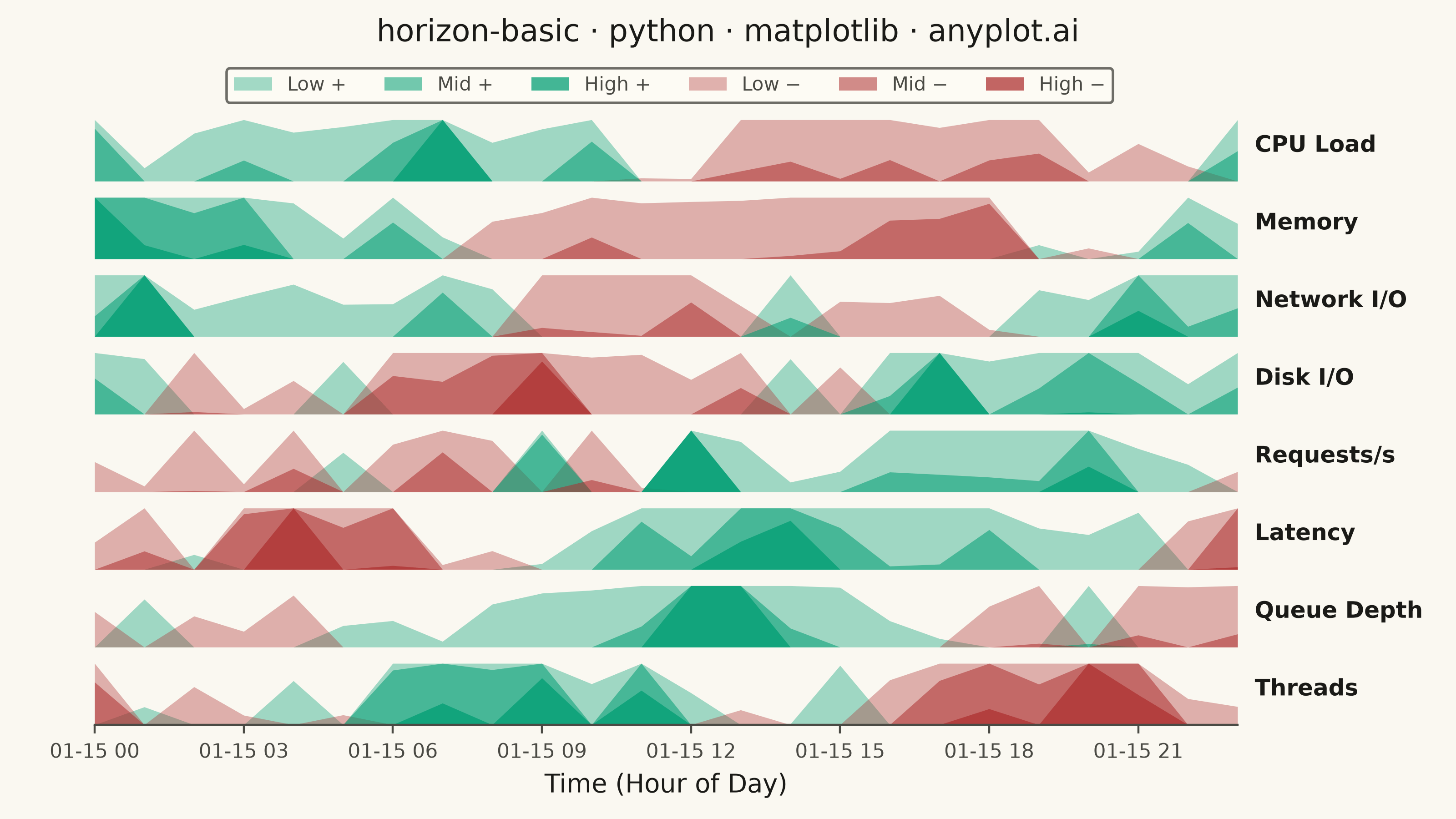
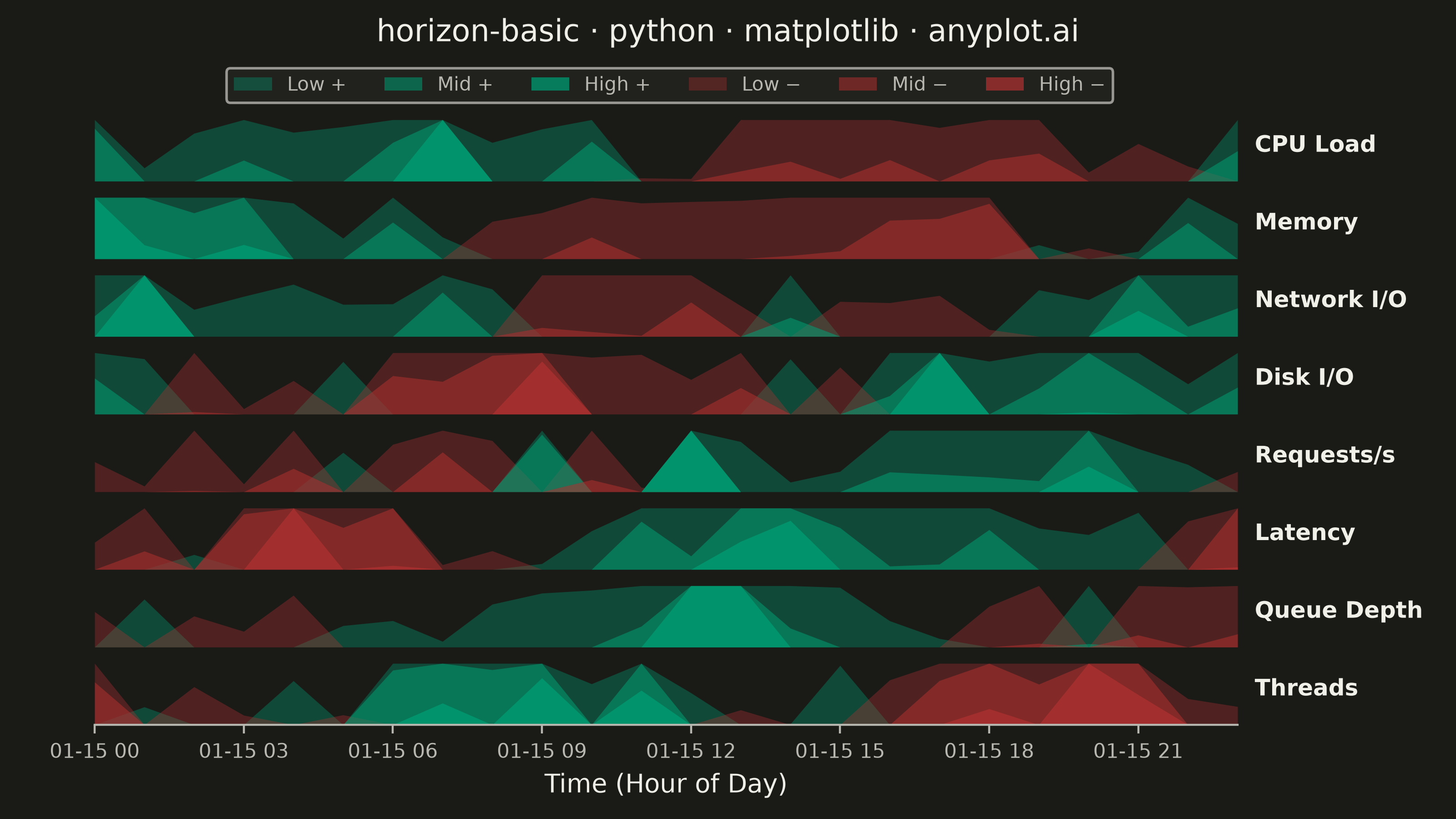
A horizon chart displays many time series compactly by folding values into color-coded bands, preserving local resolution while minimizing vertical space. It divides the y-axis into bands and uses color intensity to encode magnitude, allowing dozens of series to be compared in limited space. This technique is particularly effective when monitoring many metrics simultaneously where traditional line charts would become unreadable.
""" anyplot.ai
horizon-basic: Horizon Chart
Library: matplotlib 3.11.1 | Python 3.13.15
Quality: 89/100 | Updated: 2026-08-18
"""

import os

import matplotlib.colors as mcolors
import matplotlib.dates as mdates
import matplotlib.patheffects as pe
import matplotlib.pyplot as plt
import numpy as np
import pandas as pd
from scipy.ndimage import gaussian_filter1d


# Theme tokens
THEME = os.getenv("ANYPLOT_THEME", "light")
PAGE_BG = "#FAF8F1" if THEME == "light" else "#1A1A17"
ELEVATED_BG = "#FFFDF6" if THEME == "light" else "#242420"
INK = "#1A1A17" if THEME == "light" else "#F0EFE8"
INK_SOFT = "#4A4A44" if THEME == "light" else "#B8B7B0"

# Data - 8 server metrics over 24 hours, sampled every 5 minutes for a smooth
# mountain-range fold, with pronounced daily cycles + localized spikes.
np.random.seed(42)
hours = pd.date_range("2024-01-15", periods=288, freq="5min")

series_names = ["CPU Load", "Memory", "Network I/O", "Disk I/O", "Requests/s", "Latency", "Queue Depth", "Threads"]
n_series = len(series_names)
n_points = len(hours)

data = {}
for i, name in enumerate(series_names):
    base = np.sin(np.linspace(0, 2 * np.pi, n_points) + i * np.pi / 4) * 0.5
    # Smooth the per-point noise so the 5-min sampling reads as a fluid
    # mountain-range fold rather than a jittery, needle-thin silhouette.
    noise = gaussian_filter1d(np.random.randn(n_points), sigma=4) * 0.45
    spikes = np.zeros(n_points)
    if i % 2 == 0:
        t = np.arange(n_points)
        width = n_points / 48  # ~30-minute-wide bump at 5-minute resolution
        for center in np.random.choice(n_points, 4, replace=False):
            magnitude = np.random.uniform(0.7, 1.2) * (1 if np.random.random() > 0.3 else -1)
            spikes += magnitude * np.exp(-0.5 * ((t - center) / width) ** 2)
    data[name] = np.clip(base + noise + spikes, -1.5, 1.5)

# Horizon chart parameters - 3 mirrored bands, intensity increases with magnitude.
# Imprint green for positive load, Imprint red for negative (matches the
# domain convention of "elevated load" reading as the warmer/alarming hue).
n_bands = 3
pos_base = mcolors.to_rgb("#009E73")
neg_base = mcolors.to_rgb("#AE3030")
# Custom normalizer maps band index -> fill alpha, replacing a hand-tuned
# arithmetic ladder with a reusable, principled intensity ramp.
band_norm = mcolors.Normalize(vmin=-0.6, vmax=n_bands - 0.4)


def band_alpha(band_idx):
    return 0.25 + 0.60 * band_norm(band_idx)


# Canvas - landscape 3200x1800 (figsize x dpi), hard contract, never deviate
fig, axes = plt.subplots(n_series, 1, figsize=(8, 4.5), dpi=400, sharex=True, facecolor=PAGE_BG)
fig.subplots_adjust(hspace=0.10, top=0.865, bottom=0.115, left=0.065, right=0.85)

for idx, (name, values) in enumerate(data.items()):
    ax = axes[idx]
    ax.set_facecolor(PAGE_BG)

    max_abs = max(abs(values.min()), abs(values.max()), 0.01)
    normalized = values / max_abs
    band_edges = np.linspace(0, 1, n_bands + 1)

    for band_idx in range(n_bands):
        lower, upper = band_edges[band_idx], band_edges[band_idx + 1]
        alpha = band_alpha(band_idx)

        pos_folded = np.clip(np.clip(normalized, 0, None) - lower, 0, upper - lower)
        ax.fill_between(hours, 0, pos_folded, color=(*pos_base, alpha), linewidth=0)

        neg_folded = np.clip(np.clip(-normalized, 0, None) - lower, 0, upper - lower)
        ax.fill_between(hours, 0, neg_folded, color=(*neg_base, alpha), linewidth=0)

    ax.set_ylim(0, 1 / n_bands + 0.05)
    ax.set_xlim(hours[0], hours[-1])
    ax.set_yticks([])

    # Series label with a background-matched stroke so it stays legible
    # even where it sits directly above a high-intensity band.
    ax.text(
        1.015,
        0.5,
        name,
        transform=ax.transAxes,
        fontsize=9,
        fontweight="bold",
        va="center",
        ha="left",
        color=INK,
        path_effects=[pe.withStroke(linewidth=2, foreground=PAGE_BG)],
    )

    ax.spines["top"].set_visible(False)
    ax.spines["right"].set_visible(False)
    ax.spines["left"].set_visible(False)

    if idx < n_series - 1:
        ax.spines["bottom"].set_visible(False)
        ax.tick_params(axis="x", length=0)
    else:
        ax.spines["bottom"].set_color(INK_SOFT)
        ax.tick_params(axis="x", labelsize=8, colors=INK_SOFT, labelcolor=INK_SOFT)

# Configure x-axis on bottom subplot - plain hour-of-day ticks since every
# point falls on the same day, matching the "Time (Hour of Day)" axis label.
axes[-1].xaxis.set_major_locator(mdates.HourLocator(byhour=range(0, 24, 3)))
axes[-1].xaxis.set_major_formatter(mdates.DateFormatter("%H:%M"))
axes[-1].set_xlabel("Time (Hour of Day)", fontsize=10, color=INK)

# Title
fig.suptitle("horizon-basic · python · matplotlib · anyplot.ai", fontsize=12, fontweight="medium", y=0.978, color=INK)

# Legend for bands with theme-aware colors
legend_elements = [
    plt.Rectangle((0, 0), 1, 1, facecolor=(*pos_base, band_alpha(i)), label=lbl)
    for i, lbl in enumerate(["Low +", "Mid +", "High +"])
] + [
    plt.Rectangle((0, 0), 1, 1, facecolor=(*neg_base, band_alpha(i)), label=lbl)
    for i, lbl in enumerate(["Low −", "Mid −", "High −"])
]
leg = fig.legend(
    handles=legend_elements,
    loc="upper center",
    ncol=6,
    fontsize=7.5,
    frameon=True,
    bbox_to_anchor=(0.46, 0.928),
    facecolor=ELEVATED_BG,
    edgecolor=INK_SOFT,
)
plt.setp(leg.get_texts(), color=INK_SOFT)

# bbox_inches MUST stay default (None) - "tight" silently crops the 3200x1800 canvas
plt.savefig(f"plot-{THEME}.png", dpi=400, facecolor=PAGE_BG)
Runnable source as JSON, for any HTTP client: https://api.anyplot.ai/specs/horizon-basic/matplotlib/code. Any spec id and library id listed in llms-full.txt fit the same URL shape; every URL below is complete and callable.
{
  "spec_id": "horizon-basic",
  "language": "python",
  "library": "matplotlib",
  "page": "https://anyplot.ai/horizon-basic/python/matplotlib",
  "hub": "https://anyplot.ai/horizon-basic",
  "code_json": "https://api.anyplot.ai/specs/horizon-basic/matplotlib/code",
  "spec_json": "https://api.anyplot.ai/specs/horizon-basic",
  "render_light_png": "https://storage.googleapis.com/anyplot-images/plots/horizon-basic/python/matplotlib/plot-light.png",
  "render_dark_png": "https://storage.googleapis.com/anyplot-images/plots/horizon-basic/python/matplotlib/plot-dark.png",
  "quality_score": 89.0,
  "license": "MIT",
  "guide": "https://anyplot.ai/llms.txt"
}
Part of Horizon Chart on anyplot.ai.