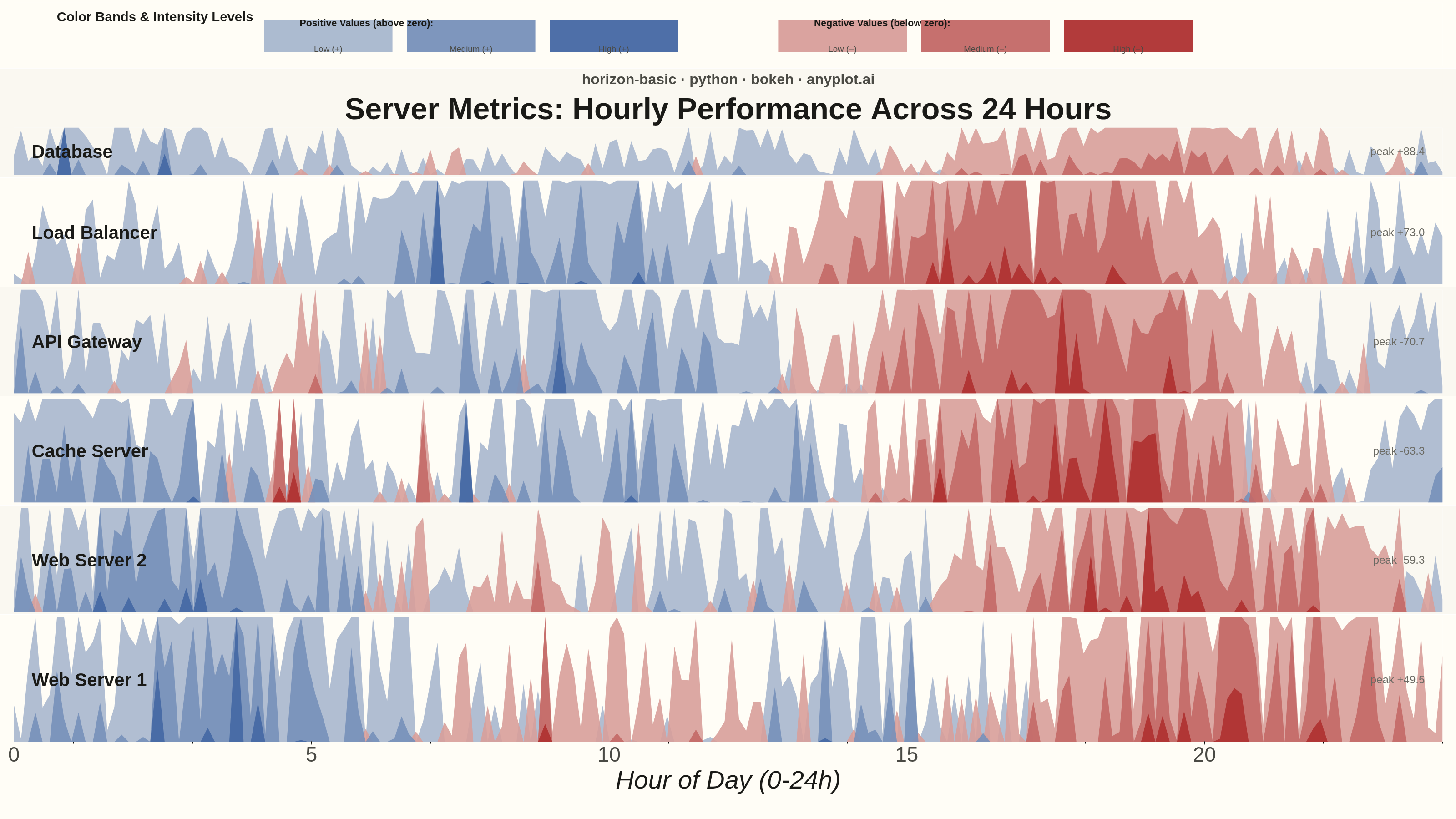
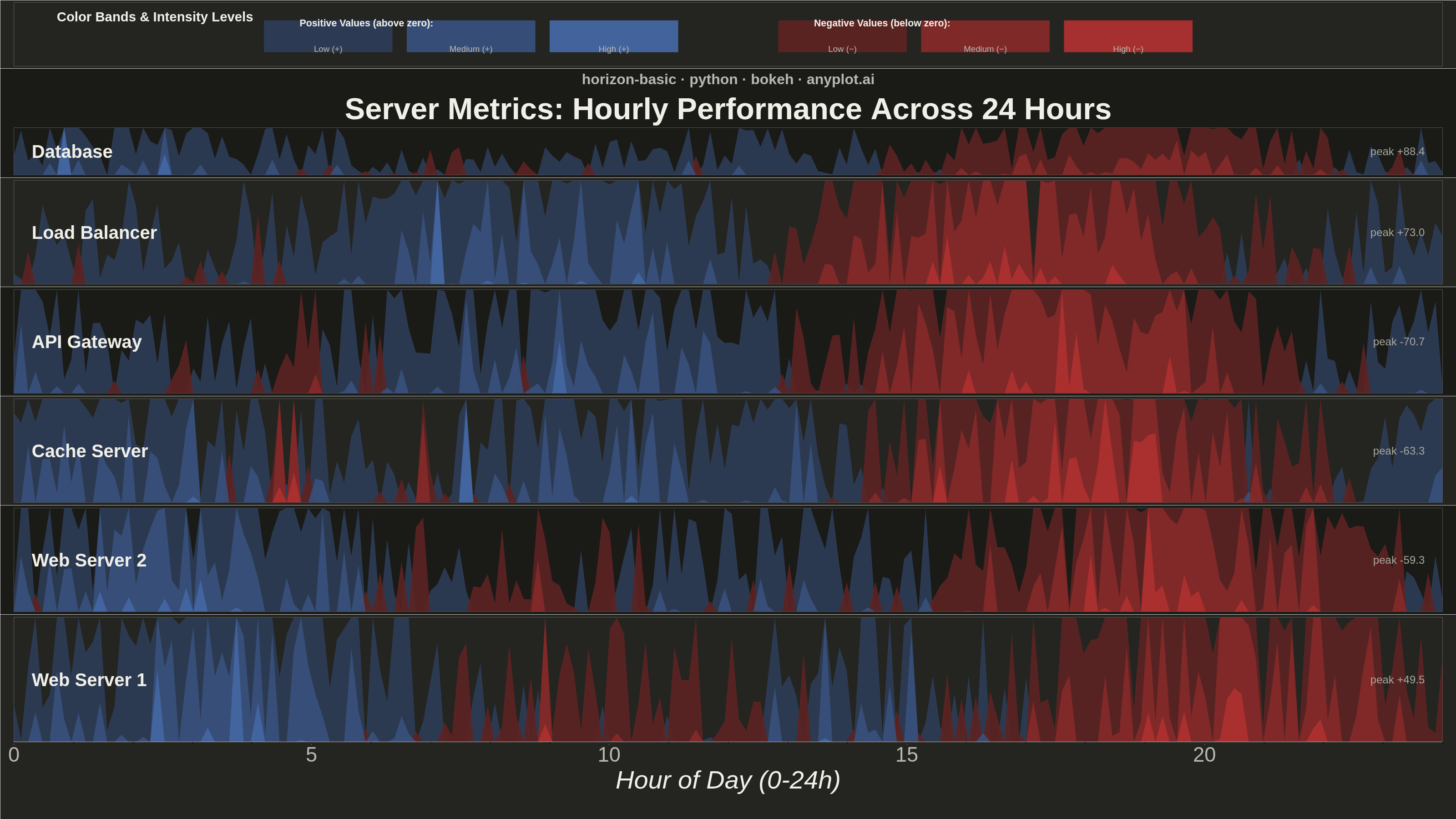
A horizon chart displays many time series compactly by folding values into color-coded bands, preserving local resolution while minimizing vertical space. It divides the y-axis into bands and uses color intensity to encode magnitude, allowing dozens of series to be compared in limited space. This technique is particularly effective when monitoring many metrics simultaneously where traditional line charts would become unreadable.
""" anyplot.ai
horizon-basic: Horizon Chart
Library: bokeh 3.9.2 | Python 3.13.15
Quality: 91/100 | Updated: 2026-08-18
"""

import os
import sys
import time
from pathlib import Path


# Remove current directory from path FIRST to avoid conflict with local bokeh.py filename
# This must happen before any imports that might add "." back to sys.path
while "" in sys.path:
    sys.path.remove("")
while "." in sys.path:
    sys.path.remove(".")
# Also clear any bokeh module already in sys.modules
if "bokeh" in sys.modules:
    del sys.modules["bokeh"]

import numpy as np
from bokeh.io import output_file, save
from bokeh.layouts import column
from bokeh.models import ColumnDataSource, CrosshairTool, HoverTool, Label, Range1d, Title
from bokeh.plotting import figure
from selenium import webdriver
from selenium.webdriver.chrome.options import Options


# Theme tokens (see prompts/default-style-guide.md)
THEME = os.getenv("ANYPLOT_THEME", "light")
PAGE_BG = "#FAF8F1" if THEME == "light" else "#1A1A17"
ELEVATED_BG = "#FFFDF6" if THEME == "light" else "#242420"
INK = "#1A1A17" if THEME == "light" else "#F0EFE8"
INK_SOFT = "#4A4A44" if THEME == "light" else "#B8B7B0"
INK_MUTED = "#6B6A63" if THEME == "light" else "#A8A79F"

# Imprint categorical palette (canonical order) — see prompts/default-style-guide.md
IMPRINT_PALETTE = ["#009E73", "#C475FD", "#4467A3", "#BD8233", "#AE3030", "#2ABCCD", "#954477", "#99B314"]
IMPRINT_BLUE = IMPRINT_PALETTE[2]  # positive-magnitude pole of the Imprint diverging ramp
IMPRINT_RED = IMPRINT_PALETTE[4]  # negative-magnitude pole of the Imprint diverging ramp


def _lerp_hex(c0, c1, t):
    r0, g0, b0 = (int(c0[i : i + 2], 16) for i in (1, 3, 5))
    r1, g1, b1 = (int(c1[i : i + 2], 16) for i in (1, 3, 5))
    r, g, b = (int(round(a + (b - a) * t)) for a, b in ((r0, r1), (g0, g1), (b0, b1)))
    return f"#{r:02X}{g:02X}{b:02X}"


# Data - Server metrics over 24 hours for 6 servers
np.random.seed(42)

n_points = 200
n_series = 6
server_names = ["Web Server 1", "Web Server 2", "Database", "Cache Server", "API Gateway", "Load Balancer"]

# Create time series data with different patterns
hours = np.linspace(0, 24, n_points)

# Each server has a different pattern
series_data = []
for i, name in enumerate(server_names):
    # Base pattern with some periodicity
    base = np.sin(hours * np.pi / 6 + i * 0.5) * 20
    # Add some noise and trends
    noise = np.random.randn(n_points) * 10
    trend = np.sin(hours * np.pi / 12) * 15 * (1 + i * 0.2)
    # Add some spikes for realism
    spikes = np.zeros(n_points)
    spike_locations = np.random.choice(n_points, size=5, replace=False)
    spikes[spike_locations] = np.random.randn(5) * 30

    values = base + noise + trend + spikes
    series_data.append({"name": name, "hours": hours, "values": values})

# Order rows by peak volatility (most eventful server first) — gives the stack a
# deliberate reading order instead of an arbitrary alphabetical/index list.
series_data.sort(key=lambda d: np.max(np.abs(d["values"])), reverse=True)

# Horizon chart parameters
n_bands = 3  # Number of positive/negative bands

# Canvas — hard rule (prompts/library/bokeh.md): landscape 3200x1800 exactly.
chart_width = 3200
total_height = 1800
LEGEND_HEIGHT = 150
BASE_PANEL_HEIGHT = 240  # panels without an x-axis (all but the last row)
LAST_PANEL_HEIGHT = 450  # bottom row reserves extra height for the x-axis stack
# LEGEND_HEIGHT + 5*BASE_PANEL_HEIGHT + LAST_PANEL_HEIGHT == total_height (1800), no dead strip

# Imprint diverging ramp, sampled at 3 stops per pole (near-neutral -> saturated
# pole) instead of hand-picked hex values — keeps the intensity bands on-brand
# and perceptually ordered. Midpoint is the theme-adaptive plot background.
_midpoint = PAGE_BG
pos_colors = [_lerp_hex(_midpoint, IMPRINT_BLUE, t) for t in (0.45, 0.72, 1.0)]
neg_colors = [_lerp_hex(_midpoint, IMPRINT_RED, t) for t in (0.45, 0.72, 1.0)]

# Shared x-range instance: every panel below zooms/pans in lock-step, a
# distinctly Bokeh feature (linked ranges) that a static-only library can't offer.
x_range_shared = Range1d(0, 24)

# Create individual horizon plots
plots = []

for idx, data in enumerate(series_data):
    values = data["values"]
    x = data["hours"]
    name = data["name"]
    is_last = idx == len(series_data) - 1

    # Normalize values to fit in bands
    max_abs = np.max(np.abs(values))
    band_size = max_abs / n_bands

    panel_height = LAST_PANEL_HEIGHT if is_last else BASE_PANEL_HEIGHT

    # Create figure for this series
    p = figure(
        width=chart_width,
        height=panel_height,
        x_range=x_range_shared,
        y_range=Range1d(0, band_size),
        tools="",
        toolbar_location=None,  # hard rule: default toolbar adds ~30-50px to the PNG
        min_border_left=30,
        min_border_right=30,
        min_border_top=6,
        min_border_bottom=170 if is_last else 6,
    )

    # Zebra-striped rows (alternating elevated background) give the stack a
    # subtle rhythm and make it easier to trace a row across its full width.
    row_bg = ELEVATED_BG if idx % 2 == 1 else PAGE_BG
    p.background_fill_color = row_bg
    p.border_fill_color = row_bg
    p.outline_line_color = None

    # Configure axes
    if not is_last:
        p.xaxis.visible = False
    else:
        p.xaxis.axis_label = "Hour of Day (0-24h)"
        p.xaxis.axis_label_text_font_size = "42pt"
        p.xaxis.major_label_text_font_size = "34pt"
        p.xaxis.axis_label_text_color = INK
        p.xaxis.major_label_text_color = INK_SOFT
        p.xaxis.axis_line_color = INK_SOFT
        p.xaxis.major_tick_line_color = INK_SOFT

    p.yaxis.visible = False
    p.grid.visible = False

    # Add series name as label on the left
    label = Label(
        x=0.3,
        y=band_size * 0.5,
        text=name,
        text_font_size="30pt",
        text_font_style="bold",
        text_align="left",
        text_baseline="middle",
        text_color=INK,
    )
    p.add_layout(label)

    # Peak-magnitude readout on the right — a quick numeric anchor for the row's
    # most extreme excursion, so the stack tells a story beyond raw shape.
    peak_val = values[np.argmax(np.abs(values))]
    peak_label = Label(
        x=23.7,
        y=band_size * 0.5,
        text=f"peak {peak_val:+.1f}",
        text_font_size="18pt",
        text_align="right",
        text_baseline="middle",
        text_color=INK_MUTED,
    )
    p.add_layout(peak_label)

    # Add customized HoverTool showing actual values and crosshair for better interactivity
    hover = HoverTool(tooltips=[("Server", name), ("Hour", "@x{0.1}"), ("Value", "@original{0.1}")], mode="vline")
    p.add_tools(hover)

    # Add crosshair tool for precision reading
    crosshair = CrosshairTool(dimensions="both", line_color=INK_SOFT, line_alpha=0.4)
    p.add_tools(crosshair)

    # Draw horizon bands (folded areas)
    for band_idx in range(n_bands):
        band_min = band_idx * band_size

        # Positive values for this band
        pos_vals = np.clip(values - band_min, 0, band_size)
        pos_vals = np.where(values > band_min, pos_vals, 0)

        # Negative values for this band (mirrored)
        neg_vals = np.clip(-values - band_min, 0, band_size)
        neg_vals = np.where(values < -band_min, neg_vals, 0)

        # Create patches for positive band
        if np.any(pos_vals > 0):
            source_pos = ColumnDataSource(data={"x": x, "y": pos_vals, "original": values})
            p.varea(x="x", y1=0, y2="y", source=source_pos, fill_color=pos_colors[band_idx], fill_alpha=0.9)

        # Create patches for negative band
        if np.any(neg_vals > 0):
            source_neg = ColumnDataSource(data={"x": x, "y": neg_vals, "original": values})
            p.varea(x="x", y1=0, y2="y", source=source_neg, fill_color=neg_colors[band_idx], fill_alpha=0.9)

    plots.append(p)

# Add main title to the first plot with enhanced styling for visual hierarchy
title = Title(
    text="Server Metrics: Hourly Performance Across 24 Hours", text_font_size="50pt", align="center", text_color=INK
)
plots[0].add_layout(title, "above")

# Add subtitle with library and source attribution
subtitle = Title(
    text="horizon-basic · python · bokeh · anyplot.ai", text_font_size="24pt", align="center", text_color=INK_SOFT
)
plots[0].add_layout(subtitle, "above")

# Create legend figure explaining color bands - refined styling with elevated background
legend_fig = figure(
    width=chart_width,
    height=LEGEND_HEIGHT,
    x_range=Range1d(0, 100),
    y_range=Range1d(0, 10),
    tools="",
    toolbar_location=None,
)
legend_fig.xaxis.visible = False
legend_fig.yaxis.visible = False
legend_fig.grid.visible = False
# Use elevated background for better visual distinction
legend_fig.background_fill_color = ELEVATED_BG
legend_fig.border_fill_color = ELEVATED_BG
legend_fig.outline_line_color = None

# Add legend title with enhanced styling
legend_fig.add_layout(
    Label(
        x=3,
        y=9.0,
        text="Color Bands & Intensity Levels",
        text_font_size="22pt",
        text_font_style="bold",
        text_color=INK,
        text_baseline="top",
    )
)

# Positive bands legend (left side) - enhanced visual styling
legend_fig.add_layout(
    Label(
        x=20,
        y=7.6,
        text="Positive Values (above zero):",
        text_font_size="16pt",
        text_font_style="bold",
        text_color=INK,
        text_baseline="top",
    )
)
for i, (color, label_text) in enumerate(zip(pos_colors, ["Low (+)", "Medium (+)", "High (+)"], strict=True)):
    legend_fig.rect(x=22 + i * 10, y=4.7, width=9, height=5, fill_color=color, line_color=None, fill_alpha=0.95)
    legend_fig.add_layout(
        Label(x=22 + i * 10, y=2, text=label_text, text_font_size="14pt", text_align="center", text_color=INK_SOFT)
    )

# Negative bands legend (right side) - enhanced visual styling
legend_fig.add_layout(
    Label(
        x=56,
        y=7.6,
        text="Negative Values (below zero):",
        text_font_size="16pt",
        text_font_style="bold",
        text_color=INK,
        text_baseline="top",
    )
)
for i, (color, label_text) in enumerate(zip(neg_colors, ["Low (−)", "Medium (−)", "High (−)"], strict=True)):
    legend_fig.rect(x=58 + i * 10, y=4.7, width=9, height=5, fill_color=color, line_color=None, fill_alpha=0.95)
    legend_fig.add_layout(
        Label(x=58 + i * 10, y=2, text=label_text, text_font_size="14pt", text_align="center", text_color=INK_SOFT)
    )

# Combine all plots vertically with legend at top
layout = column(legend_fig, *plots)

# Save as HTML (interactive)
output_file(f"plot-{THEME}.html")
save(layout)

# Screenshot with headless Chrome for PNG
W, H = chart_width, total_height
opts = Options()
for arg in (
    "--headless=new",
    "--no-sandbox",
    "--disable-dev-shm-usage",
    "--disable-gpu",
    f"--window-size={W},{H}",
    "--hide-scrollbars",
):
    opts.add_argument(arg)
driver = webdriver.Chrome(options=opts)
driver.set_window_size(W, H)
driver.get(f"file://{Path(f'plot-{THEME}.html').resolve()}")
# Headless Chrome's --window-size sets the OUTER window, which still reserves a
# phantom title-bar height even headless — pin the viewport exactly via CDP so
# the screenshot lands at exactly W x H.
driver.execute_cdp_cmd(
    "Emulation.setDeviceMetricsOverride", {"width": W, "height": H, "deviceScaleFactor": 1, "mobile": False}
)
time.sleep(3)
driver.save_screenshot(f"plot-{THEME}.png")
driver.quit()
Runnable source as JSON, for any HTTP client: https://api.anyplot.ai/specs/horizon-basic/bokeh/code. Any spec id and library id listed in llms-full.txt fit the same URL shape; every URL below is complete and callable.
{
  "spec_id": "horizon-basic",
  "language": "python",
  "library": "bokeh",
  "page": "https://anyplot.ai/horizon-basic/python/bokeh",
  "hub": "https://anyplot.ai/horizon-basic",
  "code_json": "https://api.anyplot.ai/specs/horizon-basic/bokeh/code",
  "spec_json": "https://api.anyplot.ai/specs/horizon-basic",
  "render_light_png": "https://storage.googleapis.com/anyplot-images/plots/horizon-basic/python/bokeh/plot-light.png",
  "render_dark_png": "https://storage.googleapis.com/anyplot-images/plots/horizon-basic/python/bokeh/plot-dark.png",
  "interactive_light_html": "https://storage.googleapis.com/anyplot-images/plots/horizon-basic/python/bokeh/plot-light.html",
  "interactive_dark_html": "https://storage.googleapis.com/anyplot-images/plots/horizon-basic/python/bokeh/plot-dark.html",
  "quality_score": 91.0,
  "license": "MIT",
  "guide": "https://anyplot.ai/llms.txt"
}
Part of Horizon Chart on anyplot.ai.