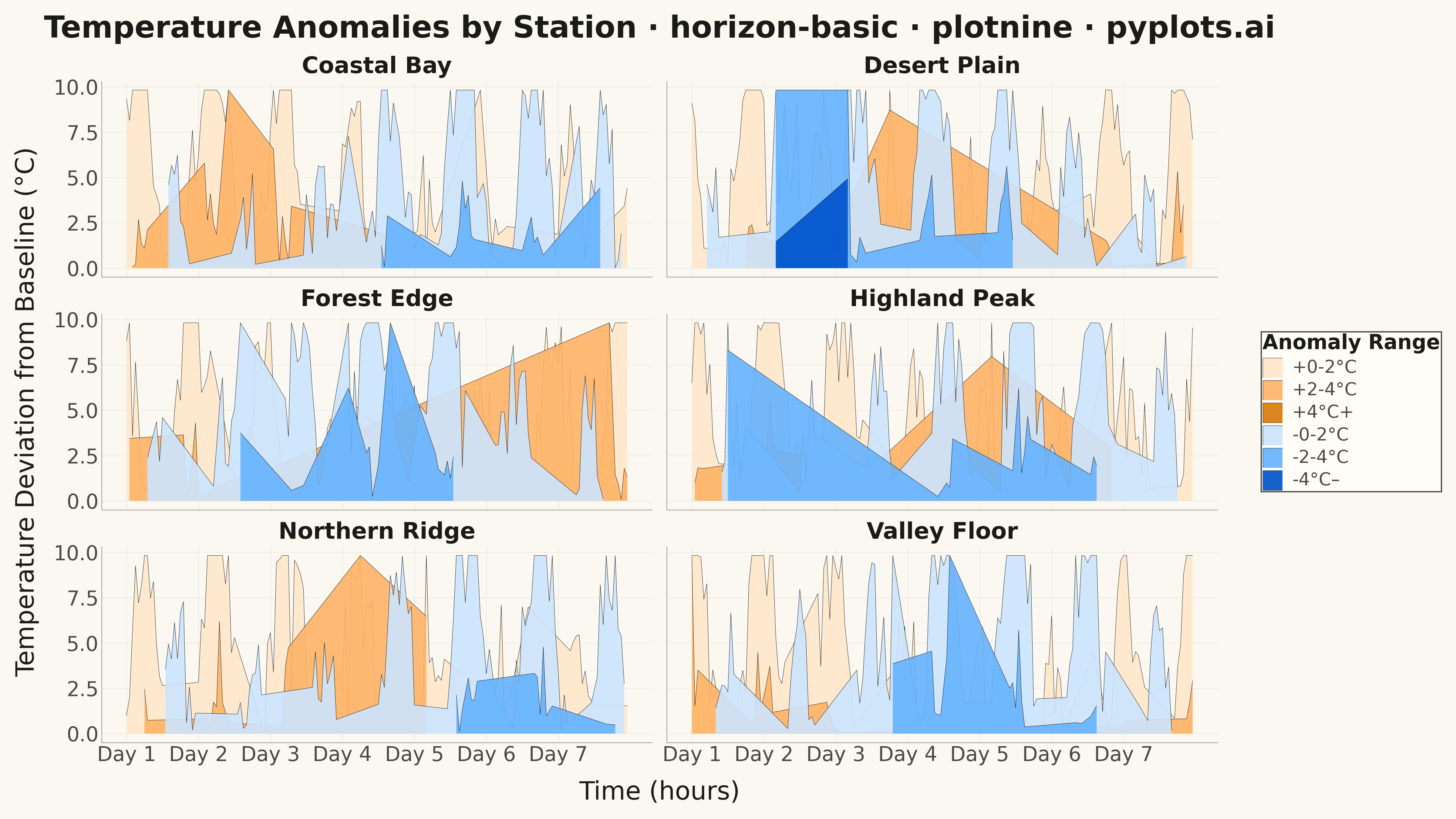
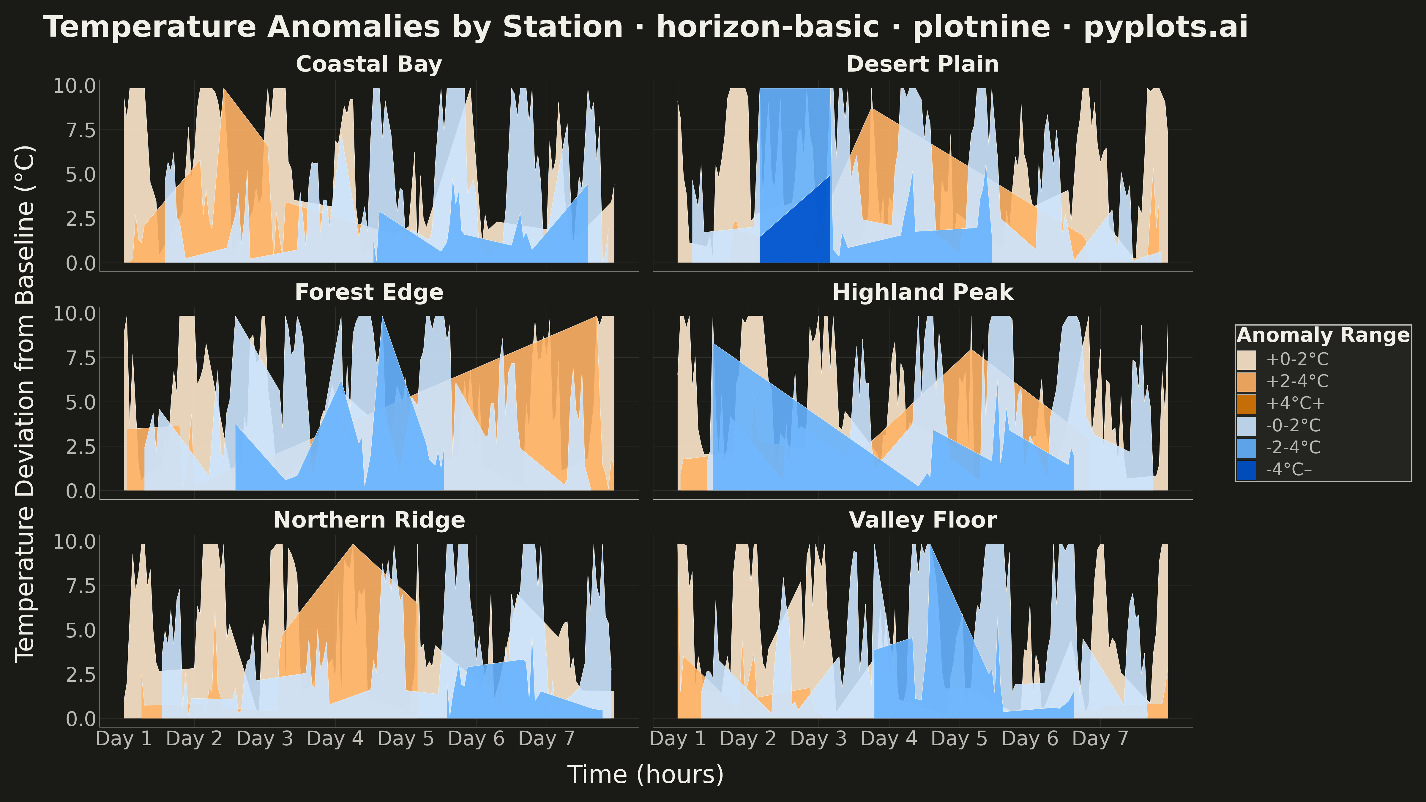
A horizon chart displays many time series compactly by folding values into color-coded bands, preserving local resolution while minimizing vertical space. It divides the y-axis into bands and uses color intensity to encode magnitude, allowing dozens of series to be compared in limited space. This technique is particularly effective when monitoring many metrics simultaneously where traditional line charts would become unreadable.
""" anyplot.ai
horizon-basic: Horizon Chart
Library: plotnine 0.15.4 | Python 3.13.13
Quality: 86/100 | Updated: 2026-05-07
"""

import os

import numpy as np
import pandas as pd
from plotnine import (
    aes,
    element_blank,
    element_line,
    element_rect,
    element_text,
    facet_wrap,
    geom_area,
    ggplot,
    labs,
    scale_fill_manual,
    scale_x_continuous,
    theme,
    theme_minimal,
)


# Theme colors - theme-adaptive chrome
THEME = os.getenv("ANYPLOT_THEME", "light")
PAGE_BG = "#FAF8F1" if THEME == "light" else "#1A1A17"
ELEVATED_BG = "#FFFDF6" if THEME == "light" else "#242420"
INK = "#1A1A17" if THEME == "light" else "#F0EFE8"
INK_SOFT = "#4A4A44" if THEME == "light" else "#B8B7B0"
GRID_COLOR = INK

# Data - Environmental temperature anomalies over 5 weeks for 6 weather stations
np.random.seed(42)

n_points = 168  # 7 days * 24 hours, but we'll use 5 weeks = 840 hours. Using 168 for compact display
n_series = 6
station_names = ["Northern Ridge", "Coastal Bay", "Highland Peak", "Valley Floor", "Forest Edge", "Desert Plain"]

# Create time series data (hours over ~5 weeks)
hours = np.arange(n_points)

# Generate realistic temperature anomaly data (deviation from seasonal mean)
data_records = []
for i, name in enumerate(station_names):
    # Daily temperature cycle (warmer during day, cooler at night) - shifted per station
    daily_cycle = 8 * np.sin(2 * np.pi * hours / 24 + i * np.pi / 6)
    # Weekly pattern (cooler at start of week, warmer mid-week for some stations)
    weekly_pattern = 5 * np.sin(2 * np.pi * hours / 168 + i * 0.3)
    # Random weather events (cold snaps, heat waves)
    noise = np.random.randn(n_points) * 2
    # Occasional extreme events
    extremes = np.zeros(n_points)
    event_indices = np.random.choice(n_points, size=4, replace=False)
    extremes[event_indices] = np.random.choice([-1, 1], size=4) * np.random.uniform(12, 18, size=4)

    values = daily_cycle + weekly_pattern + noise + extremes

    for h, val in zip(hours, values, strict=True):
        data_records.append({"hour": h, "value": val, "station": name})

df = pd.DataFrame(data_records)

# Horizon chart parameters - fold values into bands
n_bands = 3
max_val = df["value"].abs().max()
band_size = max_val / n_bands

# Create horizon-folded data for visualization
horizon_records = []

# Band labels with stronger contrast
band_labels = {"pos0": "+0-2°C", "pos1": "+2-4°C", "pos2": "+4°C+", "neg0": "-0-2°C", "neg1": "-2-4°C", "neg2": "-4°C–"}

# Band order for proper layering
band_order = ["pos0", "pos1", "pos2", "neg0", "neg1", "neg2"]

for station in station_names:
    station_data = df[df["station"] == station]
    values = station_data["value"].values
    hours_arr = station_data["hour"].values

    for band in range(n_bands):
        low = band * band_size
        high = (band + 1) * band_size

        # Process positive values (anomaly warmer than baseline)
        pos = np.clip(np.maximum(values, 0) - low, 0, band_size)
        # Process negative values (anomaly colder than baseline) - mirror for display
        neg = np.clip(np.maximum(-values, 0) - low, 0, band_size)

        for h, pv, nv in zip(hours_arr, pos, neg, strict=True):
            if pv > 0.01:
                horizon_records.append(
                    {"hour": h, "value": pv, "station": station, "band": f"pos{band}", "sign": "positive"}
                )
            if nv > 0.01:
                horizon_records.append(
                    {"hour": h, "value": nv, "station": station, "band": f"neg{band}", "sign": "negative"}
                )

horizon_df = pd.DataFrame(horizon_records)

# Set band as categorical with explicit order for proper layering
horizon_df["band"] = pd.Categorical(horizon_df["band"], categories=band_order, ordered=True)

# Enhanced color scheme with stronger contrast
# Warm (orange-red) for positive anomalies, cool (blue) for negative anomalies
colors = {
    "pos0": "#ffe8cc",  # Very light orange
    "pos1": "#ffb366",  # Medium orange
    "pos2": "#d97706",  # Dark orange-red
    "neg0": "#cce5ff",  # Very light blue
    "neg1": "#66b3ff",  # Medium blue
    "neg2": "#0052cc",  # Dark blue
}

# Create the horizon chart
plot = (
    ggplot(horizon_df, aes(x="hour", y="value", fill="band"))
    + geom_area(position="identity", alpha=0.9, color=GRID_COLOR, size=0.15)
    + scale_fill_manual(values=colors, labels=band_labels, breaks=band_order)
    + facet_wrap("~station", ncol=2)
    + scale_x_continuous(
        breaks=[0, 24, 48, 72, 96, 120, 144], labels=["Day 1", "Day 2", "Day 3", "Day 4", "Day 5", "Day 6", "Day 7"]
    )
    + labs(
        title="Temperature Anomalies by Station · horizon-basic · plotnine · pyplots.ai",
        x="Time (hours)",
        y="Temperature Deviation from Baseline (°C)",
        fill="Anomaly Range",
    )
    + theme_minimal()
    + theme(
        figure_size=(16, 9),
        plot_background=element_rect(fill=PAGE_BG, color=PAGE_BG),
        panel_background=element_rect(fill=PAGE_BG, color=None),
        plot_title=element_text(size=24, weight="bold", color=INK),
        axis_title=element_text(size=20, color=INK),
        axis_text_x=element_text(size=16, color=INK_SOFT),
        axis_text_y=element_text(size=16, color=INK_SOFT),
        strip_text=element_text(size=18, weight="bold", color=INK),
        legend_position="right",
        legend_background=element_rect(fill=ELEVATED_BG, color=INK_SOFT),
        legend_title=element_text(size=16, weight="bold", color=INK),
        legend_text=element_text(size=14, color=INK_SOFT),
        panel_grid_major=element_line(color=GRID_COLOR, size=0.3, alpha=0.10),
        panel_grid_minor=element_blank(),
        axis_line=element_line(color=INK_SOFT, size=0.3),
        axis_ticks=element_blank(),
    )
)

# Save as PNG with theme-suffixed filename
plot.save(f"plot-{THEME}.png", dpi=300, verbose=False)
Runnable source as JSON, for any HTTP client: https://api.anyplot.ai/specs/horizon-basic/plotnine/code. Any spec id and library id listed in llms-full.txt fit the same URL shape; every URL below is complete and callable.
{
  "spec_id": "horizon-basic",
  "language": "python",
  "library": "plotnine",
  "page": "https://anyplot.ai/horizon-basic/python/plotnine",
  "hub": "https://anyplot.ai/horizon-basic",
  "code_json": "https://api.anyplot.ai/specs/horizon-basic/plotnine/code",
  "spec_json": "https://api.anyplot.ai/specs/horizon-basic",
  "render_light_png": "https://storage.googleapis.com/anyplot-images/plots/horizon-basic/python/plotnine/plot-light.png",
  "render_dark_png": "https://storage.googleapis.com/anyplot-images/plots/horizon-basic/python/plotnine/plot-dark.png",
  "quality_score": 86.0,
  "license": "MIT",
  "guide": "https://anyplot.ai/llms.txt"
}
Part of Horizon Chart on anyplot.ai.