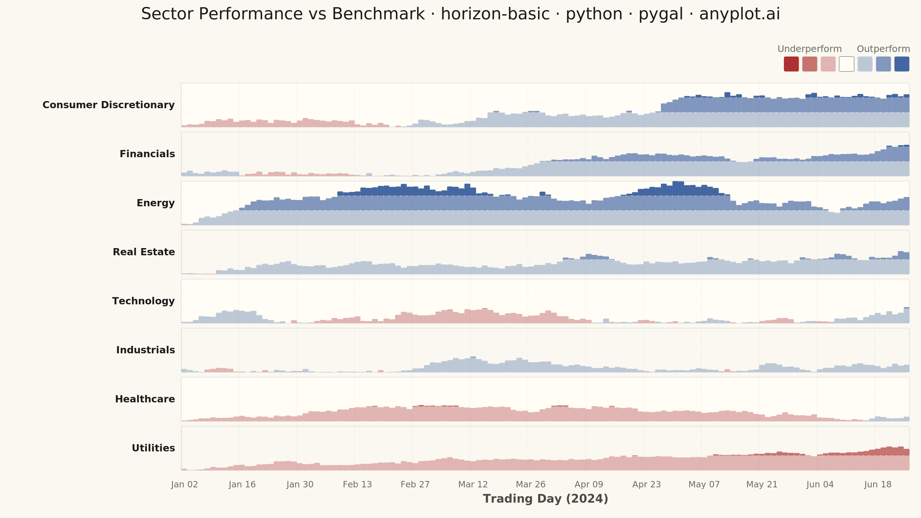
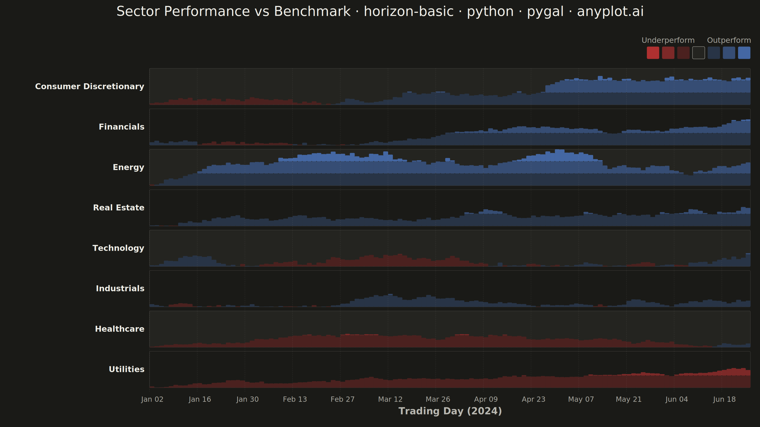
A horizon chart displays many time series compactly by folding values into color-coded bands, preserving local resolution while minimizing vertical space. It divides the y-axis into bands and uses color intensity to encode magnitude, allowing dozens of series to be compared in limited space. This technique is particularly effective when monitoring many metrics simultaneously where traditional line charts would become unreadable.
""" anyplot.ai
horizon-basic: Horizon Chart
Library: pygal 3.1.3 | Python 3.13.15
Quality: 93/100 | Updated: 2026-08-18
"""

import os
import sys

import numpy as np
import pandas as pd


# Temporarily remove current directory from path to avoid name collision
# with this file (pygal.py) shadowing the real "pygal" package on import.
_cwd = sys.path[0] if sys.path[0] else "."
if _cwd in sys.path:
    sys.path.remove(_cwd)

from pygal.graph.graph import Graph
from pygal.style import Style


# Restore path
sys.path.insert(0, _cwd)

# Theme configuration (see prompts/default-style-guide.md "Theme-adaptive Chrome")
THEME = os.getenv("ANYPLOT_THEME", "light")
PAGE_BG = "#FAF8F1" if THEME == "light" else "#1A1A17"
ELEVATED_BG = "#FFFDF6" if THEME == "light" else "#242420"
INK = "#1A1A17" if THEME == "light" else "#F0EFE8"
INK_SOFT = "#4A4A44" if THEME == "light" else "#B8B7B0"
INK_MUTED = "#6B6A63" if THEME == "light" else "#A8A79F"
RULE = "rgba(26,26,23,0.15)" if THEME == "light" else "rgba(240,239,232,0.15)"

# imprint_div endpoints (diverging, meaningful midpoint = the sector's own
# background) — never ColorBrewer / viridis / any other named cmap.
DIV_NEGATIVE = "#AE3030"
DIV_POSITIVE = "#4467A3"
DIV_MIDPOINT = PAGE_BG


def _lerp_hex(c0, c1, t):
    """Interpolate two hex colors — Imprint has no built-in cmap API, so
    continuous bands are built manually from the two imprint_div endpoints."""
    r0, g0, b0 = (int(c0[i : i + 2], 16) for i in (1, 3, 5))
    r1, g1, b1 = (int(c1[i : i + 2], 16) for i in (1, 3, 5))
    r, g, b = (int(round(a + (b - a) * t)) for a, b in ((r0, r1), (g0, g1), (b0, b1)))
    return f"#{r:02X}{g:02X}{b:02X}"


class HorizonChart(Graph):
    """Custom Horizon Chart for pygal — folds signed deviations into
    imprint_div color bands. Pygal has no native horizon chart type, so this
    subclasses Graph and draws directly onto the SVG canvas (the documented
    pygal mechanism for a chart type outside the stock catalog)."""

    def __init__(self, *args, **kwargs):
        self.series_data = kwargs.pop("series_data", {})
        self.time_labels = kwargs.pop("time_labels", [])
        self.n_bands = kwargs.pop("n_bands", 3)
        self.pos_colors = kwargs.pop("pos_colors", [])
        self.neg_colors = kwargs.pop("neg_colors", [])
        super().__init__(*args, **kwargs)

    def _plot(self):
        """Draw the horizon chart: one row per series, folded bands per cell."""
        if not self.series_data:
            return

        series_names = list(self.series_data.keys())
        n_series = len(series_names)
        n_points = len(self.time_labels)

        plot_width = self.view.width
        plot_height = self.view.height

        # Layout margins tuned for the 3200x1800 canvas — margin_left must
        # fit the longest series label ("Consumer Discretionary") at
        # label_font_size without overflowing past the canvas edge.
        margin_left = 520
        margin_right = 50
        margin_top = 140
        margin_bottom = 130

        available_width = plot_width - margin_left - margin_right
        available_height = plot_height - margin_top - margin_bottom

        row_height = available_height / n_series
        band_gap = row_height * 0.10
        actual_row_height = row_height - band_gap
        cell_width = available_width / n_points

        x_offset = self.view.x(0) + margin_left
        y_offset = self.view.y(n_series) + margin_top

        plot_node = self.nodes["plot"]
        horizon_group = self.svg.node(plot_node, class_="horizon-chart")

        # Global min/max drives the fold — every row shares one scale so
        # band color intensity is comparable sector-to-sector.
        all_values = [v for values in self.series_data.values() for v in values]
        global_max = max(abs(v) for v in all_values)
        band_size = global_max / self.n_bands

        label_font_size = min(34, int(actual_row_height * 0.34))

        for i, series_name in enumerate(series_names):
            values = self.series_data[series_name]
            row_y = y_offset + i * row_height

            # Zebra striping for row-to-row scan-ability
            bg_rect = self.svg.node(
                horizon_group, "rect", x=x_offset, y=row_y, width=available_width, height=actual_row_height, rx=4
            )
            bg_rect.set("fill", ELEVATED_BG if i % 2 == 0 else PAGE_BG)
            bg_rect.set("stroke", RULE)
            bg_rect.set("stroke-width", "1.5")

            # Series (sector) label
            text_node = self.svg.node(
                horizon_group, "text", x=x_offset - 22, y=row_y + actual_row_height / 2 + label_font_size * 0.32
            )
            text_node.set("text-anchor", "end")
            text_node.set("fill", INK)
            text_node.set("style", f"font-size:{label_font_size}px;font-weight:600;font-family:sans-serif")
            text_node.text = series_name

            # Horizon bands, one folded stack per time point
            for j, value in enumerate(values):
                cell_x = x_offset + j * cell_width
                is_positive = value >= 0
                remaining = abs(value)

                for band_idx in range(self.n_bands):
                    band_value = min(remaining, band_size)
                    if band_value <= 0:
                        break

                    height_ratio = band_value / band_size
                    band_height = (actual_row_height / self.n_bands) * height_ratio
                    band_y = row_y + actual_row_height - (actual_row_height / self.n_bands) * (band_idx + height_ratio)
                    color = (self.pos_colors if is_positive else self.neg_colors)[band_idx]

                    rect = self.svg.node(
                        horizon_group, "rect", x=cell_x, y=band_y, width=cell_width + 0.5, height=band_height, rx=3
                    )
                    rect.set("fill", color)
                    rect.set("stroke", "none")

                    # Real SVG hover tooltip (native browser behavior in the
                    # interactive HTML output — not a simulated/fake one).
                    tip = self.svg.node(rect, "title")
                    tip.text = f"{series_name} · {self.time_labels[j]}: {value:+.1f}pp vs benchmark"

                    remaining -= band_size

        # Subtle vertical grid at regular intervals for time readability
        grid_interval = max(1, n_points // 12)
        for j in range(0, n_points + 1, grid_interval):
            grid_x = x_offset + j * cell_width
            line = self.svg.node(
                horizon_group, "line", x1=grid_x, y1=y_offset, x2=grid_x, y2=y_offset + n_series * row_height
            )
            line.set("stroke", RULE)
            line.set("stroke-width", "1")
            line.set("stroke-dasharray", "4,4")

        # X-axis tick labels
        x_label_font_size = 30
        label_interval = max(1, n_points // 12)
        for j in range(0, n_points, label_interval):
            label_x = x_offset + j * cell_width + cell_width / 2
            label_y = y_offset + n_series * row_height + 42

            text_node = self.svg.node(horizon_group, "text", x=label_x, y=label_y)
            text_node.set("text-anchor", "middle")
            text_node.set("fill", INK_MUTED)
            text_node.set("style", f"font-size:{x_label_font_size}px;font-family:sans-serif")
            text_node.text = self.time_labels[j]

        # X-axis title
        x_title_font_size = 40
        text_node = self.svg.node(
            horizon_group, "text", x=x_offset + available_width / 2, y=y_offset + n_series * row_height + 95
        )
        text_node.set("text-anchor", "middle")
        text_node.set("fill", INK_SOFT)
        text_node.set("style", f"font-size:{x_title_font_size}px;font-weight:600;font-family:sans-serif")
        text_node.text = "Trading Day (2024)"

        # Diverging color-scale legend (imprint_div): a single compact strip
        # from full red (strong underperformance) through the neutral
        # benchmark swatch to full blue (strong outperformance).
        swatch = 52
        gap = 12
        n_neg = len(self.neg_colors)
        n_pos = len(self.pos_colors)
        stops = list(reversed(self.neg_colors)) + [None] + self.pos_colors
        legend_width = len(stops) * (swatch + gap) - gap
        legend_x = x_offset + available_width - legend_width
        legend_y = self.view.y(n_series) + 48
        legend_font_size = 32

        for k, color in enumerate(stops):
            sx = legend_x + k * (swatch + gap)
            rect = self.svg.node(horizon_group, "rect", x=sx, y=legend_y, width=swatch, height=swatch, rx=5)
            if color is None:
                rect.set("fill", ELEVATED_BG)
                rect.set("stroke", INK_MUTED)
                rect.set("stroke-width", "1.5")
            else:
                rect.set("fill", color)
                rect.set("stroke", "none")

        # Center each label under its own color group (not the whole legend
        # bar) so a wider, more legible font never collides across groups.
        neg_block_width = n_neg * (swatch + gap) - gap
        pos_block_start = legend_x + (n_neg + 1) * (swatch + gap)
        pos_block_width = n_pos * (swatch + gap) - gap
        neg_center_x = legend_x + neg_block_width / 2
        pos_center_x = pos_block_start + pos_block_width / 2

        left_label = self.svg.node(horizon_group, "text", x=neg_center_x, y=legend_y - 16)
        left_label.set("text-anchor", "middle")
        left_label.set("fill", INK_MUTED)
        left_label.set("style", f"font-size:{legend_font_size}px;font-family:sans-serif")
        left_label.text = "Underperform"

        right_label = self.svg.node(horizon_group, "text", x=pos_center_x, y=legend_y - 16)
        right_label.set("text-anchor", "middle")
        right_label.set("fill", INK_MUTED)
        right_label.set("style", f"font-size:{legend_font_size}px;font-family:sans-serif")
        right_label.text = "Outperform"

    def _compute(self):
        """Establish the data-space box for view.x()/view.y() scaling."""
        n_series = len(self.series_data) if self.series_data else 1
        n_points = len(self.time_labels) if self.time_labels else 1
        self._box.xmin = 0
        self._box.xmax = n_points
        self._box.ymin = 0
        self._box.ymax = n_series


# Data: cumulative sector performance vs. a market benchmark over one
# trading quarter (realistic, non-controversial finance scenario; a
# different time window and domain than the sibling 24h/seed-42 server
# metrics used elsewhere in the catalog).
np.random.seed(42)

trading_days = pd.bdate_range("2024-01-02", periods=126)
time_labels = [d.strftime("%b %d") for d in trading_days]
n_points = len(time_labels)

# (sector, daily drift pp, daily volatility pp) — each sector's cumulative
# excess return vs. the benchmark is a drifted random walk.
sector_params = [
    ("Technology", 0.14, 1.3),
    ("Consumer Discretionary", 0.09, 1.1),
    ("Financials", 0.07, 0.9),
    ("Industrials", 0.05, 0.8),
    ("Healthcare", 0.04, 0.7),
    ("Utilities", -0.03, 0.5),
    ("Real Estate", -0.06, 1.0),
    ("Energy", -0.08, 1.4),
]

sector_returns = {}
for sector_name, drift, volatility in sector_params:
    daily_excess_return = np.random.normal(drift, volatility, n_points)
    sector_returns[sector_name] = np.cumsum(daily_excess_return).tolist()

# Rank rows by final cumulative excess return (best performer on top) so the
# chart reads as a leaderboard — a clearer focal point than declaration order.
sector_returns = dict(sorted(sector_returns.items(), key=lambda kv: kv[1][-1], reverse=True))

n_bands = 3
pos_colors = [_lerp_hex(DIV_MIDPOINT, DIV_POSITIVE, (i + 1) / n_bands) for i in range(n_bands)]
neg_colors = [_lerp_hex(DIV_MIDPOINT, DIV_NEGATIVE, (i + 1) / n_bands) for i in range(n_bands)]

# Title — scale fontsize down if the descriptive prefix pushes past the
# 67-char baseline the style guide's default (66) is tuned for.
title = "Sector Performance vs Benchmark · horizon-basic · python · pygal · anyplot.ai"
title_font_size = round(66 * min(1.0, 67 / len(title)))

custom_style = Style(
    background=PAGE_BG,
    plot_background=PAGE_BG,
    foreground=INK,
    foreground_strong=INK,
    foreground_subtle=INK_MUTED,
    colors=(DIV_POSITIVE,),
    title_font_size=title_font_size,
    legend_font_size=44,
    label_font_size=56,
    major_label_font_size=44,
    value_font_size=36,
    font_family="sans-serif",
)

chart = HorizonChart(
    width=3200,
    height=1800,
    style=custom_style,
    title=title,
    series_data=sector_returns,
    time_labels=time_labels,
    n_bands=n_bands,
    pos_colors=pos_colors,
    neg_colors=neg_colors,
    show_legend=False,
    margin=50,
    margin_top=50,
    margin_bottom=50,
    show_x_labels=False,
    show_y_labels=False,
)

# Dummy series to trigger the render pipeline (_plot draws everything else)
chart.add("", [0])

# Save outputs
chart.render_to_file(f"plot-{THEME}.html")
chart.render_to_png(f"plot-{THEME}.png")
Runnable source as JSON, for any HTTP client: https://api.anyplot.ai/specs/horizon-basic/pygal/code. Any spec id and library id listed in llms-full.txt fit the same URL shape; every URL below is complete and callable.
{
  "spec_id": "horizon-basic",
  "language": "python",
  "library": "pygal",
  "page": "https://anyplot.ai/horizon-basic/python/pygal",
  "hub": "https://anyplot.ai/horizon-basic",
  "code_json": "https://api.anyplot.ai/specs/horizon-basic/pygal/code",
  "spec_json": "https://api.anyplot.ai/specs/horizon-basic",
  "render_light_png": "https://storage.googleapis.com/anyplot-images/plots/horizon-basic/python/pygal/plot-light.png",
  "render_dark_png": "https://storage.googleapis.com/anyplot-images/plots/horizon-basic/python/pygal/plot-dark.png",
  "interactive_light_html": "https://storage.googleapis.com/anyplot-images/plots/horizon-basic/python/pygal/plot-light.html",
  "interactive_dark_html": "https://storage.googleapis.com/anyplot-images/plots/horizon-basic/python/pygal/plot-dark.html",
  "quality_score": 93.0,
  "license": "MIT",
  "guide": "https://anyplot.ai/llms.txt"
}
Part of Horizon Chart on anyplot.ai.