The same plot in 14 other libraries — JavaScript: D3.js, Apache ECharts, Highcharts, MUI X Charts; Python: Altair, Bokeh, lets-plot, Matplotlib, Plotly, plotnine, Pygal, Seaborn; R: ggplot2; Julia: Makie.jl. Compare all 15 side by side: Individual Conditional Expectation (ICE) Plot in Python, R, Julia and JavaScript.
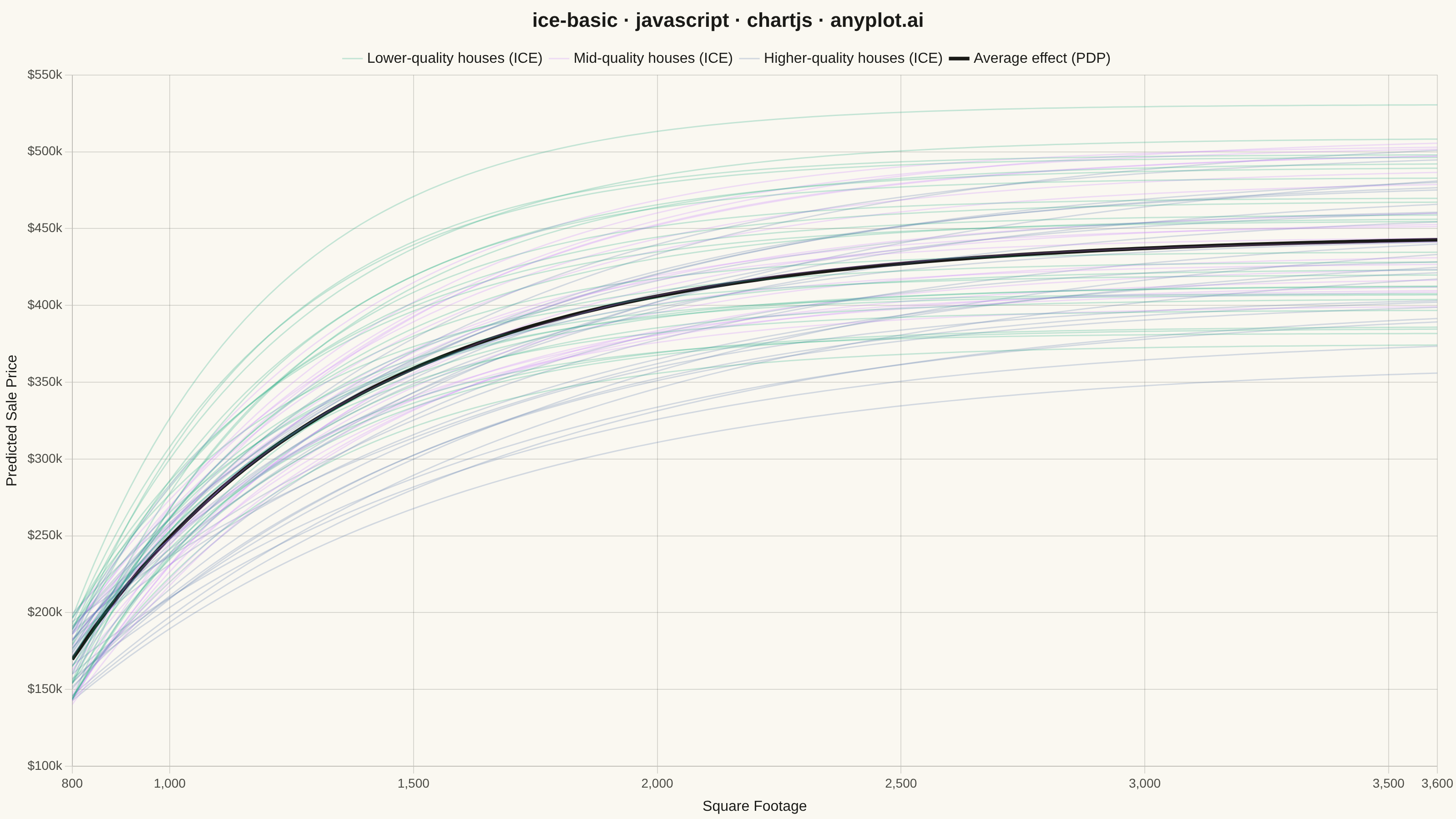
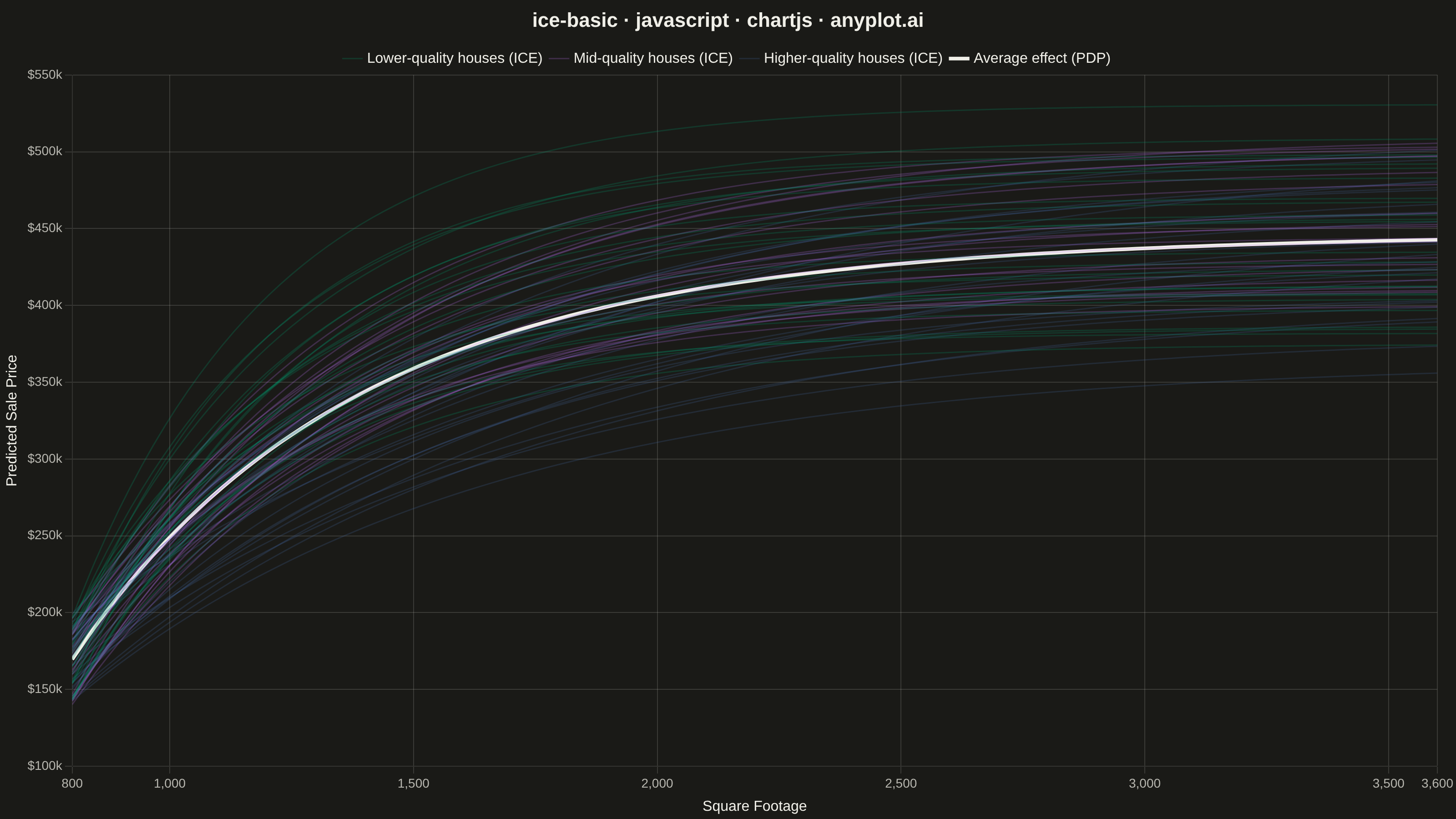
An Individual Conditional Expectation (ICE) plot visualizes how the predicted outcome of a machine learning model changes for each individual observation as a single feature varies across its range. Unlike partial dependence plots (PDP) that show the average marginal effect, ICE plots display one line per observation, revealing heterogeneous effects, feature interactions, and subgroup-specific behaviors that would be hidden by averaging. This makes ICE plots essential for detecting when a feature's effect varies across the population.
// anyplot.ai
// ice-basic: Individual Conditional Expectation (ICE) Plot
// Library: chartjs 4.4.7 | JavaScript 22.23.2
// Quality: 91/100 | Created: 2026-08-17

const t = window.ANYPLOT_TOKENS;

// --- Data (in-memory, deterministic LCG) ------------------------------------
// House price predictions from a GradientBoostingRegressor as square footage
// varies, for 70 individual houses. Each house has its own latent "quality"
// level that governs how quickly the size effect on price saturates -- higher
// quality builds keep appreciating with size, modest builds plateau sooner.
// That divergence is exactly what ICE reveals and an averaged PDP curve hides.
let seed = 42;
function lcg() {
  seed = (seed * 1103515245 + 12345) & 0x7fffffff;
  return seed / 0x7fffffff;
}

const N_OBSERVATIONS = 70;
const N_GRID_POINTS = 60;
const SQFT_MIN = 800;
const SQFT_MAX = 3600;

const featureGrid = Array.from({ length: N_GRID_POINTS }, (_, i) =>
  SQFT_MIN + (i / (N_GRID_POINTS - 1)) * (SQFT_MAX - SQFT_MIN),
);

const houses = Array.from({ length: N_OBSERVATIONS }, () => ({
  basePrice: 140000 + lcg() * 60000,
  quality: lcg(),
  amplitude: 220000 + lcg() * 120000,
}));

function predictPrice(house, sqft) {
  const decay = 0.0025 - house.quality * 0.0016; // higher quality -> slower saturation
  const sizeEffect = house.amplitude * (1 - Math.exp(-decay * (sqft - SQFT_MIN)));
  return house.basePrice + sizeEffect;
}

const iceCurves = houses.map((house) => featureGrid.map((sqft) => predictPrice(house, sqft)));
const pdpCurve = featureGrid.map((_, gridIndex) => {
  const total = iceCurves.reduce((sum, curve) => sum + curve[gridIndex], 0);
  return total / iceCurves.length;
});

function hexToRgba(hex, alpha) {
  const value = parseInt(hex.slice(1), 16);
  const r = (value >> 16) & 255;
  const g = (value >> 8) & 255;
  const b = value & 255;
  return `rgba(${r}, ${g}, ${b}, ${alpha})`;
}

// Color-code the ICE bundle by house quality (terciles) so the divergence
// between modest and premium builds -- the interaction the spec calls out --
// is visible directly in the fan of lines, not just in the average PDP curve.
const QUALITY_TIERS = [
  { label: "Lower-quality houses (ICE)", test: (q) => q < 1 / 3 },
  { label: "Mid-quality houses (ICE)", test: (q) => q < 2 / 3 },
  { label: "Higher-quality houses (ICE)", test: () => true },
];

function tierIndexFor(quality) {
  return QUALITY_TIERS.findIndex((tier) => tier.test(quality));
}

// --- Mount -------------------------------------------------------------------
const canvas = document.createElement("canvas");
document.getElementById("container").appendChild(canvas);

// --- Chart -------------------------------------------------------------------
// Group by tier (not raw house order) so the chart's first dataset -- and
// first legend swatch -- is always the tier-0 bundle in the mandated
// #009E73 brand green.
const houseIndicesByTier = QUALITY_TIERS.map((_, tierIndex) =>
  houses.map((house, i) => i).filter((i) => tierIndexFor(houses[i].quality) === tierIndex),
);

const iceDatasets = houseIndicesByTier.flatMap((indices, tierIndex) =>
  indices.map((i, j) => ({
    label: j === 0 ? QUALITY_TIERS[tierIndex].label : "",
    data: featureGrid.map((sqft, gridIndex) => ({ x: sqft, y: iceCurves[i][gridIndex] })),
    borderColor: hexToRgba(t.palette[tierIndex], 0.22),
    borderWidth: 1.5,
    pointRadius: 0,
    fill: false,
    tension: 0.3,
  })),
);

const pdpDataset = {
  label: "Average effect (PDP)",
  data: featureGrid.map((sqft, gridIndex) => ({ x: sqft, y: pdpCurve[gridIndex] })),
  borderColor: t.ink,
  borderWidth: 4,
  pointRadius: 0,
  fill: false,
  tension: 0.3,
};

new Chart(canvas, {
  type: "line",
  data: {
    datasets: [...iceDatasets, pdpDataset],
  },
  options: {
    responsive: true,
    maintainAspectRatio: false,
    animation: false,
    plugins: {
      title: {
        display: true,
        text: "ice-basic · javascript · chartjs · anyplot.ai",
        color: t.ink,
        font: { size: 22 },
      },
      legend: {
        labels: {
          color: t.ink,
          font: { size: 16 },
          usePointStyle: true,
          pointStyle: "line",
          filter: (item) => item.text !== "",
        },
      },
    },
    scales: {
      x: {
        type: "linear",
        min: SQFT_MIN,
        max: SQFT_MAX,
        ticks: { color: t.inkSoft, font: { size: 14 } },
        grid: { color: t.grid },
        title: { display: true, text: "Square Footage", color: t.ink, font: { size: 16 } },
      },
      y: {
        ticks: {
          color: t.inkSoft,
          font: { size: 14 },
          callback: (value) => `$${(value / 1000).toFixed(0)}k`,
        },
        grid: { color: t.grid },
        title: { display: true, text: "Predicted Sale Price", color: t.ink, font: { size: 16 } },
      },
    },
  },
});
Runnable source as JSON, for any HTTP client: https://api.anyplot.ai/specs/ice-basic/chartjs/code. Any spec id and library id listed in llms-full.txt fit the same URL shape; every URL below is complete and callable.
{
  "spec_id": "ice-basic",
  "language": "javascript",
  "library": "chartjs",
  "page": "https://anyplot.ai/ice-basic/javascript/chartjs",
  "hub": "https://anyplot.ai/ice-basic",
  "code_json": "https://api.anyplot.ai/specs/ice-basic/chartjs/code",
  "spec_json": "https://api.anyplot.ai/specs/ice-basic",
  "render_light_png": "https://storage.googleapis.com/anyplot-images/plots/ice-basic/javascript/chartjs/plot-light.png",
  "render_dark_png": "https://storage.googleapis.com/anyplot-images/plots/ice-basic/javascript/chartjs/plot-dark.png",
  "interactive_light_html": "https://storage.googleapis.com/anyplot-images/plots/ice-basic/javascript/chartjs/plot-light.html",
  "interactive_dark_html": "https://storage.googleapis.com/anyplot-images/plots/ice-basic/javascript/chartjs/plot-dark.html",
  "quality_score": 91.0,
  "license": "MIT",
  "guide": "https://anyplot.ai/llms.txt"
}
Part of Individual Conditional Expectation (ICE) Plot on anyplot.ai.