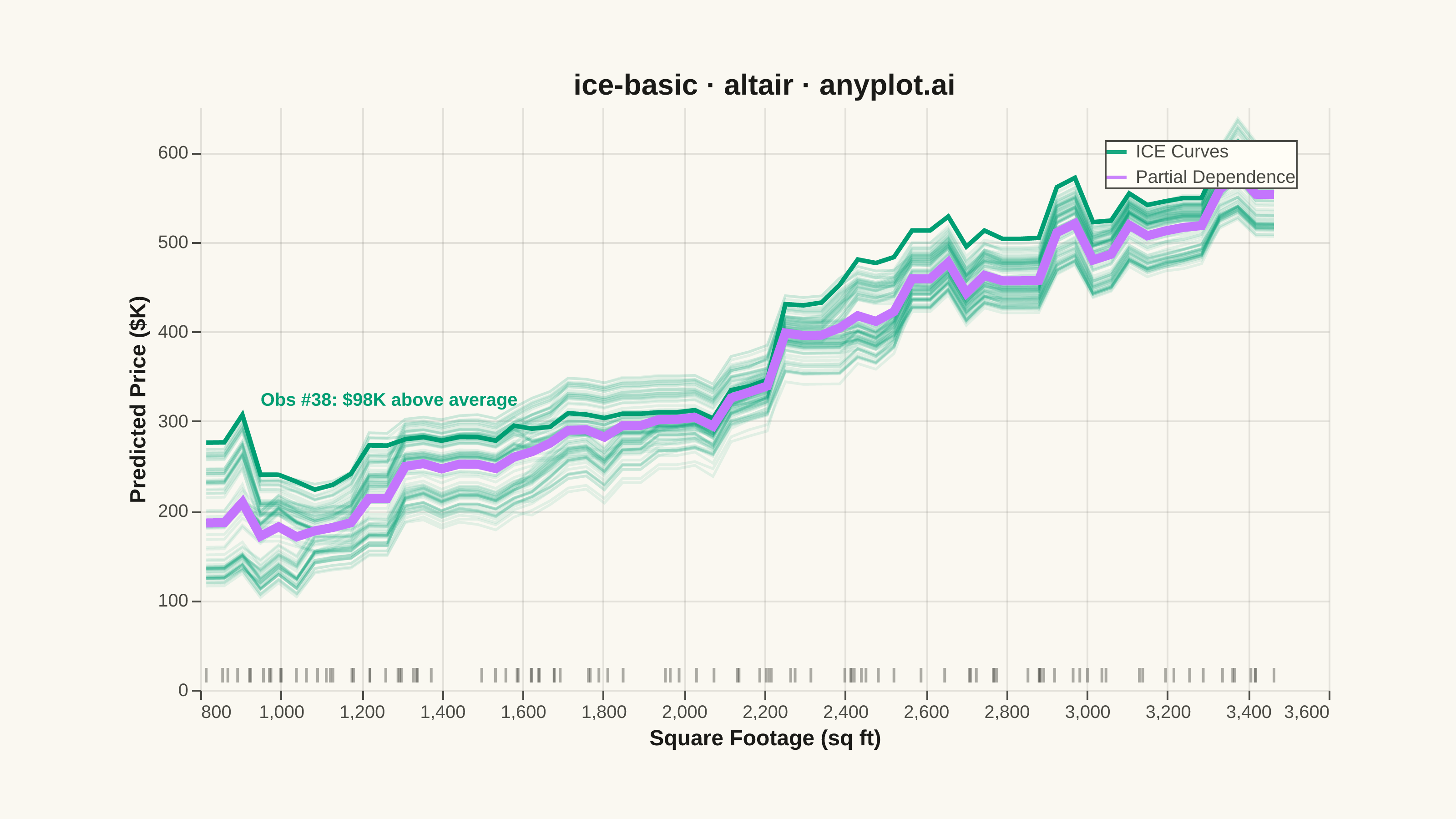
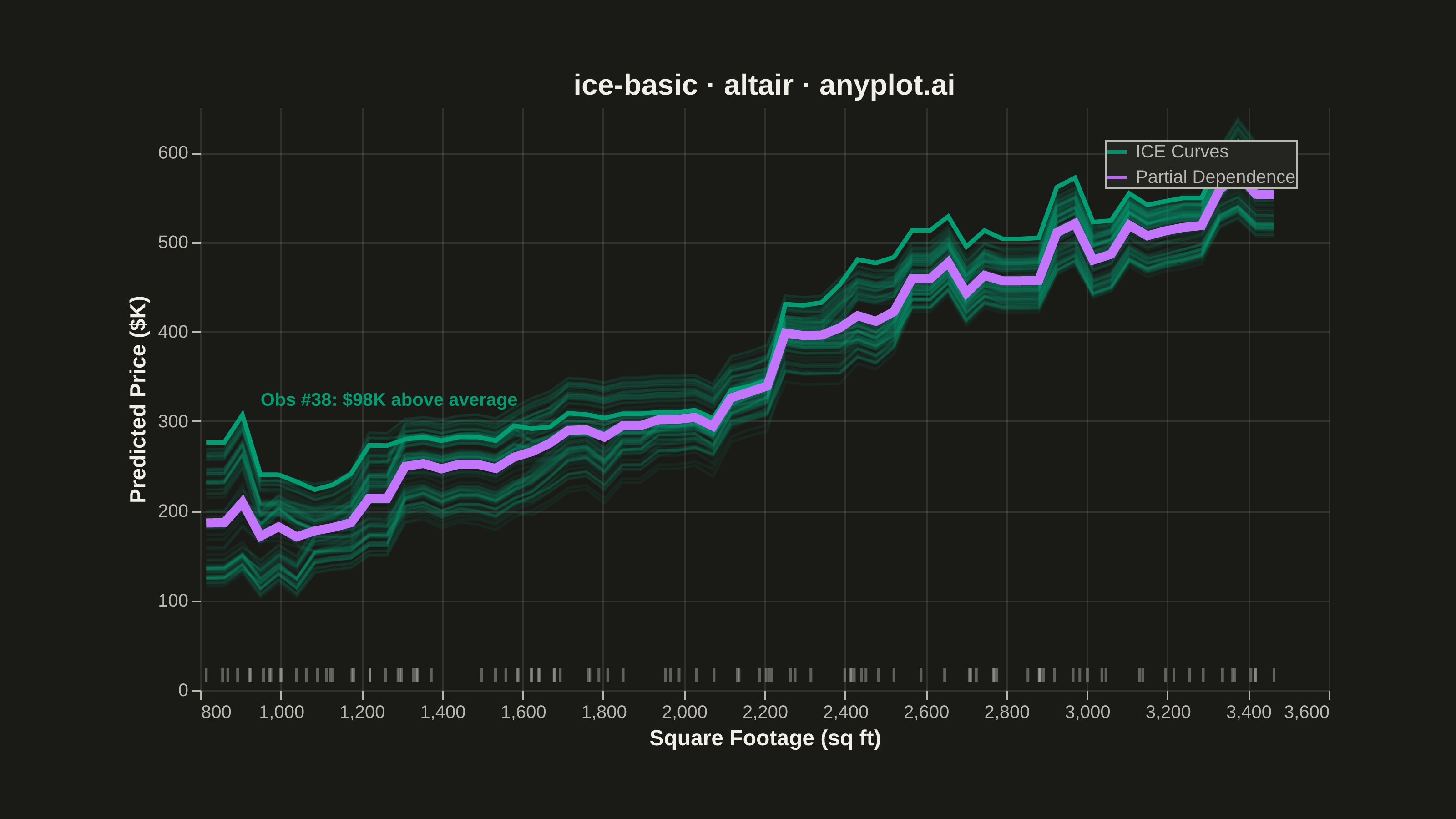
The same plot in 14 other libraries — Python: Bokeh, lets-plot, Matplotlib, Plotly, plotnine, Pygal, Seaborn; R: ggplot2; Julia: Makie.jl; JavaScript: Chart.js, D3.js, Apache ECharts, Highcharts, MUI X Charts. Compare all 15 side by side: Individual Conditional Expectation (ICE) Plot in Python, R, Julia and JavaScript.
An Individual Conditional Expectation (ICE) plot visualizes how the predicted outcome of a machine learning model changes for each individual observation as a single feature varies across its range. Unlike partial dependence plots (PDP) that show the average marginal effect, ICE plots display one line per observation, revealing heterogeneous effects, feature interactions, and subgroup-specific behaviors that would be hidden by averaging. This makes ICE plots essential for detecting when a feature's effect varies across the population.
""" anyplot.ai
ice-basic: Individual Conditional Expectation (ICE) Plot
Library: altair 6.2.2 | Python 3.13.15
Quality: 87/100 | Updated: 2026-08-17
"""

import os
import sys


# Prevent this file from shadowing the altair package
_script_dir = os.path.dirname(os.path.abspath(__file__)) if "__file__" in dir() else os.getcwd()
if _script_dir in sys.path:
    sys.path.remove(_script_dir)

import altair as alt
import numpy as np
import pandas as pd
from PIL import Image
from sklearn.ensemble import GradientBoostingRegressor


# Theme tokens (see prompts/default-style-guide.md "Theme-adaptive Chrome")
THEME = os.getenv("ANYPLOT_THEME", "light")
PAGE_BG = "#FAF8F1" if THEME == "light" else "#1A1A17"
ELEVATED_BG = "#FFFDF6" if THEME == "light" else "#242420"
INK = "#1A1A17" if THEME == "light" else "#F0EFE8"
INK_SOFT = "#4A4A44" if THEME == "light" else "#B8B7B0"

# Imprint palette — first series ALWAYS #009E73
BRAND = "#009E73"
PDP_COLOR = "#C475FD"

# Canvas — landscape inner view, see prompts/library/altair.md "Canvas — hard rule"
VIEW_W, VIEW_H = 620, 320
TARGET_W, TARGET_H = 3200, 1800

# Data
np.random.seed(42)
n_obs = 100
sqft = np.random.uniform(800, 3500, n_obs)
bedrooms = np.random.randint(1, 6, n_obs)
house_age = np.random.uniform(0, 50, n_obs)

price = 120 * sqft + 25000 * bedrooms - 600 * house_age + 0.008 * sqft**2 + np.random.normal(0, 25000, n_obs)

X = np.column_stack([sqft, bedrooms, house_age])
model = GradientBoostingRegressor(n_estimators=200, max_depth=4, random_state=42)
model.fit(X, price)

# Build ICE curves — vary square footage across its range for each observation
grid_size = 60
sqft_grid = np.linspace(sqft.min(), sqft.max(), grid_size)

records = []
for obs_id in range(n_obs):
    X_ice = np.column_stack([sqft_grid, np.full(grid_size, bedrooms[obs_id]), np.full(grid_size, house_age[obs_id])])
    preds = model.predict(X_ice)
    for sq, pred in zip(sqft_grid, preds, strict=False):
        records.append({"obs_id": obs_id, "sqft": sq, "price_k": pred / 1000, "series": "ICE Curves"})

ice_df = pd.DataFrame(records)

# PDP: mean prediction at each sqft grid point
pdp_df = ice_df.groupby("sqft", as_index=False)["price_k"].mean()
pdp_df["series"] = "Partial Dependence"

# Shared color scale for legend
color_scale = alt.Scale(domain=["ICE Curves", "Partial Dependence"], range=[BRAND, PDP_COLOR])
color_legend = alt.Legend(title="", labelFontSize=10, symbolSize=120, symbolStrokeWidth=2, orient="top-right")

# Real interactivity in the HTML export: hovering a curve highlights it. The
# unselected (default) branch matches the static PNG state, so the PNG render
# is unaffected — only the interactive HTML gains the hover behavior.
hover = alt.selection_point(fields=["obs_id"], on="pointerover", empty=False)

# ICE individual curves — semi-transparent to show density
ice_layer = (
    alt.Chart(ice_df)
    .mark_line(strokeWidth=1.5)
    .encode(
        x=alt.X("sqft:Q", title="Square Footage (sq ft)"),
        y=alt.Y("price_k:Q", title="Predicted Price ($K)"),
        detail="obs_id:N",
        color=alt.Color("series:N", scale=color_scale, legend=color_legend),
        opacity=alt.condition(hover, alt.value(0.9), alt.value(0.10)),
    )
    .add_params(hover)
)

# PDP overlay — bold opaque curve showing average marginal effect
pdp_layer = (
    alt.Chart(pdp_df)
    .mark_line(strokeWidth=5)
    .encode(x="sqft:Q", y="price_k:Q", color=alt.Color("series:N", scale=color_scale, legend=color_legend))
)

# Divergent-observation callout — instead of repeating the legend's "Partial
# Dependence" label, find the single point where an individual curve deviates
# furthest from the average and name it, surfacing the heterogeneity ICE
# plots exist to reveal.
merged = ice_df.merge(pdp_df[["sqft", "price_k"]], on="sqft", suffixes=("", "_pdp"))
merged["deviation"] = merged["price_k"] - merged["price_k_pdp"]
divergent_row = merged.loc[merged["deviation"].abs().idxmax()]
divergent_id = int(divergent_row["obs_id"])
divergent_deviation = float(divergent_row["deviation"])
divergent_direction = "above" if divergent_deviation > 0 else "below"

divergent_df = ice_df[ice_df["obs_id"] == divergent_id]
divergent_layer = (
    alt.Chart(divergent_df)
    .mark_line(strokeWidth=2.5, opacity=1.0)
    .encode(x="sqft:Q", y="price_k:Q", color=alt.Color("series:N", scale=color_scale, legend=color_legend))
)

divergent_point_df = merged.loc[[merged["deviation"].abs().idxmax()], ["sqft", "price_k"]]
# Keep the callout clear of the y-axis title (left edge) and the top-right
# legend by flipping horizontal/vertical anchoring based on where the
# divergent point actually falls on the canvas.
sqft_mid = (sqft_grid.min() + sqft_grid.max()) / 2
text_align = "left" if divergent_row["sqft"] < sqft_mid else "right"
text_dx = 10 if text_align == "left" else -10
text_dy = -8 if divergent_row["price_k"] < pdp_df["price_k"].max() * 0.85 else 16
divergent_annotation = (
    alt.Chart(divergent_point_df)
    .mark_text(align=text_align, dx=text_dx, dy=text_dy, fontSize=10, color=BRAND, fontWeight="bold")
    .encode(
        x="sqft:Q",
        y="price_k:Q",
        text=alt.value(f"Obs #{divergent_id}: ${abs(divergent_deviation):.0f}K {divergent_direction} average"),
    )
)

# Rug plot — actual observed sqft values along the x-axis
rug_df = pd.DataFrame({"sqft": sqft})
rug_layer = (
    alt.Chart(rug_df)
    .mark_tick(thickness=1.5, size=8, opacity=0.45, color=INK_SOFT)
    .encode(x="sqft:Q", y=alt.value(VIEW_H - 8))
)

chart = (
    alt.layer(ice_layer, divergent_layer, pdp_layer, divergent_annotation, rug_layer)
    .properties(
        width=VIEW_W, height=VIEW_H, background=PAGE_BG, title=alt.Title("ice-basic · altair · anyplot.ai", fontSize=16)
    )
    .configure_view(fill=PAGE_BG, strokeWidth=0)
    .configure_axis(
        domain=False,
        tickColor=INK_SOFT,
        gridColor=INK,
        gridOpacity=0.10,
        labelColor=INK_SOFT,
        titleColor=INK,
        labelFontSize=10,
        titleFontSize=12,
    )
    .configure_title(color=INK, fontSize=16)
    .configure_legend(
        fillColor=ELEVATED_BG, strokeColor=INK_SOFT, labelColor=INK_SOFT, titleColor=INK, labelFontSize=10
    )
)

chart.save(f"plot-{THEME}.png", scale_factor=4.0)
chart.save(f"plot-{THEME}.html")

# PAD-only to exact target canvas — vl-convert pads title/axis/legend outside
# width/height, so the saved PNG needs a final centered pad, never a crop.
_img = Image.open(f"plot-{THEME}.png").convert("RGB")
_w, _h = _img.size
if _w > TARGET_W or _h > TARGET_H:
    raise SystemExit(
        f"altair vl-convert produced {_w}x{_h}, exceeds target {TARGET_W}x{TARGET_H}. "
        f"Shrink chart .properties(width=, height=) values and re-render."
    )
if _w < TARGET_W or _h < TARGET_H:
    _canvas = Image.new("RGB", (TARGET_W, TARGET_H), PAGE_BG)
    _canvas.paste(_img, ((TARGET_W - _w) // 2, (TARGET_H - _h) // 2))
    _canvas.save(f"plot-{THEME}.png")
Runnable source as JSON, for any HTTP client: https://api.anyplot.ai/specs/ice-basic/altair/code. Any spec id and library id listed in llms-full.txt fit the same URL shape; every URL below is complete and callable.
{
  "spec_id": "ice-basic",
  "language": "python",
  "library": "altair",
  "page": "https://anyplot.ai/ice-basic/python/altair",
  "hub": "https://anyplot.ai/ice-basic",
  "code_json": "https://api.anyplot.ai/specs/ice-basic/altair/code",
  "spec_json": "https://api.anyplot.ai/specs/ice-basic",
  "render_light_png": "https://storage.googleapis.com/anyplot-images/plots/ice-basic/python/altair/plot-light.png",
  "render_dark_png": "https://storage.googleapis.com/anyplot-images/plots/ice-basic/python/altair/plot-dark.png",
  "interactive_light_html": "https://storage.googleapis.com/anyplot-images/plots/ice-basic/python/altair/plot-light.html",
  "interactive_dark_html": "https://storage.googleapis.com/anyplot-images/plots/ice-basic/python/altair/plot-dark.html",
  "quality_score": 87.0,
  "license": "MIT",
  "guide": "https://anyplot.ai/llms.txt"
}
Part of Individual Conditional Expectation (ICE) Plot on anyplot.ai.