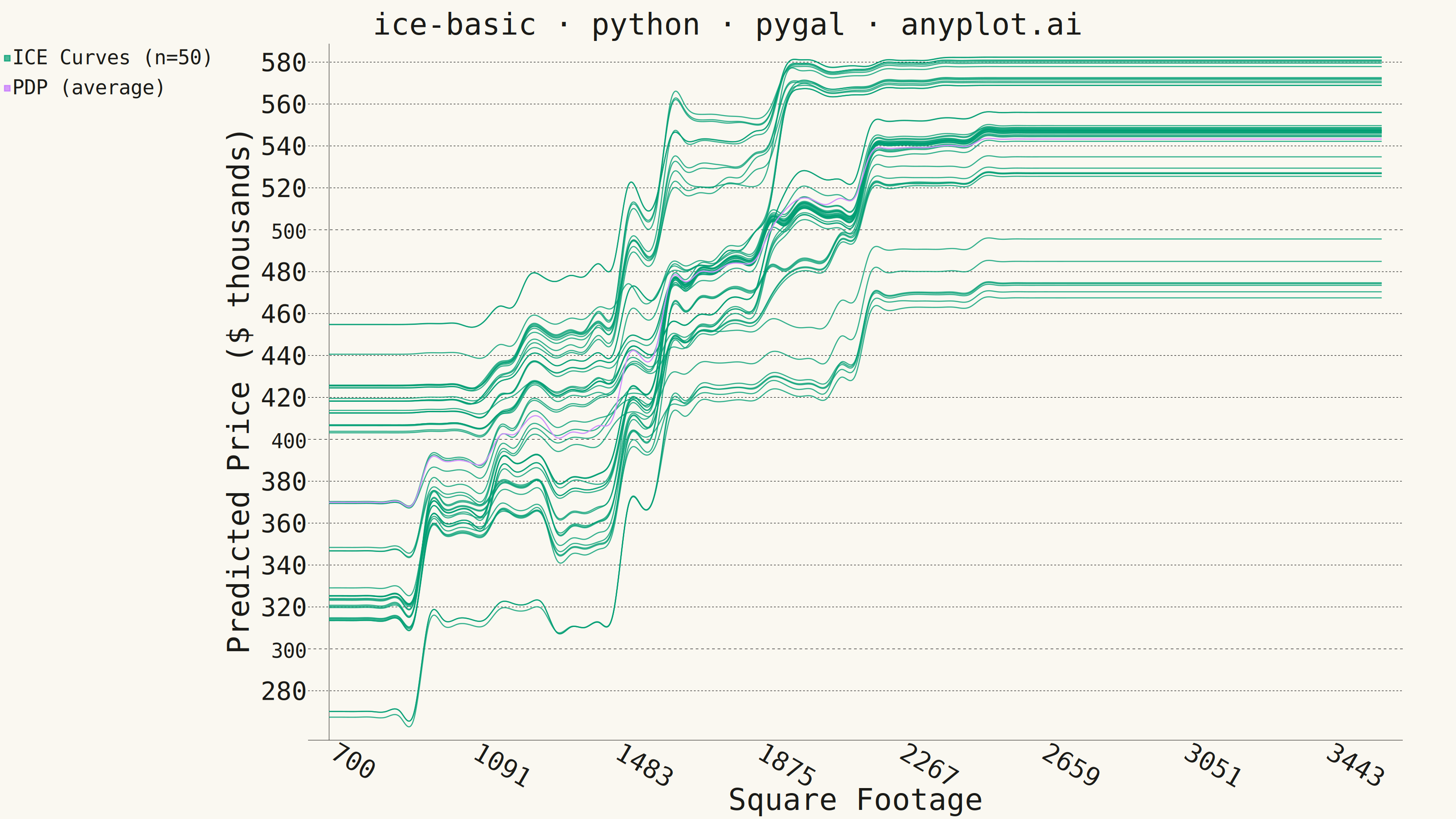
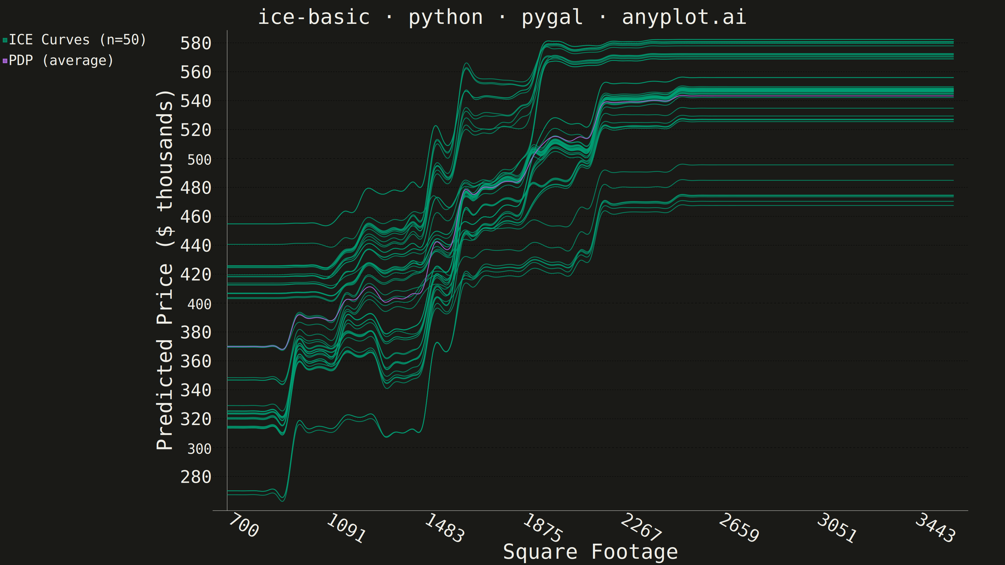
The same plot in 14 other libraries — Python: Altair, Bokeh, lets-plot, Matplotlib, Plotly, plotnine, Seaborn; R: ggplot2; Julia: Makie.jl; JavaScript: Chart.js, D3.js, Apache ECharts, Highcharts, MUI X Charts. Compare all 15 side by side: Individual Conditional Expectation (ICE) Plot in Python, R, Julia and JavaScript.
An Individual Conditional Expectation (ICE) plot visualizes how the predicted outcome of a machine learning model changes for each individual observation as a single feature varies across its range. Unlike partial dependence plots (PDP) that show the average marginal effect, ICE plots display one line per observation, revealing heterogeneous effects, feature interactions, and subgroup-specific behaviors that would be hidden by averaging. This makes ICE plots essential for detecting when a feature's effect varies across the population.
""" anyplot.ai
ice-basic: Individual Conditional Expectation (ICE) Plot
Library: pygal 3.1.3 | Python 3.13.15
Quality: 86/100 | Updated: 2026-08-17
"""

import importlib
import os
import sys

import numpy as np
from sklearn.ensemble import GradientBoostingRegressor


# Prevent self-import: this file is named pygal.py, which shadows the package.
# Remove the script directory from sys.path before loading the pygal package.
_this_dir = os.path.dirname(os.path.abspath(__file__))
sys.path = [p for p in sys.path if os.path.abspath(p or ".") != _this_dir]

pygal = importlib.import_module("pygal")
Style = importlib.import_module("pygal.style").Style

# Theme tokens
THEME = os.getenv("ANYPLOT_THEME", "light")
PAGE_BG = "#FAF8F1" if THEME == "light" else "#1A1A17"
INK = "#1A1A17" if THEME == "light" else "#F0EFE8"
INK_SOFT = "#4A4A44" if THEME == "light" else "#B8B7B0"
INK_MUTED = "#6B6A63" if THEME == "light" else "#A8A79F"

IMPRINT_PALETTE = ("#009E73", "#C475FD", "#4467A3", "#BD8233", "#AE3030", "#2ABCCD", "#954477", "#99B314")
ICE_COLOR = IMPRINT_PALETTE[0]  # Imprint palette position 1 — ICE lines
PDP_COLOR = IMPRINT_PALETTE[1]  # Imprint palette position 2 — PDP line
PDP_HALO_COLOR = PAGE_BG  # background-colored outline so PDP reads through dense ICE bands

# Data: house price predictions from GradientBoostingRegressor
np.random.seed(42)
n_obs = 50
n_grid = 75  # spec recommends 50-100 grid points

sqft = np.random.normal(1800, 450, n_obs).clip(700, 3600)
bedrooms = np.random.randint(2, 6, n_obs)
location_score = np.random.uniform(0.2, 1.0, n_obs)
price = 100_000 + 130 * sqft + 9_000 * bedrooms + 180_000 * location_score + np.random.normal(0, 18_000, n_obs)

sqft_grid = np.linspace(700, 3600, n_grid)

X = np.column_stack([sqft, bedrooms, location_score])
model = GradientBoostingRegressor(n_estimators=200, max_depth=4, random_state=42)
model.fit(X, price)

ice_curves = np.zeros((n_obs, n_grid))
for i in range(n_obs):
    X_ice = np.tile([sqft[i], bedrooms[i], location_score[i]], (n_grid, 1))
    X_ice[:, 0] = sqft_grid
    ice_curves[i] = model.predict(X_ice) / 1_000  # convert to $K

pdp_curve = ice_curves.mean(axis=0)

# Style: ICE lines use brand green, PDP uses lavender for contrast; a background-colored
# halo line is drawn just beneath the PDP line so it stays legible where curves converge
colors_tuple = (ICE_COLOR,) * n_obs + (PDP_HALO_COLOR, PDP_COLOR)

custom_style = Style(
    background=PAGE_BG,
    plot_background=PAGE_BG,
    foreground=INK,
    foreground_strong=INK,
    foreground_subtle=INK_MUTED,
    colors=colors_tuple,
    title_font_size=66,  # library-prompt canonical native-pixel sizing for 3200x1800
    label_font_size=56,
    major_label_font_size=44,
    legend_font_size=44,
    value_font_size=36,
    stroke_width=2.5,
)

# Plot — cubic interpolation gives smooth ICE curves (pygal-native feature)
# legend stays off the bottom: pygal reserves bottom margin proportional to the
# *total* series count (all 51 lines) regardless of which ones carry a legend
# label, so legend_at_bottom here would still reserve ~40% of canvas height for
# a legend that only ever shows 2 rows. The default side legend only reserves
# space for the labels actually rendered.
chart = pygal.Line(
    style=custom_style,
    width=3200,
    height=1800,
    title="ice-basic · python · pygal · anyplot.ai",
    x_title="Square Footage",
    y_title="Predicted Price ($ thousands)",
    show_dots=False,
    show_y_guides=True,
    show_x_guides=False,
    interpolate="cubic",
    x_label_rotation=30,
    truncate_legend=-1,  # disable truncation — only 2 legend rows are ever shown
)

# x-axis: label every 10th grid point to avoid crowding (75 total)
x_labels = [""] * n_grid
step = max(1, n_grid // 7)
for idx in range(0, n_grid, step):
    x_labels[idx] = str(int(sqft_grid[idx]))
chart.x_labels = x_labels

# ICE lines — only the first carries a legend label; the rest use title=None
# (not "") so pygal's _legend() skips their row entirely instead of rendering
# 49 blank entries.
chart.add(
    f"ICE Curves (n={n_obs})", [round(float(v), 1) for v in ice_curves[0]], stroke_style={"width": 2, "opacity": 0.3}
)
for i in range(1, n_obs):
    chart.add(None, [round(float(v), 1) for v in ice_curves[i]], stroke_style={"width": 2, "opacity": 0.3})

# PDP line — a wide background-colored halo drawn first, then the bold, fully opaque
# PDP curve on top; the halo keeps the average visible where ICE curves converge into
# dense bands (e.g. sqft 1875-3443) instead of blending into the green mass
pdp_values = [round(float(v), 1) for v in pdp_curve]
chart.add(None, pdp_values, stroke_style={"width": 18, "opacity": 0.95})
chart.add("PDP (average)", pdp_values, stroke_style={"width": 12, "opacity": 1.0})

# Save
chart.render_to_png(f"plot-{THEME}.png")
with open(f"plot-{THEME}.html", "wb") as f:
    f.write(chart.render())
Runnable source as JSON, for any HTTP client: https://api.anyplot.ai/specs/ice-basic/pygal/code. Any spec id and library id listed in llms-full.txt fit the same URL shape; every URL below is complete and callable.
{
  "spec_id": "ice-basic",
  "language": "python",
  "library": "pygal",
  "page": "https://anyplot.ai/ice-basic/python/pygal",
  "hub": "https://anyplot.ai/ice-basic",
  "code_json": "https://api.anyplot.ai/specs/ice-basic/pygal/code",
  "spec_json": "https://api.anyplot.ai/specs/ice-basic",
  "render_light_png": "https://storage.googleapis.com/anyplot-images/plots/ice-basic/python/pygal/plot-light.png",
  "render_dark_png": "https://storage.googleapis.com/anyplot-images/plots/ice-basic/python/pygal/plot-dark.png",
  "interactive_light_html": "https://storage.googleapis.com/anyplot-images/plots/ice-basic/python/pygal/plot-light.html",
  "interactive_dark_html": "https://storage.googleapis.com/anyplot-images/plots/ice-basic/python/pygal/plot-dark.html",
  "quality_score": 86.0,
  "license": "MIT",
  "guide": "https://anyplot.ai/llms.txt"
}
Part of Individual Conditional Expectation (ICE) Plot on anyplot.ai.