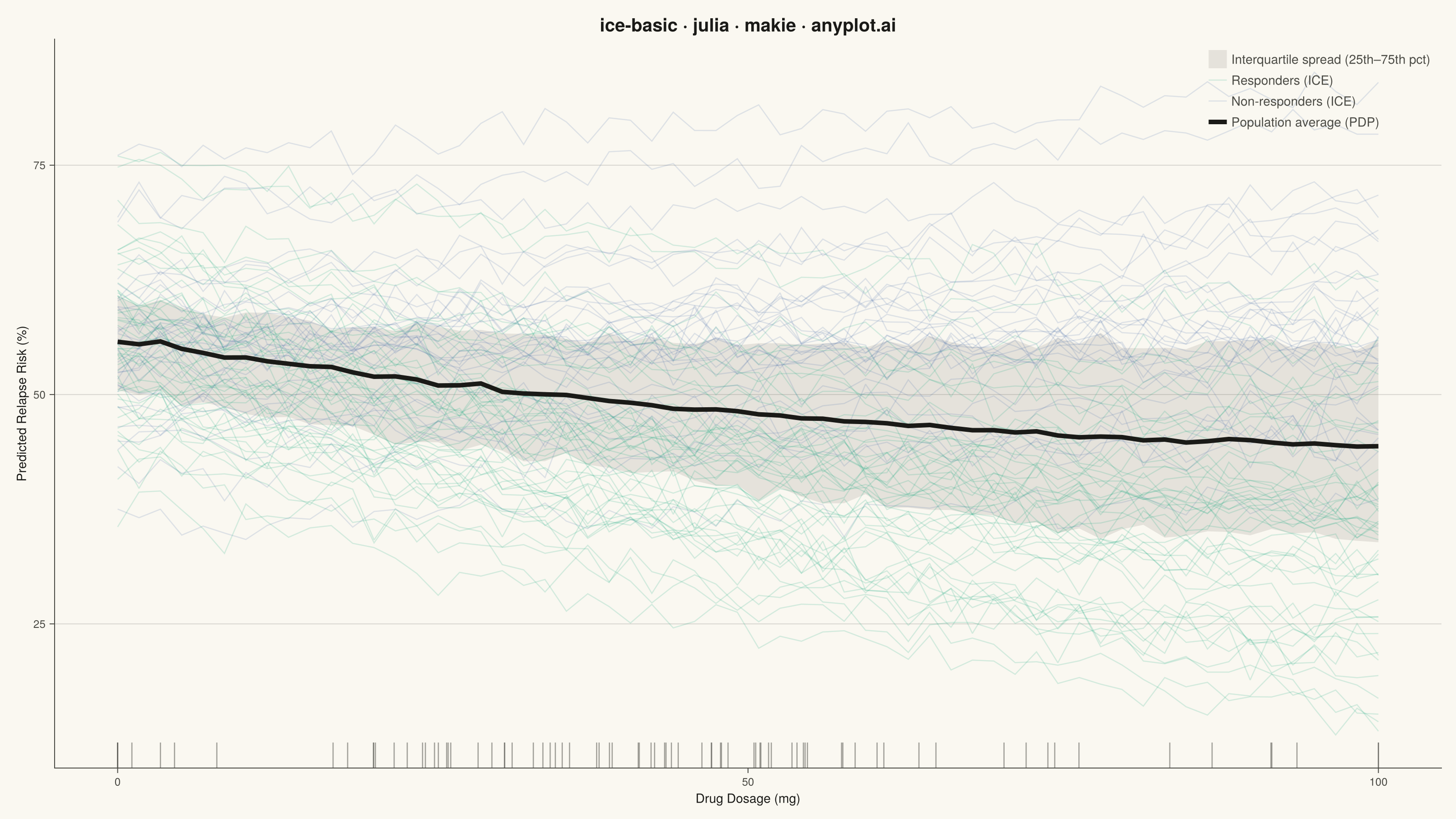
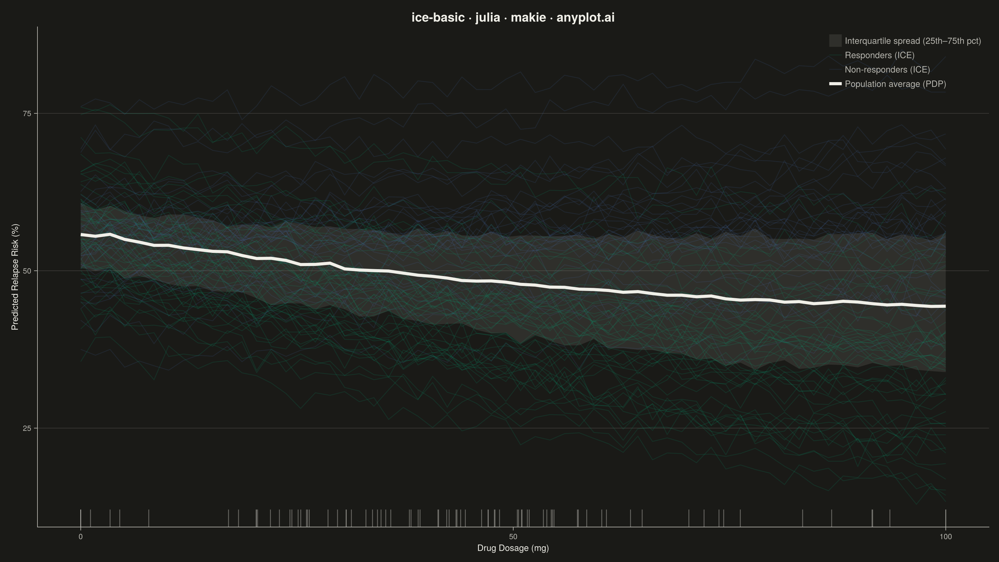
The same plot in 14 other libraries — Python: Altair, Bokeh, lets-plot, Matplotlib, Plotly, plotnine, Pygal, Seaborn; R: ggplot2; JavaScript: Chart.js, D3.js, Apache ECharts, Highcharts, MUI X Charts. Compare all 15 side by side: Individual Conditional Expectation (ICE) Plot in Python, R, Julia and JavaScript.
An Individual Conditional Expectation (ICE) plot visualizes how the predicted outcome of a machine learning model changes for each individual observation as a single feature varies across its range. Unlike partial dependence plots (PDP) that show the average marginal effect, ICE plots display one line per observation, revealing heterogeneous effects, feature interactions, and subgroup-specific behaviors that would be hidden by averaging. This makes ICE plots essential for detecting when a feature's effect varies across the population.
# anyplot.ai
# ice-basic: Individual Conditional Expectation (ICE) Plot
# Library: makie 0.21.9 | Julia 1.11.9
# Quality: 93/100 | Created: 2026-08-17

using CairoMakie
using Colors
using Random
using Statistics

Random.seed!(42)

# --- Theme tokens -----------------------------------------------------------
const THEME    = get(ENV, "ANYPLOT_THEME", "light")
const PAGE_BG  = THEME == "light" ? colorant"#FAF8F1" : colorant"#1A1A17"
const INK      = THEME == "light" ? colorant"#1A1A17" : colorant"#F0EFE8"
const INK_SOFT = THEME == "light" ? colorant"#4A4A44" : colorant"#B8B7B0"
const IMPRINT_PALETTE = [
    colorant"#009E73", colorant"#C475FD", colorant"#4467A3", colorant"#BD8233",
    colorant"#AE3030", colorant"#2ABCCD", colorant"#954477", colorant"#99B314",
]
const BRAND          = IMPRINT_PALETTE[1]  # ALWAYS first series
const ANYPLOT_NEUTRAL = INK                # baseline / reference line
const ANYPLOT_MUTED   = THEME == "light" ? colorant"#6B6A63" : colorant"#A8A79F"  # confidence-band fill
const RESPONDER_COLOR     = BRAND                 # responders — primary story, brand green
const NONRESPONDER_COLOR  = IMPRINT_PALETTE[3]    # non-responders — blue, CVD-safe contrast to green

# --- Data ---------------------------------------------------------------
# ICE curves from a gradient-boosted risk model: predicted relapse-risk
# score as a function of drug dosage, one curve per simulated patient.
n_patients  = 80
n_grid      = 60
dosage_grid = range(0, 100; length = n_grid)

# ~65% of patients respond to dosage (risk falls with increasing dose);
# the remainder show little to no response — the subgroup split an ICE
# plot is designed to reveal that a partial-dependence average would hide.
responder = rand(n_patients) .< 0.65

risk_curves = Matrix{Float64}(undef, n_grid, n_patients)
for i in 1:n_patients
    baseline = 55 + randn() * 8
    if responder[i]
        slope     = -0.34 + randn() * 0.07
        curvature = 0.0014 + randn() * 0.0004
        risk_curves[:, i] = baseline .+ slope .* dosage_grid .+
                            curvature .* dosage_grid .^ 2 .+ randn(n_grid) .* 1.4
    else
        slope = 0.04 + randn() * 0.05
        risk_curves[:, i] = baseline .+ slope .* dosage_grid .+ randn(n_grid) .* 1.4
    end
end

pdp_curve = vec(mean(risk_curves; dims = 2))

# Interquartile spread at each grid point, to anchor the eye against the
# dense haze of 80 overlapping semi-transparent lines.
band_lo = [quantile(risk_curves[j, :], 0.25) for j in 1:n_grid]
band_hi = [quantile(risk_curves[j, :], 0.75) for j in 1:n_grid]

first_responder    = findfirst(responder)
first_nonresponder = findfirst(!, responder)

# Observed dosages actually recorded per patient, for the x-axis rug.
observed_dosage = clamp.(45 .+ randn(n_patients) .* 22, 0, 100)

# --- Plot -----------------------------------------------------------------
fig = Figure(
    resolution      = (1600, 900),
    fontsize        = 14,
    backgroundcolor = PAGE_BG,
)

ax = Axis(
    fig[1, 1];
    title              = "ice-basic · julia · makie · anyplot.ai",
    titlesize          = 20,
    titlecolor         = INK,
    xlabel             = "Drug Dosage (mg)",
    ylabel             = "Predicted Relapse Risk (%)",
    xlabelsize         = 14,
    ylabelsize         = 14,
    xlabelcolor        = INK,
    ylabelcolor        = INK,
    xticklabelsize     = 12,
    yticklabelsize     = 12,
    xticklabelcolor    = INK_SOFT,
    yticklabelcolor    = INK_SOFT,
    xtickcolor         = INK_SOFT,
    ytickcolor         = INK_SOFT,
    backgroundcolor    = PAGE_BG,
    topspinevisible    = false,
    rightspinevisible  = false,
    leftspinecolor     = INK_SOFT,
    bottomspinecolor   = INK_SOFT,
    xgridvisible       = false,
    ygridcolor         = RGBAf(INK.r, INK.g, INK.b, 0.15),
    xminorgridvisible  = false,
    yminorgridvisible  = false,
)

band!(
    ax, dosage_grid, band_lo, band_hi;
    color = (ANYPLOT_MUTED, 0.15),
    label = "Interquartile spread (25th–75th pct)",
)

for i in 1:n_patients
    group_color = responder[i] ? RESPONDER_COLOR : NONRESPONDER_COLOR
    label = if i == first_responder
        "Responders (ICE)"
    elseif i == first_nonresponder
        "Non-responders (ICE)"
    else
        nothing
    end
    lines!(
        ax, dosage_grid, risk_curves[:, i];
        color     = (group_color, 0.16),
        linewidth = 1.3,
        label     = label,
    )
end

lines!(
    ax, dosage_grid, pdp_curve;
    color     = ANYPLOT_NEUTRAL,
    linewidth = 5,
    label     = "Population average (PDP)",
)

# Rug plot: distribution of the dosages actually observed in the cohort.
vlines!(
    ax, observed_dosage;
    ymin      = 0.0,
    ymax      = 0.035,
    color     = INK_SOFT,
    linewidth = 1.3,
    alpha     = 0.5,
)

axislegend(
    ax;
    position        = :rt,
    backgroundcolor = THEME == "light" ? colorant"#FFFDF6" : colorant"#242420",
    labelcolor      = INK_SOFT,
    framevisible    = false,
)

# --- Save -------------------------------------------------------------------
save("plot-$(THEME).png", fig; px_per_unit = 2)
Runnable source as JSON, for any HTTP client: https://api.anyplot.ai/specs/ice-basic/makie/code. Any spec id and library id listed in llms-full.txt fit the same URL shape; every URL below is complete and callable.
{
  "spec_id": "ice-basic",
  "language": "julia",
  "library": "makie",
  "page": "https://anyplot.ai/ice-basic/julia/makie",
  "hub": "https://anyplot.ai/ice-basic",
  "code_json": "https://api.anyplot.ai/specs/ice-basic/makie/code",
  "spec_json": "https://api.anyplot.ai/specs/ice-basic",
  "render_light_png": "https://storage.googleapis.com/anyplot-images/plots/ice-basic/julia/makie/plot-light.png",
  "render_dark_png": "https://storage.googleapis.com/anyplot-images/plots/ice-basic/julia/makie/plot-dark.png",
  "quality_score": 93.0,
  "license": "MIT",
  "guide": "https://anyplot.ai/llms.txt"
}
Part of Individual Conditional Expectation (ICE) Plot on anyplot.ai.