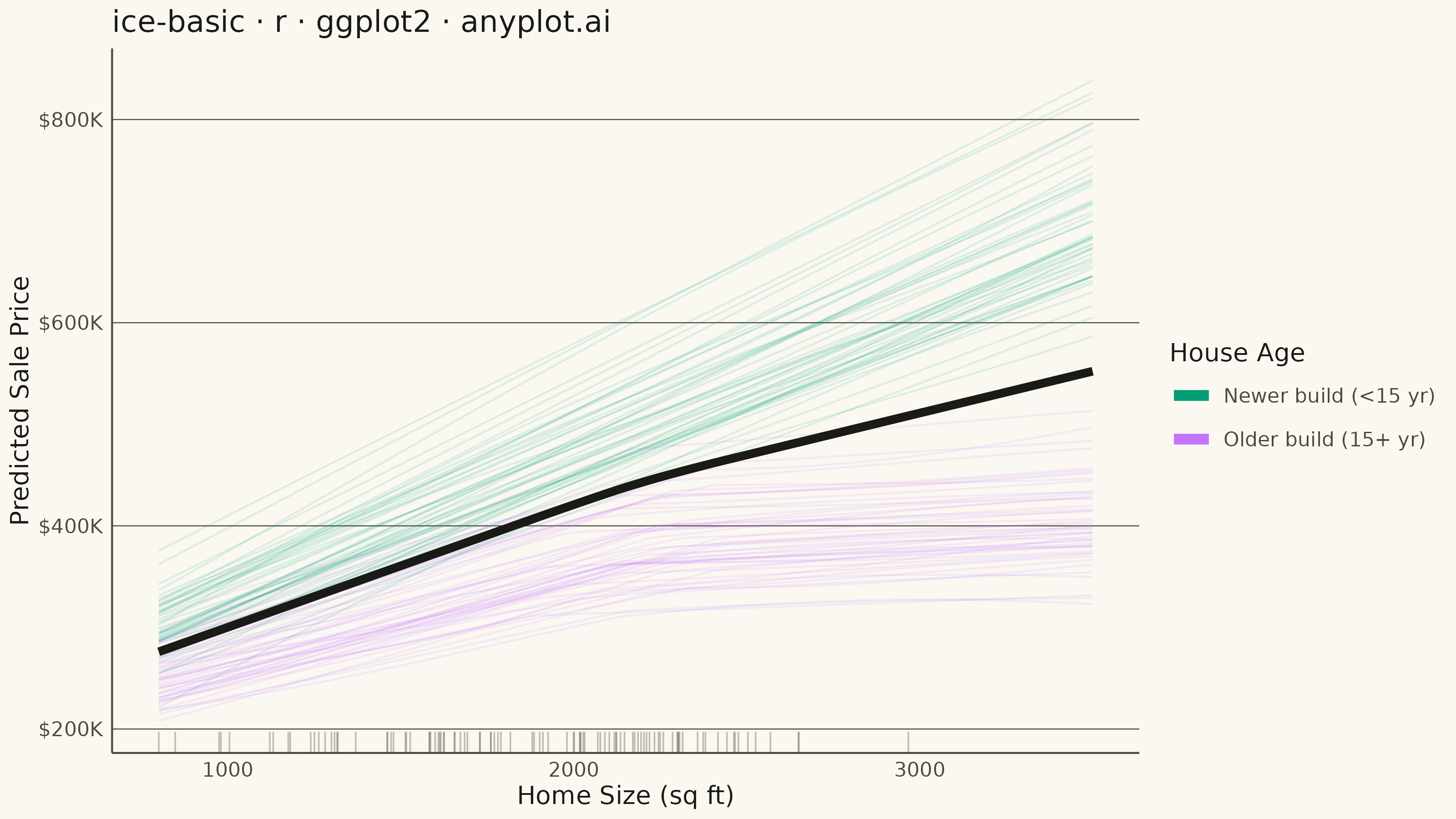
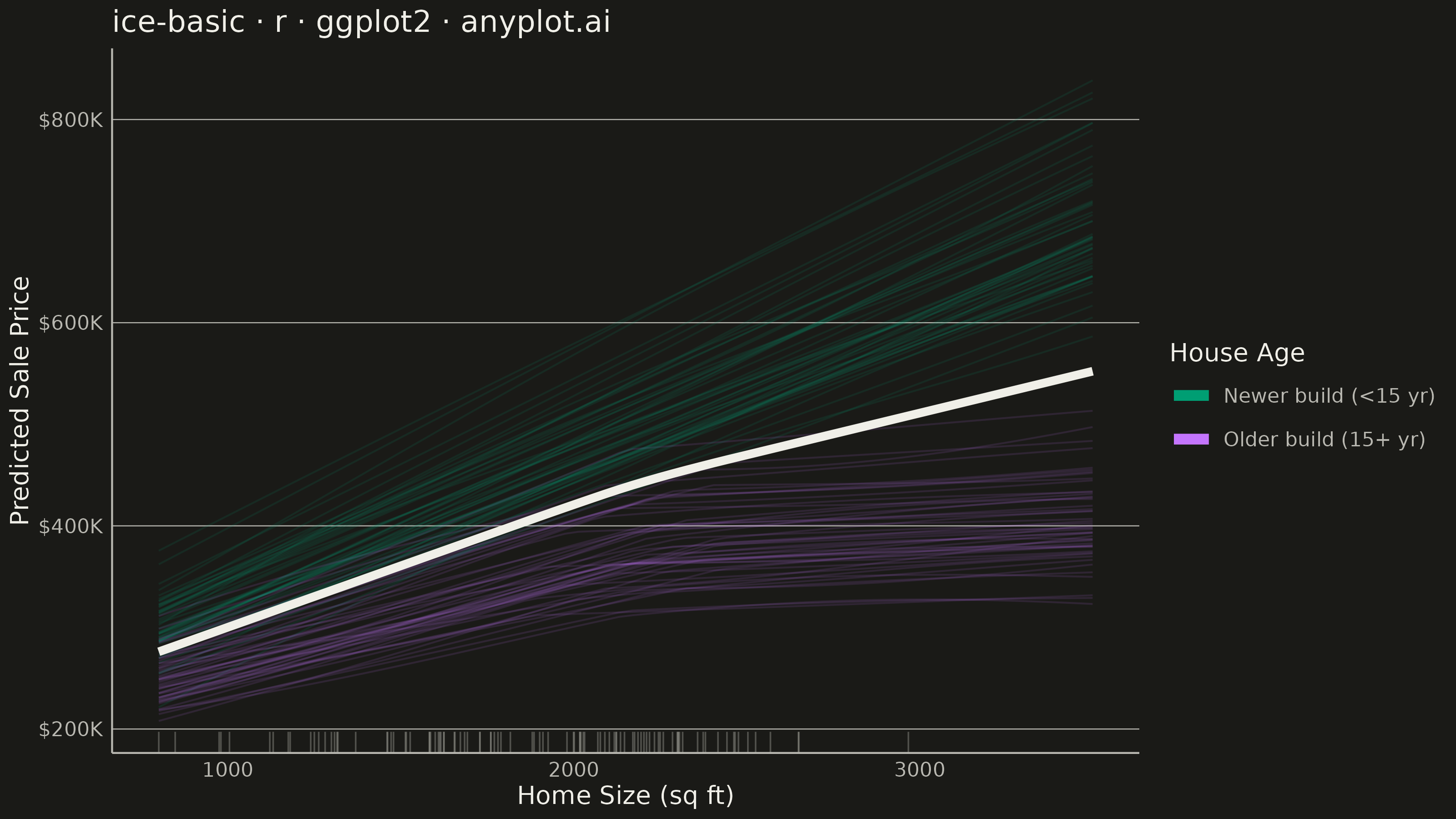
The same plot in 14 other libraries — Python: Altair, Bokeh, lets-plot, Matplotlib, Plotly, plotnine, Pygal, Seaborn; Julia: Makie.jl; JavaScript: Chart.js, D3.js, Apache ECharts, Highcharts, MUI X Charts. Compare all 15 side by side: Individual Conditional Expectation (ICE) Plot in Python, R, Julia and JavaScript.
An Individual Conditional Expectation (ICE) plot visualizes how the predicted outcome of a machine learning model changes for each individual observation as a single feature varies across its range. Unlike partial dependence plots (PDP) that show the average marginal effect, ICE plots display one line per observation, revealing heterogeneous effects, feature interactions, and subgroup-specific behaviors that would be hidden by averaging. This makes ICE plots essential for detecting when a feature's effect varies across the population.
#' anyplot.ai
#' ice-basic: Individual Conditional Expectation (ICE) Plot
#' Library: ggplot2 3.5.1 | R 4.4.1
#' Quality: 92/100 | Created: 2026-08-17

library(ggplot2)
library(dplyr)
library(tidyr)
library(scales)
library(ragg)

set.seed(42)

# --- Theme tokens -------------------------------------------------------
THEME       <- Sys.getenv("ANYPLOT_THEME", "light")
PAGE_BG     <- if (THEME == "light") "#FAF8F1" else "#1A1A17"
INK         <- if (THEME == "light") "#1A1A17" else "#F0EFE8"
INK_SOFT    <- if (THEME == "light") "#4A4A44" else "#B8B7B0"
IMPRINT_PALETTE <- c("#009E73", "#C475FD", "#4467A3", "#BD8233",
                     "#AE3030", "#2ABCCD", "#954477", "#99B314")

# --- Data -----------------------------------------------------------------
# ICE curves from a house-price model: predicted sale price as home size
# varies, one curve per house. Two age cohorts reveal a feature interaction —
# older homes plateau above a size threshold, newer homes keep climbing.
n_houses <- 100
n_grid <- 70

age_levels <- c("Newer build (<15 yr)", "Older build (15+ yr)")
house_age <- factor(
  sample(age_levels, n_houses, replace = TRUE, prob = c(0.45, 0.55)),
  levels = age_levels
)

sqft_grid <- seq(800, 3500, length.out = n_grid)

base_price      <- rnorm(n_houses, mean = 180000, sd = 22000)
price_per_sqft  <- ifelse(house_age == "Newer build (<15 yr)",
                           rnorm(n_houses, mean = 148, sd = 14),
                           rnorm(n_houses, mean = 96, sd = 18))
plateau_sqft    <- ifelse(house_age == "Older build (15+ yr)",
                           rnorm(n_houses, mean = 2200, sd = 150), Inf)
wiggle_amplitude <- rnorm(n_houses, mean = 0, sd = 9000)
wiggle_phase     <- runif(n_houses, 0, 2 * pi)

house_params <- tibble::tibble(
  observation_id   = seq_len(n_houses),
  house_age        = house_age,
  base_price       = base_price,
  price_per_sqft   = price_per_sqft,
  plateau_sqft     = plateau_sqft,
  wiggle_amplitude = wiggle_amplitude,
  wiggle_phase     = wiggle_phase
)

ice_df <- expand_grid(observation_id = seq_len(n_houses), feature_value = sqft_grid) %>%
  left_join(house_params, by = "observation_id") %>%
  mutate(
    effective_sqft = pmin(feature_value, plateau_sqft) +
      0.18 * pmax(feature_value - plateau_sqft, 0),
    prediction = base_price + price_per_sqft * effective_sqft +
      wiggle_amplitude * sin(feature_value / 650 + wiggle_phase)
  ) %>%
  select(observation_id, house_age, feature_value, prediction)

pdp_df <- ice_df %>%
  group_by(feature_value) %>%
  summarize(prediction = mean(prediction), .groups = "drop")

observed_sqft <- tibble::tibble(
  feature_value = pmin(pmax(rnorm(n_houses, 1900, 480), 800), 3500)
)

# --- Plot -------------------------------------------------------------------
p <- ggplot() +
  geom_line(
    data = ice_df,
    aes(x = feature_value, y = prediction, group = observation_id, color = house_age),
    alpha = 0.12, linewidth = 0.35
  ) +
  geom_rug(
    data = observed_sqft,
    aes(x = feature_value),
    sides = "b", color = INK_SOFT, alpha = 0.35, linewidth = 0.3
  ) +
  geom_line(
    data = pdp_df,
    aes(x = feature_value, y = prediction),
    color = INK, linewidth = 1.6
  ) +
  scale_color_manual(values = IMPRINT_PALETTE[1:2]) +
  scale_y_continuous(labels = label_dollar(scale = 1e-3, suffix = "K")) +
  guides(color = guide_legend(override.aes = list(alpha = 1, linewidth = 2))) +
  labs(
    title = "ice-basic · r · ggplot2 · anyplot.ai",
    x = "Home Size (sq ft)",
    y = "Predicted Sale Price",
    color = "House Age"
  ) +
  theme_minimal(base_size = 8) +
  theme(
    plot.background     = element_rect(fill = PAGE_BG, color = PAGE_BG),
    panel.background    = element_rect(fill = PAGE_BG, color = NA),
    panel.grid.major.x  = element_blank(),
    panel.grid.minor    = element_blank(),
    panel.grid.major.y  = element_line(color = INK_SOFT, linewidth = 0.2),
    axis.line           = element_line(color = INK_SOFT),
    axis.title          = element_text(color = INK, size = 10),
    axis.text           = element_text(color = INK_SOFT, size = 8),
    plot.title          = element_text(color = INK, size = 12),
    legend.background   = element_blank(),
    legend.key          = element_blank(),
    legend.text         = element_text(color = INK_SOFT, size = 8),
    legend.title        = element_text(color = INK, size = 10)
  )

# --- Save -------------------------------------------------------------------
ggsave(
  filename = sprintf("plot-%s.png", THEME),
  plot     = p,
  device   = ragg::agg_png,
  width    = 8,
  height   = 4.5,
  units    = "in",
  dpi      = 400
)
Runnable source as JSON, for any HTTP client: https://api.anyplot.ai/specs/ice-basic/ggplot2/code. Any spec id and library id listed in llms-full.txt fit the same URL shape; every URL below is complete and callable.
{
  "spec_id": "ice-basic",
  "language": "r",
  "library": "ggplot2",
  "page": "https://anyplot.ai/ice-basic/r/ggplot2",
  "hub": "https://anyplot.ai/ice-basic",
  "code_json": "https://api.anyplot.ai/specs/ice-basic/ggplot2/code",
  "spec_json": "https://api.anyplot.ai/specs/ice-basic",
  "render_light_png": "https://storage.googleapis.com/anyplot-images/plots/ice-basic/r/ggplot2/plot-light.png",
  "render_dark_png": "https://storage.googleapis.com/anyplot-images/plots/ice-basic/r/ggplot2/plot-dark.png",
  "quality_score": 92.0,
  "license": "MIT",
  "guide": "https://anyplot.ai/llms.txt"
}
Part of Individual Conditional Expectation (ICE) Plot on anyplot.ai.