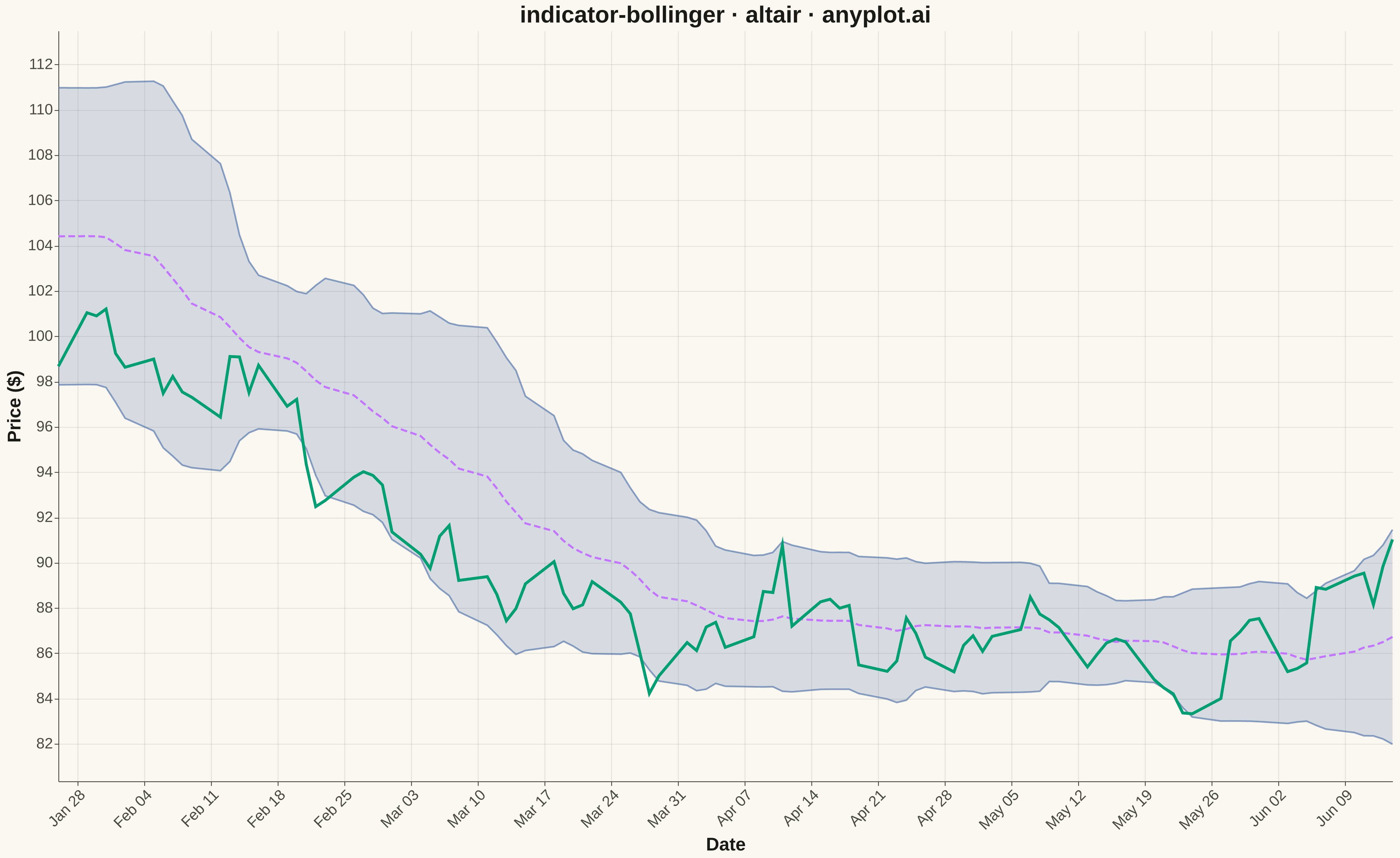
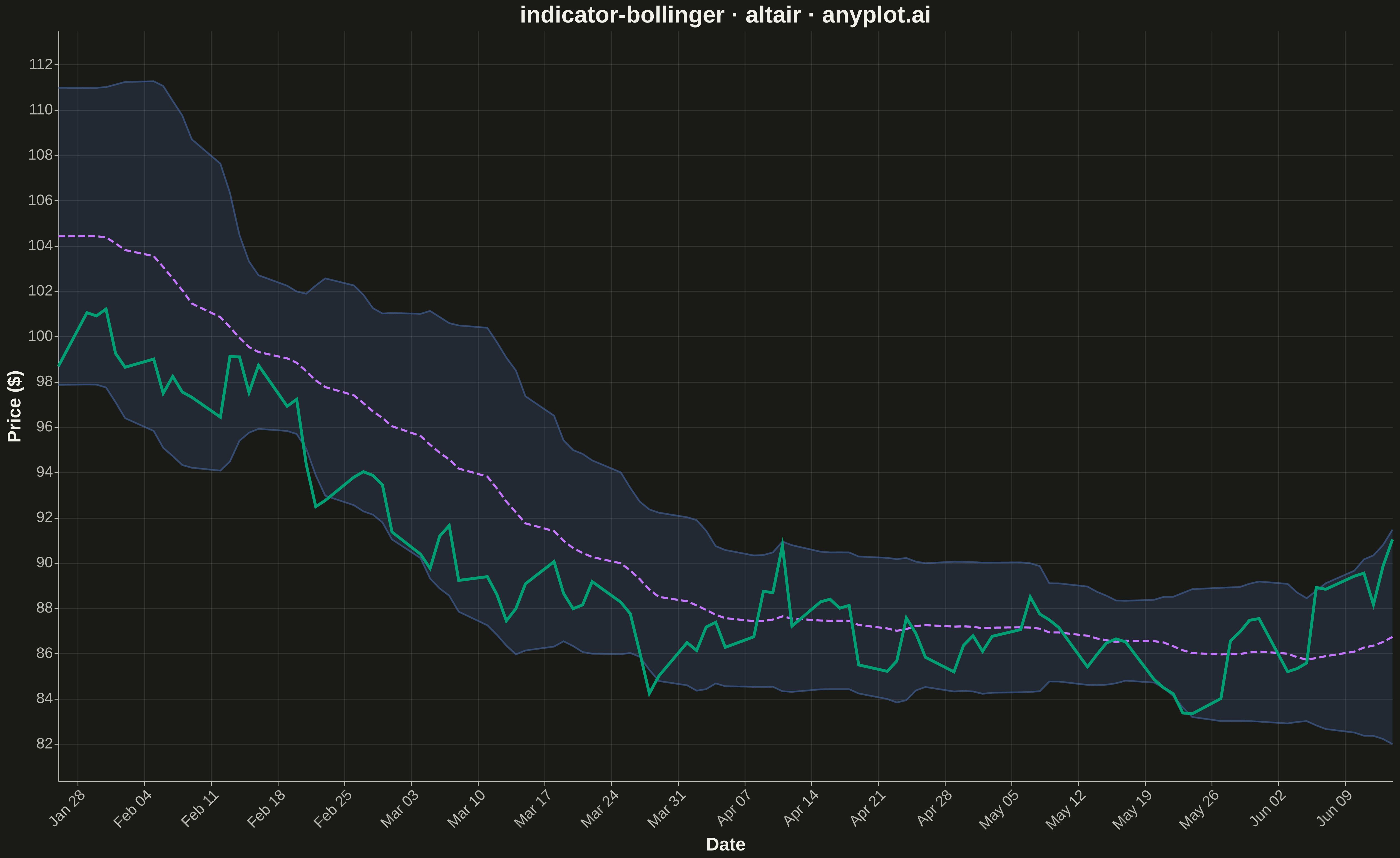
A Bollinger Bands chart displays price data with a volatility envelope consisting of three lines: a middle band (simple moving average), an upper band (SMA plus 2 standard deviations), and a lower band (SMA minus 2 standard deviations). This technical indicator helps traders identify overbought/oversold conditions, volatility patterns, and potential price breakouts by showing how prices relate to their recent statistical range.
""" anyplot.ai
indicator-bollinger: Bollinger Bands Indicator Chart
Library: altair 6.1.0 | Python 3.13.13
Quality: 99/100 | Updated: 2026-05-17
"""

import os
import sys

import numpy as np
import pandas as pd


sys.path = [p for p in sys.path if p != "" and p != os.getcwd()]
import altair as alt


# Theme tokens
THEME = os.getenv("ANYPLOT_THEME", "light")
PAGE_BG = "#FAF8F1" if THEME == "light" else "#1A1A17"
ELEVATED_BG = "#FFFDF6" if THEME == "light" else "#242420"
INK = "#1A1A17" if THEME == "light" else "#F0EFE8"
INK_SOFT = "#4A4A44" if THEME == "light" else "#B8B7B0"

# Data colors (Okabe-Ito palette - theme-independent)
PRICE_COLOR = "#009E73"  # Position 1: brand green
SMA_COLOR = "#C475FD"  # Position 2: vermillion
BAND_COLOR = "#4467A3"  # Position 3: blue

# Data - Simulated stock price with realistic Bollinger Bands
np.random.seed(42)
n_days = 120
dates = pd.date_range("2024-01-01", periods=n_days, freq="B")  # Business days

# Generate price series with trend and volatility changes
returns = np.random.randn(n_days) * 0.015  # Daily returns ~1.5% std
returns[:30] += 0.002  # Uptrend start
returns[50:70] -= 0.003  # Downtrend middle
returns[90:] += 0.002  # Recovery end
price = 100 * np.cumprod(1 + returns)

# Calculate Bollinger Bands (20-period SMA, 2 std deviations)
window = 20
sma = pd.Series(price).rolling(window=window).mean()
std = pd.Series(price).rolling(window=window).std()
upper_band = sma + 2 * std
lower_band = sma - 2 * std

# Create DataFrame starting from period 20 (where we have valid SMA)
df = pd.DataFrame(
    {
        "date": dates[window - 1 :],
        "close": price[window - 1 :],
        "sma": sma[window - 1 :].values,
        "upper_band": upper_band[window - 1 :].values,
        "lower_band": lower_band[window - 1 :].values,
    }
)

# Calculate Y-axis range with some padding
y_min = df[["close", "lower_band"]].min().min() * 0.98
y_max = df[["close", "upper_band"]].max().max() * 1.02

# Base chart configuration
base = alt.Chart(df).encode(
    x=alt.X("date:T", title="Date", axis=alt.Axis(format="%b %d", labelAngle=-45, tickCount=10))
)

# Band area (filled region between upper and lower bands)
band_area = (
    alt.Chart(df)
    .mark_area(opacity=0.2, color=BAND_COLOR)
    .encode(
        x=alt.X("date:T", title="Date"),
        y=alt.Y("lower_band:Q", title="Price ($)", scale=alt.Scale(domain=[y_min, y_max])),
        y2="upper_band:Q",
    )
)

# Upper band line
upper_line = base.mark_line(strokeWidth=2, color=BAND_COLOR, opacity=0.6).encode(
    y=alt.Y("upper_band:Q", scale=alt.Scale(domain=[y_min, y_max]))
)

# Lower band line
lower_line = base.mark_line(strokeWidth=2, color=BAND_COLOR, opacity=0.6).encode(
    y=alt.Y("lower_band:Q", scale=alt.Scale(domain=[y_min, y_max]))
)

# Middle band (SMA) - dashed line
sma_line = base.mark_line(strokeWidth=2.5, strokeDash=[8, 4], color=SMA_COLOR).encode(
    y=alt.Y("sma:Q", scale=alt.Scale(domain=[y_min, y_max]))
)

# Price line - prominent
price_line = base.mark_line(strokeWidth=3.5, color=PRICE_COLOR).encode(
    y=alt.Y("close:Q", scale=alt.Scale(domain=[y_min, y_max]))
)

# Combine all layers
chart = (
    alt.layer(band_area, upper_line, lower_line, sma_line, price_line)
    .properties(
        width=1600,
        height=900,
        background=PAGE_BG,
        title=alt.Title("indicator-bollinger · altair · anyplot.ai", fontSize=28, anchor="middle"),
    )
    .configure_view(fill=PAGE_BG, stroke=INK_SOFT, strokeWidth=0)
    .configure_axis(
        domainColor=INK_SOFT,
        tickColor=INK_SOFT,
        gridColor=INK,
        gridOpacity=0.1,
        labelColor=INK_SOFT,
        titleColor=INK,
        labelFontSize=18,
        titleFontSize=22,
    )
    .configure_title(color=INK, fontSize=28)
)

# Save outputs
chart.save(f"plot-{THEME}.png", scale_factor=3.0)
chart.save(f"plot-{THEME}.html")
Runnable source as JSON, for any HTTP client: https://api.anyplot.ai/specs/indicator-bollinger/altair/code. Any spec id and library id listed in llms-full.txt fit the same URL shape; every URL below is complete and callable.
{
  "spec_id": "indicator-bollinger",
  "language": "python",
  "library": "altair",
  "page": "https://anyplot.ai/indicator-bollinger/python/altair",
  "hub": "https://anyplot.ai/indicator-bollinger",
  "code_json": "https://api.anyplot.ai/specs/indicator-bollinger/altair/code",
  "spec_json": "https://api.anyplot.ai/specs/indicator-bollinger",
  "render_light_png": "https://storage.googleapis.com/anyplot-images/plots/indicator-bollinger/python/altair/plot-light.png",
  "render_dark_png": "https://storage.googleapis.com/anyplot-images/plots/indicator-bollinger/python/altair/plot-dark.png",
  "interactive_light_html": "https://storage.googleapis.com/anyplot-images/plots/indicator-bollinger/python/altair/plot-light.html",
  "interactive_dark_html": "https://storage.googleapis.com/anyplot-images/plots/indicator-bollinger/python/altair/plot-dark.html",
  "quality_score": 99.0,
  "license": "MIT",
  "guide": "https://anyplot.ai/llms.txt"
}
Part of Bollinger Bands Indicator Chart on anyplot.ai.