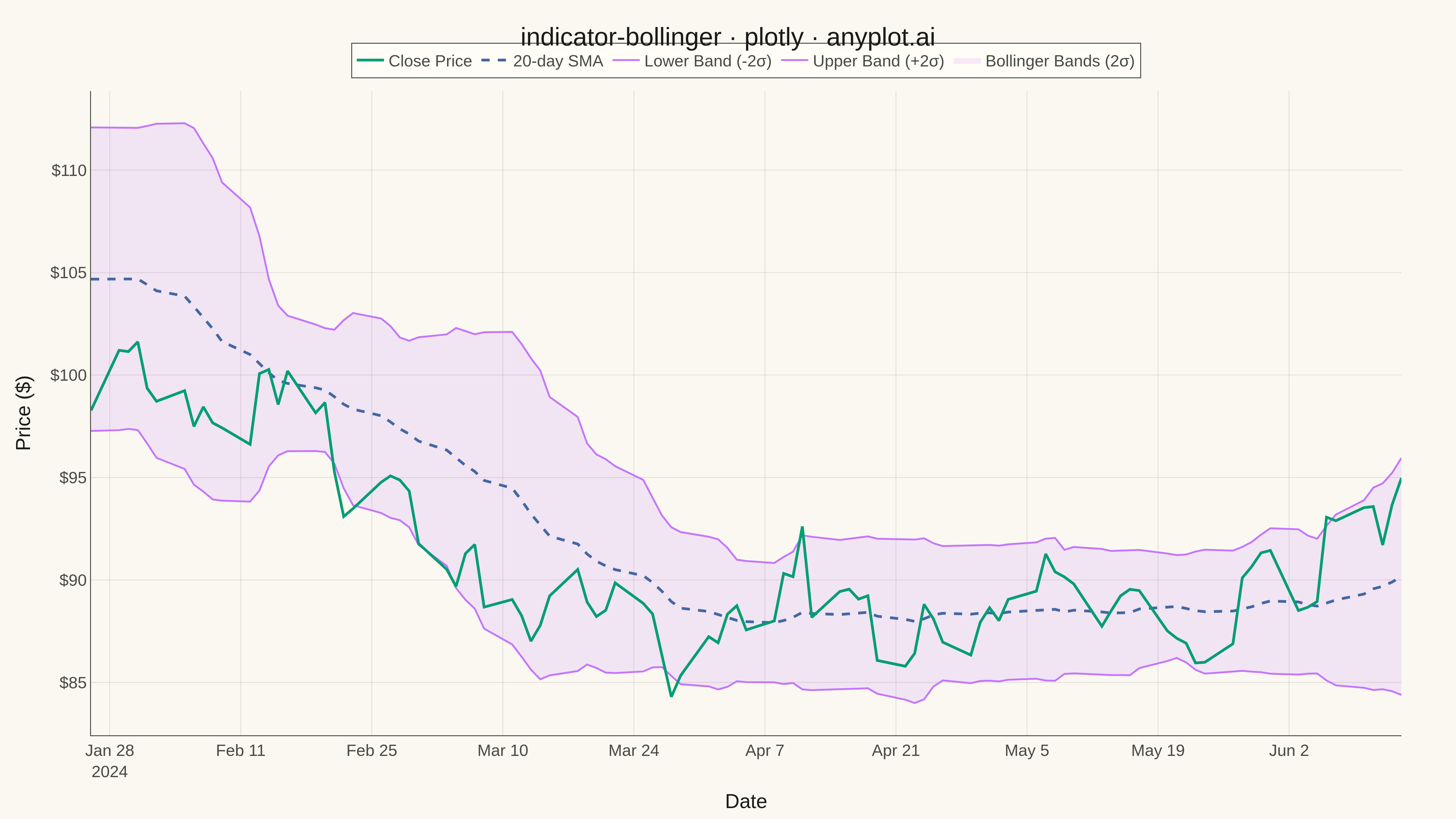
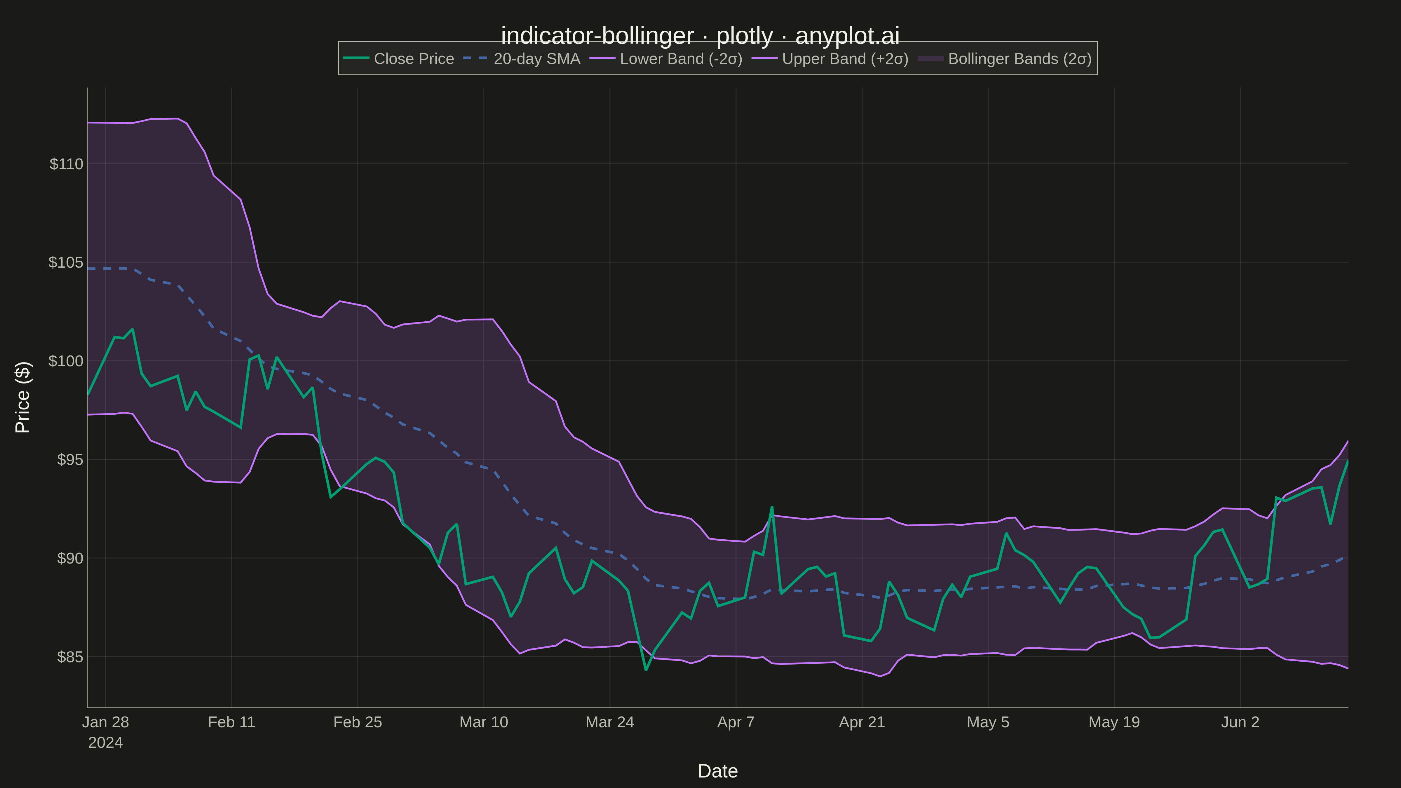
A Bollinger Bands chart displays price data with a volatility envelope consisting of three lines: a middle band (simple moving average), an upper band (SMA plus 2 standard deviations), and a lower band (SMA minus 2 standard deviations). This technical indicator helps traders identify overbought/oversold conditions, volatility patterns, and potential price breakouts by showing how prices relate to their recent statistical range.
""" anyplot.ai
indicator-bollinger: Bollinger Bands Indicator Chart
Library: plotly 6.7.0 | Python 3.13.13
Quality: 90/100 | Updated: 2026-05-17
"""

import os
import sys


# Prioritize venv's site-packages over current directory
if sys.prefix not in sys.path:
    import site

    site_packages = site.getsitepackages()
    if isinstance(site_packages, list):
        sys.path = site_packages + sys.path
    else:
        sys.path.insert(0, site_packages)

import numpy as np
import pandas as pd
import plotly.graph_objects as go


# Theme tokens (see prompts/default-style-guide.md)
THEME = os.getenv("ANYPLOT_THEME", "light")
PAGE_BG = "#FAF8F1" if THEME == "light" else "#1A1A17"
ELEVATED_BG = "#FFFDF6" if THEME == "light" else "#242420"
INK = "#1A1A17" if THEME == "light" else "#F0EFE8"
INK_SOFT = "#4A4A44" if THEME == "light" else "#B8B7B0"
GRID = "rgba(26,26,23,0.10)" if THEME == "light" else "rgba(240,239,232,0.10)"
BRAND = "#009E73"  # Okabe-Ito position 1 — close price
IMPRINT = [
    "#C475FD",  # position 2 — upper/lower bands
    "#4467A3",  # position 3 — SMA
    "#BD8233",
    "#AE3030",
    "#2ABCCD",
    "#954477",
]

# Data - Generate realistic stock price data with Bollinger Bands
np.random.seed(42)
n_periods = 120

# Generate synthetic stock price data with trends and volatility
dates = pd.date_range("2024-01-01", periods=n_periods, freq="B")  # Business days
returns = np.random.normal(0.0005, 0.018, n_periods)
# Add some trending behavior
trend = np.sin(np.linspace(0, 3 * np.pi, n_periods)) * 0.003
returns = returns + trend
price = 100 * np.cumprod(1 + returns)

# Calculate Bollinger Bands (20-period SMA, 2 standard deviations)
window = 20
df = pd.DataFrame({"date": dates, "close": price})
df["sma"] = df["close"].rolling(window=window).mean()
df["std"] = df["close"].rolling(window=window).std()
df["upper_band"] = df["sma"] + 2 * df["std"]
df["lower_band"] = df["sma"] - 2 * df["std"]

# Remove NaN values from rolling calculation
df = df.dropna().reset_index(drop=True)

# Create figure
fig = go.Figure()

# Add the filled area between bands (volatility envelope)
fig.add_trace(
    go.Scatter(x=df["date"], y=df["upper_band"], mode="lines", line={"width": 0}, showlegend=False, hoverinfo="skip")
)

fig.add_trace(
    go.Scatter(
        x=df["date"],
        y=df["lower_band"],
        mode="lines",
        line={"width": 0},
        fill="tonexty",
        fillcolor=f"rgba({int(IMPRINT[0][1:3], 16)}, {int(IMPRINT[0][3:5], 16)}, {int(IMPRINT[0][5:7], 16)}, 0.15)",
        name="Bollinger Bands (2σ)",
        hoverinfo="skip",
    )
)

# Add upper band line
fig.add_trace(
    go.Scatter(
        x=df["date"],
        y=df["upper_band"],
        mode="lines",
        line={"color": IMPRINT[0], "width": 2, "dash": "solid"},
        name="Upper Band (+2σ)",
        hovertemplate="Upper: $%{y:.2f}<extra></extra>",
    )
)

# Add lower band line
fig.add_trace(
    go.Scatter(
        x=df["date"],
        y=df["lower_band"],
        mode="lines",
        line={"color": IMPRINT[0], "width": 2, "dash": "solid"},
        name="Lower Band (-2σ)",
        hovertemplate="Lower: $%{y:.2f}<extra></extra>",
    )
)

# Add middle band (SMA) - dashed line
fig.add_trace(
    go.Scatter(
        x=df["date"],
        y=df["sma"],
        mode="lines",
        line={"color": IMPRINT[1], "width": 3, "dash": "dash"},
        name="20-day SMA",
        hovertemplate="SMA: $%{y:.2f}<extra></extra>",
    )
)

# Add price line (close) - most prominent, brand color
fig.add_trace(
    go.Scatter(
        x=df["date"],
        y=df["close"],
        mode="lines",
        line={"color": BRAND, "width": 3},
        name="Close Price",
        hovertemplate="Date: %{x|%Y-%m-%d}<br>Close: $%{y:.2f}<extra></extra>",
    )
)

# Update layout with theme-adaptive colors
fig.update_layout(
    title={
        "text": "indicator-bollinger · plotly · anyplot.ai",
        "font": {"size": 28, "color": INK},
        "x": 0.5,
        "xanchor": "center",
    },
    xaxis={
        "title": {"text": "Date", "font": {"size": 22, "color": INK}},
        "tickfont": {"size": 18, "color": INK_SOFT},
        "showgrid": True,
        "gridcolor": GRID,
        "gridwidth": 1,
        "linecolor": INK_SOFT,
    },
    yaxis={
        "title": {"text": "Price ($)", "font": {"size": 22, "color": INK}},
        "tickfont": {"size": 18, "color": INK_SOFT},
        "tickformat": "$.0f",
        "showgrid": True,
        "gridcolor": GRID,
        "gridwidth": 1,
        "linecolor": INK_SOFT,
    },
    paper_bgcolor=PAGE_BG,
    plot_bgcolor=PAGE_BG,
    legend={
        "font": {"size": 18, "color": INK_SOFT},
        "orientation": "h",
        "yanchor": "bottom",
        "y": 1.02,
        "xanchor": "center",
        "x": 0.5,
        "bgcolor": ELEVATED_BG,
        "bordercolor": INK_SOFT,
        "borderwidth": 1,
    },
    margin={"l": 100, "r": 60, "t": 100, "b": 80},
    hovermode="x unified",
)

# Save as PNG (4800 x 2700 px)
fig.write_image(f"plot-{THEME}.png", width=1600, height=900, scale=3)

# Save interactive HTML version
fig.write_html(f"plot-{THEME}.html", include_plotlyjs="cdn")
Runnable source as JSON, for any HTTP client: https://api.anyplot.ai/specs/indicator-bollinger/plotly/code. Any spec id and library id listed in llms-full.txt fit the same URL shape; every URL below is complete and callable.
{
  "spec_id": "indicator-bollinger",
  "language": "python",
  "library": "plotly",
  "page": "https://anyplot.ai/indicator-bollinger/python/plotly",
  "hub": "https://anyplot.ai/indicator-bollinger",
  "code_json": "https://api.anyplot.ai/specs/indicator-bollinger/plotly/code",
  "spec_json": "https://api.anyplot.ai/specs/indicator-bollinger",
  "render_light_png": "https://storage.googleapis.com/anyplot-images/plots/indicator-bollinger/python/plotly/plot-light.png",
  "render_dark_png": "https://storage.googleapis.com/anyplot-images/plots/indicator-bollinger/python/plotly/plot-dark.png",
  "interactive_light_html": "https://storage.googleapis.com/anyplot-images/plots/indicator-bollinger/python/plotly/plot-light.html",
  "interactive_dark_html": "https://storage.googleapis.com/anyplot-images/plots/indicator-bollinger/python/plotly/plot-dark.html",
  "quality_score": 90.0,
  "license": "MIT",
  "guide": "https://anyplot.ai/llms.txt"
}
Part of Bollinger Bands Indicator Chart on anyplot.ai.