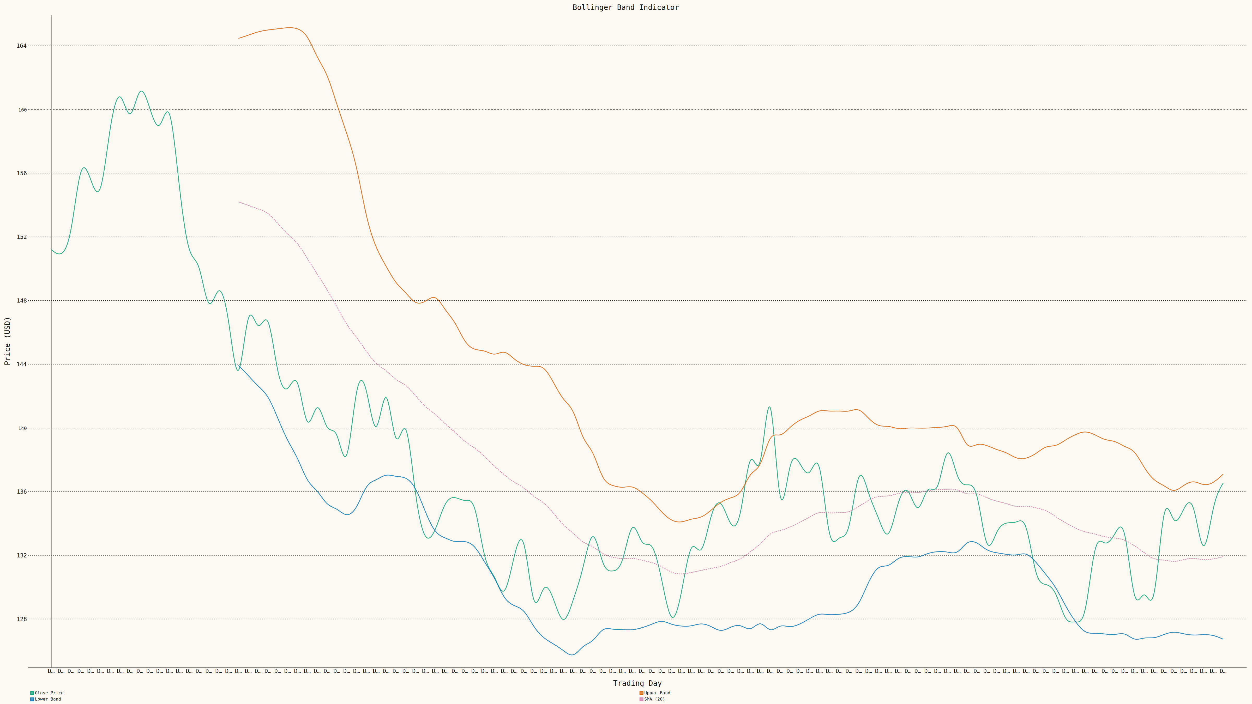
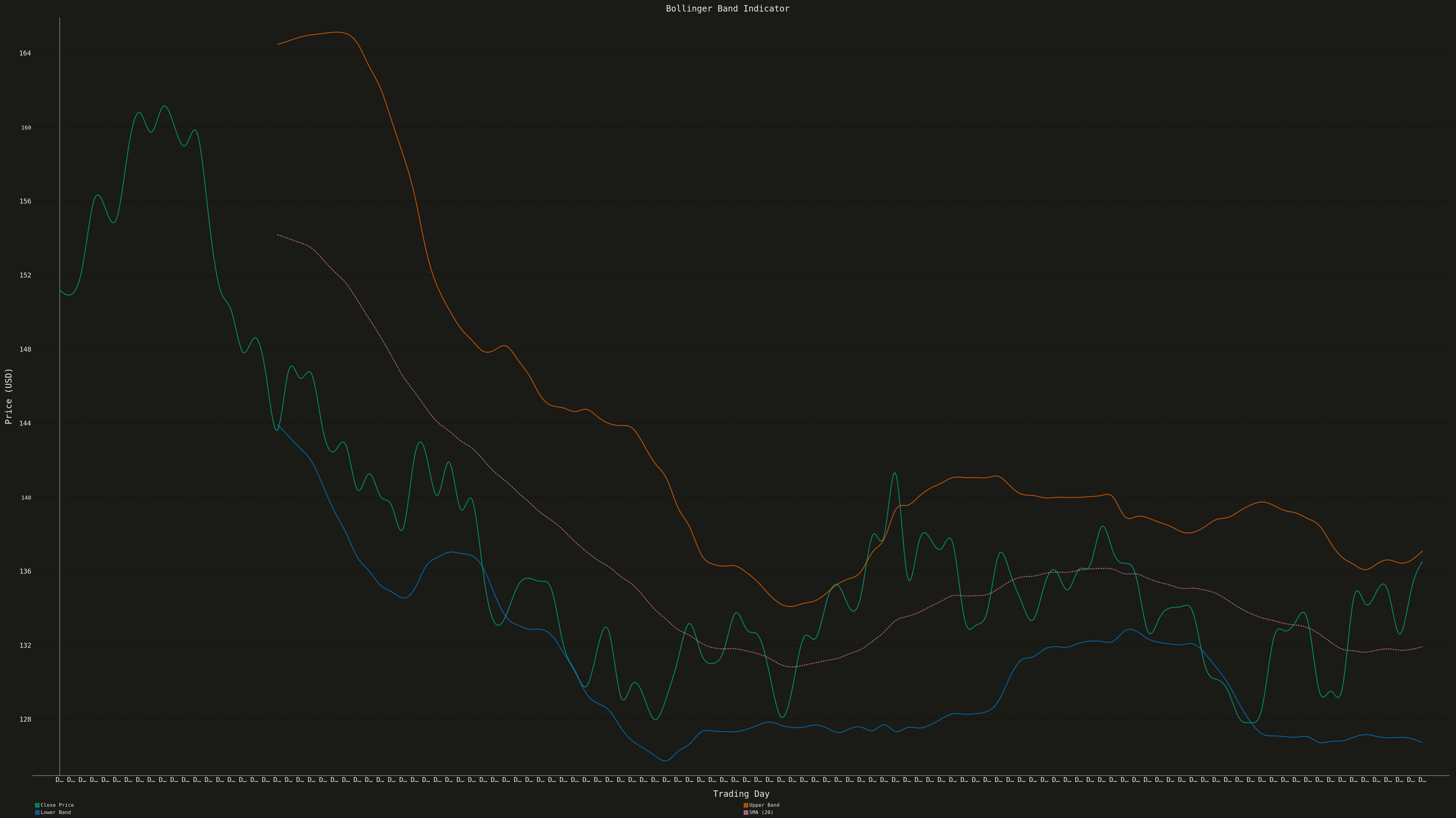
A Bollinger Bands chart displays price data with a volatility envelope consisting of three lines: a middle band (simple moving average), an upper band (SMA plus 2 standard deviations), and a lower band (SMA minus 2 standard deviations). This technical indicator helps traders identify overbought/oversold conditions, volatility patterns, and potential price breakouts by showing how prices relate to their recent statistical range.
""" anyplot.ai
indicator-bollinger: Bollinger Bands Indicator Chart
Library: pygal 3.1.0 | Python 3.13.13
Quality: 67/100 | Updated: 2026-05-17
"""

import numpy as np
import pygal
from pygal.style import Style


# Seed for reproducibility
np.random.seed(42)

# Generate realistic stock price data (120 trading days)
n_days = 120
base_price = 150

# Generate price movements with trend and volatility
returns = np.random.normal(0.0005, 0.015, n_days)
prices = base_price * np.cumprod(1 + returns)

# Calculate Bollinger Bands (20-period SMA with 2 standard deviations)
window = 20
sma = np.array([np.mean(prices[max(0, i - window + 1) : i + 1]) if i >= window - 1 else None for i in range(n_days)])
std = np.array([np.std(prices[max(0, i - window + 1) : i + 1]) if i >= window - 1 else None for i in range(n_days)])
upper_band = np.array([sma[i] + 2 * std[i] if sma[i] is not None else None for i in range(n_days)])
lower_band = np.array([sma[i] - 2 * std[i] if sma[i] is not None else None for i in range(n_days)])

# Create x-axis labels (trading days)
x_labels = [f"Day {i + 1}" for i in range(n_days)]

# Custom style for 4800x2700 canvas with subtle grid
custom_style = Style(
    background="white",
    plot_background="white",
    foreground="#333333",
    foreground_strong="#333333",
    foreground_subtle="#CCCCCC",  # Subtle gray for grid lines
    colors=("#306998", "#FFD43B", "#5A9BD4", "#8BC34A"),  # Price (blue), SMA (gold), Upper (steel blue), Lower (green)
    title_font_size=72,
    label_font_size=42,
    major_label_font_size=36,
    legend_font_size=42,
    value_font_size=32,
    tooltip_font_size=28,
    stroke_width=4,
    opacity=0.9,
    opacity_hover=1.0,
    guide_stroke_color="#E0E0E0",  # Very subtle guide lines
    guide_stroke_dasharray="4,4",
)

# Create line chart with filled band area
chart = pygal.Line(
    width=4800,
    height=2700,
    style=custom_style,
    title="indicator-bollinger · pygal · pyplots.ai",
    x_title="Trading Day",
    y_title="Price (USD)",
    show_x_guides=False,
    show_y_guides=True,
    x_label_rotation=45,
    show_dots=False,
    stroke_style={"width": 4},
    legend_at_bottom=True,
    legend_box_size=30,
    truncate_label=10,
    show_minor_x_labels=False,
    x_labels_major_every=20,
    interpolate="cubic",
    margin=50,
    spacing=30,
)

# Set x labels
chart.x_labels = x_labels

# Prepare band data with fill between upper and lower bands
upper_band_list = [float(v) if v is not None else None for v in upper_band]
lower_band_list = [float(v) if v is not None else None for v in lower_band]

# Add upper band with fill to create visual band area
chart.add("Upper Band", upper_band_list, stroke_style={"width": 3}, fill=True, allow_interruptions=True)

# Add lower band with fill (fills down, but creates visual contrast)
chart.add("Lower Band", lower_band_list, stroke_style={"width": 3}, fill=True, allow_interruptions=True)

# Add SMA as dashed line (middle band)
chart.add(
    "SMA (20)",
    [float(v) if v is not None else None for v in sma],
    stroke_style={"width": 4, "dasharray": "10,5"},
    fill=False,
)

# Add close price on top for visibility
chart.add("Close Price", prices.tolist(), stroke_style={"width": 5, "dasharray": "0"}, fill=False)

# Save as PNG and HTML
chart.render_to_png("plot.png")
chart.render_to_file("plot.html")
Runnable source as JSON, for any HTTP client: https://api.anyplot.ai/specs/indicator-bollinger/pygal/code. Any spec id and library id listed in llms-full.txt fit the same URL shape; every URL below is complete and callable.
{
  "spec_id": "indicator-bollinger",
  "language": "python",
  "library": "pygal",
  "page": "https://anyplot.ai/indicator-bollinger/python/pygal",
  "hub": "https://anyplot.ai/indicator-bollinger",
  "code_json": "https://api.anyplot.ai/specs/indicator-bollinger/pygal/code",
  "spec_json": "https://api.anyplot.ai/specs/indicator-bollinger",
  "render_light_png": "https://storage.googleapis.com/anyplot-images/plots/indicator-bollinger/python/pygal/plot-light.png",
  "render_dark_png": "https://storage.googleapis.com/anyplot-images/plots/indicator-bollinger/python/pygal/plot-dark.png",
  "interactive_light_html": "https://storage.googleapis.com/anyplot-images/plots/indicator-bollinger/python/pygal/plot-light.html",
  "interactive_dark_html": "https://storage.googleapis.com/anyplot-images/plots/indicator-bollinger/python/pygal/plot-dark.html",
  "quality_score": 67.0,
  "license": "MIT",
  "guide": "https://anyplot.ai/llms.txt"
}
Part of Bollinger Bands Indicator Chart on anyplot.ai.