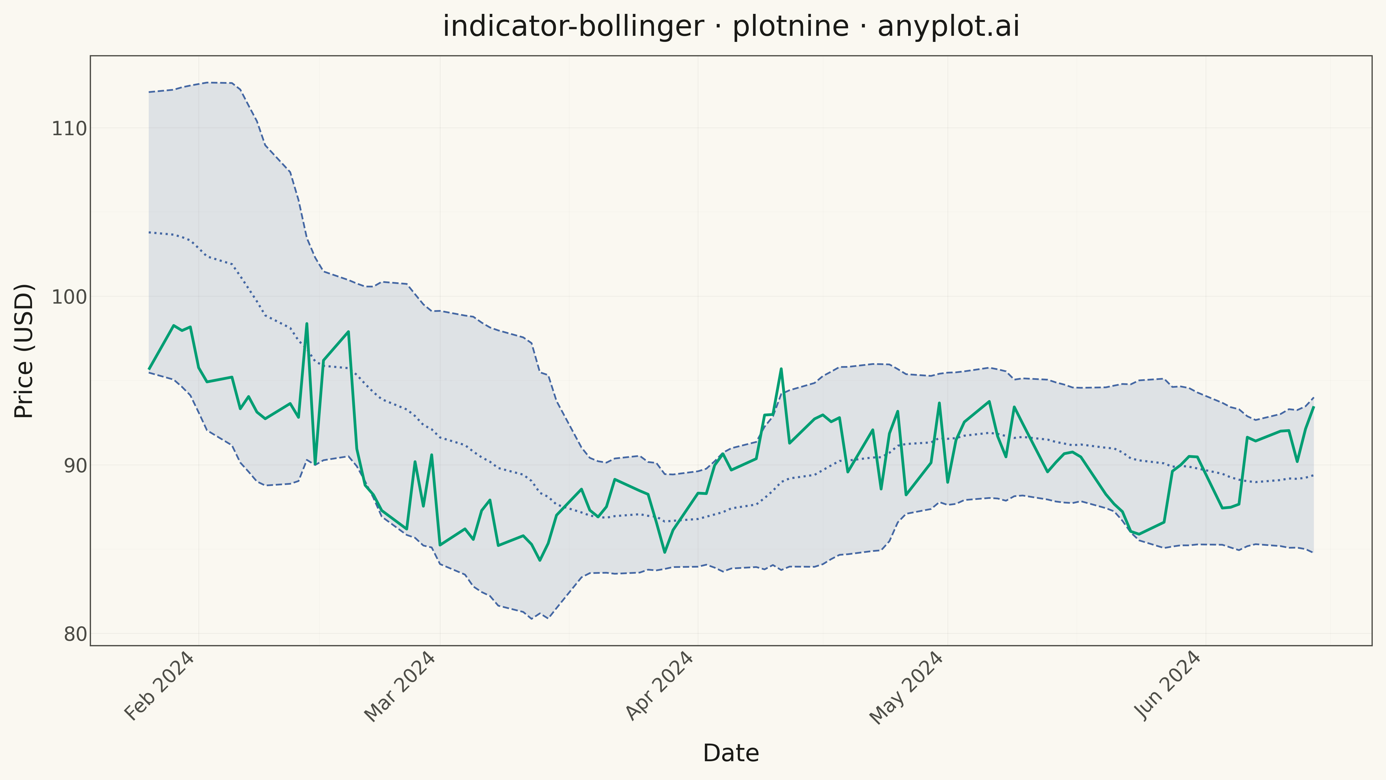
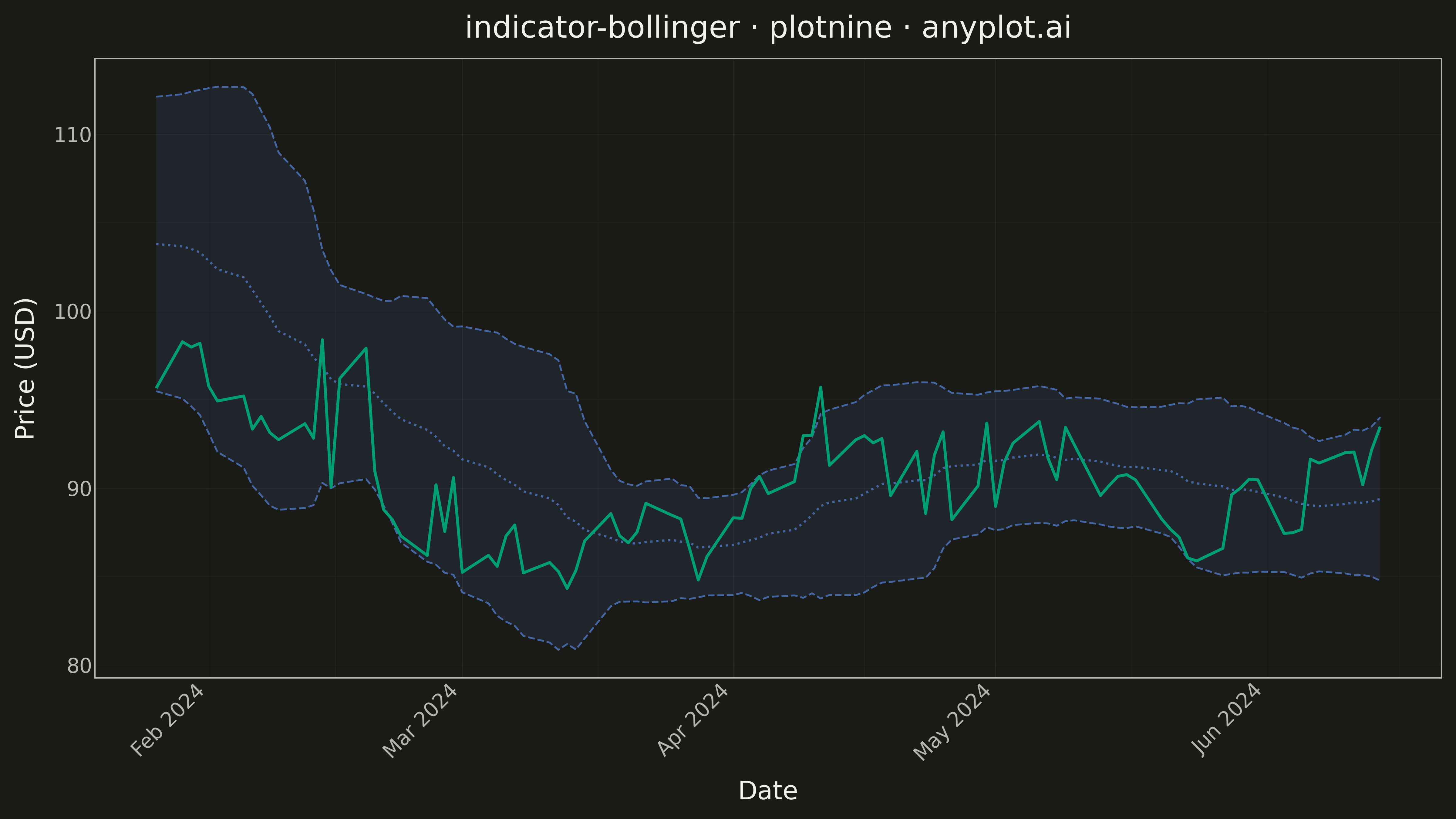
A Bollinger Bands chart displays price data with a volatility envelope consisting of three lines: a middle band (simple moving average), an upper band (SMA plus 2 standard deviations), and a lower band (SMA minus 2 standard deviations). This technical indicator helps traders identify overbought/oversold conditions, volatility patterns, and potential price breakouts by showing how prices relate to their recent statistical range.
""" anyplot.ai
indicator-bollinger: Bollinger Bands Indicator Chart
Library: plotnine 0.15.4 | Python 3.13.13
Quality: 91/100 | Updated: 2026-05-17
"""

import os

import numpy as np
import pandas as pd
from plotnine import (
    aes,
    element_line,
    element_rect,
    element_text,
    geom_line,
    geom_ribbon,
    ggplot,
    labs,
    scale_x_datetime,
    theme,
    theme_minimal,
)


# Theme tokens
THEME = os.getenv("ANYPLOT_THEME", "light")
PAGE_BG = "#FAF8F1" if THEME == "light" else "#1A1A17"
INK = "#1A1A17" if THEME == "light" else "#F0EFE8"
INK_SOFT = "#4A4A44" if THEME == "light" else "#B8B7B0"
RULE = "rgba(26,26,23,0.10)" if THEME == "light" else "rgba(240,239,232,0.10)"

# Okabe-Ito palette
BRAND = "#009E73"  # Close price - first series
BAND_COLOR = "#4467A3"  # Bollinger bands - second series

# Data - Generate realistic stock price with Bollinger Bands
np.random.seed(42)
n_periods = 120
dates = pd.date_range("2024-01-01", periods=n_periods, freq="B")

# Generate price with trend and volatility
returns = np.random.normal(0.001, 0.018, n_periods)
price = 100 * np.cumprod(1 + returns)

# Add volatility clusters for interesting band patterns
volatility_shock = np.zeros(n_periods)
volatility_shock[30:45] = np.random.normal(0, 0.025, 15)
volatility_shock[80:95] = np.random.normal(0, 0.02, 15)
price = price * (1 + volatility_shock)

# Calculate Bollinger Bands (20-period SMA, 2 standard deviations)
window = 20
sma = pd.Series(price).rolling(window=window).mean()
std = pd.Series(price).rolling(window=window).std()
upper_band = sma + 2 * std
lower_band = sma - 2 * std

# Create DataFrame
df = pd.DataFrame({"date": dates, "close": price, "sma": sma, "upper_band": upper_band, "lower_band": lower_band})

# Remove NaN values from rolling calculation
df = df.dropna().reset_index(drop=True)

# Plot
plot = (
    ggplot(df)
    + geom_ribbon(aes(x="date", ymin="lower_band", ymax="upper_band"), fill=BAND_COLOR, alpha=0.15)
    + geom_line(aes(x="date", y="upper_band"), color=BAND_COLOR, size=0.8, linetype="dashed")
    + geom_line(aes(x="date", y="lower_band"), color=BAND_COLOR, size=0.8, linetype="dashed")
    + geom_line(aes(x="date", y="sma"), color=BAND_COLOR, size=1.0, linetype="dotted")
    + geom_line(aes(x="date", y="close"), color=BRAND, size=1.3)
    + scale_x_datetime(date_labels="%b %Y", date_breaks="1 month")
    + labs(x="Date", y="Price (USD)", title="indicator-bollinger · plotnine · anyplot.ai")
    + theme_minimal()
    + theme(
        figure_size=(16, 9),
        plot_background=element_rect(fill=PAGE_BG, color=PAGE_BG),
        panel_background=element_rect(fill=PAGE_BG),
        panel_grid_major=element_line(color=INK, size=0.3, alpha=0.10),
        panel_grid_minor=element_line(color=INK, size=0.2, alpha=0.05),
        panel_border=element_rect(color=INK_SOFT, fill=None),
        axis_title=element_text(size=20, color=INK),
        axis_text=element_text(size=16, color=INK_SOFT),
        axis_text_x=element_text(angle=45, ha="right"),
        axis_line=element_line(color=INK_SOFT),
        plot_title=element_text(size=24, color=INK),
        text=element_text(size=14, color=INK),
    )
)

# Save
plot.save(f"plot-{THEME}.png", dpi=300, verbose=False)
Runnable source as JSON, for any HTTP client: https://api.anyplot.ai/specs/indicator-bollinger/plotnine/code. Any spec id and library id listed in llms-full.txt fit the same URL shape; every URL below is complete and callable.
{
  "spec_id": "indicator-bollinger",
  "language": "python",
  "library": "plotnine",
  "page": "https://anyplot.ai/indicator-bollinger/python/plotnine",
  "hub": "https://anyplot.ai/indicator-bollinger",
  "code_json": "https://api.anyplot.ai/specs/indicator-bollinger/plotnine/code",
  "spec_json": "https://api.anyplot.ai/specs/indicator-bollinger",
  "render_light_png": "https://storage.googleapis.com/anyplot-images/plots/indicator-bollinger/python/plotnine/plot-light.png",
  "render_dark_png": "https://storage.googleapis.com/anyplot-images/plots/indicator-bollinger/python/plotnine/plot-dark.png",
  "quality_score": 91.0,
  "license": "MIT",
  "guide": "https://anyplot.ai/llms.txt"
}
Part of Bollinger Bands Indicator Chart on anyplot.ai.