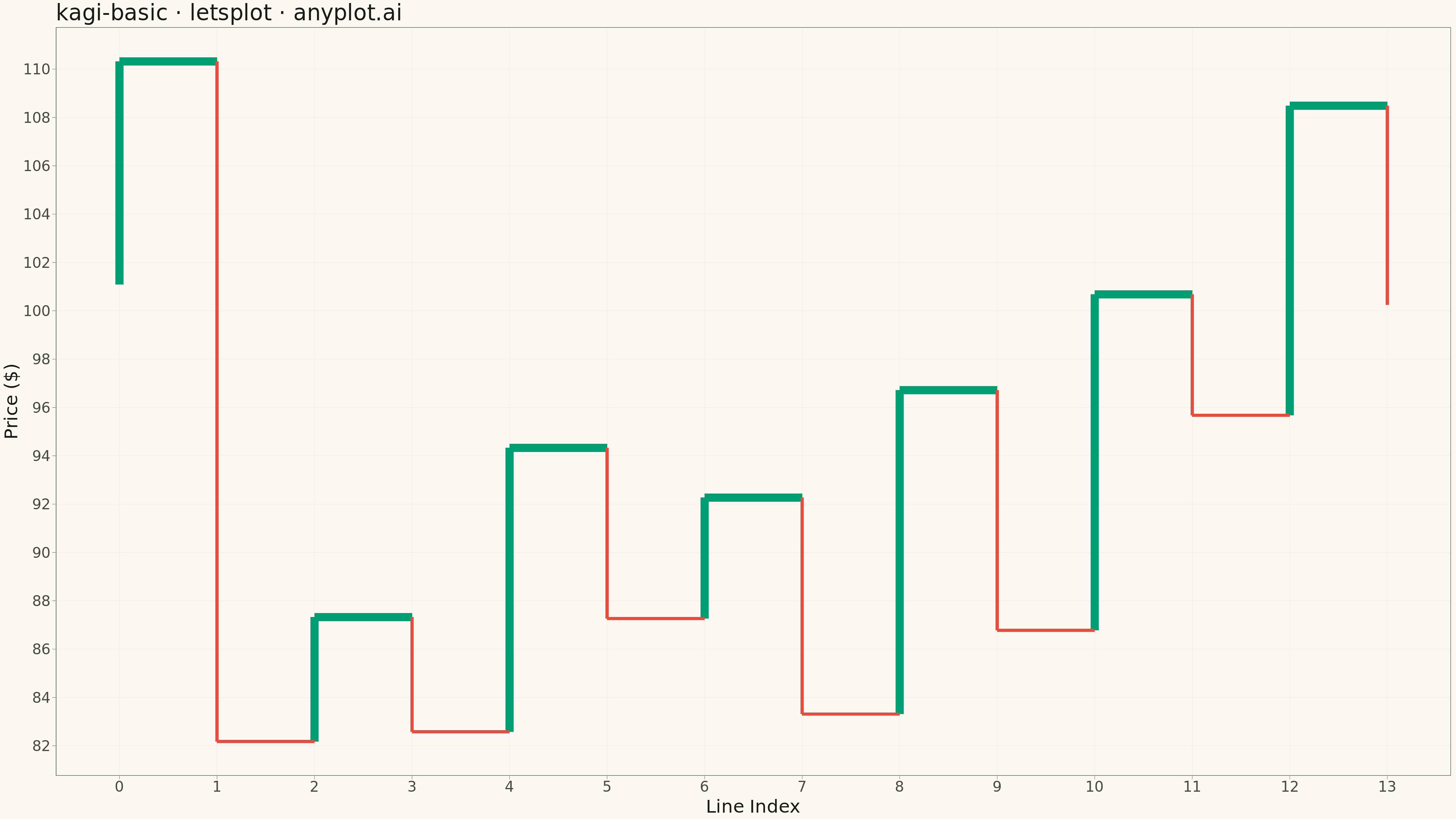
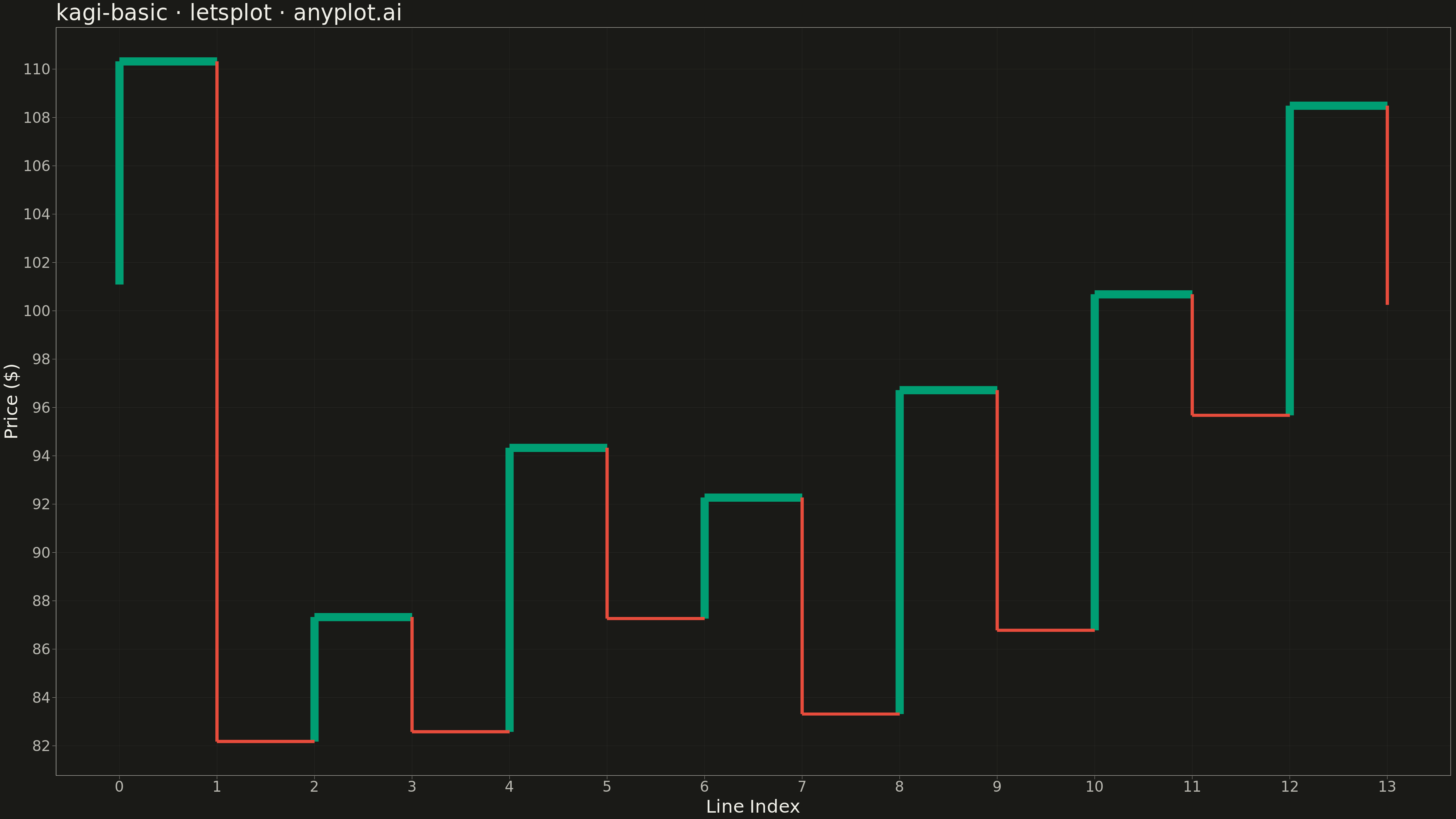
A Kagi chart is a Japanese charting technique that displays price movements using vertical lines of varying thickness. Unlike time-based charts, Kagi charts change direction only when price moves by a significant amount (the reversal threshold), effectively filtering out market noise. Thick lines (yang) indicate uptrends when price exceeds previous highs, while thin lines (yin) show downtrends when price falls below previous lows, making trend identification intuitive.
""" anyplot.ai
kagi-basic: Basic Kagi Chart
Library: letsplot 4.9.0 | Python 3.13.13
Quality: 90/100 | Updated: 2026-05-17
"""

import os

import numpy as np
import pandas as pd
from lets_plot import (
    LetsPlot,
    aes,
    element_blank,
    element_line,
    element_rect,
    element_text,
    geom_segment,
    ggplot,
    ggsize,
    labs,
    theme,
    theme_minimal,
)
from lets_plot.export import ggsave


LetsPlot.setup_html()

# Theme tokens
THEME = os.getenv("ANYPLOT_THEME", "light")
PAGE_BG = "#FAF8F1" if THEME == "light" else "#1A1A17"
ELEVATED_BG = "#FFFDF6" if THEME == "light" else "#242420"
INK = "#1A1A17" if THEME == "light" else "#F0EFE8"
INK_SOFT = "#4A4A44" if THEME == "light" else "#B8B7B0"
GRID_COLOR = "rgba(26,26,23,0.08)" if THEME == "light" else "rgba(240,239,232,0.08)"

# Kagi chart colors (semantic meaning: green for bullish/up, red for bearish/down)
YANG_COLOR = "#009E73"  # Green for bullish/uptrend (yang)
YIN_COLOR = "#E74C3C"  # Red for bearish/downtrend (yin)

# Generate synthetic stock price data
np.random.seed(42)
n_days = 200
returns = np.random.normal(0.001, 0.02, n_days)
prices = 100 * np.cumprod(1 + returns)

# Kagi chart parameters
reversal_threshold = 0.04  # 4% reversal threshold

# Build Kagi chart segments from price data
segments = []
direction = 1  # 1 = up, -1 = down
last_high = prices[0]
last_low = prices[0]
current_price = prices[0]
x_idx = 0

for price in prices[1:]:
    if direction == 1:  # Currently in uptrend
        if price > last_high:
            last_high = price
            current_price = price
        elif price <= current_price * (1 - reversal_threshold):
            # Add vertical yang (thick) line
            segments.append({"x1": x_idx, "y1": last_low, "x2": x_idx, "y2": last_high, "line_type": "yang"})
            x_idx += 1
            # Add horizontal shoulder
            segments.append({"x1": x_idx - 1, "y1": last_high, "x2": x_idx, "y2": last_high, "line_type": "yang"})
            # Change direction
            direction = -1
            last_low = price
            current_price = price
    else:  # Currently in downtrend
        if price < last_low:
            last_low = price
            current_price = price
        elif price >= current_price * (1 + reversal_threshold):
            # Add vertical yin (thin) line
            segments.append({"x1": x_idx, "y1": last_high, "x2": x_idx, "y2": last_low, "line_type": "yin"})
            x_idx += 1
            # Add horizontal waist
            segments.append({"x1": x_idx - 1, "y1": last_low, "x2": x_idx, "y2": last_low, "line_type": "yin"})
            # Change direction
            direction = 1
            last_high = price
            current_price = price

# Add final segment
if direction == 1:
    segments.append({"x1": x_idx, "y1": last_low, "x2": x_idx, "y2": current_price, "line_type": "yang"})
else:
    segments.append({"x1": x_idx, "y1": last_high, "x2": x_idx, "y2": current_price, "line_type": "yin"})

# Create dataframe and separate by line type
kagi_df = pd.DataFrame(segments)
yang_df = kagi_df[kagi_df["line_type"] == "yang"].copy()
yin_df = kagi_df[kagi_df["line_type"] == "yin"].copy()

# Create the plot
plot = (
    ggplot()
    + geom_segment(
        aes(x="x1", y="y1", xend="x2", yend="y2"),
        data=yang_df,
        color=YANG_COLOR,
        size=4,  # Thick line for yang
    )
    + geom_segment(
        aes(x="x1", y="y1", xend="x2", yend="y2"),
        data=yin_df,
        color=YIN_COLOR,
        size=1.5,  # Thin line for yin
    )
    + labs(title="kagi-basic · letsplot · anyplot.ai", x="Line Index", y="Price ($)")
    + theme_minimal()
    + theme(
        plot_background=element_rect(fill=PAGE_BG, color=PAGE_BG),
        panel_background=element_rect(fill=PAGE_BG),
        panel_grid_major=element_line(color=GRID_COLOR, size=0.3),
        panel_grid_minor=element_blank(),
        axis_title=element_text(size=20, color=INK),
        axis_text=element_text(size=16, color=INK_SOFT),
        axis_line=element_line(color=INK_SOFT, size=0.4),
        plot_title=element_text(size=24, color=INK),
        legend_background=element_rect(fill=ELEVATED_BG, color=INK_SOFT),
        legend_text=element_text(size=14, color=INK_SOFT),
        legend_title=element_text(size=16, color=INK),
    )
    + ggsize(1600, 900)
)

# Save as PNG (scaled 3x for 4800x2700 px)
ggsave(plot, f"plot-{THEME}.png", path=".", scale=3)

# Save as HTML for interactive viewing
ggsave(plot, f"plot-{THEME}.html", path=".")
Runnable source as JSON, for any HTTP client: https://api.anyplot.ai/specs/kagi-basic/letsplot/code. Any spec id and library id listed in llms-full.txt fit the same URL shape; every URL below is complete and callable.
{
  "spec_id": "kagi-basic",
  "language": "python",
  "library": "letsplot",
  "page": "https://anyplot.ai/kagi-basic/python/letsplot",
  "hub": "https://anyplot.ai/kagi-basic",
  "code_json": "https://api.anyplot.ai/specs/kagi-basic/letsplot/code",
  "spec_json": "https://api.anyplot.ai/specs/kagi-basic",
  "render_light_png": "https://storage.googleapis.com/anyplot-images/plots/kagi-basic/python/letsplot/plot-light.png",
  "render_dark_png": "https://storage.googleapis.com/anyplot-images/plots/kagi-basic/python/letsplot/plot-dark.png",
  "interactive_light_html": "https://storage.googleapis.com/anyplot-images/plots/kagi-basic/python/letsplot/plot-light.html",
  "interactive_dark_html": "https://storage.googleapis.com/anyplot-images/plots/kagi-basic/python/letsplot/plot-dark.html",
  "quality_score": 90.0,
  "license": "MIT",
  "guide": "https://anyplot.ai/llms.txt"
}
Part of Basic Kagi Chart on anyplot.ai.