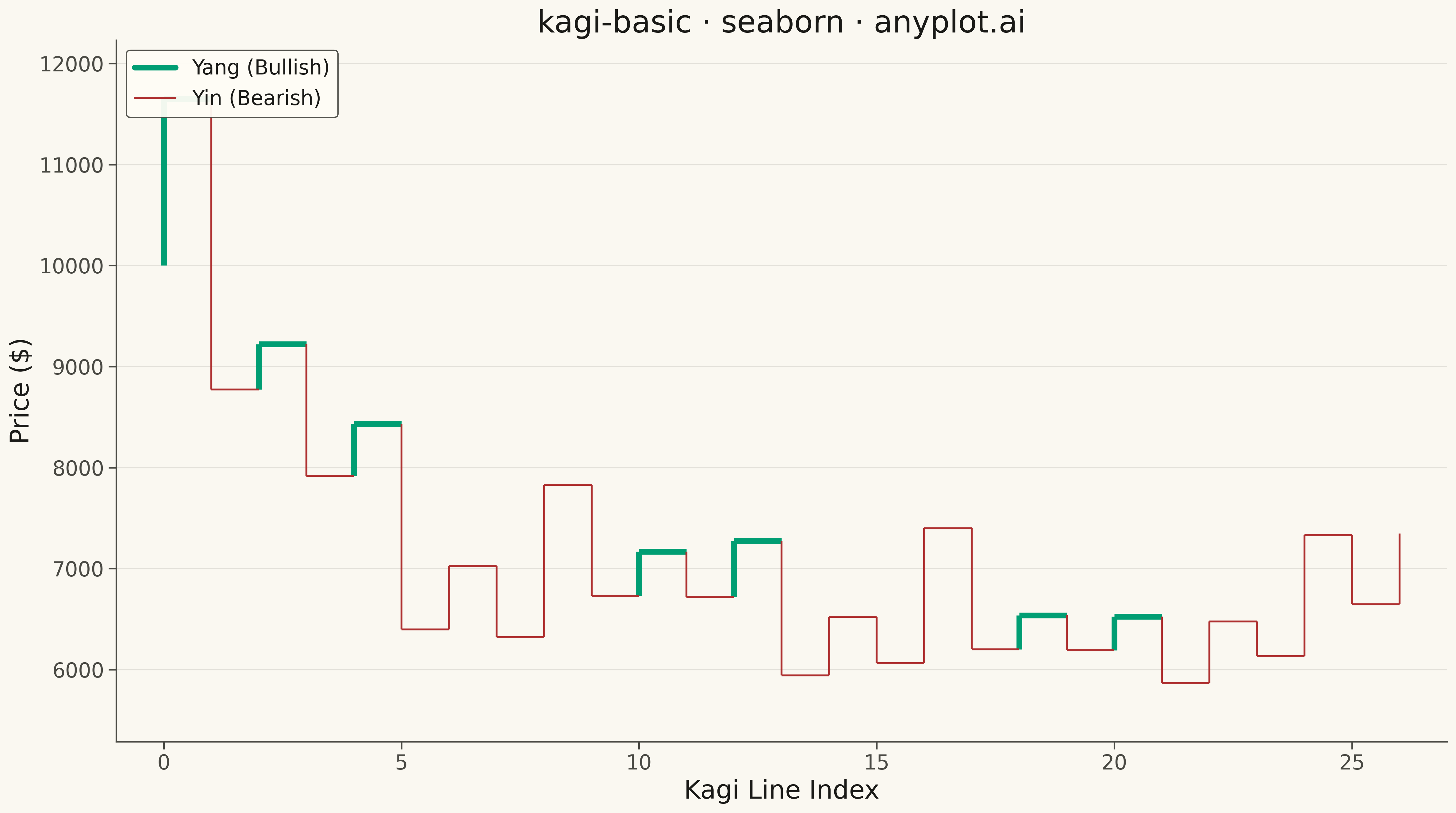
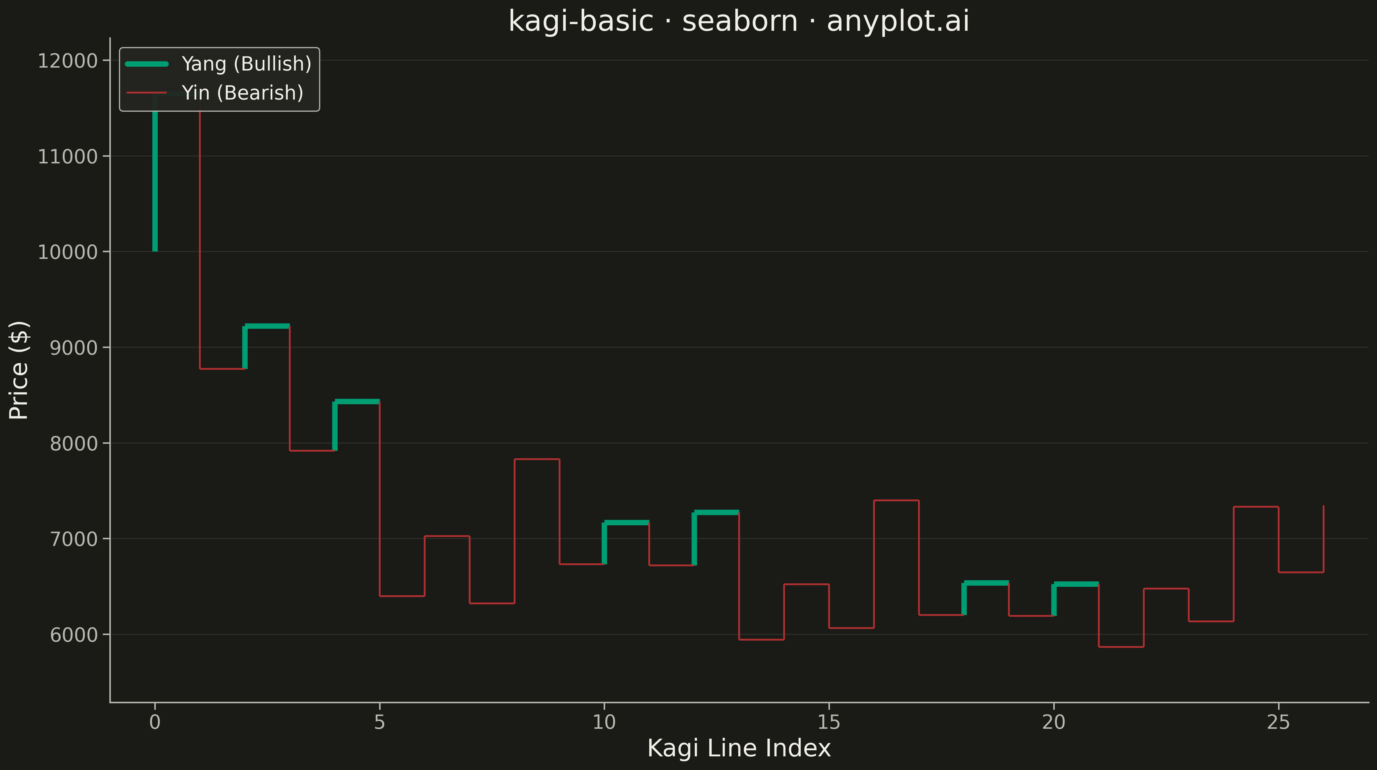
A Kagi chart is a Japanese charting technique that displays price movements using vertical lines of varying thickness. Unlike time-based charts, Kagi charts change direction only when price moves by a significant amount (the reversal threshold), effectively filtering out market noise. Thick lines (yang) indicate uptrends when price exceeds previous highs, while thin lines (yin) show downtrends when price falls below previous lows, making trend identification intuitive.
""" anyplot.ai
kagi-basic: Basic Kagi Chart
Library: seaborn 0.13.2 | Python 3.13.13
Quality: 94/100 | Updated: 2026-05-17
"""

import os

import matplotlib.pyplot as plt
import numpy as np
import pandas as pd
import seaborn as sns


# Theme tokens
THEME = os.getenv("ANYPLOT_THEME", "light")
PAGE_BG = "#FAF8F1" if THEME == "light" else "#1A1A17"
ELEVATED_BG = "#FFFDF6" if THEME == "light" else "#242420"
INK = "#1A1A17" if THEME == "light" else "#F0EFE8"
INK_SOFT = "#4A4A44" if THEME == "light" else "#B8B7B0"

# Configure seaborn theme with theme-adaptive chrome
sns.set_theme(
    style="ticks",
    rc={
        "figure.facecolor": PAGE_BG,
        "axes.facecolor": PAGE_BG,
        "axes.edgecolor": INK_SOFT,
        "axes.labelcolor": INK,
        "text.color": INK,
        "xtick.color": INK_SOFT,
        "ytick.color": INK_SOFT,
        "grid.color": INK,
        "grid.alpha": 0.10,
        "legend.facecolor": ELEVATED_BG,
        "legend.edgecolor": INK_SOFT,
    },
)

# Generate synthetic cryptocurrency price data (different domain from altair)
np.random.seed(42)
n_periods = 180

# Create mean-reverting cryptocurrency price movements (different volatility regime from stock data)
# Simulates crypto volatility with price oscillations around a trend
prices = [10000]
for _ in range(n_periods - 1):
    # Mean reversion toward 11000 with higher volatility
    drift = 0.0002 * (11000 - prices[-1]) / 11000
    volatility = np.random.normal(drift, 0.035, 1)[0]
    new_price = prices[-1] * (1 + volatility)
    prices.append(max(new_price, 1000))  # Prevent negative prices

prices = np.array(prices)

# Kagi chart parameters
reversal_threshold = 0.05  # 5% reversal (crypto-appropriate)

# Build Kagi chart segments from price data
segments = []
direction = None
current_price = prices[0]
last_high = prices[0]
last_low = prices[0]

for price in prices[1:]:
    if direction is None:
        if price > current_price * (1 + reversal_threshold):
            direction = 1
            segments.append({"start": current_price, "end": price, "yang": True})
            last_high = max(last_high, price)
            current_price = price
        elif price < current_price * (1 - reversal_threshold):
            direction = -1
            segments.append({"start": current_price, "end": price, "yang": False})
            last_low = min(last_low, price)
            current_price = price
    elif direction == 1:
        if price > current_price:
            if segments:
                segments[-1]["end"] = price
                segments[-1]["yang"] = price > last_high
            current_price = price
            last_high = max(last_high, price)
        elif price < current_price * (1 - reversal_threshold):
            direction = -1
            segments.append({"start": current_price, "end": price, "yang": False})
            current_price = price
            if price < last_low:
                last_low = price
    else:
        if price < current_price:
            if segments:
                segments[-1]["end"] = price
                segments[-1]["yang"] = False
            current_price = price
            last_low = min(last_low, price)
        elif price > current_price * (1 + reversal_threshold):
            direction = 1
            segments.append({"start": current_price, "end": price, "yang": True})
            current_price = price
            if price > last_high:
                last_high = price

# Build data for plotting
line_data = []
line_id = 0

for i, seg in enumerate(segments):
    segment_type = "Yang" if seg["yang"] else "Yin"

    # Vertical line segment
    line_data.append({"x": i, "y": seg["start"], "segment": line_id, "type": segment_type})
    line_data.append({"x": i, "y": seg["end"], "segment": line_id, "type": segment_type})
    line_id += 1

    # Horizontal connector to next segment
    if i < len(segments) - 1:
        line_data.append({"x": i, "y": seg["end"], "segment": line_id, "type": segment_type})
        line_data.append({"x": i + 1, "y": seg["end"], "segment": line_id, "type": segment_type})
        line_id += 1

df = pd.DataFrame(line_data)

# Create figure
fig, ax = plt.subplots(figsize=(16, 9))

# imprint semantic anchors (green for bullish, red for bearish)
color_yang = "#009E73"  # imprint green — bullish
color_yin = "#AE3030"  # imprint red — bearish

# Plot Yang (bullish) and Yin (bearish) segments with different line widths
for segment_type, color, linewidth in [("Yang", color_yang, 4.5), ("Yin", color_yin, 1.5)]:
    type_df = df[df["type"] == segment_type]
    for seg_id in type_df["segment"].unique():
        seg_df = type_df[type_df["segment"] == seg_id]
        ax.plot(seg_df["x"], seg_df["y"], color=color, linewidth=linewidth, solid_capstyle="butt")

# Create legend with manual line artists
yang_line = plt.Line2D([0], [0], color=color_yang, linewidth=4.5, label="Yang (Bullish)")
yin_line = plt.Line2D([0], [0], color=color_yin, linewidth=1.5, label="Yin (Bearish)")
ax.legend(handles=[yang_line, yin_line], loc="upper left", fontsize=16, framealpha=0.95, frameon=True)

# Labels and styling
ax.set_xlabel("Kagi Line Index", fontsize=20, color=INK)
ax.set_ylabel("Price ($)", fontsize=20, color=INK)
ax.set_title("kagi-basic · seaborn · anyplot.ai", fontsize=24, fontweight="medium", color=INK)
ax.tick_params(axis="both", labelsize=16, colors=INK_SOFT)

# Grid: solid lines with very low opacity
ax.yaxis.grid(True, alpha=0.10, linewidth=0.8, linestyle="-", color=INK)
ax.set_axisbelow(True)

# Remove top and right spines
ax.spines["top"].set_visible(False)
ax.spines["right"].set_visible(False)
ax.spines["left"].set_color(INK_SOFT)
ax.spines["bottom"].set_color(INK_SOFT)

# Set axis limits with padding
y_min = min(min(seg["start"], seg["end"]) for seg in segments)
y_max = max(max(seg["start"], seg["end"]) for seg in segments)
padding = (y_max - y_min) * 0.1
ax.set_ylim(y_min - padding, y_max + padding)
ax.set_xlim(-1, len(segments))

plt.tight_layout()

# Save to the script's directory
script_dir = os.path.dirname(os.path.abspath(__file__))
output_path = os.path.join(script_dir, f"plot-{THEME}.png")
plt.savefig(output_path, dpi=300, bbox_inches="tight", facecolor=PAGE_BG)
plt.close()
Runnable source as JSON, for any HTTP client: https://api.anyplot.ai/specs/kagi-basic/seaborn/code. Any spec id and library id listed in llms-full.txt fit the same URL shape; every URL below is complete and callable.
{
  "spec_id": "kagi-basic",
  "language": "python",
  "library": "seaborn",
  "page": "https://anyplot.ai/kagi-basic/python/seaborn",
  "hub": "https://anyplot.ai/kagi-basic",
  "code_json": "https://api.anyplot.ai/specs/kagi-basic/seaborn/code",
  "spec_json": "https://api.anyplot.ai/specs/kagi-basic",
  "render_light_png": "https://storage.googleapis.com/anyplot-images/plots/kagi-basic/python/seaborn/plot-light.png",
  "render_dark_png": "https://storage.googleapis.com/anyplot-images/plots/kagi-basic/python/seaborn/plot-dark.png",
  "quality_score": 94.0,
  "license": "MIT",
  "guide": "https://anyplot.ai/llms.txt"
}
Part of Basic Kagi Chart on anyplot.ai.