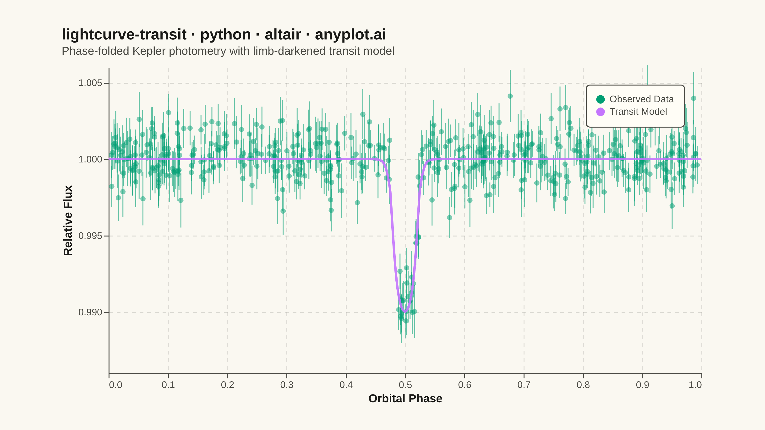
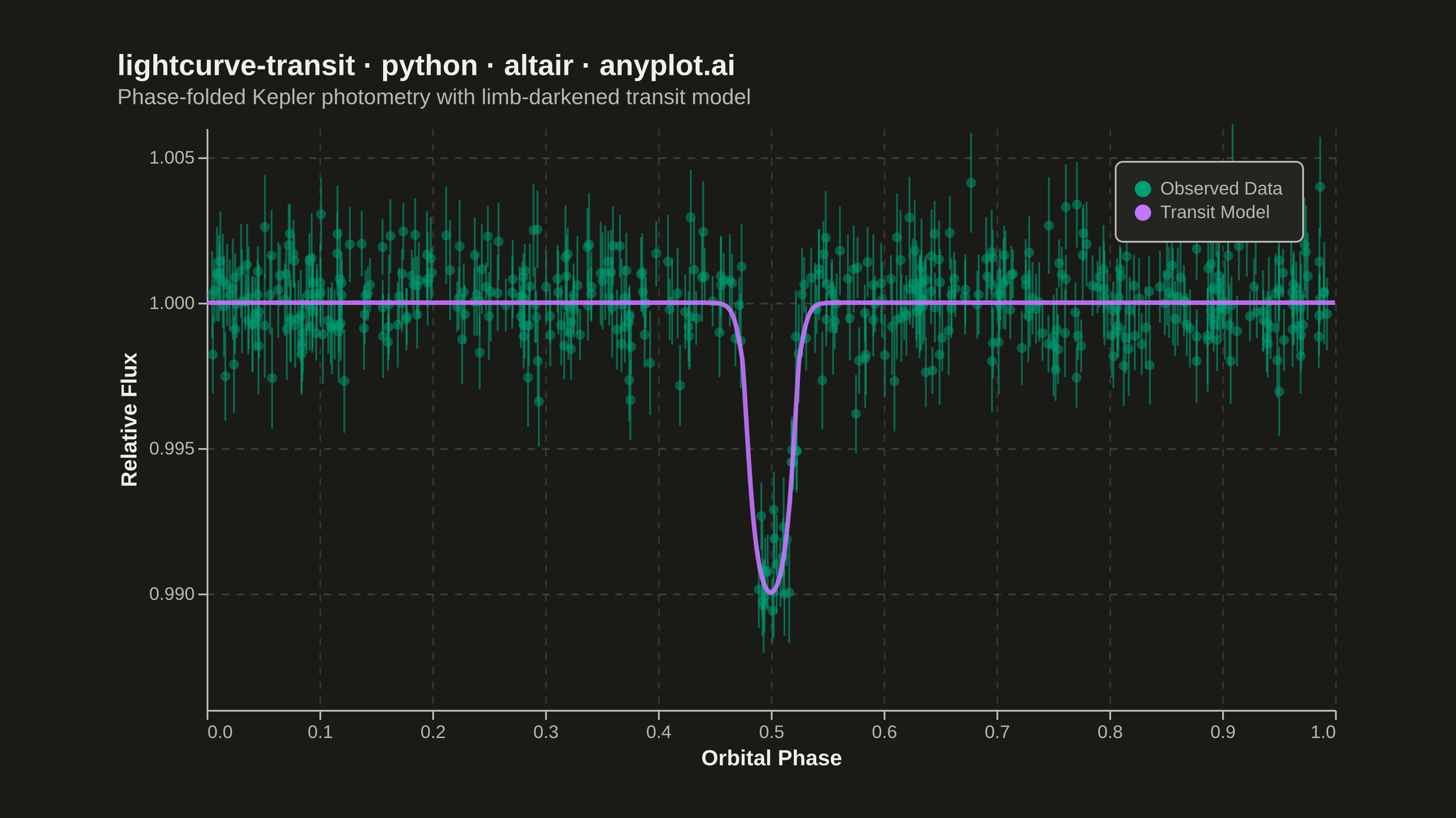
A time-series plot showing the brightness of an astronomical object over time, designed to reveal exoplanet transit events as characteristic dips in flux. The plot displays photometric measurements with error bars against time or orbital phase, with an optional fitted transit model overlay. This visualization is fundamental in observational astronomy for detecting and characterizing planetary transits, variable stars, and other periodic brightness variations.
""" anyplot.ai
lightcurve-transit: Astronomical Light Curve
Library: altair 6.2.1 | Python 3.13.14
Quality: 92/100 | Updated: 2026-06-20
"""

import os
import sys


# Remove script directory from sys.path to avoid importing local altair.py instead of the package
_script_dir = os.path.dirname(os.path.abspath(__file__))
if _script_dir in sys.path:
    sys.path.remove(_script_dir)

import altair as alt
import numpy as np
import pandas as pd
from PIL import Image


# Theme tokens — Imprint palette / default-style-guide.md
THEME = os.getenv("ANYPLOT_THEME", "light")
PAGE_BG = "#FAF8F1" if THEME == "light" else "#1A1A17"
ELEVATED_BG = "#FFFDF6" if THEME == "light" else "#242420"
INK = "#1A1A17" if THEME == "light" else "#F0EFE8"
INK_SOFT = "#4A4A44" if THEME == "light" else "#B8B7B0"
INK_MUTED = "#6B6A63" if THEME == "light" else "#A8A79F"

# Imprint palette — positions 1 and 2 for the two series
COLOR_OBS = "#009E73"  # Imprint position 1 — observed data (brand green, always first)
COLOR_MODEL = "#C475FD"  # Imprint position 2 — fitted transit model

# Data — simulated exoplanet transit light curve (phase-folded)
np.random.seed(42)

n_points = 500
phase = np.sort(np.random.uniform(0.0, 1.0, n_points))

# Transit parameters
transit_center = 0.5
transit_width = 0.025
transit_depth = 0.01
limb_u1, limb_u2 = 0.4, 0.2
sharpness = 120

# Smooth transit model: tanh ingress/egress with quadratic limb darkening
dist = np.abs(phase - transit_center)
box = 0.5 * (np.tanh(sharpness * (transit_width - dist)) + 1.0)
mu = np.clip(1.0 - (dist / transit_width) ** 2, 0, 1)
limb = 1.0 - limb_u1 * (1 - mu) - limb_u2 * (1 - mu) ** 2
model_flux = 1.0 - transit_depth * box * limb

# Observed flux with Gaussian noise
flux_err = np.random.uniform(0.0008, 0.0018, n_points)
flux = model_flux + np.random.normal(0, 1, n_points) * flux_err

df_obs = pd.DataFrame(
    {"phase": phase, "flux": flux, "flux_err": flux_err, "flux_upper": flux + flux_err, "flux_lower": flux - flux_err}
)

# Dense model curve for smooth overlay
phase_model = np.linspace(0.0, 1.0, 2000)
dist_m = np.abs(phase_model - transit_center)
box_m = 0.5 * (np.tanh(sharpness * (transit_width - dist_m)) + 1.0)
mu_m = np.clip(1.0 - (dist_m / transit_width) ** 2, 0, 1)
limb_m = 1.0 - limb_u1 * (1 - mu_m) - limb_u2 * (1 - mu_m) ** 2
model_dense = 1.0 - transit_depth * box_m * limb_m

df_model = pd.DataFrame({"phase": phase_model, "flux": model_dense})

# Legend helper — invisible points to drive one legend entry per series
df_legend = pd.DataFrame(
    {
        "phase": [phase[0], phase_model[0]],
        "flux": [flux[0], model_dense[0]],
        "series": ["Observed Data", "Transit Model"],
    }
)
legend_scale = alt.Scale(domain=["Observed Data", "Transit Model"], range=[COLOR_OBS, COLOR_MODEL])

# Axis objects — grid/format only; colors come from configure_axis below
y_scale = alt.Scale(domain=[0.986, 1.006])
y_axis = alt.Axis(grid=True, gridOpacity=0.15, gridDash=[4, 4], format=".3f", tickCount=6)
x_axis = alt.Axis(grid=True, gridOpacity=0.12, gridDash=[4, 4], tickCount=10)

# Error bars — increased opacity (was 0.2) so they read clearly against the background
error_bars = (
    alt.Chart(df_obs)
    .mark_rule(strokeWidth=1, opacity=0.6, color=COLOR_OBS)
    .encode(
        x=alt.X("phase:Q", title="Orbital Phase", axis=x_axis),
        y=alt.Y("flux_lower:Q", scale=y_scale),
        y2="flux_upper:Q",
    )
)

# Data points
points = (
    alt.Chart(df_obs)
    .mark_circle(size=30, opacity=0.5)
    .encode(
        x=alt.X("phase:Q", title="Orbital Phase", axis=x_axis),
        y=alt.Y("flux:Q", title="Relative Flux", scale=y_scale, axis=y_axis),
        color=alt.value(COLOR_OBS),
        tooltip=[
            alt.Tooltip("phase:Q", title="Phase", format=".4f"),
            alt.Tooltip("flux:Q", title="Flux", format=".5f"),
            alt.Tooltip("flux_err:Q", title="Error", format=".5f"),
        ],
    )
)

# Transit model curve
model_line = (
    alt.Chart(df_model)
    .mark_line(strokeWidth=2.5, opacity=0.9)
    .encode(x=alt.X("phase:Q"), y=alt.Y("flux:Q", scale=y_scale), color=alt.value(COLOR_MODEL))
)

# Invisible points to drive the unified legend
legend_points = (
    alt.Chart(df_legend)
    .mark_point(size=0, filled=True, opacity=0)
    .encode(
        x=alt.X("phase:Q"),
        y=alt.Y("flux:Q", scale=y_scale),
        color=alt.Color(
            "series:N",
            scale=legend_scale,
            legend=alt.Legend(
                title=None,
                orient="top-right",
                labelFontSize=10,
                symbolSize=80,
                padding=10,
                cornerRadius=4,
                fillColor=ELEVATED_BG,
                strokeColor=INK_SOFT,
                labelColor=INK_SOFT,
            ),
        ),
    )
)

# Interactive hover — nearest-point selection with crosshair
nearest = alt.selection_point(nearest=True, on="pointerover", fields=["phase"], empty=False)

selectors = alt.Chart(df_obs).mark_point(size=1, opacity=0).encode(x="phase:Q", y="flux:Q").add_params(nearest)
hover_rule = (
    alt.Chart(df_obs)
    .mark_rule(color=INK_SOFT, strokeWidth=1, strokeDash=[3, 3])
    .encode(x="phase:Q")
    .transform_filter(nearest)
)
hover_point = (
    alt.Chart(df_obs)
    .mark_circle(size=120, color=COLOR_OBS, stroke=COLOR_OBS, strokeWidth=2, opacity=1)
    .encode(x="phase:Q", y="flux:Q")
    .transform_filter(nearest)
)

TITLE = "lightcurve-transit · python · altair · anyplot.ai"

chart = (
    alt.layer(error_bars, points, model_line, legend_points, selectors, hover_rule, hover_point)
    .properties(
        width=620,
        height=320,
        background=PAGE_BG,
        title=alt.Title(
            TITLE,
            fontSize=16,
            fontWeight="bold",
            color=INK,
            subtitle="Phase-folded Kepler photometry with limb-darkened transit model",
            subtitleFontSize=12,
            subtitleColor=INK_SOFT,
            subtitlePadding=4,
            anchor="start",
            offset=8,
        ),
    )
    .configure_view(fill=PAGE_BG, strokeWidth=0)
    .configure_axis(
        labelFontSize=10,
        titleFontSize=12,
        domainColor=INK_SOFT,
        tickColor=INK_SOFT,
        gridColor=INK,
        gridOpacity=0.15,
        labelColor=INK_SOFT,
        titleColor=INK,
    )
    .configure_title(color=INK, subtitleColor=INK_SOFT)
    .configure_legend(
        fillColor=ELEVATED_BG,
        strokeColor=INK_SOFT,
        labelColor=INK_SOFT,
        titleColor=INK,
        labelFontSize=10,
        titleFontSize=10,
    )
)

# Save — landscape 3200 × 1800 target
TW, TH = 3200, 1800
chart.save(f"plot-{THEME}.png", scale_factor=4.0)
chart.save(f"plot-{THEME}.html")

# PAD-only to exact target canvas (do NOT crop — cropping clips title/axis labels)
_img = Image.open(f"plot-{THEME}.png").convert("RGB")
_w, _h = _img.size
if _w > TW or _h > TH:
    raise SystemExit(
        f"altair vl-convert produced {_w}×{_h}, exceeds target {TW}×{TH}. "
        f"Shrink chart .properties(width=, height=) values and re-render."
    )
if _w < TW or _h < TH:
    _canvas = Image.new("RGB", (TW, TH), PAGE_BG)
    _canvas.paste(_img, ((TW - _w) // 2, (TH - _h) // 2))
    _canvas.save(f"plot-{THEME}.png")
Runnable source as JSON, for any HTTP client: https://api.anyplot.ai/specs/lightcurve-transit/altair/code. Any spec id and library id listed in llms-full.txt fit the same URL shape; every URL below is complete and callable.
{
  "spec_id": "lightcurve-transit",
  "language": "python",
  "library": "altair",
  "page": "https://anyplot.ai/lightcurve-transit/python/altair",
  "hub": "https://anyplot.ai/lightcurve-transit",
  "code_json": "https://api.anyplot.ai/specs/lightcurve-transit/altair/code",
  "spec_json": "https://api.anyplot.ai/specs/lightcurve-transit",
  "render_light_png": "https://storage.googleapis.com/anyplot-images/plots/lightcurve-transit/python/altair/plot-light.png",
  "render_dark_png": "https://storage.googleapis.com/anyplot-images/plots/lightcurve-transit/python/altair/plot-dark.png",
  "interactive_light_html": "https://storage.googleapis.com/anyplot-images/plots/lightcurve-transit/python/altair/plot-light.html",
  "interactive_dark_html": "https://storage.googleapis.com/anyplot-images/plots/lightcurve-transit/python/altair/plot-dark.html",
  "quality_score": 92.0,
  "license": "MIT",
  "guide": "https://anyplot.ai/llms.txt"
}
Part of Astronomical Light Curve on anyplot.ai.