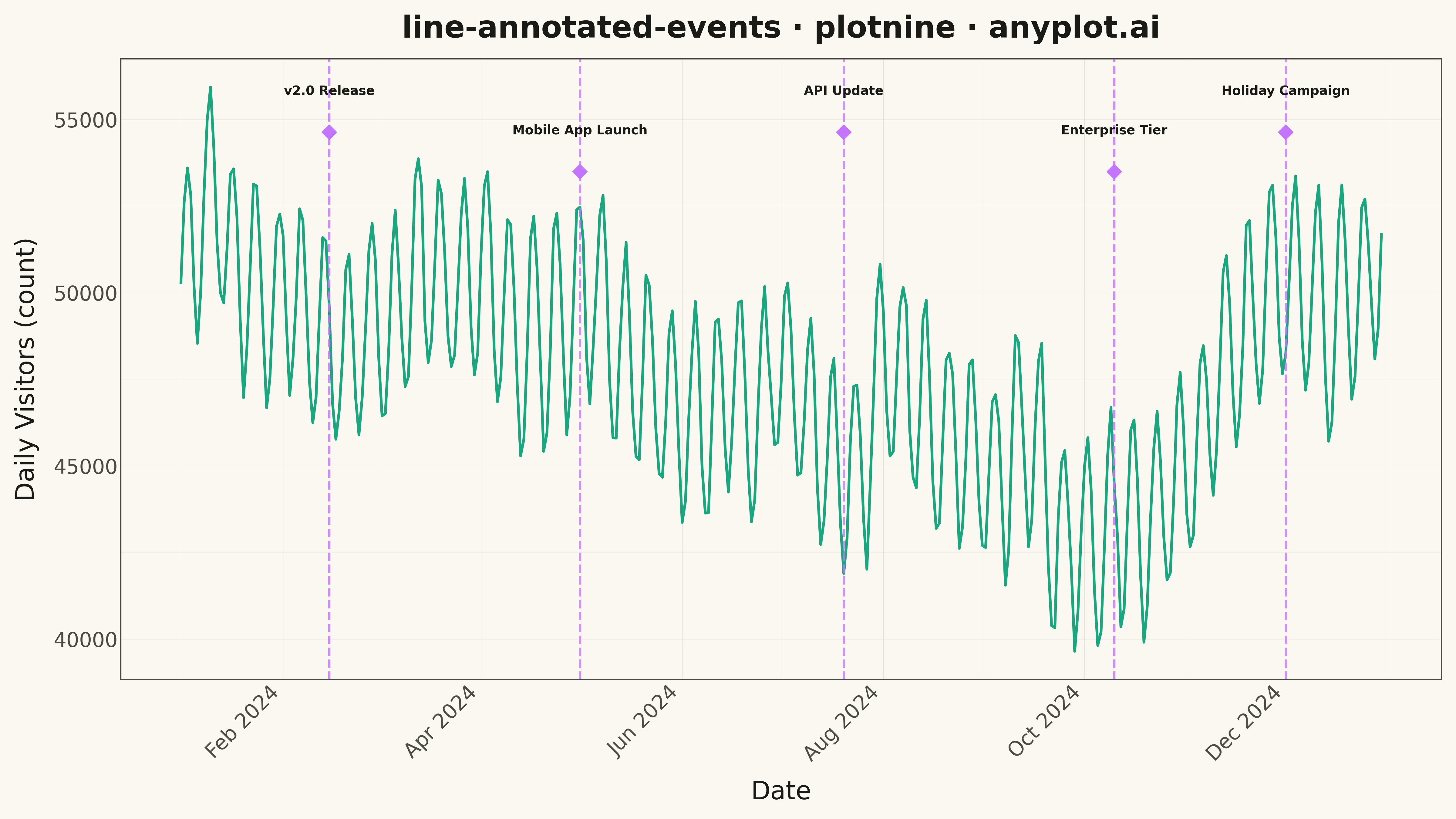
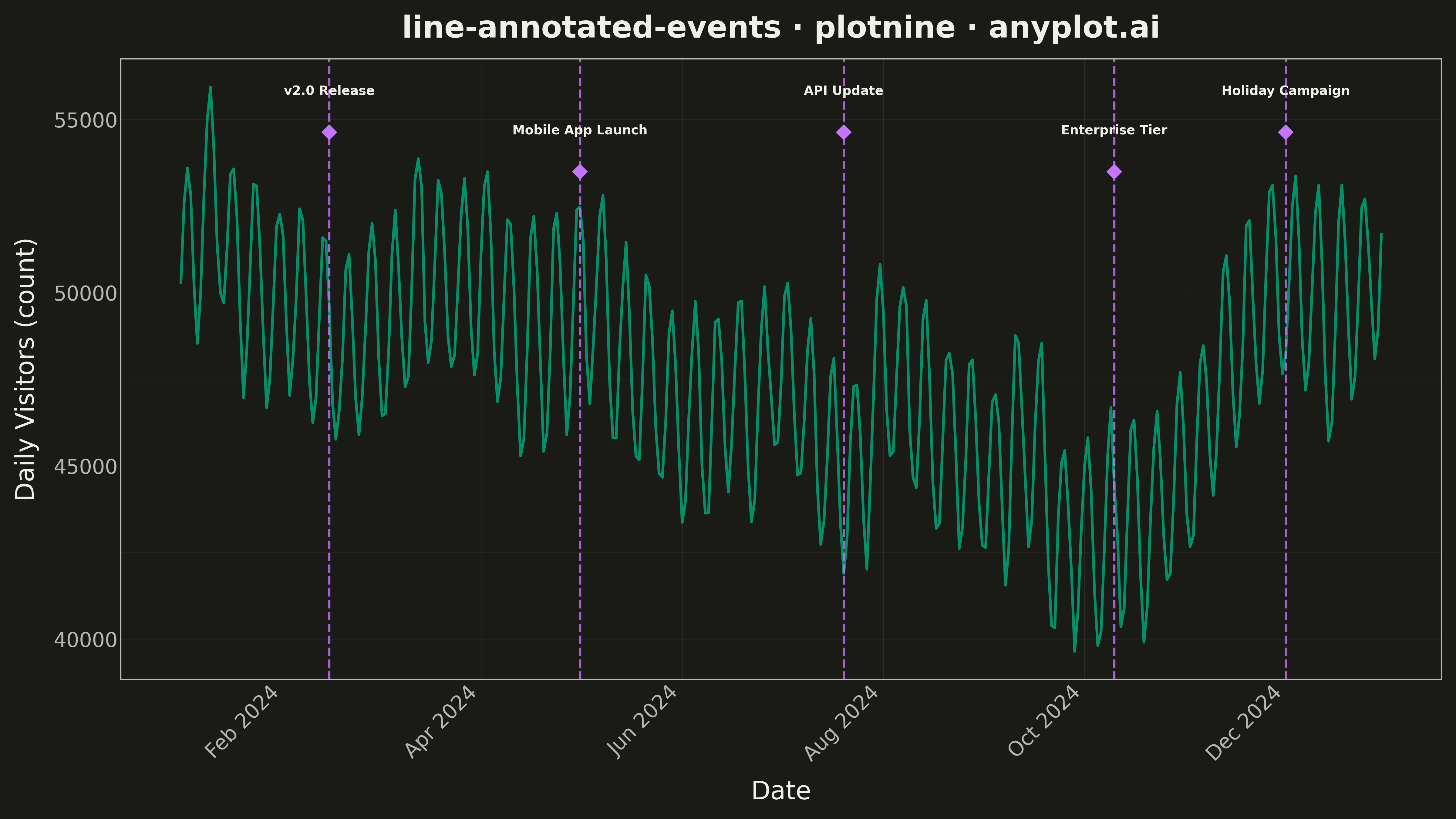
A line plot with annotations at key points marking important events or milestones. This visualization enhances time series data by highlighting significant occurrences such as product launches, policy changes, or market events directly on the chart. Vertical lines, markers, and text labels draw attention to specific moments in time, making it easy to correlate data trends with real-world events.
""" anyplot.ai
line-annotated-events: Annotated Line Plot with Event Markers
Library: plotnine 0.15.4 | Python 3.13.13
Quality: 91/100 | Updated: 2026-05-16
"""

import os

import numpy as np
import pandas as pd
from plotnine import (
    aes,
    element_line,
    element_rect,
    element_text,
    geom_line,
    geom_point,
    geom_text,
    geom_vline,
    ggplot,
    labs,
    scale_x_datetime,
    theme,
    theme_minimal,
)


# Theme-adaptive colors
THEME = os.getenv("ANYPLOT_THEME", "light")
PAGE_BG = "#FAF8F1" if THEME == "light" else "#1A1A17"
ELEVATED_BG = "#FFFDF6" if THEME == "light" else "#242420"
INK = "#1A1A17" if THEME == "light" else "#F0EFE8"
INK_SOFT = "#4A4A44" if THEME == "light" else "#B8B7B0"

# Data - Simulated website traffic with product release events
np.random.seed(42)

# Generate daily data for one year
dates = pd.date_range("2024-01-01", periods=365, freq="D")
base = 50000 + np.cumsum(np.random.randn(365) * 500)
seasonal = 5000 * np.sin(2 * np.pi * np.arange(365) / 365)
weekly = 3000 * np.sin(2 * np.pi * np.arange(365) / 7)
values = base + seasonal + weekly

df = pd.DataFrame({"date": dates, "value": values})

# Event markers - product releases and major updates
events = pd.DataFrame(
    {
        "event_date": pd.to_datetime(["2024-02-15", "2024-05-01", "2024-07-20", "2024-10-10", "2024-12-01"]),
        "event_label": ["v2.0 Release", "Mobile App Launch", "API Update", "Enterprise Tier", "Holiday Campaign"],
        "y_offset": [0.92, 0.85, 0.92, 0.85, 0.92],  # Alternating heights to avoid overlap
    }
)

# Calculate y positions for labels (as fraction of y range)
y_min, y_max = df["value"].min(), df["value"].max()
y_range = y_max - y_min
events["y_pos"] = y_min + events["y_offset"] * y_range

# Create the plot
plot = (
    ggplot(df, aes(x="date", y="value"))
    + geom_line(color="#009E73", size=1.2, alpha=0.9)
    + geom_vline(aes(xintercept="event_date"), data=events, color="#C475FD", linetype="dashed", size=1.0, alpha=0.8)
    + geom_point(aes(x="event_date", y="y_pos"), data=events, color="#C475FD", size=4, shape="D")
    + geom_text(
        aes(x="event_date", y="y_pos", label="event_label"),
        data=events,
        color=INK,
        size=10,
        ha="center",
        va="bottom",
        nudge_y=1000,
        fontweight="bold",
    )
    + labs(x="Date", y="Daily Visitors (count)", title="line-annotated-events · plotnine · anyplot.ai")
    + scale_x_datetime(date_breaks="2 months", date_labels="%b %Y")
    + theme_minimal()
    + theme(
        figure_size=(16, 9),
        plot_background=element_rect(fill=PAGE_BG, color=PAGE_BG),
        panel_background=element_rect(fill=PAGE_BG),
        panel_grid_major=element_line(color=INK, size=0.3, alpha=0.10),
        panel_grid_minor=element_line(color=INK, size=0.2, alpha=0.05),
        panel_border=element_rect(color=INK_SOFT, fill=None),
        text=element_text(size=14, color=INK),
        axis_title=element_text(size=20, color=INK),
        axis_text=element_text(size=16, color=INK_SOFT),
        axis_text_x=element_text(angle=45, ha="right"),
        axis_line=element_line(color=INK_SOFT),
        plot_title=element_text(size=24, weight="bold", color=INK),
    )
)

# Save
plot.save(f"plot-{THEME}.png", dpi=300, verbose=False)
Runnable source as JSON, for any HTTP client: https://api.anyplot.ai/specs/line-annotated-events/plotnine/code. Any spec id and library id listed in llms-full.txt fit the same URL shape; every URL below is complete and callable.
{
  "spec_id": "line-annotated-events",
  "language": "python",
  "library": "plotnine",
  "page": "https://anyplot.ai/line-annotated-events/python/plotnine",
  "hub": "https://anyplot.ai/line-annotated-events",
  "code_json": "https://api.anyplot.ai/specs/line-annotated-events/plotnine/code",
  "spec_json": "https://api.anyplot.ai/specs/line-annotated-events",
  "render_light_png": "https://storage.googleapis.com/anyplot-images/plots/line-annotated-events/python/plotnine/plot-light.png",
  "render_dark_png": "https://storage.googleapis.com/anyplot-images/plots/line-annotated-events/python/plotnine/plot-dark.png",
  "quality_score": 91.0,
  "license": "MIT",
  "guide": "https://anyplot.ai/llms.txt"
}
Part of Annotated Line Plot with Event Markers on anyplot.ai.