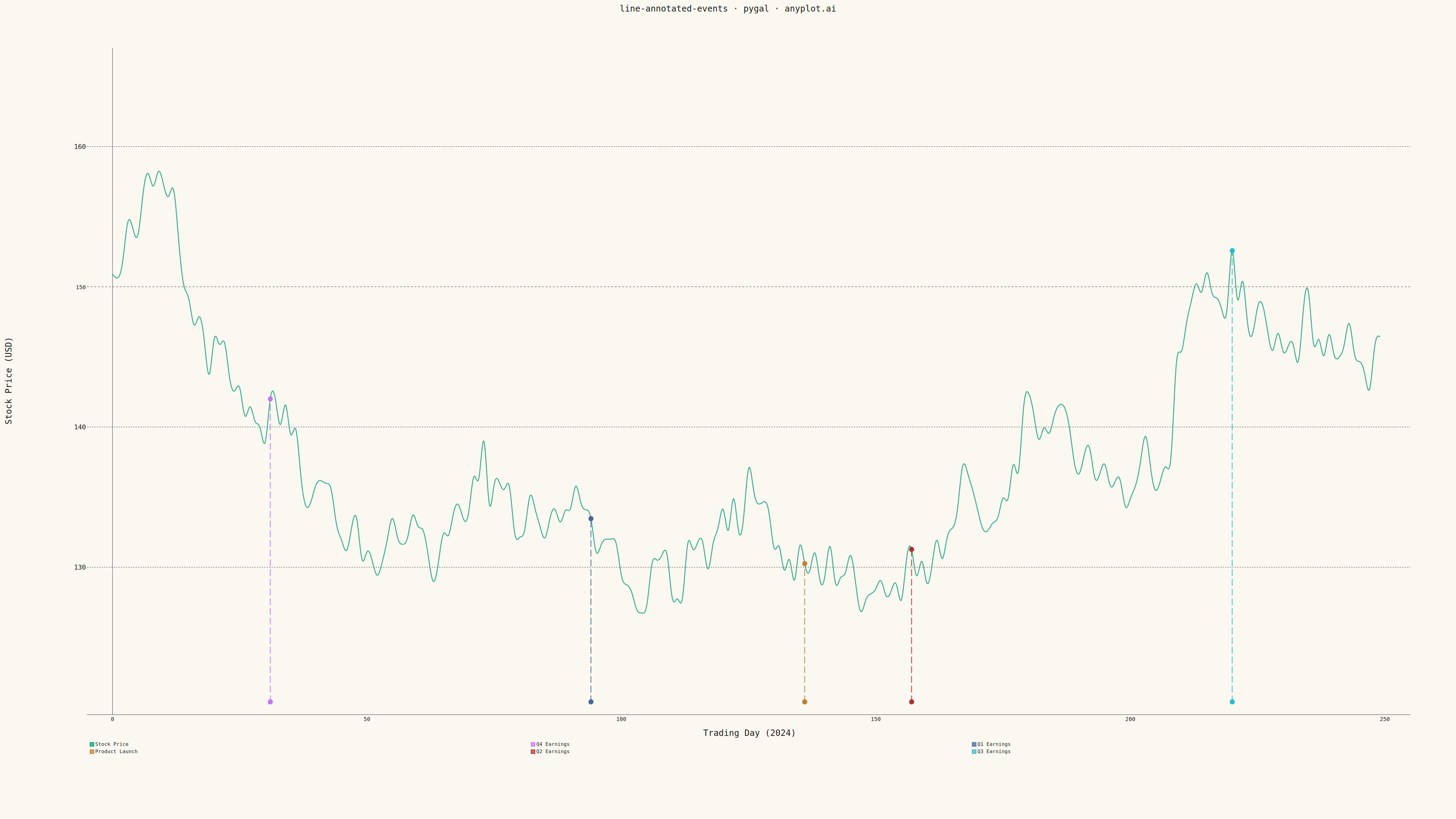
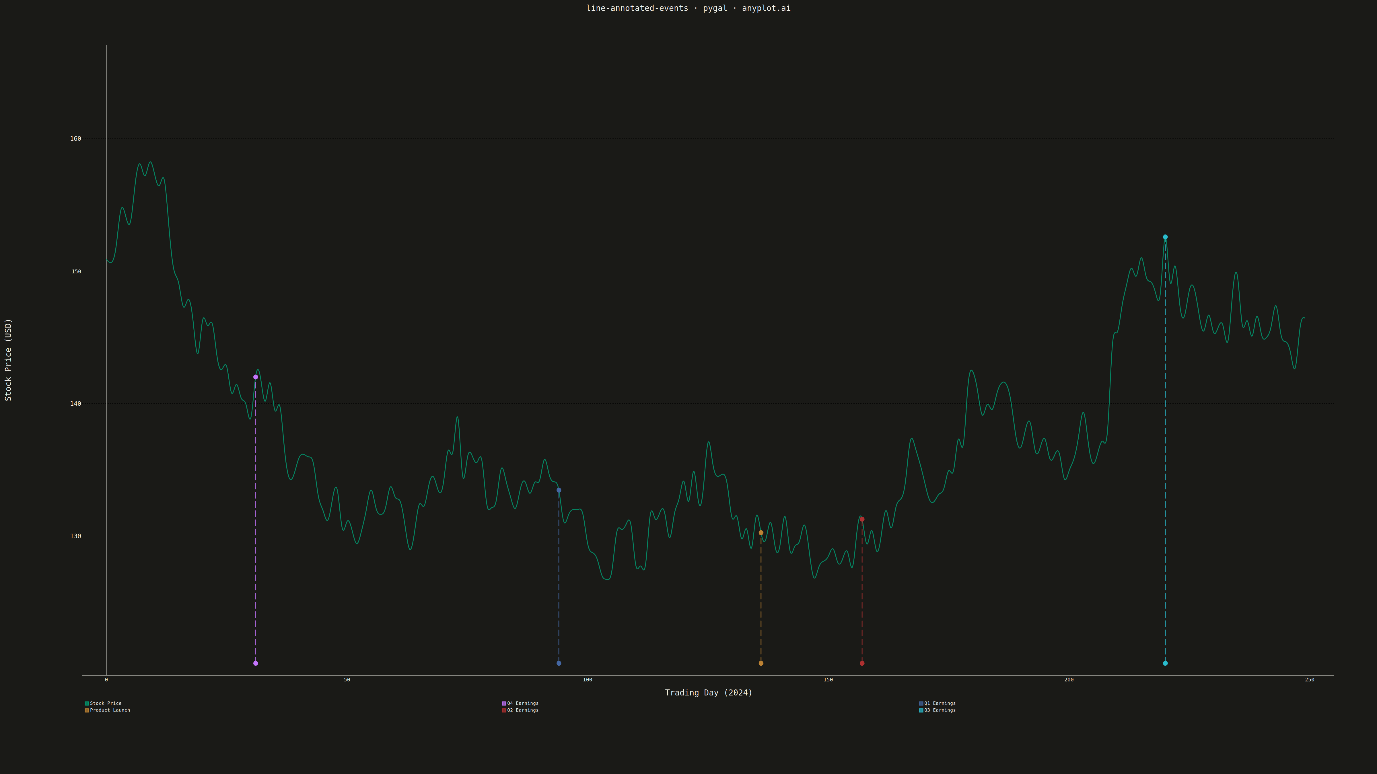
A line plot with annotations at key points marking important events or milestones. This visualization enhances time series data by highlighting significant occurrences such as product launches, policy changes, or market events directly on the chart. Vertical lines, markers, and text labels draw attention to specific moments in time, making it easy to correlate data trends with real-world events.
""" anyplot.ai
line-annotated-events: Annotated Line Plot with Event Markers
Library: pygal 3.1.0 | Python 3.13.13
Quality: 92/100 | Updated: 2026-05-16
"""

import os

import numpy as np
import pygal
from pygal.style import Style


THEME = os.getenv("ANYPLOT_THEME", "light")
PAGE_BG = "#FAF8F1" if THEME == "light" else "#1A1A17"
INK = "#1A1A17" if THEME == "light" else "#F0EFE8"
INK_MUTED = "#6B6A63" if THEME == "light" else "#A8A79F"

IMPRINT = ("#009E73", "#C475FD", "#4467A3", "#BD8233", "#AE3030", "#2ABCCD", "#954477")

# Data - Stock price over a year with quarterly events
np.random.seed(42)
n_days = 250  # Trading days in a year

# Generate realistic stock-like price data with trend and volatility
base_price = 150
returns = np.random.randn(n_days) * 0.012
prices = base_price * np.cumprod(1 + returns)

# Event data - indices and labels
events = [(31, "Q4 Earnings"), (94, "Q1 Earnings"), (136, "Product Launch"), (157, "Q2 Earnings"), (220, "Q3 Earnings")]

# Custom style with theme-adaptive colors
custom_style = Style(
    background=PAGE_BG,
    plot_background=PAGE_BG,
    foreground=INK,
    foreground_strong=INK,
    foreground_subtle=INK_MUTED,
    colors=IMPRINT,
    title_font_size=28,
    label_font_size=22,
    major_label_font_size=18,
    legend_font_size=16,
    value_font_size=14,
    stroke_width=3,
)

# Create XY chart for precise coordinate control
chart = pygal.XY(
    width=4800,
    height=2700,
    style=custom_style,
    title="line-annotated-events · pygal · anyplot.ai",
    x_title="Trading Day (2024)",
    y_title="Stock Price (USD)",
    show_dots=False,
    stroke_style={"width": 3, "linecap": "round"},
    show_legend=True,
    legend_at_bottom=True,
    show_x_guides=False,
    show_y_guides=True,
    margin=120,
    margin_bottom=200,
    margin_left=200,
    margin_right=150,
    print_values=False,
    interpolate="cubic",
    range=(min(prices) * 0.95, max(prices) * 1.05),
    xrange=(0, n_days),
    x_labels_major_count=6,
    show_minor_x_labels=False,
)

# Set x-axis labels
chart.x_labels = [0, 50, 100, 150, 200, 250]

# Add main stock price line as XY coordinates
price_data = [(i, prices[i]) for i in range(n_days)]
chart.add("Stock Price", price_data, stroke_style={"width": 3})

# Add event markers with vertical lines
# Each event is visualized as a prominent vertical line with dot marker
y_min = min(prices) * 0.95
y_max = max(prices) * 1.05

for day_idx, label in events:
    event_price = prices[day_idx]

    # Create vertical line from bottom to the event point
    vertical_line = [(day_idx, y_min), (day_idx, event_price)]

    # Add vertical line with prominent styling
    chart.add(label, vertical_line, stroke_style={"width": 8, "dasharray": "20, 12"}, show_dots=True, dots_size=8)

# Render outputs
chart.render_to_png(f"plot-{THEME}.png")

with open(f"plot-{THEME}.html", "wb") as f:
    f.write(chart.render())
Runnable source as JSON, for any HTTP client: https://api.anyplot.ai/specs/line-annotated-events/pygal/code. Any spec id and library id listed in llms-full.txt fit the same URL shape; every URL below is complete and callable.
{
  "spec_id": "line-annotated-events",
  "language": "python",
  "library": "pygal",
  "page": "https://anyplot.ai/line-annotated-events/python/pygal",
  "hub": "https://anyplot.ai/line-annotated-events",
  "code_json": "https://api.anyplot.ai/specs/line-annotated-events/pygal/code",
  "spec_json": "https://api.anyplot.ai/specs/line-annotated-events",
  "render_light_png": "https://storage.googleapis.com/anyplot-images/plots/line-annotated-events/python/pygal/plot-light.png",
  "render_dark_png": "https://storage.googleapis.com/anyplot-images/plots/line-annotated-events/python/pygal/plot-dark.png",
  "interactive_light_html": "https://storage.googleapis.com/anyplot-images/plots/line-annotated-events/python/pygal/plot-light.html",
  "interactive_dark_html": "https://storage.googleapis.com/anyplot-images/plots/line-annotated-events/python/pygal/plot-dark.html",
  "quality_score": 92.0,
  "license": "MIT",
  "guide": "https://anyplot.ai/llms.txt"
}
Part of Annotated Line Plot with Event Markers on anyplot.ai.