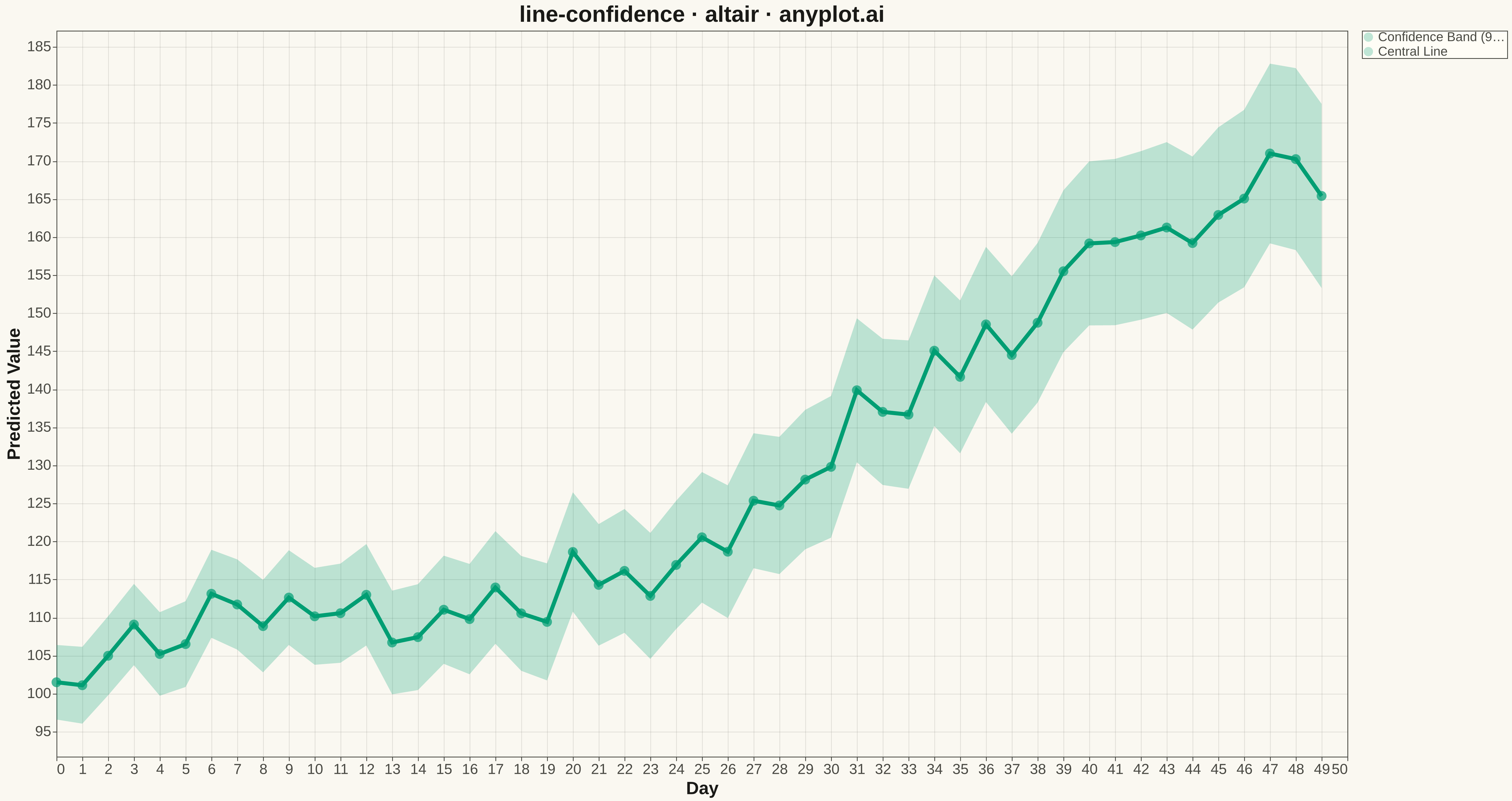
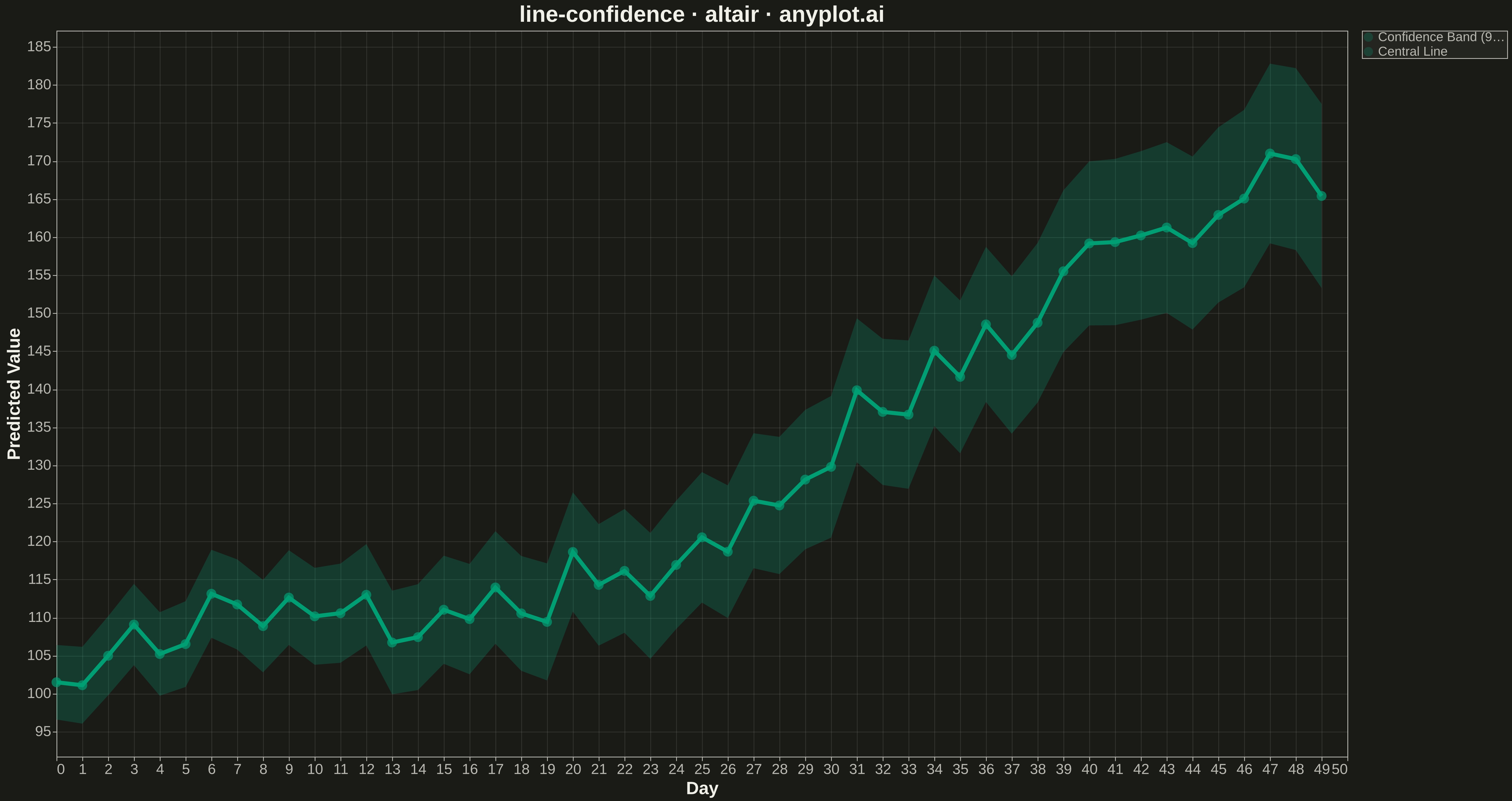
A line plot with a confidence interval displays a central trend line (typically mean or median) surrounded by a shaded band representing uncertainty or variability. The combination of a clear central line and semi-transparent confidence region effectively communicates both the estimated value and its associated uncertainty, making it essential for visualizing statistical estimates, model predictions, and forecast ranges.
""" anyplot.ai
line-confidence: Line Plot with Confidence Interval
Library: altair 6.1.0 | Python 3.13.13
Quality: 91/100 | Updated: 2026-05-09
"""

import os
import sys


if sys.path[0] == os.path.dirname(__file__):
    sys.path.pop(0)

import altair as alt
import numpy as np
import pandas as pd


THEME = os.getenv("ANYPLOT_THEME", "light")
PAGE_BG = "#FAF8F1" if THEME == "light" else "#1A1A17"
ELEVATED_BG = "#FFFDF6" if THEME == "light" else "#242420"
INK = "#1A1A17" if THEME == "light" else "#F0EFE8"
INK_SOFT = "#4A4A44" if THEME == "light" else "#B8B7B0"
BRAND = "#009E73"

# Data: Time series forecast with 95% confidence interval
np.random.seed(42)
n_points = 50
days = np.arange(n_points)

# Generate trend with natural curvature
trend = 100 + 0.5 * days + 0.02 * days**2 + np.sin(days / 5) * 5
noise = np.random.normal(0, 3, n_points)
y_mean = trend + noise

# Confidence interval widening over time (realistic for forecasts)
uncertainty = 5 + 0.15 * days
y_lower = y_mean - 1.96 * uncertainty / 2
y_upper = y_mean + 1.96 * uncertainty / 2

df = pd.DataFrame({"Day": days, "Predicted Mean": y_mean, "Lower": y_lower, "Upper": y_upper})

# Use actual data range for y-axis, not starting at 0
y_min = df["Lower"].min()
y_max = df["Upper"].max()
y_padding = (y_max - y_min) * 0.05
y_scale = alt.Scale(domain=[y_min - y_padding, y_max + y_padding])

# Reshape data for layered encoding: band needs separate rows for fill
band_data = df.copy()

# Create the confidence band (area)
band = (
    alt.Chart(band_data)
    .mark_area(opacity=0.25, color=BRAND)
    .encode(
        x=alt.X(
            "Day:Q", title="Day", axis=alt.Axis(labelFontSize=18, titleFontSize=22, labelColor=INK_SOFT, titleColor=INK)
        ),
        y=alt.Y(
            "Lower:Q",
            title="Predicted Value",
            scale=y_scale,
            axis=alt.Axis(labelFontSize=18, titleFontSize=22, labelColor=INK_SOFT, titleColor=INK),
        ),
        y2="Upper:Q",
    )
)

# Create the central line with larger stroke width
line = alt.Chart(df).mark_line(strokeWidth=5, color=BRAND).encode(x="Day:Q", y=alt.Y("Predicted Mean:Q", scale=y_scale))

# Add point markers on the line
points = (
    alt.Chart(df)
    .mark_point(size=150, filled=True, color=BRAND)
    .encode(x="Day:Q", y=alt.Y("Predicted Mean:Q", scale=y_scale))
)

# Combine all layers
chart = (
    alt.layer(band, line, points)
    .properties(
        width=1600,
        height=900,
        background=PAGE_BG,
        title=alt.Title("line-confidence · altair · anyplot.ai", fontSize=28, color=INK, anchor="middle"),
    )
    .configure_view(fill=PAGE_BG, stroke=INK_SOFT, strokeWidth=1)
    .configure_axis(domainColor=INK_SOFT, tickColor=INK_SOFT, gridColor=INK, gridOpacity=0.10)
    .configure_title(fontSize=28, color=INK)
)

# Save as PNG (scale_factor=3 gives 4800x2700)
chart.save(f"plot-{THEME}.png", scale_factor=3.0)

# Save as HTML with interactivity and tooltips
interactive_band = (
    alt.Chart(band_data)
    .mark_area(opacity=0.25, color=BRAND)
    .encode(
        x=alt.X("Day:Q", title="Day"),
        y=alt.Y("Lower:Q", title="Predicted Value", scale=y_scale),
        y2="Upper:Q",
        tooltip=[
            alt.Tooltip("Day:Q", title="Day", format="d"),
            alt.Tooltip("Lower:Q", title="Lower Bound", format=".1f"),
            alt.Tooltip("Upper:Q", title="Upper Bound", format=".1f"),
        ],
    )
)

interactive_line = (
    alt.Chart(df)
    .mark_line(strokeWidth=5, color=BRAND)
    .encode(
        x="Day:Q",
        y=alt.Y("Predicted Mean:Q", scale=y_scale),
        tooltip=alt.Tooltip("Predicted Mean:Q", title="Predicted Mean", format=".1f"),
    )
)

interactive_points = (
    alt.Chart(df)
    .mark_point(size=150, filled=True, color=BRAND)
    .encode(
        x="Day:Q",
        y=alt.Y("Predicted Mean:Q", scale=y_scale),
        tooltip=[
            alt.Tooltip("Day:Q", title="Day", format="d"),
            alt.Tooltip("Predicted Mean:Q", title="Predicted Mean", format=".1f"),
        ],
    )
)

interactive_chart = (
    alt.layer(interactive_band, interactive_line, interactive_points)
    .properties(
        width=1600,
        height=900,
        background=PAGE_BG,
        title=alt.Title("line-confidence · altair · anyplot.ai", fontSize=28, color=INK, anchor="middle"),
    )
    .configure_view(fill=PAGE_BG, stroke=INK_SOFT, strokeWidth=1)
    .configure_axis(
        domainColor=INK_SOFT,
        tickColor=INK_SOFT,
        gridColor=INK,
        gridOpacity=0.10,
        labelColor=INK_SOFT,
        titleColor=INK,
        labelFontSize=18,
        titleFontSize=22,
    )
    .configure_title(fontSize=28, color=INK)
    .interactive()
)

interactive_chart.save(f"plot-{THEME}.html")
Runnable source as JSON, for any HTTP client: https://api.anyplot.ai/specs/line-confidence/altair/code. Any spec id and library id listed in llms-full.txt fit the same URL shape; every URL below is complete and callable.
{
  "spec_id": "line-confidence",
  "language": "python",
  "library": "altair",
  "page": "https://anyplot.ai/line-confidence/python/altair",
  "hub": "https://anyplot.ai/line-confidence",
  "code_json": "https://api.anyplot.ai/specs/line-confidence/altair/code",
  "spec_json": "https://api.anyplot.ai/specs/line-confidence",
  "render_light_png": "https://storage.googleapis.com/anyplot-images/plots/line-confidence/python/altair/plot-light.png",
  "render_dark_png": "https://storage.googleapis.com/anyplot-images/plots/line-confidence/python/altair/plot-dark.png",
  "interactive_light_html": "https://storage.googleapis.com/anyplot-images/plots/line-confidence/python/altair/plot-light.html",
  "interactive_dark_html": "https://storage.googleapis.com/anyplot-images/plots/line-confidence/python/altair/plot-dark.html",
  "quality_score": 91.0,
  "license": "MIT",
  "guide": "https://anyplot.ai/llms.txt"
}
Part of Line Plot with Confidence Interval on anyplot.ai.