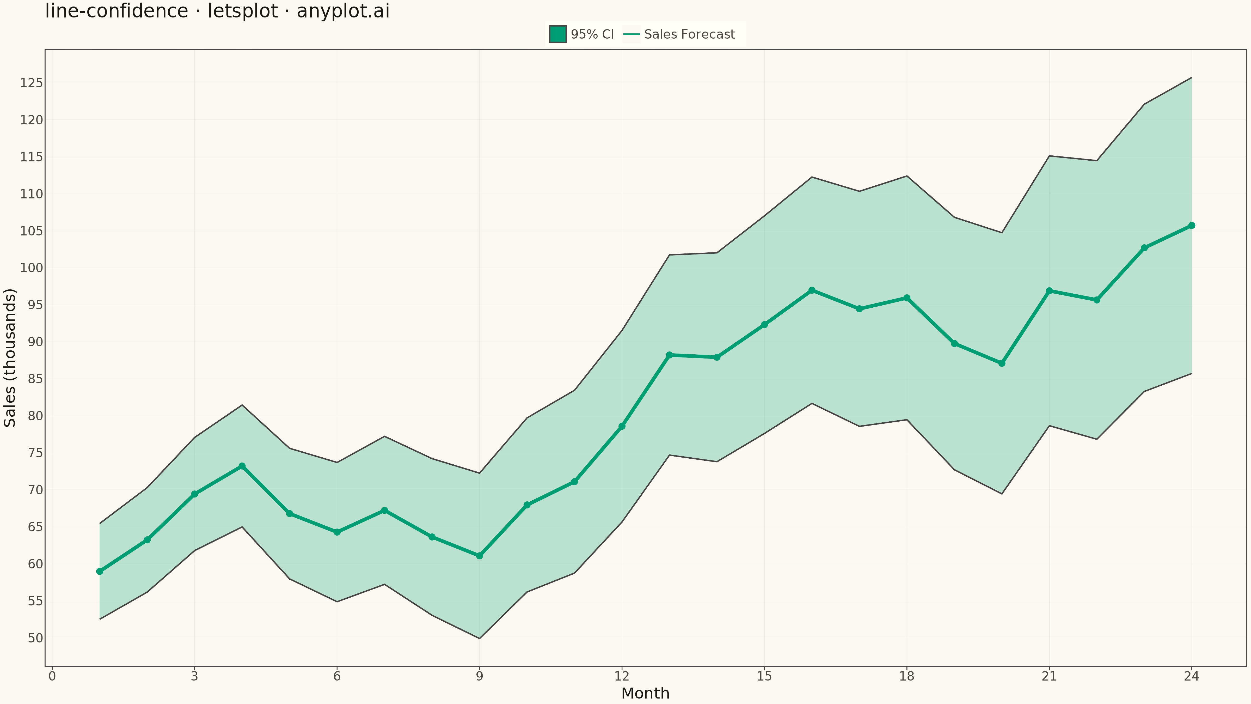
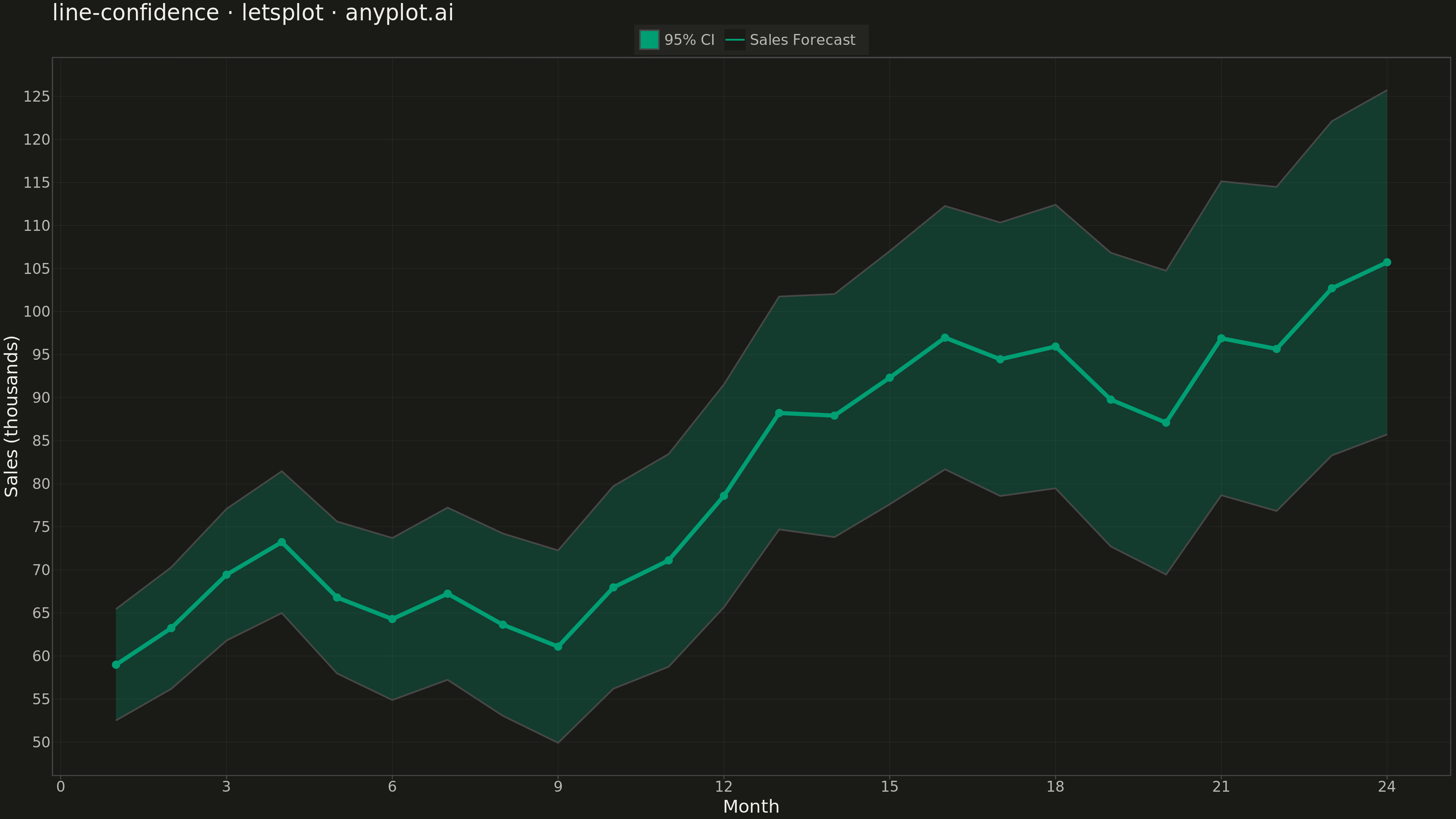
A line plot with a confidence interval displays a central trend line (typically mean or median) surrounded by a shaded band representing uncertainty or variability. The combination of a clear central line and semi-transparent confidence region effectively communicates both the estimated value and its associated uncertainty, making it essential for visualizing statistical estimates, model predictions, and forecast ranges.
""" anyplot.ai
line-confidence: Line Plot with Confidence Interval
Library: letsplot 4.9.0 | Python 3.13.13
Quality: 87/100 | Updated: 2026-05-09
"""

import os
import shutil

import numpy as np
import pandas as pd
from lets_plot import *


LetsPlot.setup_html()

# Theme tokens
THEME = os.getenv("ANYPLOT_THEME", "light")
PAGE_BG = "#FAF8F1" if THEME == "light" else "#1A1A17"
ELEVATED_BG = "#FFFDF6" if THEME == "light" else "#242420"
INK = "#1A1A17" if THEME == "light" else "#F0EFE8"
INK_SOFT = "#4A4A44" if THEME == "light" else "#B8B7B0"
RULE = "rgba(26,26,23,0.10)" if THEME == "light" else "rgba(240,239,232,0.10)"

BRAND = "#009E73"  # Okabe-Ito position 1

# Data - Monthly sales forecast with 95% confidence interval
np.random.seed(42)
months = np.arange(1, 25)
trend = 50 + months * 2.5 + np.sin(months * np.pi / 6) * 10
noise = np.random.normal(0, 3, len(months))
y = trend + noise

# Calculate confidence interval (simulating forecast uncertainty that grows over time)
std_error = 3 + months * 0.3
y_lower = y - 1.96 * std_error
y_upper = y + 1.96 * std_error

df = pd.DataFrame({"Month": months, "Sales": y, "Lower": y_lower, "Upper": y_upper})

# Create plot with legend
plot = (
    ggplot(df)
    + geom_ribbon(aes(x="Month", ymin="Lower", ymax="Upper", fill="95% Confidence Interval"), alpha=0.25)
    + geom_line(aes(x="Month", y="Sales", color="Sales Forecast"), size=2)
    + geom_point(aes(x="Month", y="Sales"), color=BRAND, size=4)
    + scale_color_manual(values=[BRAND])
    + scale_fill_manual(values=[BRAND])
    + labs(x="Month", y="Sales (thousands)", title="line-confidence · letsplot · anyplot.ai")
    + scale_x_continuous(breaks=list(range(0, 25, 3)))
    + theme(
        plot_background=element_rect(fill=PAGE_BG, color=PAGE_BG),
        panel_background=element_rect(fill=PAGE_BG),
        panel_grid_major=element_line(color=RULE, size=0.3),
        panel_grid_minor=element_blank(),
        axis_title=element_text(size=20, color=INK),
        axis_text=element_text(size=16, color=INK_SOFT),
        axis_line=element_line(color=INK_SOFT, size=0.5),
        plot_title=element_text(size=24, color=INK),
        legend_background=element_rect(fill=ELEVATED_BG, color=INK_SOFT),
        legend_text=element_text(size=16, color=INK_SOFT),
        legend_title=element_text(size=16, color=INK),
        legend_position="top",
    )
    + ggsize(1600, 900)
)

# Save as PNG with explicit pixel dimensions (4800 × 2700 px)
png_path = ggsave(plot, f"plot-{THEME}.png", w=4800, h=2700, unit="px", dpi=100)
shutil.move(png_path, f"plot-{THEME}.png")

# Save as HTML for interactive viewing
html_path = ggsave(plot, f"plot-{THEME}.html")
shutil.move(html_path, f"plot-{THEME}.html")
Runnable source as JSON, for any HTTP client: https://api.anyplot.ai/specs/line-confidence/letsplot/code. Any spec id and library id listed in llms-full.txt fit the same URL shape; every URL below is complete and callable.
{
  "spec_id": "line-confidence",
  "language": "python",
  "library": "letsplot",
  "page": "https://anyplot.ai/line-confidence/python/letsplot",
  "hub": "https://anyplot.ai/line-confidence",
  "code_json": "https://api.anyplot.ai/specs/line-confidence/letsplot/code",
  "spec_json": "https://api.anyplot.ai/specs/line-confidence",
  "render_light_png": "https://storage.googleapis.com/anyplot-images/plots/line-confidence/python/letsplot/plot-light.png",
  "render_dark_png": "https://storage.googleapis.com/anyplot-images/plots/line-confidence/python/letsplot/plot-dark.png",
  "interactive_light_html": "https://storage.googleapis.com/anyplot-images/plots/line-confidence/python/letsplot/plot-light.html",
  "interactive_dark_html": "https://storage.googleapis.com/anyplot-images/plots/line-confidence/python/letsplot/plot-dark.html",
  "quality_score": 87.0,
  "license": "MIT",
  "guide": "https://anyplot.ai/llms.txt"
}
Part of Line Plot with Confidence Interval on anyplot.ai.