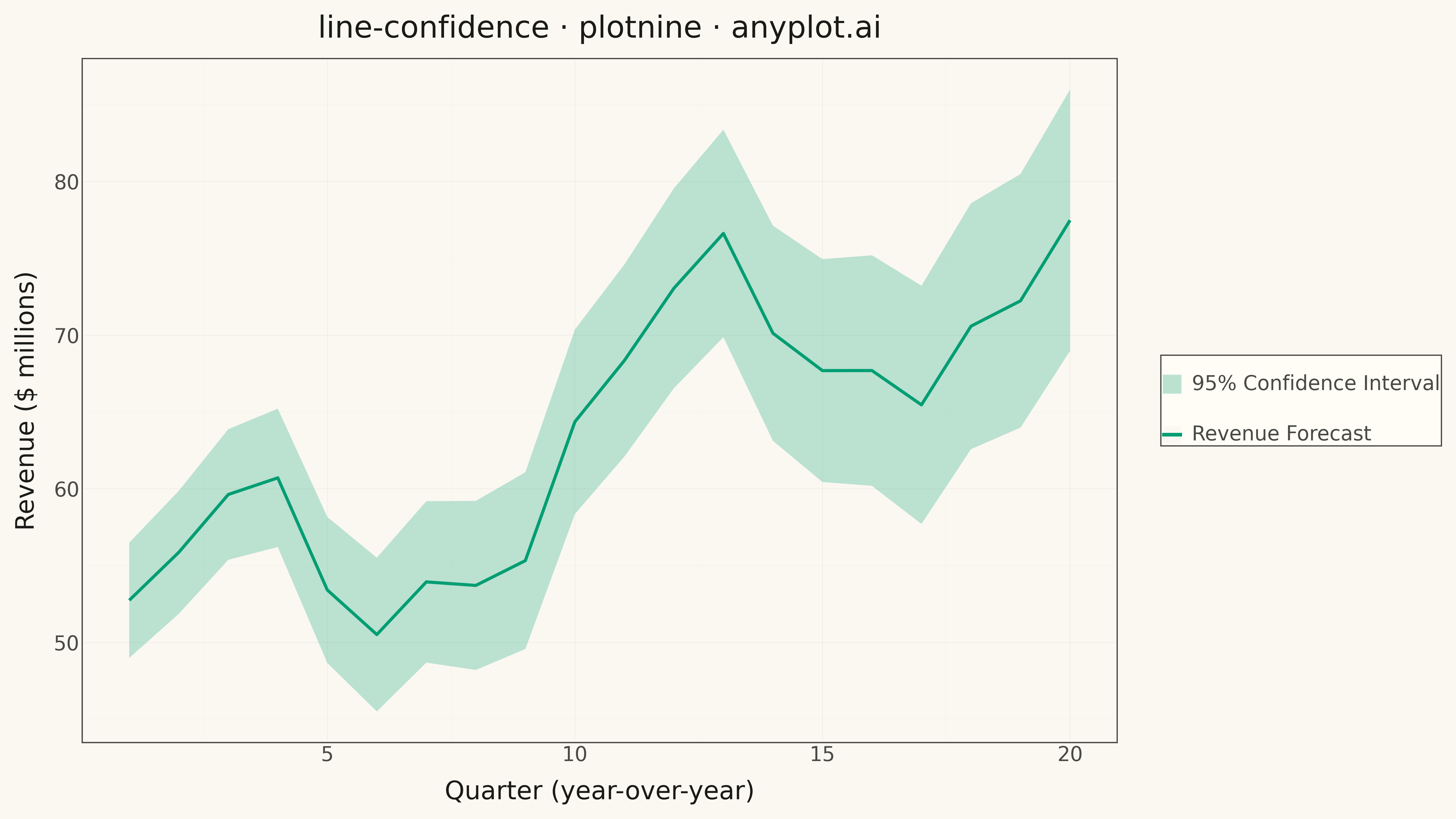
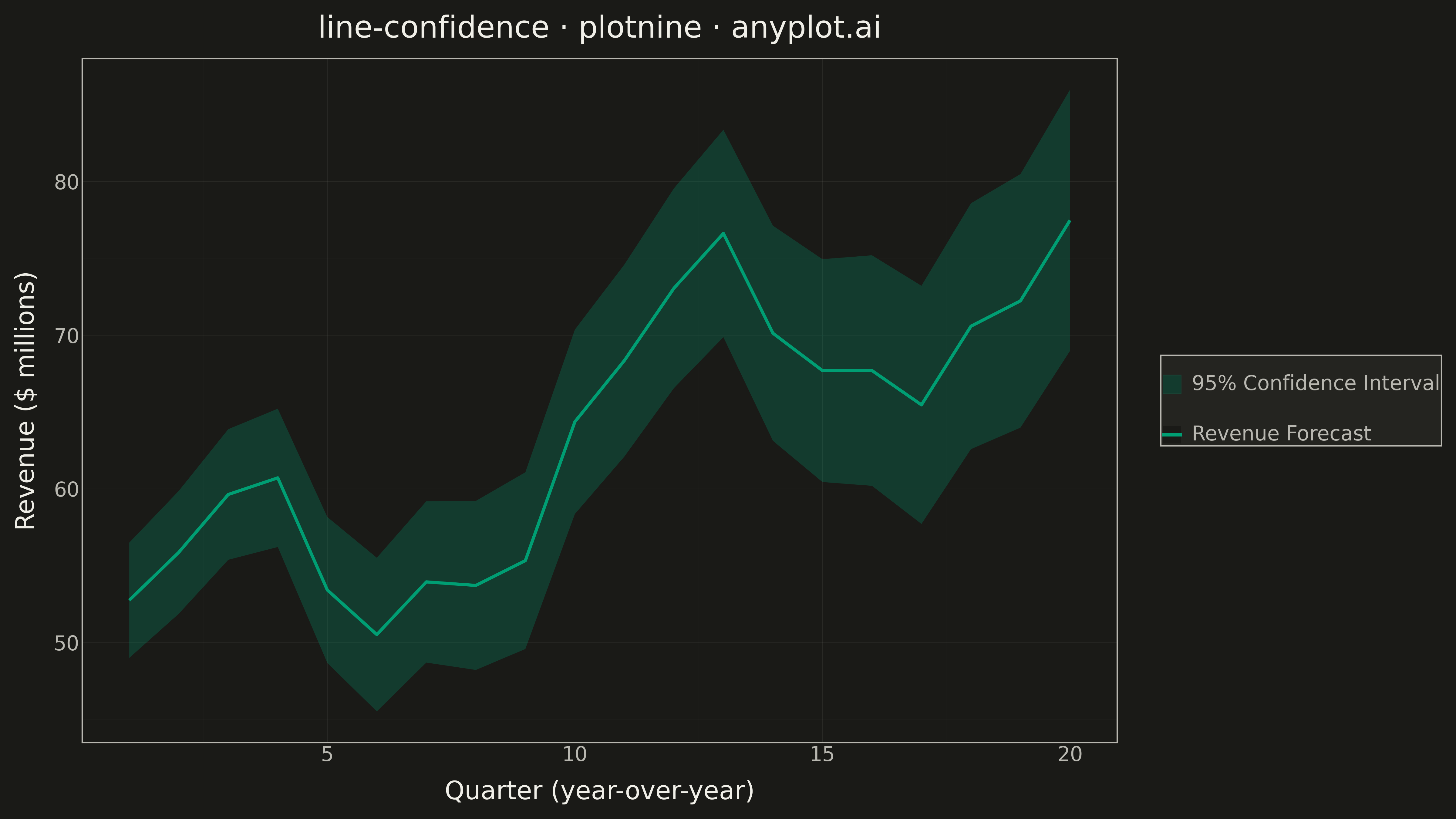
A line plot with a confidence interval displays a central trend line (typically mean or median) surrounded by a shaded band representing uncertainty or variability. The combination of a clear central line and semi-transparent confidence region effectively communicates both the estimated value and its associated uncertainty, making it essential for visualizing statistical estimates, model predictions, and forecast ranges.
""" anyplot.ai
line-confidence: Line Plot with Confidence Interval
Library: plotnine 0.15.4 | Python 3.13.13
Quality: 90/100 | Updated: 2026-05-09
"""

import os
import pathlib
import sys

import numpy as np
import pandas as pd


sys.path = [p for p in sys.path if pathlib.Path(p).resolve() != pathlib.Path.cwd().resolve()]

from plotnine import (
    aes,
    element_line,
    element_rect,
    element_text,
    geom_line,
    geom_ribbon,
    ggplot,
    labs,
    scale_color_manual,
    scale_fill_manual,
    theme,
    theme_minimal,
)


# Theme tokens
THEME = os.getenv("ANYPLOT_THEME", "light")
PAGE_BG = "#FAF8F1" if THEME == "light" else "#1A1A17"
ELEVATED_BG = "#FFFDF6" if THEME == "light" else "#242420"
INK = "#1A1A17" if THEME == "light" else "#F0EFE8"
INK_SOFT = "#4A4A44" if THEME == "light" else "#B8B7B0"

BRAND = "#009E73"  # Okabe-Ito position 1

# Data: Simulated quarterly revenue forecast with 95% confidence interval
np.random.seed(42)
quarters = np.arange(1, 21)
trend = 45 + 1.8 * quarters + 8 * np.sin(quarters * np.pi / 5)
noise = np.random.randn(20) * 2.5
y = trend + noise

base_ci = 3.5
ci_growth = 0.25 * quarters
y_lower = y - (base_ci + ci_growth)
y_upper = y + (base_ci + ci_growth)

df = pd.DataFrame({"Quarter": quarters, "Revenue": y, "Lower": y_lower, "Upper": y_upper, "Group": "forecast"})

# Plot
plot = (
    ggplot(df, aes(x="Quarter"))
    + geom_ribbon(aes(ymin="Lower", ymax="Upper", fill="Group"), alpha=0.25)
    + geom_line(aes(y="Revenue", color="Group"), size=1.4)
    + scale_fill_manual(values={"forecast": BRAND}, labels={"forecast": "95% Confidence Interval"})
    + scale_color_manual(values={"forecast": BRAND}, labels={"forecast": "Revenue Forecast"})
    + labs(
        x="Quarter (year-over-year)",
        y="Revenue ($ millions)",
        title="line-confidence · plotnine · anyplot.ai",
        fill="",
        color="",
    )
    + theme_minimal()
    + theme(
        plot_background=element_rect(fill=PAGE_BG, color=PAGE_BG),
        panel_background=element_rect(fill=PAGE_BG),
        panel_grid_major=element_line(color=INK_SOFT, size=0.3, alpha=0.10),
        panel_grid_minor=element_line(color=INK_SOFT, size=0.2, alpha=0.05),
        panel_border=element_rect(color=INK_SOFT, fill=None),
        axis_title=element_text(color=INK, size=20),
        axis_text=element_text(color=INK_SOFT, size=16),
        axis_line=element_line(color=INK_SOFT),
        plot_title=element_text(color=INK, size=24),
        legend_background=element_rect(fill=ELEVATED_BG, color=INK_SOFT),
        legend_text=element_text(color=INK_SOFT, size=16),
        legend_position="right",
        figure_size=(16, 9),
    )
)

# Save
plot.save(f"plot-{THEME}.png", dpi=300, verbose=False)
Runnable source as JSON, for any HTTP client: https://api.anyplot.ai/specs/line-confidence/plotnine/code. Any spec id and library id listed in llms-full.txt fit the same URL shape; every URL below is complete and callable.
{
  "spec_id": "line-confidence",
  "language": "python",
  "library": "plotnine",
  "page": "https://anyplot.ai/line-confidence/python/plotnine",
  "hub": "https://anyplot.ai/line-confidence",
  "code_json": "https://api.anyplot.ai/specs/line-confidence/plotnine/code",
  "spec_json": "https://api.anyplot.ai/specs/line-confidence",
  "render_light_png": "https://storage.googleapis.com/anyplot-images/plots/line-confidence/python/plotnine/plot-light.png",
  "render_dark_png": "https://storage.googleapis.com/anyplot-images/plots/line-confidence/python/plotnine/plot-dark.png",
  "quality_score": 90.0,
  "license": "MIT",
  "guide": "https://anyplot.ai/llms.txt"
}
Part of Line Plot with Confidence Interval on anyplot.ai.