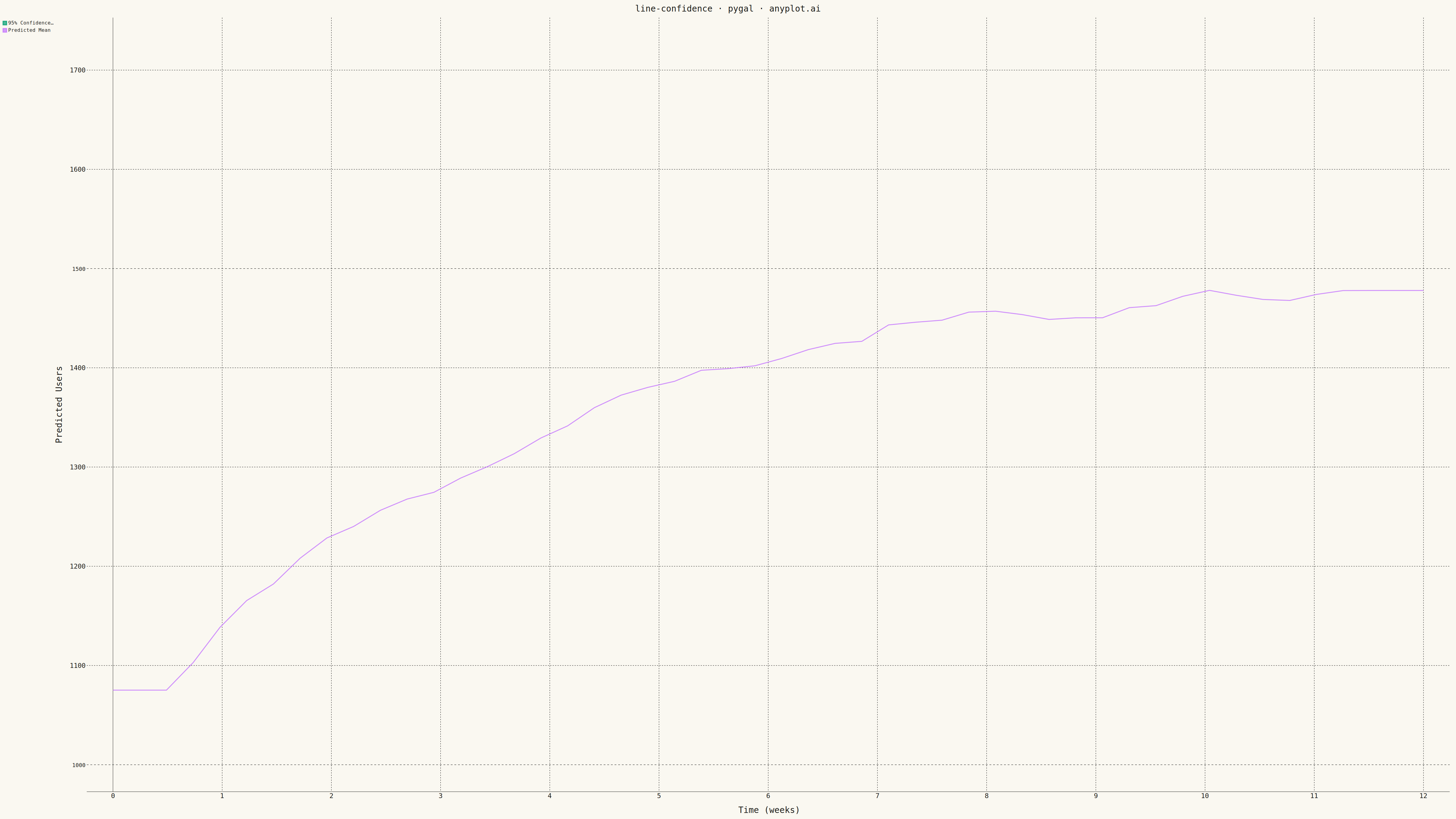
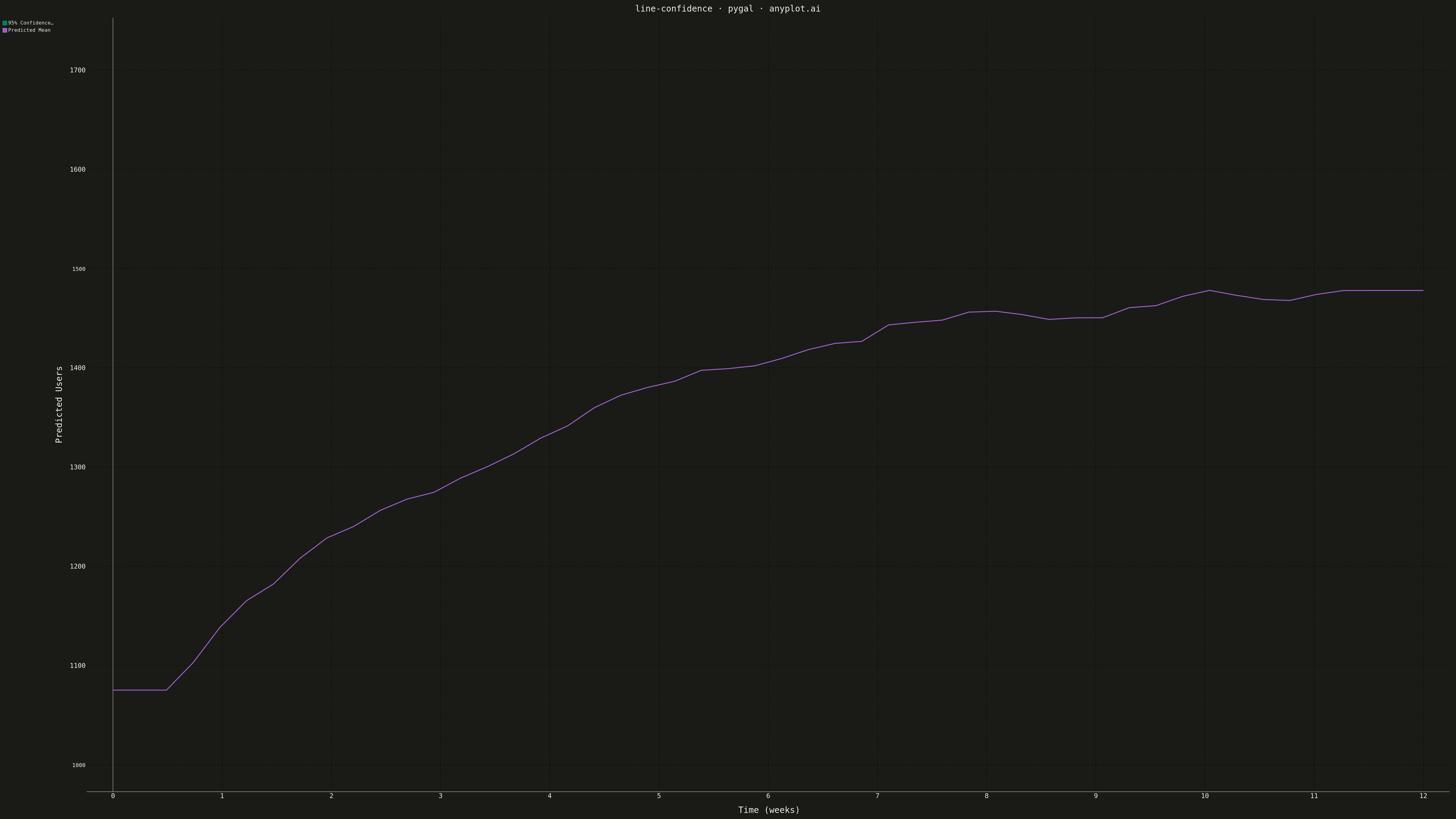
A line plot with a confidence interval displays a central trend line (typically mean or median) surrounded by a shaded band representing uncertainty or variability. The combination of a clear central line and semi-transparent confidence region effectively communicates both the estimated value and its associated uncertainty, making it essential for visualizing statistical estimates, model predictions, and forecast ranges.
""" anyplot.ai
line-confidence: Line Plot with Confidence Interval
Library: pygal 3.1.0 | Python 3.13.13
Quality: 82/100 | Updated: 2026-05-09
"""

import os

import numpy as np
import pygal
from pygal.style import Style


# Theme tokens
THEME = os.getenv("ANYPLOT_THEME", "light")
PAGE_BG = "#FAF8F1" if THEME == "light" else "#1A1A17"
INK = "#1A1A17" if THEME == "light" else "#F0EFE8"
INK_MUTED = "#6B6A63" if THEME == "light" else "#A8A79F"

# Okabe-Ito palette
IMPRINT = ("#009E73", "#C475FD", "#4467A3", "#BD8233", "#AE3030", "#2ABCCD", "#954477")

# Data - Model predictions with 95% confidence interval
np.random.seed(42)
x = np.linspace(0, 12, 50)

# Central prediction: exponential growth pattern
y_center = 1000 + 500 * (1 - np.exp(-0.3 * x)) + np.random.randn(50) * 20
y_center = np.convolve(y_center, np.ones(5) / 5, mode="same")
y_center[0:2] = y_center[2]
y_center[-2:] = y_center[-3]

# Confidence interval widens over time
uncertainty = 30 + 15 * x
y_lower = y_center - uncertainty
y_upper = y_center + uncertainty

# Custom style for 4800x2700 canvas
custom_style = Style(
    background=PAGE_BG,
    plot_background=PAGE_BG,
    foreground=INK,
    foreground_strong=INK,
    foreground_subtle=INK_MUTED,
    colors=IMPRINT,
    title_font_size=28,
    label_font_size=22,
    major_label_font_size=18,
    legend_font_size=16,
    stroke_width=3,
)

# Create XY chart
chart = pygal.XY(
    style=custom_style,
    width=4800,
    height=2700,
    title="line-confidence · pygal · anyplot.ai",
    x_title="Time (weeks)",
    y_title="Predicted Users",
    show_dots=False,
    show_x_guides=True,
    show_y_guides=True,
    range=(float(y_lower.min() - 50), float(y_upper.max() + 50)),
)

# Create confidence band as closed polygon for fill
confidence_band = []
for xi, yi in zip(x, y_upper, strict=True):
    confidence_band.append((float(xi), float(yi)))
for xi, yi in zip(reversed(x), reversed(y_lower), strict=True):
    confidence_band.append((float(xi), float(yi)))

# Center line data
center_data = [(float(xi), float(yi)) for xi, yi in zip(x, y_center, strict=True)]

# Add series: confidence band with solid fill (uses first color from palette)
chart.add("95% Confidence Interval", confidence_band, show_dots=False, fill=True, stroke=False)

# Add center line (uses second color from palette)
chart.add("Predicted Mean", center_data, fill=False, stroke=True, show_dots=False, stroke_width=6)

# Save outputs
chart.render_to_png(f"plot-{THEME}.png")
with open(f"plot-{THEME}.html", "wb") as f:
    f.write(chart.render())
Runnable source as JSON, for any HTTP client: https://api.anyplot.ai/specs/line-confidence/pygal/code. Any spec id and library id listed in llms-full.txt fit the same URL shape; every URL below is complete and callable.
{
  "spec_id": "line-confidence",
  "language": "python",
  "library": "pygal",
  "page": "https://anyplot.ai/line-confidence/python/pygal",
  "hub": "https://anyplot.ai/line-confidence",
  "code_json": "https://api.anyplot.ai/specs/line-confidence/pygal/code",
  "spec_json": "https://api.anyplot.ai/specs/line-confidence",
  "render_light_png": "https://storage.googleapis.com/anyplot-images/plots/line-confidence/python/pygal/plot-light.png",
  "render_dark_png": "https://storage.googleapis.com/anyplot-images/plots/line-confidence/python/pygal/plot-dark.png",
  "interactive_light_html": "https://storage.googleapis.com/anyplot-images/plots/line-confidence/python/pygal/plot-light.html",
  "interactive_dark_html": "https://storage.googleapis.com/anyplot-images/plots/line-confidence/python/pygal/plot-dark.html",
  "quality_score": 82.0,
  "license": "MIT",
  "guide": "https://anyplot.ai/llms.txt"
}
Part of Line Plot with Confidence Interval on anyplot.ai.