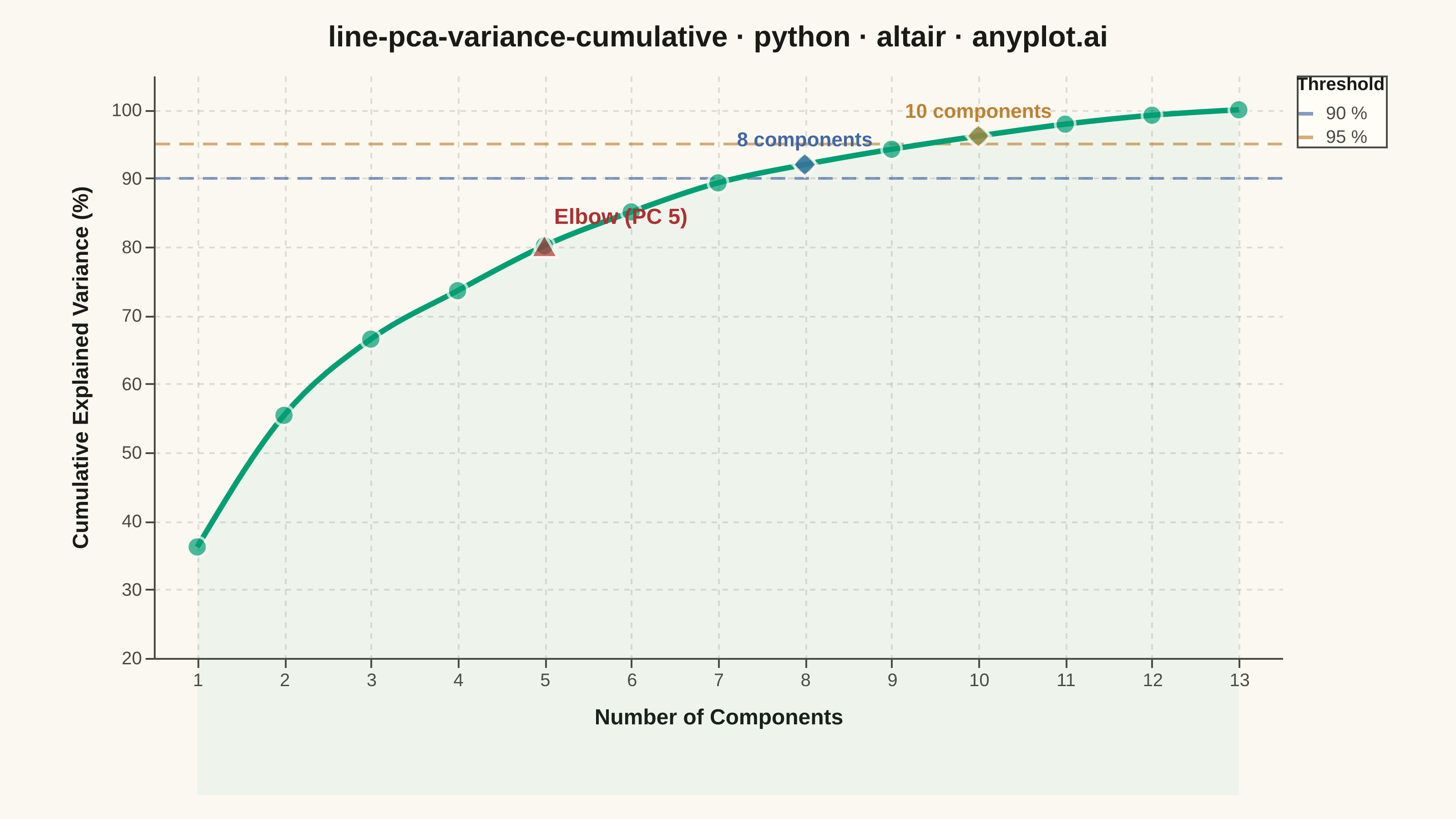
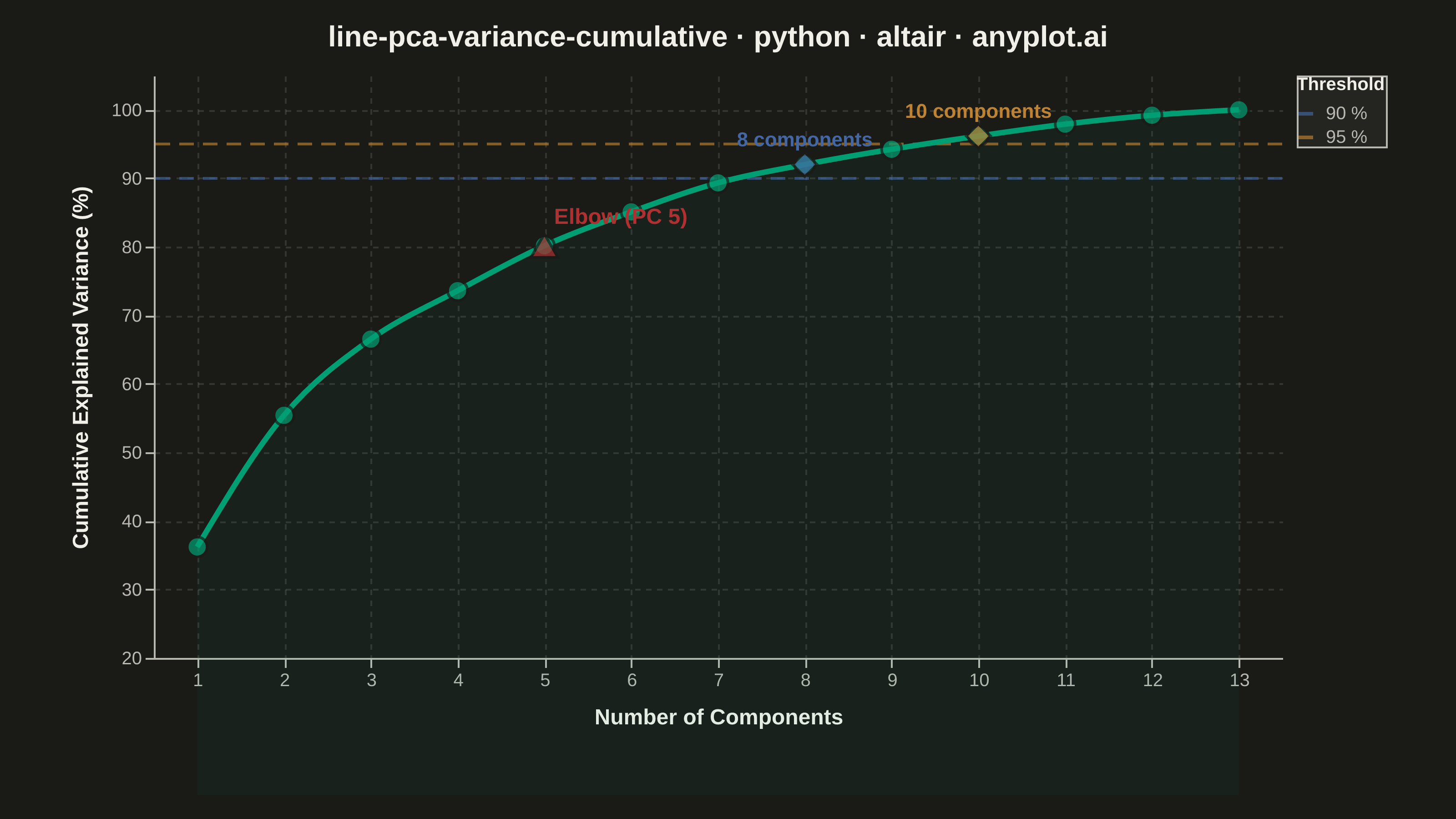
A line plot showing the cumulative proportion of explained variance as a function of the number of Principal Component Analysis (PCA) components. This visualization helps determine the optimal number of components to retain by displaying the trade-off between dimensionality reduction and information preservation. The cumulative curve typically exhibits an elbow pattern where additional components yield diminishing returns, and horizontal threshold lines (e.g., 90%, 95%) guide component selection decisions.
""" anyplot.ai
line-pca-variance-cumulative: Cumulative Explained Variance for PCA Component Selection
Library: altair 6.1.0 | Python 3.13.13
Quality: 94/100 | Updated: 2026-05-29
"""

import importlib
import os
import sys

import numpy as np
import pandas as pd
from PIL import Image
from sklearn.datasets import load_wine
from sklearn.decomposition import PCA
from sklearn.preprocessing import StandardScaler


# Drop script directory from sys.path so `altair` resolves the package, not this file
sys.path[:] = [p for p in sys.path if os.path.abspath(p or ".") != os.path.dirname(os.path.abspath(__file__))]
alt = importlib.import_module("altair")

# Theme tokens (Imprint palette — theme-adaptive chrome)
THEME = os.getenv("ANYPLOT_THEME", "light")
PAGE_BG = "#FAF8F1" if THEME == "light" else "#1A1A17"
ELEVATED_BG = "#FFFDF6" if THEME == "light" else "#242420"
INK = "#1A1A17" if THEME == "light" else "#F0EFE8"
INK_SOFT = "#4A4A44" if THEME == "light" else "#B8B7B0"

# Imprint palette positions
BRAND = "#009E73"  # position 1 — always first categorical series
THRESH_90 = "#4467A3"  # position 3 — blue
THRESH_95 = "#BD8233"  # position 4 — ochre
ELBOW_COLOR = "#AE3030"  # position 5 — matte red (semantic: key decision point)

# Data — PCA on the Wine dataset (13 features)
wine = load_wine()
X_scaled = StandardScaler().fit_transform(wine.data)
pca = PCA().fit(X_scaled)

cumulative_variance = np.cumsum(pca.explained_variance_ratio_) * 100
n_components = np.arange(1, len(cumulative_variance) + 1)

df = pd.DataFrame({"Component": n_components, "Cumulative Variance": cumulative_variance})

# Elbow point via kneedle method (max distance from diagonal)
x_norm = (n_components - n_components[0]) / (n_components[-1] - n_components[0])
y_norm = (cumulative_variance - cumulative_variance[0]) / (cumulative_variance[-1] - cumulative_variance[0])
elbow_idx = int(np.argmax(np.abs(y_norm - x_norm)))
elbow_component = n_components[elbow_idx]
elbow_value = cumulative_variance[elbow_idx]

# Threshold crossing points
thresholds = pd.DataFrame({"Threshold": [90, 95], "Label": ["90 %", "95 %"]})
crossing_points = []
for thresh in [90, 95]:
    idx = int(np.searchsorted(cumulative_variance, thresh))
    if idx < len(cumulative_variance):
        crossing_points.append(
            {
                "Component": idx + 1,
                "Cumulative Variance": cumulative_variance[idx],
                "Label": f"{thresh} %",
                "Annotation": f"{idx + 1} components",
            }
        )
crossing_df = pd.DataFrame(crossing_points)

elbow_df = pd.DataFrame(
    [{"Component": elbow_component, "Cumulative Variance": elbow_value, "Marker": f"Elbow (PC {elbow_component})"}]
)

# Shared scales
y_scale = alt.Scale(domain=[20, 105])
x_scale = alt.Scale(domain=[0.5, len(cumulative_variance) + 0.5], nice=False)
threshold_scale = alt.Scale(domain=["90 %", "95 %"], range=[THRESH_90, THRESH_95])

# Area fill under curve — reduced opacity to preserve grid contrast
area = (
    alt.Chart(df)
    .mark_area(opacity=0.05, color=BRAND)
    .encode(
        x=alt.X("Component:Q", scale=x_scale),
        y=alt.Y("Cumulative Variance:Q", scale=y_scale),
        y2=alt.value({"expr": "height"}),
    )
)

# Cumulative variance line
line = (
    alt.Chart(df)
    .mark_line(strokeWidth=3, color=BRAND, interpolate="monotone")
    .encode(
        x=alt.X(
            "Component:Q", title="Number of Components", scale=x_scale, axis=alt.Axis(tickMinStep=1, titlePadding=10)
        ),
        y=alt.Y(
            "Cumulative Variance:Q",
            title="Cumulative Explained Variance (%)",
            scale=y_scale,
            axis=alt.Axis(titlePadding=10, format=".0f"),
        ),
    )
)

# Data point markers
points = (
    alt.Chart(df)
    .mark_point(size=120, color=BRAND, filled=True, stroke=PAGE_BG, strokeWidth=1.5)
    .encode(
        x=alt.X("Component:Q", scale=x_scale),
        y=alt.Y("Cumulative Variance:Q", scale=y_scale),
        tooltip=[
            alt.Tooltip("Component:Q", title="Component"),
            alt.Tooltip("Cumulative Variance:Q", format=".1f", title="Cumulative Variance (%)"),
        ],
    )
)

# Interactive nearest-point selection (Altair's distinctive hover capability)
nearest = alt.selection_point(nearest=True, on="pointerover", fields=["Component"], empty=False)

invisible_selector = (
    alt.Chart(df)
    .mark_point(size=300, opacity=0)
    .encode(x=alt.X("Component:Q", scale=x_scale), y=alt.Y("Cumulative Variance:Q", scale=y_scale))
    .add_params(nearest)
)

highlight_point = (
    alt.Chart(df)
    .mark_point(size=180, color=BRAND, filled=True, stroke=INK, strokeWidth=2)
    .encode(
        x=alt.X("Component:Q", scale=x_scale),
        y=alt.Y("Cumulative Variance:Q", scale=y_scale),
        opacity=alt.condition(nearest, alt.value(1), alt.value(0)),
    )
)

hover_rule = (
    alt.Chart(df)
    .mark_rule(color=INK_SOFT, strokeDash=[3, 3], strokeWidth=1, opacity=0.5)
    .encode(x=alt.X("Component:Q", scale=x_scale))
    .transform_filter(nearest)
)

# Threshold reference lines
threshold_lines = (
    alt.Chart(thresholds)
    .mark_rule(strokeDash=[8, 5], strokeWidth=1.5, opacity=0.65)
    .encode(
        y=alt.Y("Threshold:Q", scale=y_scale),
        color=alt.Color(
            "Label:N",
            scale=threshold_scale,
            legend=alt.Legend(
                title="Threshold",
                titleFontSize=10,
                titleFontWeight="bold",
                labelFontSize=10,
                orient="right",
                symbolStrokeWidth=2,
                symbolSize=100,
                symbolDash=[8, 5],
                offset=8,
            ),
        ),
    )
)

# Threshold crossing markers
crossing_markers = (
    alt.Chart(crossing_df)
    .mark_point(shape="diamond", size=180, filled=True, stroke=PAGE_BG, strokeWidth=1.5)
    .encode(
        x=alt.X("Component:Q", scale=x_scale),
        y=alt.Y("Cumulative Variance:Q", scale=y_scale),
        color=alt.Color("Label:N", scale=threshold_scale, legend=None),
        tooltip=[
            alt.Tooltip("Component:Q", title="Components needed"),
            alt.Tooltip("Cumulative Variance:Q", format=".1f", title="Variance (%)"),
            alt.Tooltip("Label:N", title="Threshold"),
        ],
    )
)

# Threshold crossing annotations
crossing_labels = (
    alt.Chart(crossing_df)
    .mark_text(fontSize=11, fontWeight="bold", dy=-13, align="center")
    .encode(
        x=alt.X("Component:Q", scale=x_scale),
        y=alt.Y("Cumulative Variance:Q", scale=y_scale),
        text=alt.Text("Annotation:N"),
        color=alt.Color("Label:N", scale=threshold_scale, legend=None),
    )
)

# Elbow point marker
elbow_marker = (
    alt.Chart(elbow_df)
    .mark_point(shape="triangle-up", size=220, color=ELBOW_COLOR, filled=True, stroke=PAGE_BG, strokeWidth=1.5)
    .encode(
        x=alt.X("Component:Q", scale=x_scale),
        y=alt.Y("Cumulative Variance:Q", scale=y_scale),
        tooltip=[
            alt.Tooltip("Component:Q", title="Elbow at component"),
            alt.Tooltip("Cumulative Variance:Q", format=".1f", title="Variance (%)"),
        ],
    )
)

# Elbow label — dx=42 offsets right to clear the triangle marker (fixes overlap weakness)
elbow_label = (
    alt.Chart(elbow_df)
    .mark_text(fontSize=12, fontWeight="bold", color=ELBOW_COLOR, dy=-16, dx=42)
    .encode(
        x=alt.X("Component:Q", scale=x_scale),
        y=alt.Y("Cumulative Variance:Q", scale=y_scale),
        text=alt.Text("Marker:N"),
    )
)

# Title — 59 chars, under 67 baseline so no fontsize scaling needed
title_str = "line-pca-variance-cumulative · python · altair · anyplot.ai"

# Combine all layers
chart = (
    (
        area
        + threshold_lines
        + hover_rule
        + line
        + points
        + crossing_markers
        + crossing_labels
        + elbow_marker
        + elbow_label
        + invisible_selector
        + highlight_point
    )
    .properties(
        background=PAGE_BG,
        width=620,
        height=320,
        padding={"left": 0, "right": 0, "top": 0, "bottom": 0},
        title=alt.Title(text=title_str, fontSize=16, anchor="middle", offset=12, color=INK),
    )
    .configure_view(fill=PAGE_BG, strokeWidth=0, continuousWidth=620, continuousHeight=320)
    .configure_axis(
        grid=True,
        gridOpacity=0.12,
        gridDash=[3, 3],
        gridColor=INK,
        domainColor=INK_SOFT,
        tickColor=INK_SOFT,
        labelColor=INK_SOFT,
        titleColor=INK,
        labelFontSize=10,
        titleFontSize=12,
    )
    .configure_title(color=INK)
    .configure_legend(fillColor=ELEVATED_BG, strokeColor=INK_SOFT, labelColor=INK_SOFT, titleColor=INK)
)

# Save PNG
chart.save(f"plot-{THEME}.png", scale_factor=4.0)

# Pad PNG to exact 3200×1800 target (vl-convert lands slightly under with inner 620×320)
TW, TH = 3200, 1800
_img = Image.open(f"plot-{THEME}.png").convert("RGB")
_w, _h = _img.size
if _w > TW or _h > TH:
    raise SystemExit(
        f"altair vl-convert produced {_w}×{_h}, exceeds target {TW}×{TH}. "
        f"Shrink chart .properties(width=, height=) values and re-render."
    )
if _w < TW or _h < TH:
    _canvas = Image.new("RGB", (TW, TH), PAGE_BG)
    _canvas.paste(_img, ((TW - _w) // 2, (TH - _h) // 2))
    _canvas.save(f"plot-{THEME}.png")

chart.save(f"plot-{THEME}.html")
Runnable source as JSON, for any HTTP client: https://api.anyplot.ai/specs/line-pca-variance-cumulative/altair/code. Any spec id and library id listed in llms-full.txt fit the same URL shape; every URL below is complete and callable.
{
  "spec_id": "line-pca-variance-cumulative",
  "language": "python",
  "library": "altair",
  "page": "https://anyplot.ai/line-pca-variance-cumulative/python/altair",
  "hub": "https://anyplot.ai/line-pca-variance-cumulative",
  "code_json": "https://api.anyplot.ai/specs/line-pca-variance-cumulative/altair/code",
  "spec_json": "https://api.anyplot.ai/specs/line-pca-variance-cumulative",
  "render_light_png": "https://storage.googleapis.com/anyplot-images/plots/line-pca-variance-cumulative/python/altair/plot-light.png",
  "render_dark_png": "https://storage.googleapis.com/anyplot-images/plots/line-pca-variance-cumulative/python/altair/plot-dark.png",
  "interactive_light_html": "https://storage.googleapis.com/anyplot-images/plots/line-pca-variance-cumulative/python/altair/plot-light.html",
  "interactive_dark_html": "https://storage.googleapis.com/anyplot-images/plots/line-pca-variance-cumulative/python/altair/plot-dark.html",
  "quality_score": 94.0,
  "license": "MIT",
  "guide": "https://anyplot.ai/llms.txt"
}
Part of Cumulative Explained Variance for PCA Component Selection on anyplot.ai.