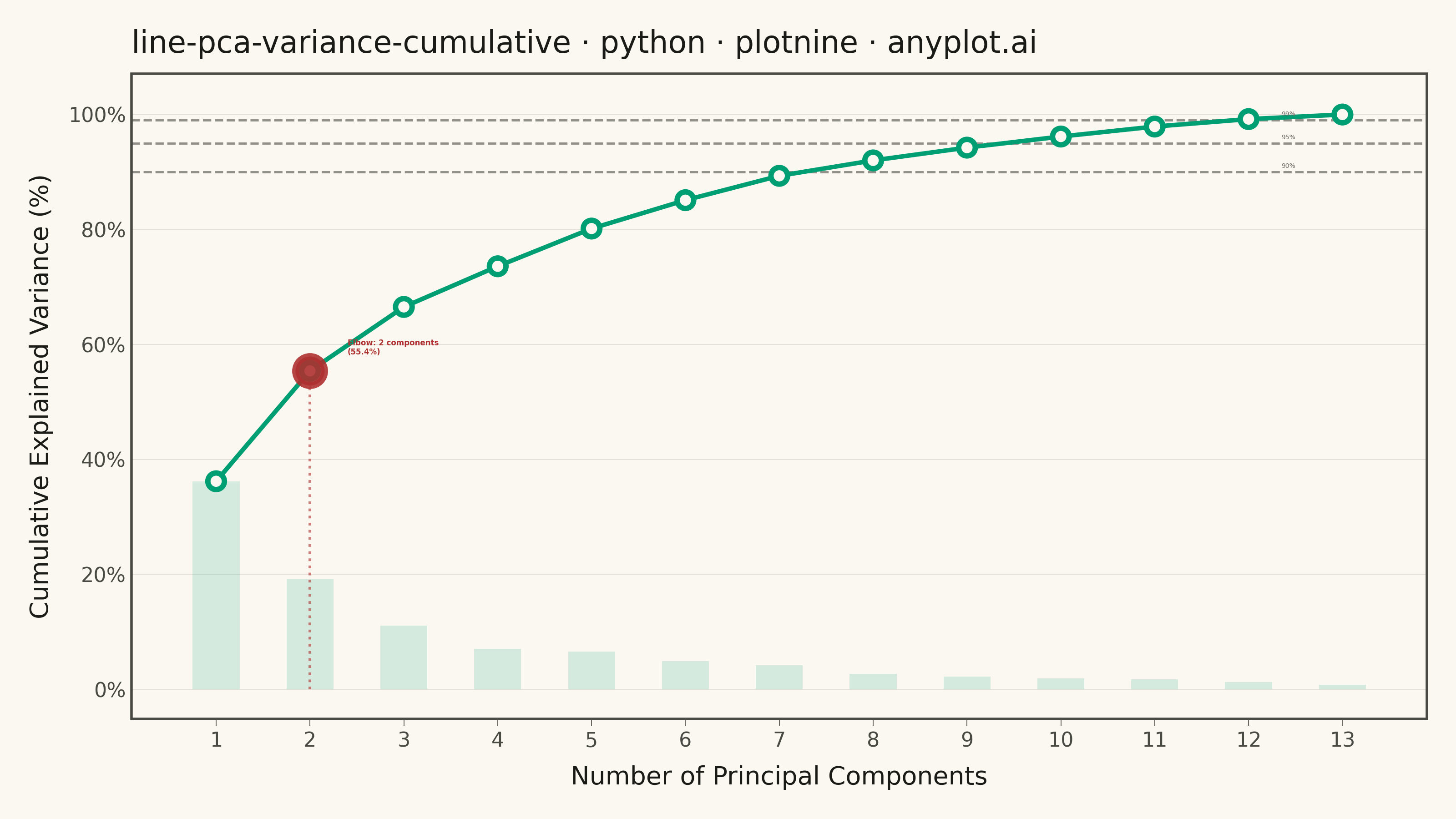
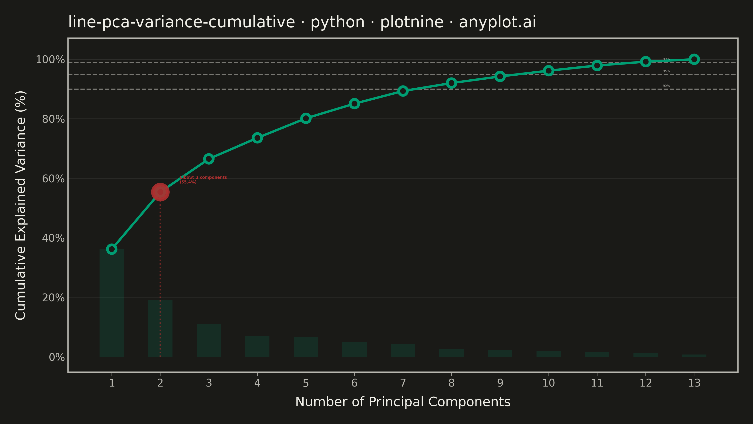
A line plot showing the cumulative proportion of explained variance as a function of the number of Principal Component Analysis (PCA) components. This visualization helps determine the optimal number of components to retain by displaying the trade-off between dimensionality reduction and information preservation. The cumulative curve typically exhibits an elbow pattern where additional components yield diminishing returns, and horizontal threshold lines (e.g., 90%, 95%) guide component selection decisions.
""" anyplot.ai
line-pca-variance-cumulative: Cumulative Explained Variance for PCA Component Selection
Library: plotnine 0.15.4 | Python 3.13.13
Quality: 90/100 | Updated: 2026-05-29
"""

import os

import numpy as np
import pandas as pd
from plotnine import (
    aes,
    element_blank,
    element_line,
    element_rect,
    element_text,
    geom_col,
    geom_hline,
    geom_line,
    geom_point,
    geom_segment,
    geom_text,
    ggplot,
    labs,
    scale_x_continuous,
    scale_y_continuous,
    theme,
    theme_minimal,
)
from sklearn.datasets import load_wine
from sklearn.decomposition import PCA
from sklearn.preprocessing import StandardScaler


# Theme tokens — Imprint palette, theme-adaptive chrome
THEME = os.getenv("ANYPLOT_THEME", "light")
PAGE_BG = "#FAF8F1" if THEME == "light" else "#1A1A17"
INK = "#1A1A17" if THEME == "light" else "#F0EFE8"
INK_SOFT = "#4A4A44" if THEME == "light" else "#B8B7B0"
INK_MUTED = "#6B6A63" if THEME == "light" else "#A8A79F"

# Imprint palette
BRAND = "#009E73"  # Imprint position 1 — ALWAYS first series
IMPRINT_RED = "#AE3030"  # Imprint matte red — semantic anchor for elbow emphasis

# Data — PCA on the Wine dataset (13 features)
X_scaled = StandardScaler().fit_transform(load_wine().data)
pca = PCA().fit(X_scaled)

n_components = np.arange(1, len(pca.explained_variance_ratio_) + 1)
cumulative_var = np.cumsum(pca.explained_variance_ratio_) * 100
individual_var = pca.explained_variance_ratio_ * 100

df = pd.DataFrame({"component": n_components, "cumulative": cumulative_var, "individual": individual_var})

# Elbow detection via maximum second-derivative change
diffs = np.diff(cumulative_var)
elbow_idx = int(np.argmax(np.abs(np.diff(diffs)))) + 1
elbow_c = int(n_components[elbow_idx])
elbow_v = cumulative_var[elbow_idx]
elbow_df = pd.DataFrame(
    {"component": [elbow_c], "cumulative": [elbow_v], "label": [f"Elbow: {elbow_c} components\n({elbow_v:.1f}%)"]}
)

# Threshold reference lines
thresholds = pd.DataFrame({"y": [90.0, 95.0, 99.0], "label": ["90%", "95%", "99%"], "x": [12.5, 12.5, 12.5]})

# Title fontsize — scaled by length per plot-generator.md formula
title_str = "line-pca-variance-cumulative · python · plotnine · anyplot.ai"
n = len(title_str)
ratio = 67 / n if n > 67 else 1.0
title_fontsize = max(8, round(12 * ratio))

# Plot
plot = (
    ggplot(df, aes(x="component", y="cumulative"))
    # Threshold dashed reference lines (structural chrome — INK_SOFT)
    + geom_hline(yintercept=90.0, linetype="dashed", color=INK_SOFT, size=0.5, alpha=0.6)
    + geom_hline(yintercept=95.0, linetype="dashed", color=INK_SOFT, size=0.5, alpha=0.6)
    + geom_hline(yintercept=99.0, linetype="dashed", color=INK_SOFT, size=0.5, alpha=0.6)
    # Individual variance as translucent bars — contextual background layer
    + geom_col(aes(y="individual"), fill=BRAND, width=0.5, alpha=0.15, show_legend=False)
    # Vertical drop-line from elbow to x-axis
    + geom_segment(
        data=elbow_df,
        mapping=aes(x="component", xend="component", y=0, yend="cumulative"),
        linetype="dotted",
        color=IMPRINT_RED,
        size=0.6,
        alpha=0.6,
    )
    # Main cumulative variance line
    + geom_line(color=BRAND, size=1.0)
    # Data point markers — PAGE_BG fill for theme-adaptive white circles
    + geom_point(color=BRAND, size=2.5, fill=PAGE_BG, stroke=1.2, shape="o")
    # Highlighted elbow point
    + geom_point(
        data=elbow_df,
        mapping=aes(x="component", y="cumulative"),
        color=IMPRINT_RED,
        size=5.0,
        fill=IMPRINT_RED,
        stroke=1.5,
        shape="o",
        alpha=0.9,
    )
    # Elbow annotation
    + geom_text(
        data=elbow_df,
        mapping=aes(x="component", y="cumulative", label="label"),
        ha="left",
        va="bottom",
        size=3.0,
        color=IMPRINT_RED,
        fontweight="bold",
        nudge_x=0.4,
        nudge_y=2.5,
    )
    # Threshold labels
    + geom_text(
        data=thresholds,
        mapping=aes(x="x", y="y", label="label"),
        ha="right",
        va="bottom",
        size=2.5,
        color=INK_MUTED,
        nudge_y=0.5,
    )
    # Scales
    + scale_x_continuous(breaks=n_components, labels=[str(i) for i in n_components], expand=(0.02, 0.4))
    + scale_y_continuous(
        limits=(0, 102), breaks=[0, 20, 40, 60, 80, 100], labels=["0%", "20%", "40%", "60%", "80%", "100%"]
    )
    + labs(x="Number of Principal Components", y="Cumulative Explained Variance (%)", title=title_str)
    + theme_minimal()
    + theme(
        figure_size=(8, 4.5),
        text=element_text(size=7, color=INK_SOFT),
        axis_title=element_text(size=10, color=INK),
        axis_text=element_text(size=8, color=INK_SOFT),
        plot_title=element_text(size=title_fontsize, color=INK, ha="left"),
        panel_grid_major_x=element_blank(),
        panel_grid_minor=element_blank(),
        panel_grid_major_y=element_line(color=INK, size=0.3, alpha=0.12),
        plot_background=element_rect(fill=PAGE_BG, color=PAGE_BG),
        panel_background=element_rect(fill=PAGE_BG),
        panel_border=element_rect(color=INK_SOFT, fill=None),
        axis_line_x=element_line(color=INK_SOFT, size=0.4),
        axis_ticks_major_x=element_line(color=INK_SOFT, size=0.3),
        plot_margin=0.02,
    )
)

# Save
plot.save(f"plot-{THEME}.png", dpi=400, width=8, height=4.5, units="in", verbose=False)
Runnable source as JSON, for any HTTP client: https://api.anyplot.ai/specs/line-pca-variance-cumulative/plotnine/code. Any spec id and library id listed in llms-full.txt fit the same URL shape; every URL below is complete and callable.
{
  "spec_id": "line-pca-variance-cumulative",
  "language": "python",
  "library": "plotnine",
  "page": "https://anyplot.ai/line-pca-variance-cumulative/python/plotnine",
  "hub": "https://anyplot.ai/line-pca-variance-cumulative",
  "code_json": "https://api.anyplot.ai/specs/line-pca-variance-cumulative/plotnine/code",
  "spec_json": "https://api.anyplot.ai/specs/line-pca-variance-cumulative",
  "render_light_png": "https://storage.googleapis.com/anyplot-images/plots/line-pca-variance-cumulative/python/plotnine/plot-light.png",
  "render_dark_png": "https://storage.googleapis.com/anyplot-images/plots/line-pca-variance-cumulative/python/plotnine/plot-dark.png",
  "quality_score": 90.0,
  "license": "MIT",
  "guide": "https://anyplot.ai/llms.txt"
}
Part of Cumulative Explained Variance for PCA Component Selection on anyplot.ai.