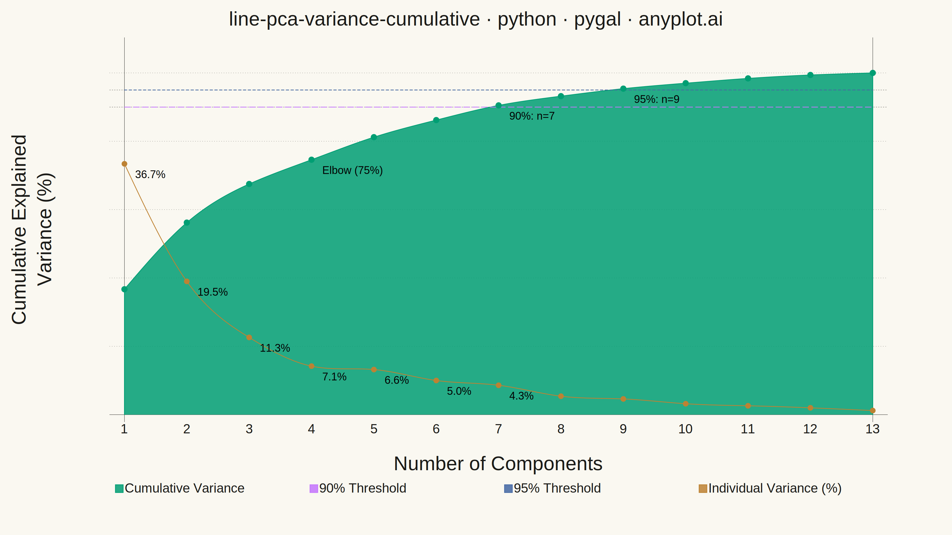
A line plot showing the cumulative proportion of explained variance as a function of the number of Principal Component Analysis (PCA) components. This visualization helps determine the optimal number of components to retain by displaying the trade-off between dimensionality reduction and information preservation. The cumulative curve typically exhibits an elbow pattern where additional components yield diminishing returns, and horizontal threshold lines (e.g., 90%, 95%) guide component selection decisions.
""" anyplot.ai
line-pca-variance-cumulative: Cumulative Explained Variance for PCA Component Selection
Library: pygal 3.1.0 | Python 3.13.13
Quality: 90/100 | Updated: 2026-05-29
"""

import os

import numpy as np
import pygal
from pygal.style import Style


# Theme tokens — Imprint palette, theme-adaptive chrome
THEME = os.getenv("ANYPLOT_THEME", "light")
PAGE_BG = "#FAF8F1" if THEME == "light" else "#1A1A17"
INK = "#1A1A17" if THEME == "light" else "#F0EFE8"
INK_SOFT = "#4A4A44" if THEME == "light" else "#B8B7B0"
INK_MUTED = "#6B6A63" if THEME == "light" else "#A8A79F"

IMPRINT_PALETTE = (
    "#009E73",  # brand green — always first series
    "#C475FD",  # lavender
    "#4467A3",  # blue
    "#BD8233",  # ochre
    "#AE3030",
    "#2ABCCD",
    "#954477",
    "#99B314",
)

# Data — realistic PCA variance ratios for a 13-feature Wine-like dataset
eigenvalues = np.array([4.73, 2.51, 1.45, 0.92, 0.85, 0.64, 0.55, 0.35, 0.29, 0.21, 0.17, 0.13, 0.08])
explained_variance_ratio = eigenvalues / eigenvalues.sum()
individual_variance = explained_variance_ratio * 100
cumulative_variance = np.cumsum(explained_variance_ratio) * 100
n_components = len(cumulative_variance)
component_labels = [str(i) for i in range(1, n_components + 1)]

# Detect elbow: where slope drops below 35% of the initial slope
slopes = np.diff(cumulative_variance)
elbow_idx = int(np.argmax(slopes < slopes[0] * 0.35))

# Threshold crossings
cross_90 = int(np.searchsorted(cumulative_variance, 90))
cross_95 = int(np.searchsorted(cumulative_variance, 95))

# Style — Imprint palette, theme-adaptive tokens, 3200×1800 canvas sizing
custom_style = Style(
    background=PAGE_BG,
    plot_background=PAGE_BG,
    foreground=INK,
    foreground_strong=INK,
    foreground_subtle=INK_SOFT,  # INK_SOFT (not INK_MUTED) for legible tick labels against green fill
    colors=IMPRINT_PALETTE,
    opacity=0.38,  # semi-transparent fill so y-axis labels remain legible beneath the green area
    opacity_hover=1.0,
    stroke_opacity=1.0,
    stroke_opacity_hover=1.0,
    stroke_width=2.5,
    dot_opacity=1.0,
    guide_stroke_color=INK_MUTED,
    guide_stroke_dasharray="2,12",  # longer gap — guides recede behind data
    major_guide_stroke_color=INK_SOFT,
    major_guide_stroke_dasharray="8,12",  # longer gap for major guides at 90%/95%
    title_font_size=66,
    label_font_size=56,
    major_label_font_size=44,
    legend_font_size=44,
    value_font_size=36,
    tooltip_font_size=34,
    font_family="Helvetica, Arial, sans-serif",
    title_font_family="Helvetica, Arial, sans-serif",
    label_font_family="Helvetica, Arial, sans-serif",
    legend_font_family="Helvetica, Arial, sans-serif",
    value_font_family="Helvetica, Arial, sans-serif",
    major_label_font_family="Helvetica, Arial, sans-serif",
    transition="200ms",
)

# Chart
chart = pygal.Line(
    width=3200,
    height=1800,
    title="line-pca-variance-cumulative · python · pygal · anyplot.ai",
    x_title="Number of Components",
    y_title="Cumulative Explained Variance (%)",
    style=custom_style,
    show_dots=True,
    dots_size=10,
    show_only_major_dots=False,
    show_y_guides=True,
    show_x_guides=False,
    legend_at_bottom=True,
    legend_at_bottom_columns=4,
    legend_box_size=26,
    truncate_legend=-1,
    range=(0, 105),
    secondary_range=(0, 55),  # individual variance secondary axis; wider margin ensures labels are visible
    margin=30,
    margin_bottom=90,
    margin_left=220,  # wider left margin so y-axis labels sit clearly outside the green fill
    margin_right=220,  # wider right margin for secondary-axis tick labels on right side
    margin_top=40,
    print_values=True,
    print_values_position="top",
    value_formatter=lambda x: "",
    spacing=20,
    show_minor_x_labels=True,
    tooltip_fancy_mode=True,
    tooltip_border_radius=10,
    interpolate="cubic",
    interpolation_precision=200,
    human_readable=False,
    no_data_text="No variance data",
)

# Axes — custom y-tick positions highlight the decision thresholds
chart.x_labels = component_labels
# Mark the three decision-point components as major x-labels (bold, guided)
chart.x_labels_major = [str(elbow_idx + 1), str(cross_90 + 1), str(cross_95 + 1)]
chart.y_labels = [0, 20, 40, 60, 80, 90, 95, 100]
chart.y_labels_major = [90, 95]  # major guide lines drawn at the two decision thresholds

# Annotations at key decision points
annotations = {
    elbow_idx: lambda x: f"Elbow: n={elbow_idx + 1} ({x:.0f}%)",
    cross_90: lambda x: f"90%: n={cross_90 + 1}",
    cross_95: lambda x: f"95%: n={cross_95 + 1}",
}

# Cumulative variance — brand green filled area, thick primary stroke for visual hierarchy
cumulative_values = [
    {"value": round(v, 1), "label": f"PC{i + 1}", "formatter": annotations.get(i, lambda x: "")}
    for i, v in enumerate(cumulative_variance)
]
chart.add(
    "Cumulative Variance",
    cumulative_values,
    stroke_style={"width": 10, "linecap": "round", "linejoin": "round"},
    fill=True,
)

# 90% threshold — lavender dashed, thinner to reinforce secondary role
chart.add(
    "90% Threshold",
    [{"value": 90, "label": "90% variance threshold", "formatter": lambda x: ""} for _ in range(n_components)],
    show_dots=False,
    fill=False,
    stroke_style={"width": 3, "dasharray": "22, 12", "linecap": "round"},
)

# 95% threshold — blue dotted, thinner for visual hierarchy
chart.add(
    "95% Threshold",
    [{"value": 95, "label": "95% variance threshold", "formatter": lambda x: ""} for _ in range(n_components)],
    show_dots=False,
    fill=False,
    stroke_style={"width": 3, "dasharray": "8, 10", "linecap": "round"},
)

# Individual variance on secondary Y-axis — ochre with larger dots for salience
# Per-point formatters serve as secondary-axis labels for components with meaningful variance
individual_values = [
    {"value": round(v, 1), "label": f"PC{i + 1}: {v:.1f}%", "formatter": lambda x: f"{x:.1f}%" if x > 3 else ""}
    for i, v in enumerate(individual_variance)
]
chart.add(
    "Individual Variance (%)",
    individual_values,
    secondary=True,
    stroke_style={"width": 8, "linecap": "round", "linejoin": "round"},
    show_dots=True,
    dots_size=11,
    fill=False,
)

# Save PNG and interactive HTML
chart.render_to_png(f"plot-{THEME}.png")
with open(f"plot-{THEME}.html", "wb") as f:
    f.write(chart.render())
Runnable source as JSON, for any HTTP client: https://api.anyplot.ai/specs/line-pca-variance-cumulative/pygal/code. Any spec id and library id listed in llms-full.txt fit the same URL shape; every URL below is complete and callable.
{
  "spec_id": "line-pca-variance-cumulative",
  "language": "python",
  "library": "pygal",
  "page": "https://anyplot.ai/line-pca-variance-cumulative/python/pygal",
  "hub": "https://anyplot.ai/line-pca-variance-cumulative",
  "code_json": "https://api.anyplot.ai/specs/line-pca-variance-cumulative/pygal/code",
  "spec_json": "https://api.anyplot.ai/specs/line-pca-variance-cumulative",
  "render_light_png": "https://storage.googleapis.com/anyplot-images/plots/line-pca-variance-cumulative/python/pygal/plot-light.png",
  "render_dark_png": "https://storage.googleapis.com/anyplot-images/plots/line-pca-variance-cumulative/python/pygal/plot-dark.png",
  "interactive_light_html": "https://storage.googleapis.com/anyplot-images/plots/line-pca-variance-cumulative/python/pygal/plot-light.html",
  "interactive_dark_html": "https://storage.googleapis.com/anyplot-images/plots/line-pca-variance-cumulative/python/pygal/plot-dark.html",
  "quality_score": 90.0,
  "license": "MIT",
  "guide": "https://anyplot.ai/llms.txt"
}
Part of Cumulative Explained Variance for PCA Component Selection on anyplot.ai.