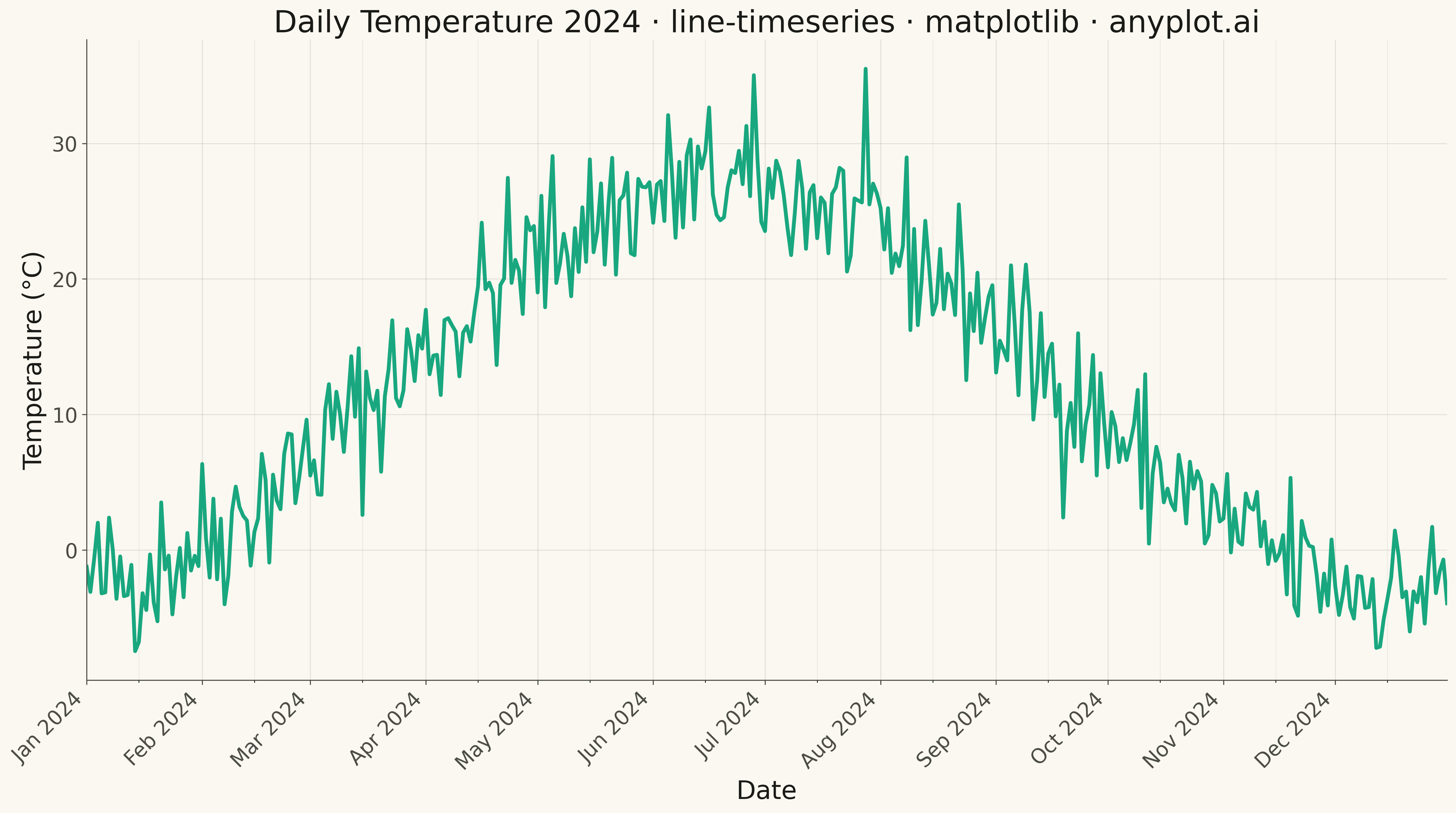
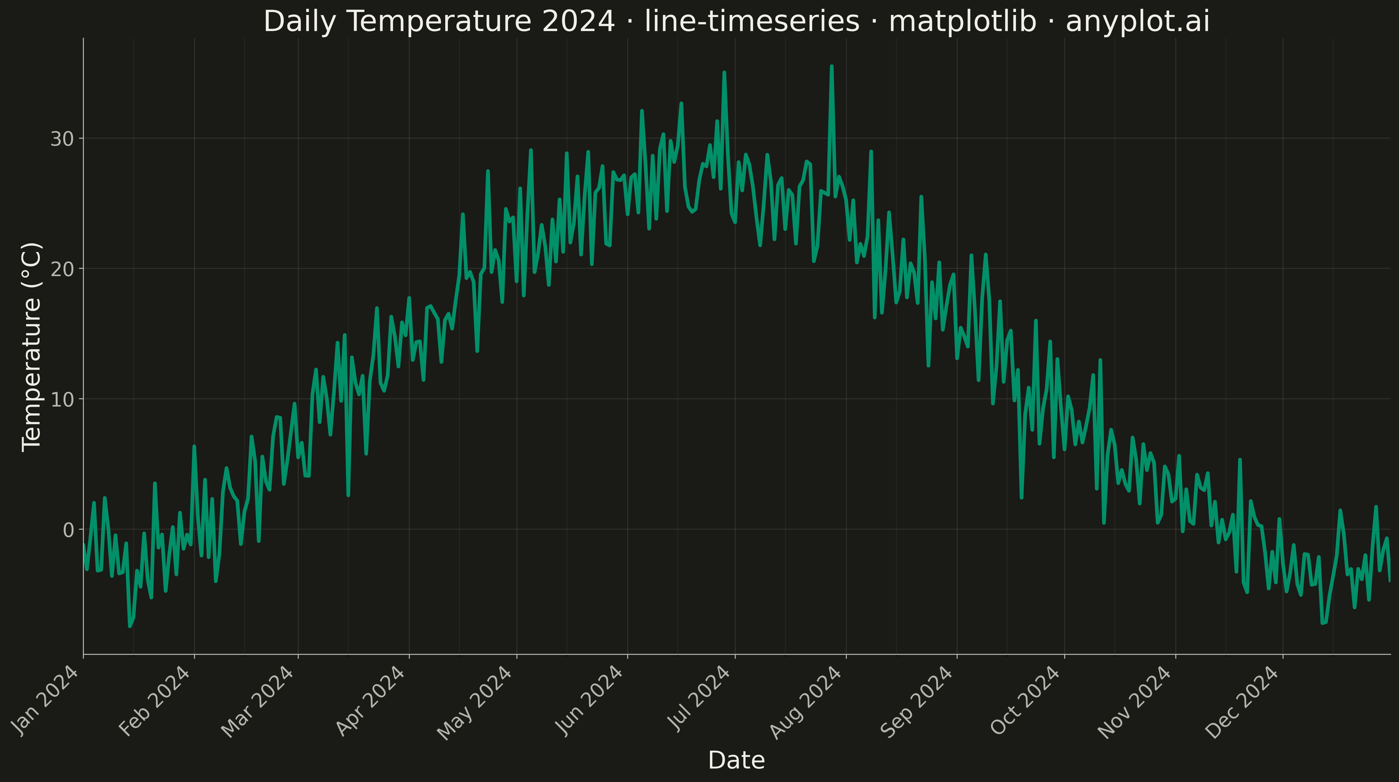
A time series line plot displays data points connected by lines over a datetime x-axis, with smart date formatting that automatically adjusts tick labels based on the time scale (days, months, years). This plot type is essential for temporal data analysis where proper date formatting and readability are critical. Unlike basic line plots, time series plots handle datetime parsing, timezone awareness, and intelligent tick label formatting.
""" anyplot.ai
line-timeseries: Time Series Line Plot
Library: matplotlib 3.10.9 | Python 3.13.13
Quality: 92/100 | Updated: 2026-05-09
"""

import os

import matplotlib.dates as mdates
import matplotlib.pyplot as plt
import numpy as np
import pandas as pd


# Theme tokens
THEME = os.getenv("ANYPLOT_THEME", "light")
PAGE_BG = "#FAF8F1" if THEME == "light" else "#1A1A17"
ELEVATED_BG = "#FFFDF6" if THEME == "light" else "#242420"
INK = "#1A1A17" if THEME == "light" else "#F0EFE8"
INK_SOFT = "#4A4A44" if THEME == "light" else "#B8B7B0"
BRAND = "#009E73"  # Okabe-Ito position 1 — ALWAYS first series

# Data - Daily temperature readings over one year
np.random.seed(42)
dates = pd.date_range(start="2024-01-01", end="2024-12-31", freq="D")

# Simulate realistic temperature pattern with seasonal variation
day_of_year = np.arange(len(dates))
seasonal = 15 * np.sin(2 * np.pi * (day_of_year - 80) / 365)
baseline = 12
noise = np.random.randn(len(dates)) * 3
temperature = baseline + seasonal + noise

# Plot
fig, ax = plt.subplots(figsize=(16, 9), facecolor=PAGE_BG)
ax.set_facecolor(PAGE_BG)

# Time series line with brand color
ax.plot(dates, temperature, linewidth=3.0, color=BRAND, alpha=0.9)

# Smart date formatting based on time range
ax.xaxis.set_major_locator(mdates.MonthLocator())
ax.xaxis.set_major_formatter(mdates.DateFormatter("%b %Y"))
ax.xaxis.set_minor_locator(mdates.MonthLocator(bymonthday=15))

# Rotate labels to prevent overlap
plt.setp(ax.xaxis.get_majorticklabels(), rotation=45, ha="right")

# Labels and styling
ax.set_xlabel("Date", fontsize=20, color=INK)
ax.set_ylabel("Temperature (°C)", fontsize=20, color=INK)
ax.set_title(
    "Daily Temperature 2024 · line-timeseries · matplotlib · anyplot.ai", fontsize=24, fontweight="medium", color=INK
)
ax.tick_params(axis="both", labelsize=16, colors=INK_SOFT)

# Spines
for spine in ("top", "right"):
    ax.spines[spine].set_visible(False)
for spine in ("left", "bottom"):
    ax.spines[spine].set_color(INK_SOFT)

# Grid for readability
ax.grid(True, alpha=0.10, which="major", color=INK)
ax.grid(True, alpha=0.05, which="minor", color=INK)

# Set axis limits with padding
ax.set_xlim(dates[0], dates[-1])
ax.margins(y=0.05)

plt.tight_layout()
plt.savefig(f"plot-{THEME}.png", dpi=300, bbox_inches="tight", facecolor=PAGE_BG)
Runnable source as JSON, for any HTTP client: https://api.anyplot.ai/specs/line-timeseries/matplotlib/code. Any spec id and library id listed in llms-full.txt fit the same URL shape; every URL below is complete and callable.
{
  "spec_id": "line-timeseries",
  "language": "python",
  "library": "matplotlib",
  "page": "https://anyplot.ai/line-timeseries/python/matplotlib",
  "hub": "https://anyplot.ai/line-timeseries",
  "code_json": "https://api.anyplot.ai/specs/line-timeseries/matplotlib/code",
  "spec_json": "https://api.anyplot.ai/specs/line-timeseries",
  "render_light_png": "https://storage.googleapis.com/anyplot-images/plots/line-timeseries/python/matplotlib/plot-light.png",
  "render_dark_png": "https://storage.googleapis.com/anyplot-images/plots/line-timeseries/python/matplotlib/plot-dark.png",
  "quality_score": 92.0,
  "license": "MIT",
  "guide": "https://anyplot.ai/llms.txt"
}
Part of Time Series Line Plot on anyplot.ai.