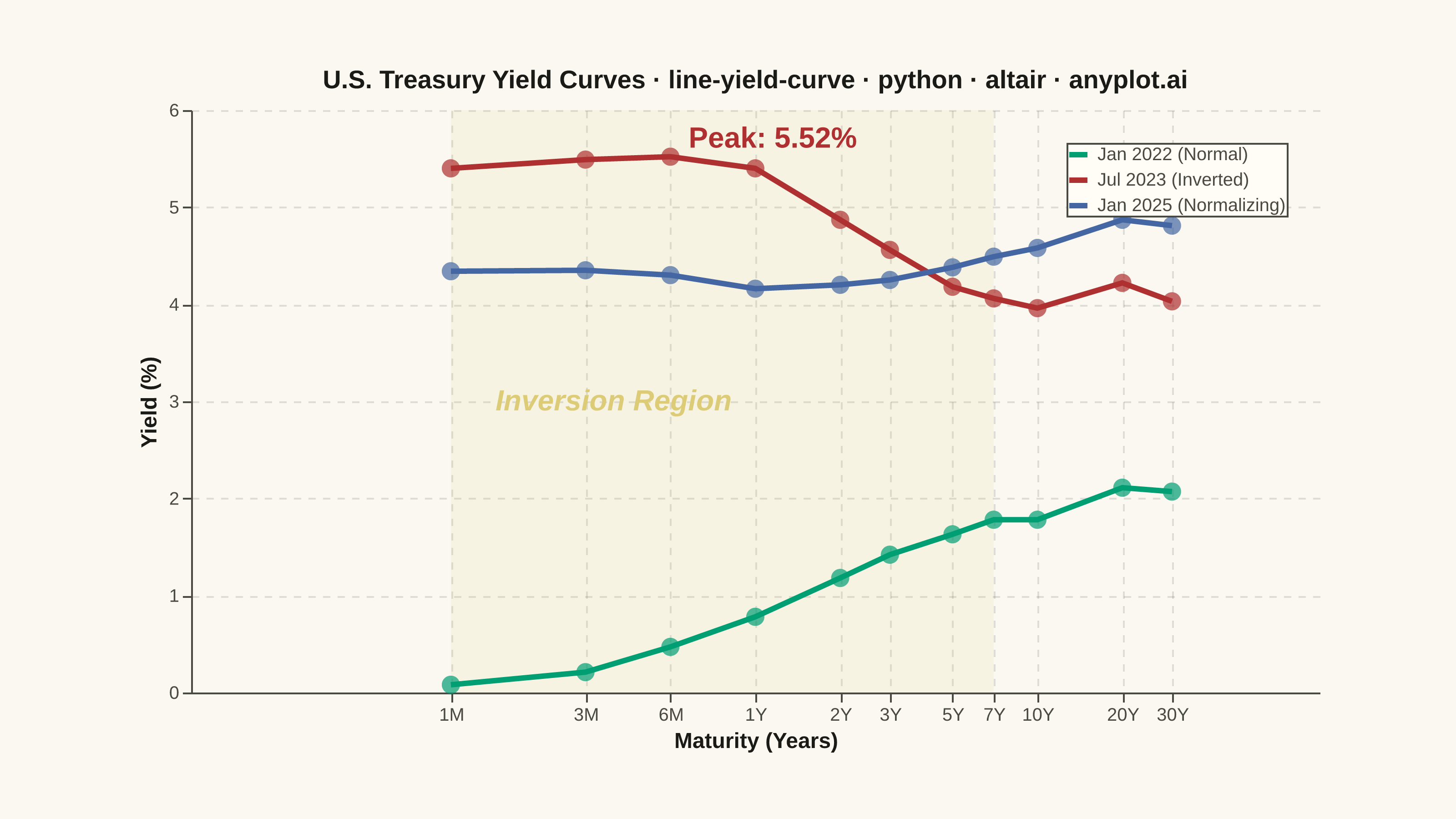
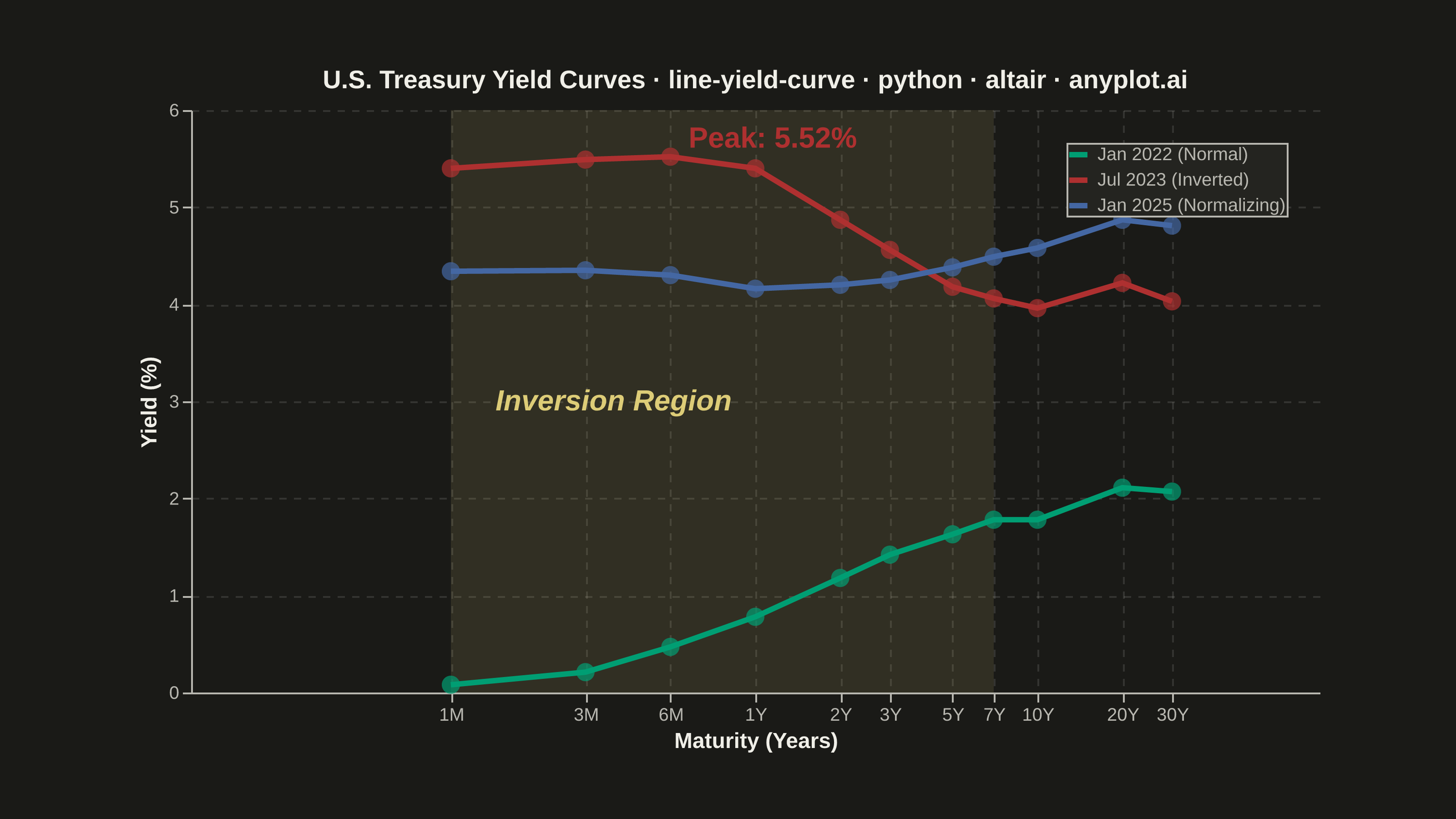
A yield curve plots interest rates (yields) of bonds against their maturities, from short-term (e.g., 1 month) to long-term (e.g., 30 years). It is one of the most iconic charts in macroeconomics and finance, used to assess market expectations for future interest rates, economic growth, and inflation. An inverted yield curve (where short-term rates exceed long-term rates) is a widely followed recession indicator. The plot should support displaying multiple curves (e.g., different dates) on the same axes to show how the term structure evolves over time.
""" anyplot.ai
line-yield-curve: Yield Curve (Interest Rate Term Structure)
Library: altair 6.2.1 | Python 3.13.13
Quality: 92/100 | Updated: 2026-06-10
"""

import os

import altair as alt
import pandas as pd
from PIL import Image


# Theme tokens (Imprint palette — theme-adaptive chrome)
THEME = os.getenv("ANYPLOT_THEME", "light")
PAGE_BG = "#FAF8F1" if THEME == "light" else "#1A1A17"
ELEVATED_BG = "#FFFDF6" if THEME == "light" else "#242420"
INK = "#1A1A17" if THEME == "light" else "#F0EFE8"
INK_SOFT = "#4A4A44" if THEME == "light" else "#B8B7B0"

# Imprint categorical palette — AE3030 used semantically for the inverted/crisis curve
IMPRINT_PALETTE = ["#009E73", "#C475FD", "#4467A3", "#BD8233", "#AE3030", "#2ABCCD", "#954477", "#99B314"]
ANYPLOT_AMBER = "#DDCC77"  # warning / caution anchor — inversion region shading

# Data — U.S. Treasury yield curves: normal, inverted, and normalizing periods
maturities = ["1M", "3M", "6M", "1Y", "2Y", "3Y", "5Y", "7Y", "10Y", "20Y", "30Y"]
maturity_years = [1 / 12, 0.25, 0.5, 1, 2, 3, 5, 7, 10, 20, 30]

# Jan 2022 — Normal upward-sloping curve (pre-tightening)
yields_normal = [0.08, 0.21, 0.47, 0.78, 1.18, 1.42, 1.63, 1.78, 1.78, 2.11, 2.07]

# Jul 2023 — Inverted curve (peak inversion; AE3030 = semantic red for recession signal)
yields_inverted = [5.40, 5.49, 5.52, 5.40, 4.87, 4.56, 4.18, 4.06, 3.96, 4.22, 4.03]

# Jan 2025 — Normalizing curve (post-pivot)
yields_normalizing = [4.34, 4.35, 4.30, 4.16, 4.20, 4.25, 4.38, 4.49, 4.58, 4.87, 4.81]

records = []
for i, mat in enumerate(maturities):
    records.append(
        {
            "maturity": mat,
            "maturity_years": maturity_years[i],
            "yield_pct": yields_normal[i],
            "date": "Jan 2022 (Normal)",
            "order": 1,
        }
    )
    records.append(
        {
            "maturity": mat,
            "maturity_years": maturity_years[i],
            "yield_pct": yields_inverted[i],
            "date": "Jul 2023 (Inverted)",
            "order": 2,
        }
    )
    records.append(
        {
            "maturity": mat,
            "maturity_years": maturity_years[i],
            "yield_pct": yields_normalizing[i],
            "date": "Jan 2025 (Normalizing)",
            "order": 3,
        }
    )

df = pd.DataFrame(records)

# Inversion region — amber shading marks where short-term rates exceed long-term rates
inversion_df = pd.DataFrame({"x_start": [1 / 12], "x_end": [7]})

inversion_shade = (
    alt.Chart(inversion_df)
    .mark_rect(opacity=0.12, color=ANYPLOT_AMBER)
    .encode(x=alt.X("x_start:Q"), x2="x_end:Q", y=alt.value(0), y2=alt.value(320))
)

inversion_label = (
    alt.Chart(pd.DataFrame({"x": [0.12], "y": [3.0], "text": ["Inversion Region"]}))
    .mark_text(fontSize=16, align="left", fontStyle="italic", color=ANYPLOT_AMBER, fontWeight="bold")
    .encode(x="x:Q", y="y:Q", text="text:N")
)

# Series colors — Imprint: green=normal growth, red=inversion/crisis, blue=normalizing
date_order = ["Jan 2022 (Normal)", "Jul 2023 (Inverted)", "Jan 2025 (Normalizing)"]
colors = [IMPRINT_PALETTE[0], IMPRINT_PALETTE[4], IMPRINT_PALETTE[2]]  # #009E73, #AE3030, #4467A3

# Peak annotation for the inverted curve
peak_annotation = (
    alt.Chart(pd.DataFrame({"x": [0.5], "y": [5.52], "text": ["Peak: 5.52%"]}))
    .mark_text(fontSize=16, align="left", dx=10, dy=-10, color=IMPRINT_PALETTE[4], fontWeight="bold")
    .encode(x="x:Q", y="y:Q", text="text:N")
)

# Title — scaled from default 16px for 76-char string (floor 11)
title_str = "U.S. Treasury Yield Curves · line-yield-curve · python · altair · anyplot.ai"
title_fontsize = max(11, round(16 * 67 / len(title_str)))

# Axis encoding
x_axis = alt.X(
    "maturity_years:Q",
    title="Maturity (Years)",
    scale=alt.Scale(type="log", domain=[0.08, 35]),
    axis=alt.Axis(
        values=[1 / 12, 0.25, 0.5, 1, 2, 3, 5, 7, 10, 20, 30],
        labelExpr=(
            "datum.value < 0.09 ? '1M' : datum.value < 0.3 ? '3M' : datum.value < 0.6 ? '6M' : datum.value + 'Y'"
        ),
    ),
)

y_axis = alt.Y(
    "yield_pct:Q",
    title="Yield (%)",
    scale=alt.Scale(domain=[0, 5.9]),  # tightened from [0, 6] for better canvas utilisation
)

color_enc = alt.Color(
    "date:N",
    scale=alt.Scale(domain=date_order, range=colors),
    legend=alt.Legend(
        title=None, labelFontSize=10, labelLimit=300, orient="top-right", symbolStrokeWidth=3, symbolSize=100
    ),
    sort=date_order,
)

# Plot layers: inversion shade + lines + points + annotation labels
line = (
    alt.Chart(df)
    .mark_line(strokeWidth=3)
    .encode(
        x=x_axis, y=y_axis, color=color_enc, tooltip=["maturity:N", "yield_pct:Q", "date:N"], order="maturity_years:Q"
    )
)

points = (
    alt.Chart(df)
    .mark_point(size=100, filled=True)
    .encode(
        x="maturity_years:Q",
        y="yield_pct:Q",
        color=alt.Color("date:N", scale=alt.Scale(domain=date_order, range=colors), legend=None, sort=date_order),
        tooltip=["maturity:N", "yield_pct:Q", "date:N"],
    )
)

# Canvas: landscape inner view 620×320, scale_factor=4.0 → PIL-padded to exactly 3200×1800
TW, TH = 3200, 1800

chart = (
    (inversion_shade + line + points + inversion_label + peak_annotation)
    .properties(
        width=620, height=320, background=PAGE_BG, title=alt.Title(title_str, fontSize=title_fontsize, anchor="middle")
    )
    .configure_view(fill=PAGE_BG, stroke=None, strokeWidth=0)
    .configure_title(color=INK)
    .configure_axis(
        domainColor=INK_SOFT,
        tickColor=INK_SOFT,
        gridColor=INK,
        gridOpacity=0.12,
        gridDash=[4, 4],
        labelColor=INK_SOFT,
        titleColor=INK,
        labelFontSize=10,
        titleFontSize=12,
    )
    .configure_legend(
        fillColor=ELEVATED_BG,
        strokeColor=INK_SOFT,
        labelColor=INK_SOFT,
        titleColor=INK,
        labelFontSize=10,
        titleFontSize=10,
    )
)

# Save PNG then pad to exact 3200×1800 target
chart.save(f"plot-{THEME}.png", scale_factor=4.0)

_img = Image.open(f"plot-{THEME}.png").convert("RGB")
_w, _h = _img.size
if _w > TW or _h > TH:
    raise SystemExit(
        f"altair vl-convert produced {_w}×{_h}, exceeds target {TW}×{TH}. "
        f"Shrink chart .properties(width=, height=) values and re-render."
    )
if _w < TW or _h < TH:
    _canvas = Image.new("RGB", (TW, TH), PAGE_BG)
    _canvas.paste(_img, ((TW - _w) // 2, (TH - _h) // 2))
    _canvas.save(f"plot-{THEME}.png")

# Save interactive HTML
chart.interactive().save(f"plot-{THEME}.html")
Runnable source as JSON, for any HTTP client: https://api.anyplot.ai/specs/line-yield-curve/altair/code. Any spec id and library id listed in llms-full.txt fit the same URL shape; every URL below is complete and callable.
{
  "spec_id": "line-yield-curve",
  "language": "python",
  "library": "altair",
  "page": "https://anyplot.ai/line-yield-curve/python/altair",
  "hub": "https://anyplot.ai/line-yield-curve",
  "code_json": "https://api.anyplot.ai/specs/line-yield-curve/altair/code",
  "spec_json": "https://api.anyplot.ai/specs/line-yield-curve",
  "render_light_png": "https://storage.googleapis.com/anyplot-images/plots/line-yield-curve/python/altair/plot-light.png",
  "render_dark_png": "https://storage.googleapis.com/anyplot-images/plots/line-yield-curve/python/altair/plot-dark.png",
  "interactive_light_html": "https://storage.googleapis.com/anyplot-images/plots/line-yield-curve/python/altair/plot-light.html",
  "interactive_dark_html": "https://storage.googleapis.com/anyplot-images/plots/line-yield-curve/python/altair/plot-dark.html",
  "quality_score": 92.0,
  "license": "MIT",
  "guide": "https://anyplot.ai/llms.txt"
}
Part of Yield Curve (Interest Rate Term Structure) on anyplot.ai.