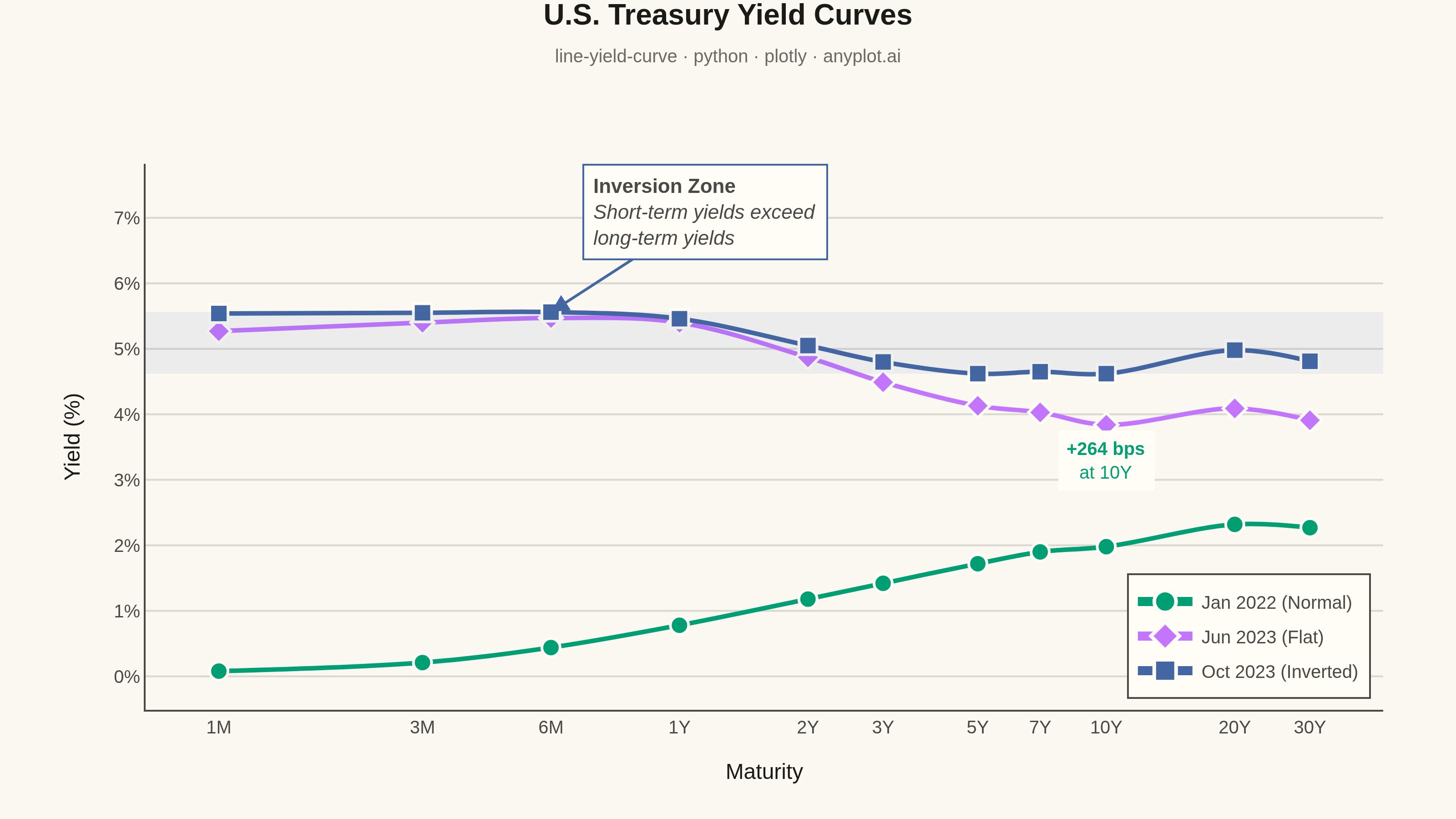
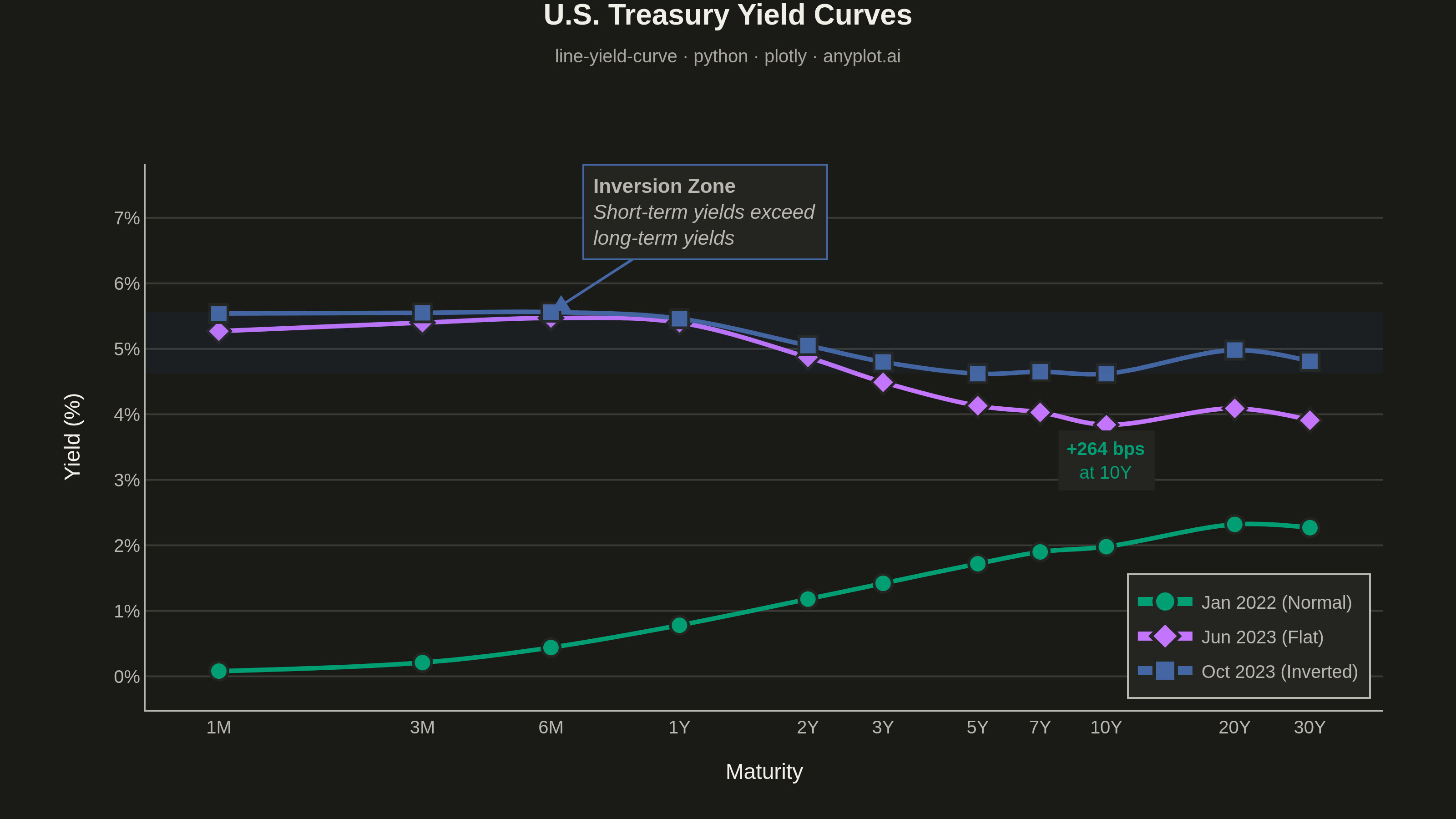
A yield curve plots interest rates (yields) of bonds against their maturities, from short-term (e.g., 1 month) to long-term (e.g., 30 years). It is one of the most iconic charts in macroeconomics and finance, used to assess market expectations for future interest rates, economic growth, and inflation. An inverted yield curve (where short-term rates exceed long-term rates) is a widely followed recession indicator. The plot should support displaying multiple curves (e.g., different dates) on the same axes to show how the term structure evolves over time.
""" anyplot.ai
line-yield-curve: Yield Curve (Interest Rate Term Structure)
Library: plotly 6.8.0 | Python 3.13.13
Quality: 95/100 | Updated: 2026-06-10
"""

import os

import numpy as np
import plotly.graph_objects as go


THEME = os.getenv("ANYPLOT_THEME", "light")
PAGE_BG = "#FAF8F1" if THEME == "light" else "#1A1A17"
ELEVATED_BG = "#FFFDF6" if THEME == "light" else "#242420"
INK = "#1A1A17" if THEME == "light" else "#F0EFE8"
INK_SOFT = "#4A4A44" if THEME == "light" else "#B8B7B0"
INK_MUTED = "#6B6A63" if THEME == "light" else "#A8A79F"
GRID = "rgba(26,26,23,0.15)" if THEME == "light" else "rgba(240,239,232,0.15)"

# Imprint palette positions 1-3
C1 = "#009E73"  # brand green — normal/upward-sloping curve
C2 = "#C475FD"  # lavender — flat curve
C3 = "#4467A3"  # blue — inverted curve

# Data - U.S. Treasury yield curves on three dates
maturity_labels = ["1M", "3M", "6M", "1Y", "2Y", "3Y", "5Y", "7Y", "10Y", "20Y", "30Y"]
maturity_years = np.array([1 / 12, 0.25, 0.5, 1, 2, 3, 5, 7, 10, 20, 30])

# Normal upward-sloping curve (Jan 2022)
yields_normal = np.array([0.08, 0.21, 0.44, 0.78, 1.18, 1.42, 1.72, 1.90, 1.98, 2.32, 2.27])
# Flat curve (Jun 2023)
yields_flat = np.array([5.27, 5.40, 5.47, 5.40, 4.87, 4.49, 4.13, 4.03, 3.84, 4.09, 3.91])
# Inverted curve (Oct 2023)
yields_inverted = np.array([5.54, 5.55, 5.56, 5.46, 5.05, 4.80, 4.62, 4.65, 4.62, 4.98, 4.81])

fig = go.Figure()

for ydata, name, color, marker in [
    (yields_normal, "Jan 2022 (Normal)", C1, "circle"),
    (yields_flat, "Jun 2023 (Flat)", C2, "diamond"),
    (yields_inverted, "Oct 2023 (Inverted)", C3, "square"),
]:
    fig.add_trace(
        go.Scatter(
            x=maturity_years,
            y=ydata,
            name=name,
            mode="lines+markers",
            line={"color": color, "width": 2.5, "shape": "spline"},
            marker={"size": 10, "symbol": marker, "line": {"width": 1.5, "color": ELEVATED_BG}},
            hovertemplate="%{text}<br>Yield: %{y:.2f}%<extra>" + name + "</extra>",
            text=maturity_labels,
        )
    )

# Inversion shading — band where short-term yields exceed long-term yields
short_term_max = max(yields_inverted[:4])
long_term_min = min(yields_inverted[6:])
fig.add_hrect(y0=long_term_min, y1=short_term_max, fillcolor="rgba(68,103,163,0.08)", line_width=0)

# Annotation: inversion zone callout (on-chart at 6M maturity)
# Note: with xaxis.type='log', annotation x values use log10(data_value)
fig.add_annotation(
    x=np.log10(0.5),
    y=short_term_max,
    xref="x",
    yref="y",
    text="<b>Inversion Zone</b><br><i>Short-term yields exceed<br>long-term yields</i>",
    showarrow=True,
    arrowhead=2,
    arrowsize=1.3,
    arrowwidth=1.5,
    arrowcolor=C3,
    ax=85,
    ay=-55,
    font={"size": 11, "color": INK_SOFT},
    align="left",
    bordercolor=C3,
    borderwidth=1,
    borderpad=5,
    bgcolor=ELEVATED_BG,
)

# Annotation: basis-point spread between inverted and normal at 10Y
spread_10y_bps = int(round((yields_inverted[8] - yields_normal[8]) * 100))
fig.add_annotation(
    x=np.log10(10),
    y=(yields_inverted[8] + yields_normal[8]) / 2,
    xref="x",
    yref="y",
    text=f"<b>+{spread_10y_bps} bps</b><br>at 10Y",
    showarrow=False,
    font={"size": 10, "color": C1},
    bgcolor=ELEVATED_BG,
    borderpad=4,
)

fig.update_layout(
    autosize=False,
    paper_bgcolor=PAGE_BG,
    plot_bgcolor=PAGE_BG,
    font={"color": INK},
    title={
        "text": (
            "<b>U.S. Treasury Yield Curves</b>"
            f"<br><span style='font-size:10px;color:{INK_MUTED}'>"
            "line-yield-curve · python · plotly · anyplot.ai</span>"
        ),
        "font": {"size": 16, "color": INK},
        "x": 0.5,
        "xanchor": "center",
        "y": 0.97,
        "yanchor": "top",
    },
    xaxis={
        "title": {"text": "Maturity", "font": {"size": 12, "color": INK}},
        "tickfont": {"size": 10, "color": INK_SOFT},
        "tickvals": maturity_years,
        "ticktext": maturity_labels,
        "type": "log",
        "showgrid": False,
        "showline": True,
        "linewidth": 1,
        "linecolor": INK_SOFT,
        "zeroline": False,
        "spikemode": "across",
        "spikethickness": 1,
        "spikecolor": INK_MUTED,
        "spikedash": "dot",
    },
    yaxis={
        "title": {"text": "Yield (%)", "font": {"size": 12, "color": INK}},
        "tickfont": {"size": 10, "color": INK_SOFT},
        "ticksuffix": "%",
        "showgrid": True,
        "gridwidth": 1,
        "gridcolor": GRID,
        "showline": True,
        "linewidth": 1,
        "linecolor": INK_SOFT,
        "zeroline": False,
        "spikemode": "across",
        "spikethickness": 1,
        "spikecolor": INK_MUTED,
        "spikedash": "dot",
    },
    legend={
        "font": {"size": 10, "color": INK_SOFT},
        "x": 0.99,
        "y": 0.02,
        "xanchor": "right",
        "yanchor": "bottom",
        "bgcolor": ELEVATED_BG,
        "bordercolor": INK_SOFT,
        "borderwidth": 1,
        "itemsizing": "constant",
    },
    margin={"l": 80, "r": 40, "t": 90, "b": 60},
    hovermode="x unified",
    hoverlabel={"font_size": 10, "namelength": -1},
    spikedistance=-1,
)

fig.write_image(f"plot-{THEME}.png", width=800, height=450, scale=4)
fig.write_html(f"plot-{THEME}.html", include_plotlyjs="cdn")
Runnable source as JSON, for any HTTP client: https://api.anyplot.ai/specs/line-yield-curve/plotly/code. Any spec id and library id listed in llms-full.txt fit the same URL shape; every URL below is complete and callable.
{
  "spec_id": "line-yield-curve",
  "language": "python",
  "library": "plotly",
  "page": "https://anyplot.ai/line-yield-curve/python/plotly",
  "hub": "https://anyplot.ai/line-yield-curve",
  "code_json": "https://api.anyplot.ai/specs/line-yield-curve/plotly/code",
  "spec_json": "https://api.anyplot.ai/specs/line-yield-curve",
  "render_light_png": "https://storage.googleapis.com/anyplot-images/plots/line-yield-curve/python/plotly/plot-light.png",
  "render_dark_png": "https://storage.googleapis.com/anyplot-images/plots/line-yield-curve/python/plotly/plot-dark.png",
  "interactive_light_html": "https://storage.googleapis.com/anyplot-images/plots/line-yield-curve/python/plotly/plot-light.html",
  "interactive_dark_html": "https://storage.googleapis.com/anyplot-images/plots/line-yield-curve/python/plotly/plot-dark.html",
  "quality_score": 95.0,
  "license": "MIT",
  "guide": "https://anyplot.ai/llms.txt"
}
Part of Yield Curve (Interest Rate Term Structure) on anyplot.ai.