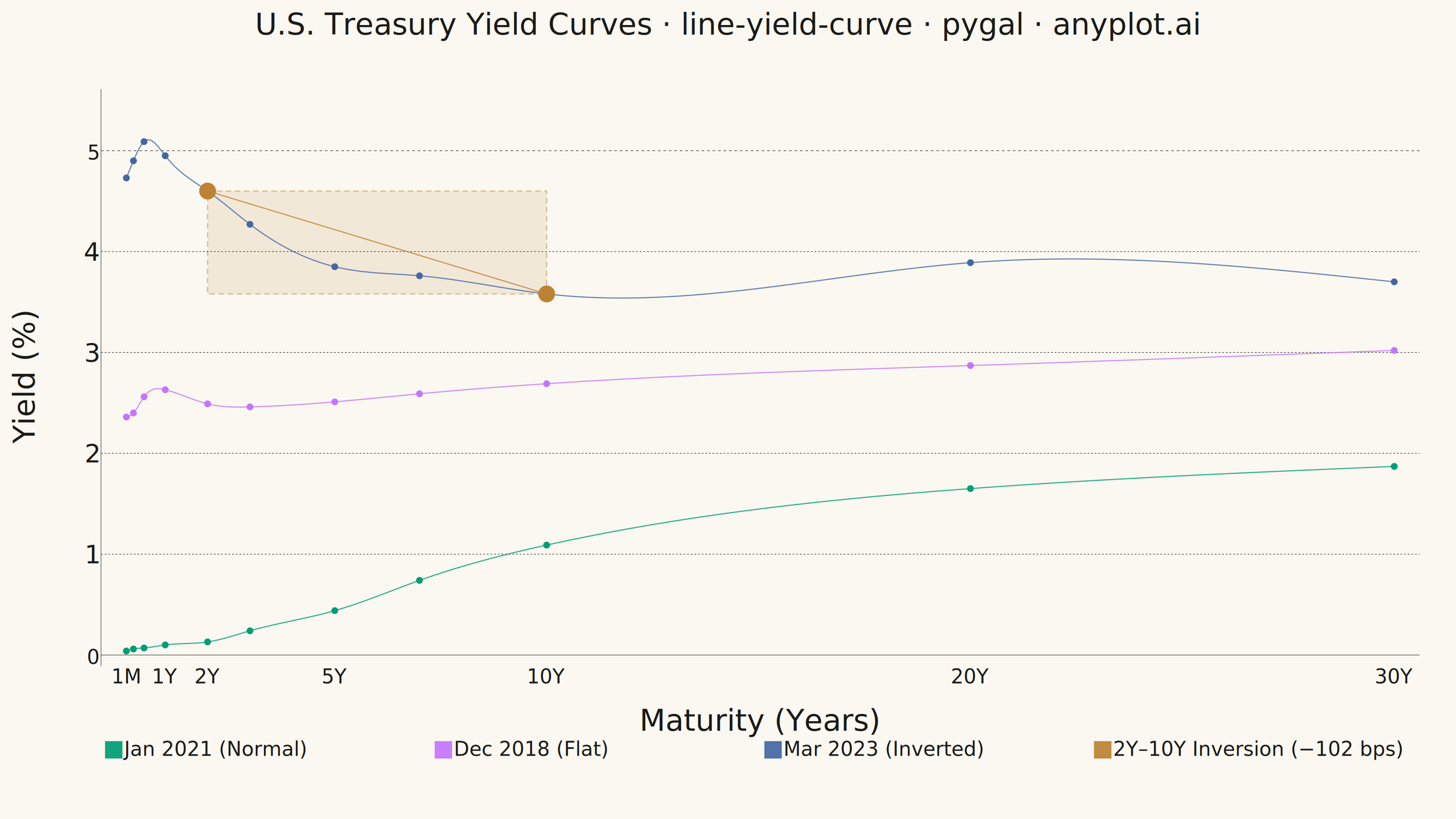
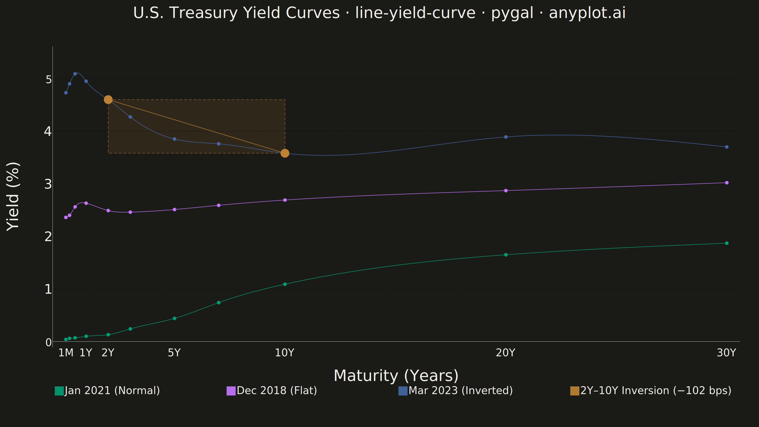
A yield curve plots interest rates (yields) of bonds against their maturities, from short-term (e.g., 1 month) to long-term (e.g., 30 years). It is one of the most iconic charts in macroeconomics and finance, used to assess market expectations for future interest rates, economic growth, and inflation. An inverted yield curve (where short-term rates exceed long-term rates) is a widely followed recession indicator. The plot should support displaying multiple curves (e.g., different dates) on the same axes to show how the term structure evolves over time.
""" anyplot.ai
line-yield-curve: Yield Curve (Interest Rate Term Structure)
Library: pygal 3.1.0 | Python 3.13.13
Quality: 87/100 | Updated: 2026-06-10
"""

import os
import re

import cairosvg
import pygal
from pygal.style import Style


THEME = os.getenv("ANYPLOT_THEME", "light")

# Theme-adaptive chrome tokens (Imprint style guide)
PAGE_BG = "#FAF8F1" if THEME == "light" else "#1A1A17"
INK = "#1A1A17" if THEME == "light" else "#F0EFE8"
INK_MUTED = "#6B6A63" if THEME == "light" else "#A8A79F"

# Imprint categorical palette — 8 hues, hybrid-v3 sort, theme-independent
IMPRINT_PALETTE = ("#009E73", "#C475FD", "#4467A3", "#BD8233", "#AE3030", "#2ABCCD", "#954477", "#99B314")

# Data — U.S. Treasury yield curves on three key dates
maturity_years = [0.083, 0.25, 0.5, 1, 2, 3, 5, 7, 10, 20, 30]

# Normal upward-sloping curve (Jan 2021)
yields_normal = [0.04, 0.06, 0.07, 0.10, 0.13, 0.24, 0.44, 0.74, 1.09, 1.65, 1.87]

# Flat curve (Dec 2018)
yields_flat = [2.36, 2.40, 2.56, 2.63, 2.49, 2.46, 2.51, 2.59, 2.69, 2.87, 3.02]

# Inverted curve (Mar 2023)
yields_inverted = [4.73, 4.90, 5.09, 4.95, 4.60, 4.27, 3.85, 3.76, 3.58, 3.89, 3.70]

custom_style = Style(
    background=PAGE_BG,
    plot_background=PAGE_BG,
    foreground=INK,
    foreground_strong=INK,
    foreground_subtle=INK_MUTED,
    colors=IMPRINT_PALETTE,
    title_font_size=66,
    label_font_size=56,
    major_label_font_size=44,
    legend_font_size=44,
    value_font_size=32,
    tooltip_font_size=28,
    stroke_width=2.5,
    opacity=0.92,
    opacity_hover=1.0,
    title_font_family="sans-serif",
    label_font_family="sans-serif",
    major_label_font_family="sans-serif",
    legend_font_family="sans-serif",
    value_font_family="sans-serif",
)

chart = pygal.XY(
    width=3200,
    height=1800,
    title="U.S. Treasury Yield Curves · line-yield-curve · pygal · anyplot.ai",
    x_title="Maturity (Years)",
    y_title="Yield (%)",
    style=custom_style,
    show_dots=True,
    dots_size=8,
    stroke_style={"width": 4},
    show_y_guides=True,
    show_x_guides=False,
    legend_at_bottom=True,
    legend_at_bottom_columns=4,
    legend_box_size=36,
    truncate_legend=-1,
    x_value_formatter=lambda x: f"{x:.0f}Y" if x >= 1 else f"{x * 12:.0f}M",
    y_value_formatter=lambda y: f"{y:.2f}%",
    margin=80,
    margin_top=120,
    margin_bottom=140,
    xrange=(0, 31),
    range=(0, 5.5),
    x_labels=[0.083, 0.25, 0.5, 1, 2, 3, 5, 7, 10, 20, 30],
    x_labels_major=[0.083, 1, 2, 5, 10, 20, 30],
    show_minor_x_labels=False,
    interpolate="cubic",
)

# Imprint palette positions 1→3 for the three yield curve shapes
normal_points = list(zip(maturity_years, yields_normal, strict=False))
flat_points = list(zip(maturity_years, yields_flat, strict=False))
inverted_points = list(zip(maturity_years, yields_inverted, strict=False))

chart.add("Jan 2021 (Normal)", normal_points, dots_size=7)
chart.add("Dec 2018 (Flat)", flat_points, dots_size=7)
chart.add("Mar 2023 (Inverted)", inverted_points, dots_size=7)

# Inversion highlight: 4th Imprint position (ochre) — oversized anchor dots at 2Y and 10Y
spread_2y10y = 4.60 - 3.58
inversion_pts = [(2, 4.60), (10, 3.58)]
chart.add(
    f"2Y–10Y Inversion (−{spread_2y10y * 100:.0f} bps)",
    inversion_pts,
    stroke_dasharray="15,10",
    dots_size=18,
    show_dots=True,
)

# Render SVG for post-processing
svg_str = chart.render(is_unicode=True)

# 1. Remove pygal's default chart frame border via CSS injection (DE-02 refinement)
border_css = "  rect.background { stroke: none !important; } .chart-background { stroke: none !important; }\n"
svg_str = svg_str.replace("</style>", border_css + "  </style>")

# 2. Inject inversion zone shading rectangle (DE-01 / data storytelling enhancement)
#    Coordinates derived from SVG circle positions (plot group translate: 222,196):
#      x-scale = 93.14 px/year, x-origin = 48px; y-scale = 221.7 px/%, y-origin = 1243.62px
#      2Y @ 4.60%: plot-local (234.3, 223.9)  |  10Y @ 3.58%: plot-local (979.4, 450.0)
#    Semi-transparent ochre box frames the annotated 2Y–10Y spread region
inversion_zone = (
    '<rect x="234.3" y="223.9" width="745.1" height="226.1" '
    'fill="rgba(189,130,51,0.13)" stroke="rgba(189,130,51,0.45)" '
    'stroke-width="3" stroke-dasharray="12,8" />'
)
# Insert after the plot-area background rect (placed inside the plot group → behind data series)
svg_str = re.sub(
    r'(<rect x="0" y="0" width="2898" height="1268(?:\.\d+)?" class="background" />)', r"\1\n" + inversion_zone, svg_str
)

# Save PNG using cairosvg directly (preserves SVG post-processing)
cairosvg.svg2png(
    bytestring=svg_str.encode("utf-8"), write_to=f"plot-{THEME}.png", output_width=3200, output_height=1800
)

with open(f"plot-{THEME}.html", "w") as f:
    f.write(
        f"""<!DOCTYPE html>
<html>
<head>
    <title>Yield Curve - pygal</title>
    <style>
        body {{ margin: 0; padding: 20px; background: {PAGE_BG}; color: {INK}; }}
        svg {{ max-width: 100%; height: auto; }}
    </style>
</head>
<body>
    {svg_str}
</body>
</html>"""
    )
Runnable source as JSON, for any HTTP client: https://api.anyplot.ai/specs/line-yield-curve/pygal/code. Any spec id and library id listed in llms-full.txt fit the same URL shape; every URL below is complete and callable.
{
  "spec_id": "line-yield-curve",
  "language": "python",
  "library": "pygal",
  "page": "https://anyplot.ai/line-yield-curve/python/pygal",
  "hub": "https://anyplot.ai/line-yield-curve",
  "code_json": "https://api.anyplot.ai/specs/line-yield-curve/pygal/code",
  "spec_json": "https://api.anyplot.ai/specs/line-yield-curve",
  "render_light_png": "https://storage.googleapis.com/anyplot-images/plots/line-yield-curve/python/pygal/plot-light.png",
  "render_dark_png": "https://storage.googleapis.com/anyplot-images/plots/line-yield-curve/python/pygal/plot-dark.png",
  "interactive_light_html": "https://storage.googleapis.com/anyplot-images/plots/line-yield-curve/python/pygal/plot-light.html",
  "interactive_dark_html": "https://storage.googleapis.com/anyplot-images/plots/line-yield-curve/python/pygal/plot-dark.html",
  "quality_score": 87.0,
  "license": "MIT",
  "guide": "https://anyplot.ai/llms.txt"
}
Part of Yield Curve (Interest Rate Term Structure) on anyplot.ai.