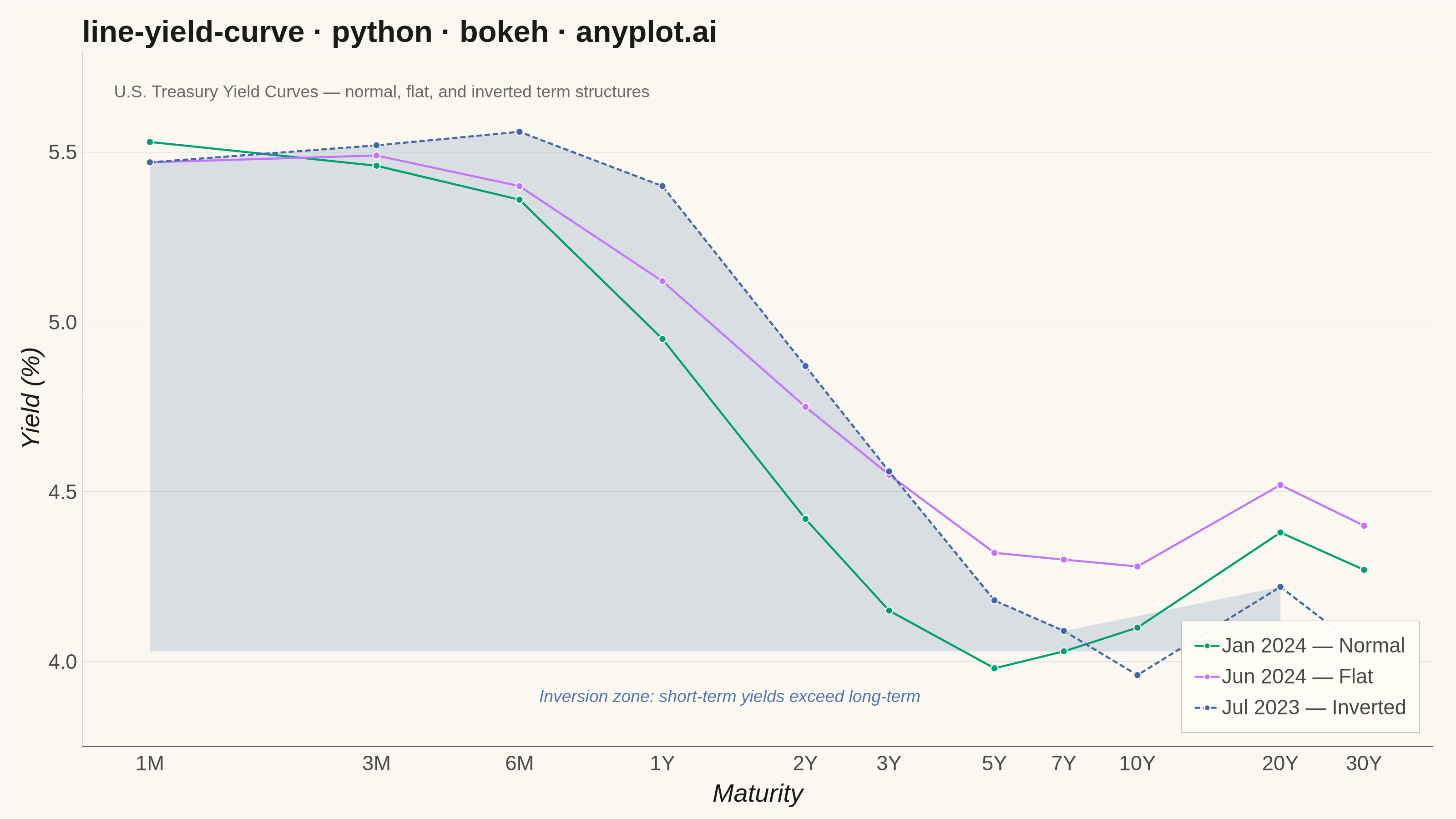
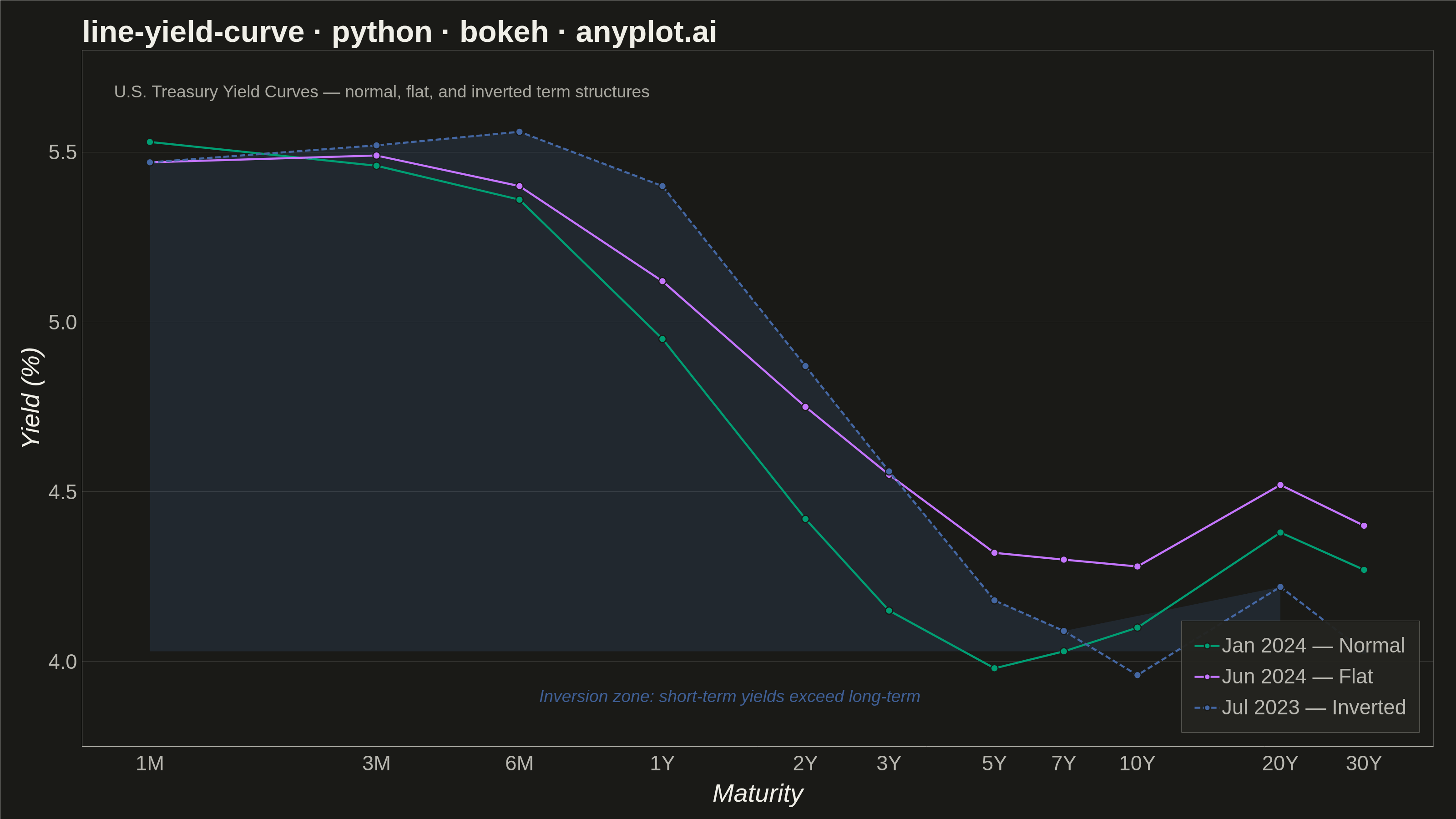
A yield curve plots interest rates (yields) of bonds against their maturities, from short-term (e.g., 1 month) to long-term (e.g., 30 years). It is one of the most iconic charts in macroeconomics and finance, used to assess market expectations for future interest rates, economic growth, and inflation. An inverted yield curve (where short-term rates exceed long-term rates) is a widely followed recession indicator. The plot should support displaying multiple curves (e.g., different dates) on the same axes to show how the term structure evolves over time.
""" anyplot.ai
line-yield-curve: Yield Curve (Interest Rate Term Structure)
Library: bokeh 3.9.1 | Python 3.13.13
Quality: 91/100 | Updated: 2026-06-10
"""

import base64
import sys


# Remove the script's own directory from sys.path so 'bokeh' resolves to the
# installed package, not this file (the filename 'bokeh.py' would shadow it).
sys.path.pop(0)

import os
import time
from pathlib import Path

import numpy as np
from bokeh.io import output_file, save
from bokeh.models import ColumnDataSource, Label, Legend, LegendItem, NumeralTickFormatter
from bokeh.plotting import figure
from selenium import webdriver
from selenium.webdriver.chrome.options import Options


# Theme tokens
THEME = os.getenv("ANYPLOT_THEME", "light")
PAGE_BG = "#FAF8F1" if THEME == "light" else "#1A1A17"
ELEVATED_BG = "#FFFDF6" if THEME == "light" else "#242420"
INK = "#1A1A17" if THEME == "light" else "#F0EFE8"
INK_SOFT = "#4A4A44" if THEME == "light" else "#B8B7B0"
INK_MUTED = "#6B6A63" if THEME == "light" else "#A8A79F"

# Imprint palette — canonical order, theme-independent
IMPRINT_PALETTE = ["#009E73", "#C475FD", "#4467A3", "#BD8233", "#AE3030", "#2ABCCD", "#954477", "#99B314"]
color_normal = IMPRINT_PALETTE[0]  # brand green: Jan 2024 — Normal
color_flat = IMPRINT_PALETTE[1]  # lavender: Jun 2024 — Flat
color_inverted = IMPRINT_PALETTE[2]  # blue: Jul 2023 — Inverted

# Data - U.S. Treasury yield curves on three representative dates
maturity_labels = ["1M", "3M", "6M", "1Y", "2Y", "3Y", "5Y", "7Y", "10Y", "20Y", "30Y"]
maturity_years = np.array([1 / 12, 0.25, 0.5, 1, 2, 3, 5, 7, 10, 20, 30])

yields_normal = np.array([5.53, 5.46, 5.36, 4.95, 4.42, 4.15, 3.98, 4.03, 4.10, 4.38, 4.27])
yields_flat = np.array([5.47, 5.49, 5.40, 5.12, 4.75, 4.55, 4.32, 4.30, 4.28, 4.52, 4.40])
yields_inverted = np.array([5.47, 5.52, 5.56, 5.40, 4.87, 4.56, 4.18, 4.09, 3.96, 4.22, 4.03])

source_normal = ColumnDataSource(data={"maturity": maturity_years, "yield_pct": yields_normal})
source_flat = ColumnDataSource(data={"maturity": maturity_years, "yield_pct": yields_flat})
source_inverted = ColumnDataSource(data={"maturity": maturity_years, "yield_pct": yields_inverted})

# Inversion zone: region where short-term yields exceed the 30Y long-end yield
inv_30y = yields_inverted[-1]
inv_mask = yields_inverted > inv_30y
inv_x = maturity_years[inv_mask]
inv_upper = yields_inverted[inv_mask]
source_inv_shade = ColumnDataSource(data={"x": inv_x, "y1": np.full_like(inv_x, inv_30y), "y2": inv_upper})

# Title — 46 chars < 67 baseline, default 50pt applies
title = "line-yield-curve · python · bokeh · anyplot.ai"

# Figure — canonical 3200×1800, toolbar disabled in constructor to prevent PNG height drift
p = figure(
    width=3200,
    height=1800,
    title=title,
    x_axis_label="Maturity",
    y_axis_label="Yield (%)",
    x_axis_type="log",
    x_range=(0.06, 42),
    y_range=(3.75, 5.8),
    toolbar_location=None,
    min_border_bottom=160,
    min_border_left=180,
    min_border_top=110,
    min_border_right=50,
)

# Inversion zone shading — alpha increased for visibility
p.varea(x="x", y1="y1", y2="y2", source=source_inv_shade, fill_color=color_inverted, fill_alpha=0.18)

# Normal curve
line_normal = p.line(x="maturity", y="yield_pct", source=source_normal, line_width=4.5, line_color=color_normal)
scatter_normal = p.scatter(
    x="maturity",
    y="yield_pct",
    source=source_normal,
    size=16,
    fill_color=color_normal,
    line_color=PAGE_BG,
    line_width=2.5,
)

# Flat curve
line_flat = p.line(x="maturity", y="yield_pct", source=source_flat, line_width=4.5, line_color=color_flat)
scatter_flat = p.scatter(
    x="maturity", y="yield_pct", source=source_flat, size=16, fill_color=color_flat, line_color=PAGE_BG, line_width=2.5
)

# Inverted curve — dashed to visually emphasize the anomalous shape
line_inverted = p.line(
    x="maturity", y="yield_pct", source=source_inverted, line_width=4.5, line_color=color_inverted, line_dash=[12, 6]
)
scatter_inverted = p.scatter(
    x="maturity",
    y="yield_pct",
    source=source_inverted,
    size=16,
    fill_color=color_inverted,
    line_color=PAGE_BG,
    line_width=2.5,
)

# Subtitle — increased font size for canvas legibility
subtitle = Label(
    x=0.07,
    y=5.65,
    text="U.S. Treasury Yield Curves — normal, flat, and inverted term structures",
    text_font_size="28pt",
    text_color=INK_MUTED,
)
p.add_layout(subtitle)

# Inversion annotation — increased font size for canvas legibility
inversion_label = Label(
    x=0.55,
    y=3.87,
    text="Inversion zone: short-term yields exceed long-term",
    text_font_size="28pt",
    text_color=color_inverted,
    text_font_style="italic",
    text_alpha=0.9,
)
p.add_layout(inversion_label)

# Legend — theme-adaptive background and labels
legend = Legend(
    items=[
        LegendItem(label="Jan 2024 — Normal", renderers=[line_normal, scatter_normal]),
        LegendItem(label="Jun 2024 — Flat", renderers=[line_flat, scatter_flat]),
        LegendItem(label="Jul 2023 — Inverted", renderers=[line_inverted, scatter_inverted]),
    ],
    location="bottom_right",
)
legend.label_text_font_size = "34pt"
legend.label_text_color = INK_SOFT
legend.glyph_width = 55
legend.glyph_height = 32
legend.spacing = 16
legend.padding = 28
legend.margin = 30
legend.background_fill_color = ELEVATED_BG
legend.border_line_color = INK_SOFT
p.add_layout(legend)

# Custom log-axis tick labels using maturity string labels
p.xaxis.ticker = list(maturity_years)
p.xaxis.major_label_overrides = {maturity_years[i]: maturity_labels[i] for i in range(len(maturity_labels))}

# Theme-adaptive chrome
p.background_fill_color = PAGE_BG
p.border_fill_color = PAGE_BG
p.outline_line_color = None

p.title.text_font_size = "50pt"
p.title.text_color = INK
p.title.text_font_style = "bold"

p.xaxis.axis_label_text_font_size = "42pt"
p.yaxis.axis_label_text_font_size = "42pt"
p.xaxis.axis_label_text_color = INK
p.yaxis.axis_label_text_color = INK
p.xaxis.major_label_text_font_size = "34pt"
p.yaxis.major_label_text_font_size = "34pt"
p.xaxis.major_label_text_color = INK_SOFT
p.yaxis.major_label_text_color = INK_SOFT

p.xaxis.axis_line_color = INK_SOFT
p.yaxis.axis_line_color = INK_SOFT
p.xaxis.major_tick_line_color = None
p.yaxis.major_tick_line_color = None
p.xaxis.minor_tick_line_color = None
p.yaxis.minor_tick_line_color = None

# Grid — subtle y-axis only, x-grid hidden
p.xgrid.grid_line_alpha = 0
p.ygrid.grid_line_alpha = 0.15
p.ygrid.grid_line_color = INK
p.ygrid.grid_line_width = 1

p.yaxis.formatter = NumeralTickFormatter(format="0.0")

# Save interactive HTML (catalog artifact)
output_file(f"plot-{THEME}.html")
save(p)

# Screenshot via headless Chrome — use CDP captureBeyondViewport to get exact W×H
W, H = 3200, 1800
opts = Options()
for arg in (
    "--headless=new",
    "--no-sandbox",
    "--disable-dev-shm-usage",
    "--disable-gpu",
    f"--window-size={W},{H}",
    "--hide-scrollbars",
    "--force-device-scale-factor=1",
):
    opts.add_argument(arg)
driver = webdriver.Chrome(options=opts)
driver.set_window_size(W, H)
driver.get(f"file://{Path(f'plot-{THEME}.html').resolve()}")
time.sleep(3)
screenshot = driver.execute_cdp_cmd(
    "Page.captureScreenshot",
    {"format": "png", "captureBeyondViewport": True, "clip": {"x": 0, "y": 0, "width": W, "height": H, "scale": 1}},
)
Path(f"plot-{THEME}.png").write_bytes(base64.b64decode(screenshot["data"]))
driver.quit()
Runnable source as JSON, for any HTTP client: https://api.anyplot.ai/specs/line-yield-curve/bokeh/code. Any spec id and library id listed in llms-full.txt fit the same URL shape; every URL below is complete and callable.
{
  "spec_id": "line-yield-curve",
  "language": "python",
  "library": "bokeh",
  "page": "https://anyplot.ai/line-yield-curve/python/bokeh",
  "hub": "https://anyplot.ai/line-yield-curve",
  "code_json": "https://api.anyplot.ai/specs/line-yield-curve/bokeh/code",
  "spec_json": "https://api.anyplot.ai/specs/line-yield-curve",
  "render_light_png": "https://storage.googleapis.com/anyplot-images/plots/line-yield-curve/python/bokeh/plot-light.png",
  "render_dark_png": "https://storage.googleapis.com/anyplot-images/plots/line-yield-curve/python/bokeh/plot-dark.png",
  "interactive_light_html": "https://storage.googleapis.com/anyplot-images/plots/line-yield-curve/python/bokeh/plot-light.html",
  "interactive_dark_html": "https://storage.googleapis.com/anyplot-images/plots/line-yield-curve/python/bokeh/plot-dark.html",
  "quality_score": 91.0,
  "license": "MIT",
  "guide": "https://anyplot.ai/llms.txt"
}
Part of Yield Curve (Interest Rate Term Structure) on anyplot.ai.