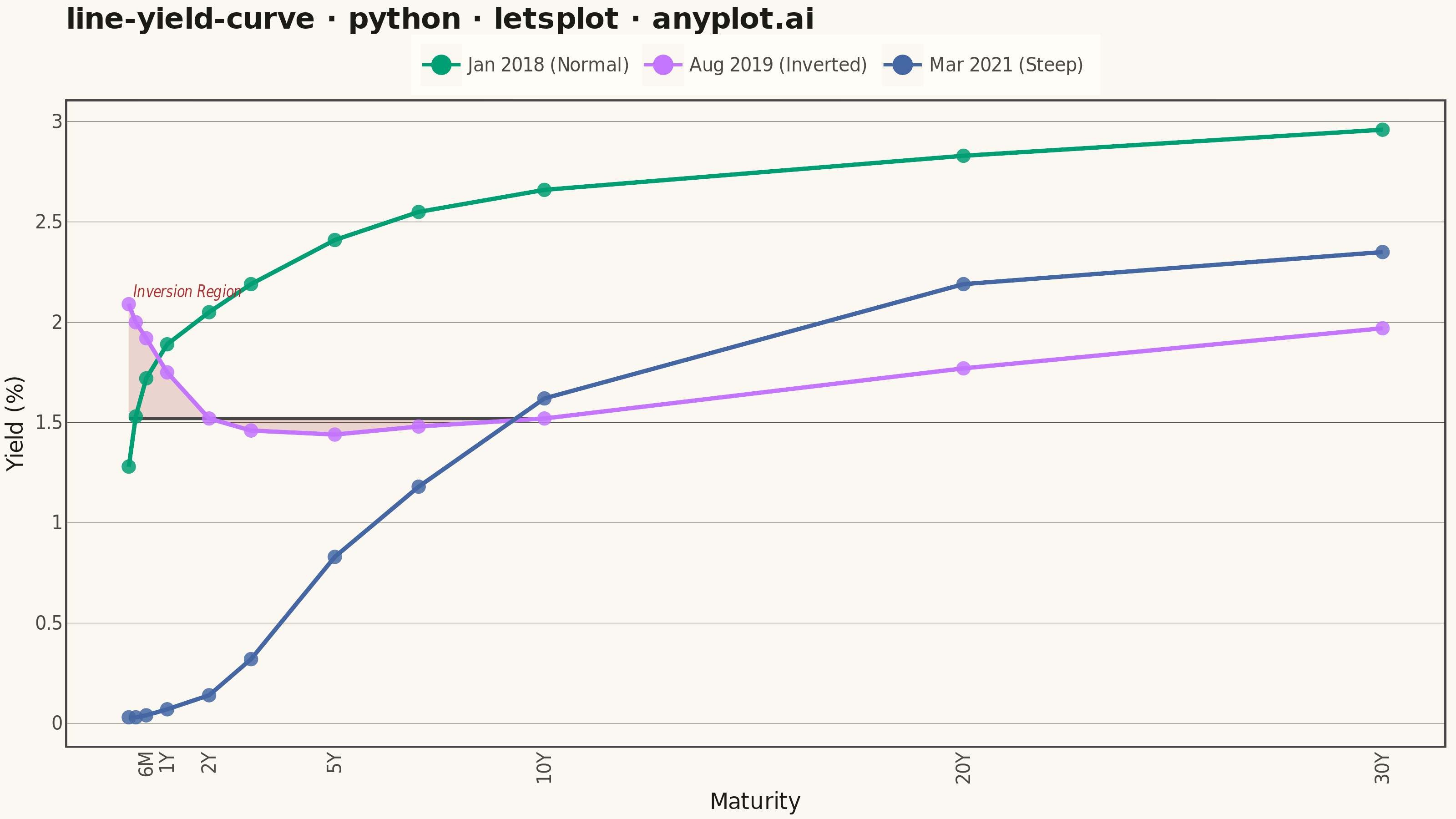
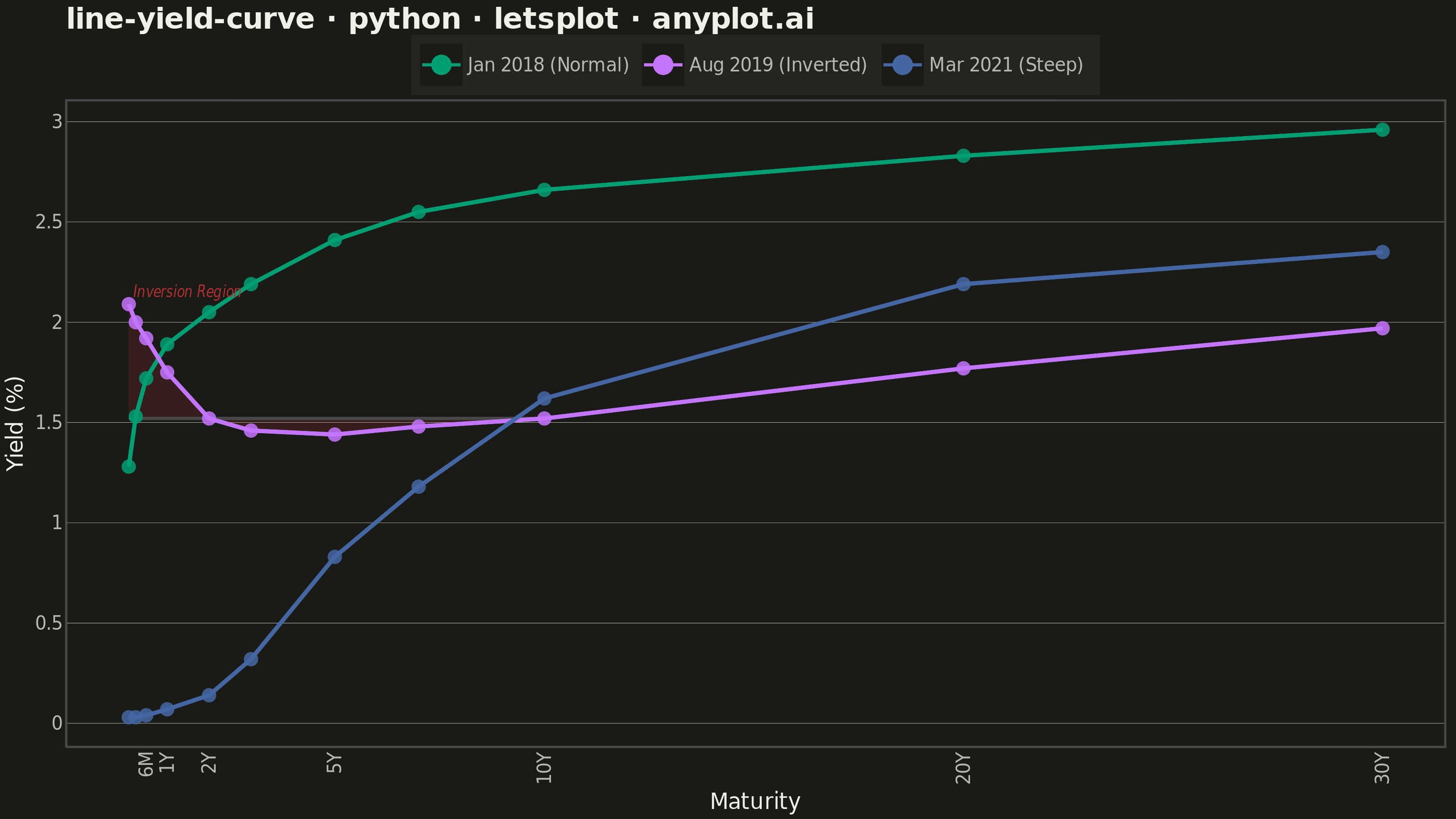
A yield curve plots interest rates (yields) of bonds against their maturities, from short-term (e.g., 1 month) to long-term (e.g., 30 years). It is one of the most iconic charts in macroeconomics and finance, used to assess market expectations for future interest rates, economic growth, and inflation. An inverted yield curve (where short-term rates exceed long-term rates) is a widely followed recession indicator. The plot should support displaying multiple curves (e.g., different dates) on the same axes to show how the term structure evolves over time.
""" anyplot.ai
line-yield-curve: Yield Curve (Interest Rate Term Structure)
Library: letsplot 4.10.1 | Python 3.13.13
Quality: 87/100 | Updated: 2026-06-10
"""

import os

import pandas as pd
from lets_plot import *


LetsPlot.setup_html()

THEME = os.getenv("ANYPLOT_THEME", "light")

# Theme-adaptive chrome tokens — Imprint palette
PAGE_BG = "#FAF8F1" if THEME == "light" else "#1A1A17"
ELEVATED_BG = "#FFFDF6" if THEME == "light" else "#242420"
INK = "#1A1A17" if THEME == "light" else "#F0EFE8"
INK_SOFT = "#4A4A44" if THEME == "light" else "#B8B7B0"

# Imprint categorical palette — canonical order, first series always #009E73
IMPRINT_PALETTE = ["#009E73", "#C475FD", "#4467A3", "#BD8233", "#AE3030", "#2ABCCD", "#954477", "#99B314"]

# Data — U.S. Treasury yield curves on three dates
maturities = ["1M", "3M", "6M", "1Y", "2Y", "3Y", "5Y", "7Y", "10Y", "20Y", "30Y"]
maturity_years = [1 / 12, 0.25, 0.5, 1, 2, 3, 5, 7, 10, 20, 30]

# Normal upward-sloping curve (Jan 2018)
yields_normal = [1.28, 1.53, 1.72, 1.89, 2.05, 2.19, 2.41, 2.55, 2.66, 2.83, 2.96]

# Inverted curve (Aug 2019 — recession signal)
yields_inverted = [2.09, 2.00, 1.92, 1.75, 1.52, 1.46, 1.44, 1.48, 1.52, 1.77, 1.97]

# Steep post-pandemic curve (Mar 2021)
yields_steep = [0.03, 0.03, 0.04, 0.07, 0.14, 0.32, 0.83, 1.18, 1.62, 2.19, 2.35]

# Use ordered Categorical so color assignments follow the named order
DATE_ORDER = ["Jan 2018 (Normal)", "Aug 2019 (Inverted)", "Mar 2021 (Steep)"]

rows = []
for i in range(len(maturities)):
    rows.append(
        {
            "maturity": maturities[i],
            "maturity_years": maturity_years[i],
            "yield_pct": yields_normal[i],
            "date": "Jan 2018 (Normal)",
        }
    )
    rows.append(
        {
            "maturity": maturities[i],
            "maturity_years": maturity_years[i],
            "yield_pct": yields_inverted[i],
            "date": "Aug 2019 (Inverted)",
        }
    )
    rows.append(
        {
            "maturity": maturities[i],
            "maturity_years": maturity_years[i],
            "yield_pct": yields_steep[i],
            "date": "Mar 2021 (Steep)",
        }
    )

df = pd.DataFrame(rows)
df["date"] = pd.Categorical(df["date"], categories=DATE_ORDER, ordered=True)

# Inversion region: shade where short-term yields exceed the 10Y baseline
ten_year_yield = yields_inverted[8]  # 10Y = 1.52%
inv_mat = [maturity_years[i] for i in range(9)]  # 1M through 10Y
inv_upper = [yields_inverted[i] for i in range(9)]
inv_lower = [ten_year_yield] * 9
inversion_df = pd.DataFrame({"maturity_years": inv_mat, "y_upper": inv_upper, "y_lower": inv_lower})

# Sparse ticks — removes 3M/1Y crowding at short maturities
tick_positions = [0.5, 1, 2, 5, 10, 20, 30]
tick_labels_x = ["6M", "1Y", "2Y", "5Y", "10Y", "20Y", "30Y"]

plot = (
    ggplot()
    # Inversion region highlight — ribbon between inverted curve and 10Y baseline
    + geom_ribbon(
        data=inversion_df,
        mapping=aes(x="maturity_years", ymin="y_lower", ymax="y_upper"),
        fill="#AE3030",
        alpha=0.18,
    )
    # Yield curve lines with interactive tooltips
    + geom_line(
        data=df,
        mapping=aes(x="maturity_years", y="yield_pct", color="date"),
        size=1.0,
        tooltips=layer_tooltips()
        .line("@date")
        .line("Maturity: @maturity")
        .line("Yield: @yield_pct%"),
    )
    + geom_point(
        data=df,
        mapping=aes(x="maturity_years", y="yield_pct", color="date"),
        size=3.5,
        alpha=0.85,
    )
    # Inversion region label — geom_text size is in mm, not pt
    + geom_text(
        aes(x="x", y="y", label="label"),
        data=pd.DataFrame({"x": [1.5], "y": [2.15], "label": ["Inversion Region"]}),
        color="#AE3030",
        size=4,
        fontface="italic",
    )
    + scale_color_manual(values=IMPRINT_PALETTE[:3])
    + scale_x_continuous(breaks=tick_positions, labels=tick_labels_x)
    + labs(
        x="Maturity", y="Yield (%)", title="line-yield-curve · python · letsplot · anyplot.ai", color=""
    )
    + ggsize(800, 450)
    + theme_minimal()
    + theme(
        plot_background=element_rect(fill=PAGE_BG, color=PAGE_BG),
        panel_background=element_rect(fill=PAGE_BG),
        panel_grid_major_y=element_line(color=INK_SOFT, size=0.2),
        panel_grid_major_x=element_blank(),
        panel_grid_minor=element_blank(),
        axis_title=element_text(color=INK, size=12),
        axis_text=element_text(color=INK_SOFT, size=10),
        axis_line=element_line(color=INK_SOFT),
        plot_title=element_text(color=INK, size=16, face="bold"),
        legend_background=element_rect(fill=ELEVATED_BG, color=INK_SOFT),
        legend_text=element_text(color=INK_SOFT, size=10),
        legend_title=element_text(color=INK),
        panel_border=element_blank(),
        legend_position="top",
    )
)

# Save PNG (scale=4 → 800×450 × 4 = 3200×1800 px) and HTML for the current theme
ggsave(plot, f"plot-{THEME}.png", path=".", scale=4)
ggsave(plot, f"plot-{THEME}.html", path=".")
Runnable source as JSON, for any HTTP client: https://api.anyplot.ai/specs/line-yield-curve/letsplot/code. Any spec id and library id listed in llms-full.txt fit the same URL shape; every URL below is complete and callable.
{
  "spec_id": "line-yield-curve",
  "language": "python",
  "library": "letsplot",
  "page": "https://anyplot.ai/line-yield-curve/python/letsplot",
  "hub": "https://anyplot.ai/line-yield-curve",
  "code_json": "https://api.anyplot.ai/specs/line-yield-curve/letsplot/code",
  "spec_json": "https://api.anyplot.ai/specs/line-yield-curve",
  "render_light_png": "https://storage.googleapis.com/anyplot-images/plots/line-yield-curve/python/letsplot/plot-light.png",
  "render_dark_png": "https://storage.googleapis.com/anyplot-images/plots/line-yield-curve/python/letsplot/plot-dark.png",
  "interactive_light_html": "https://storage.googleapis.com/anyplot-images/plots/line-yield-curve/python/letsplot/plot-light.html",
  "interactive_dark_html": "https://storage.googleapis.com/anyplot-images/plots/line-yield-curve/python/letsplot/plot-dark.html",
  "quality_score": 87.0,
  "license": "MIT",
  "guide": "https://anyplot.ai/llms.txt"
}
Part of Yield Curve (Interest Rate Term Structure) on anyplot.ai.