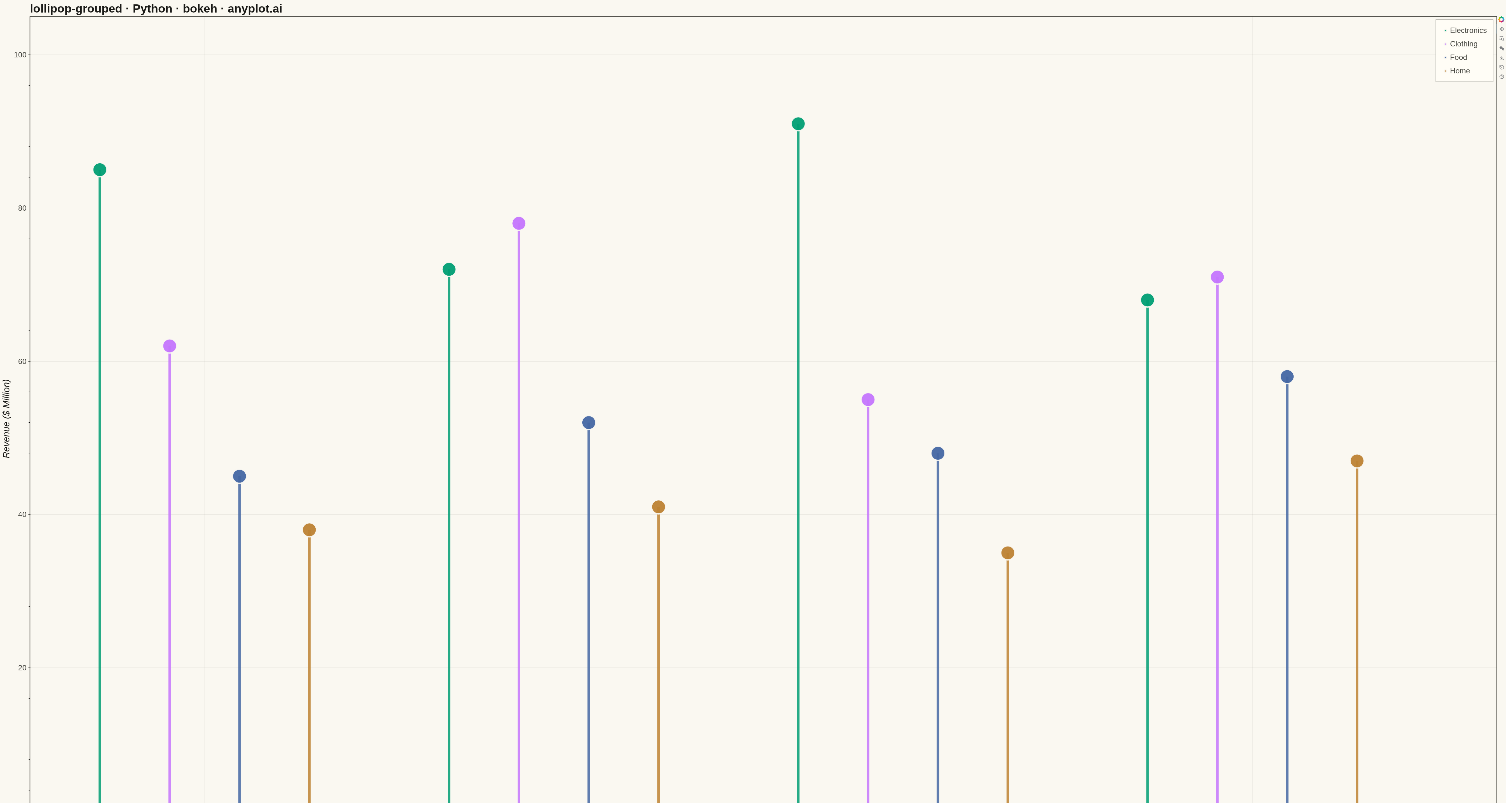
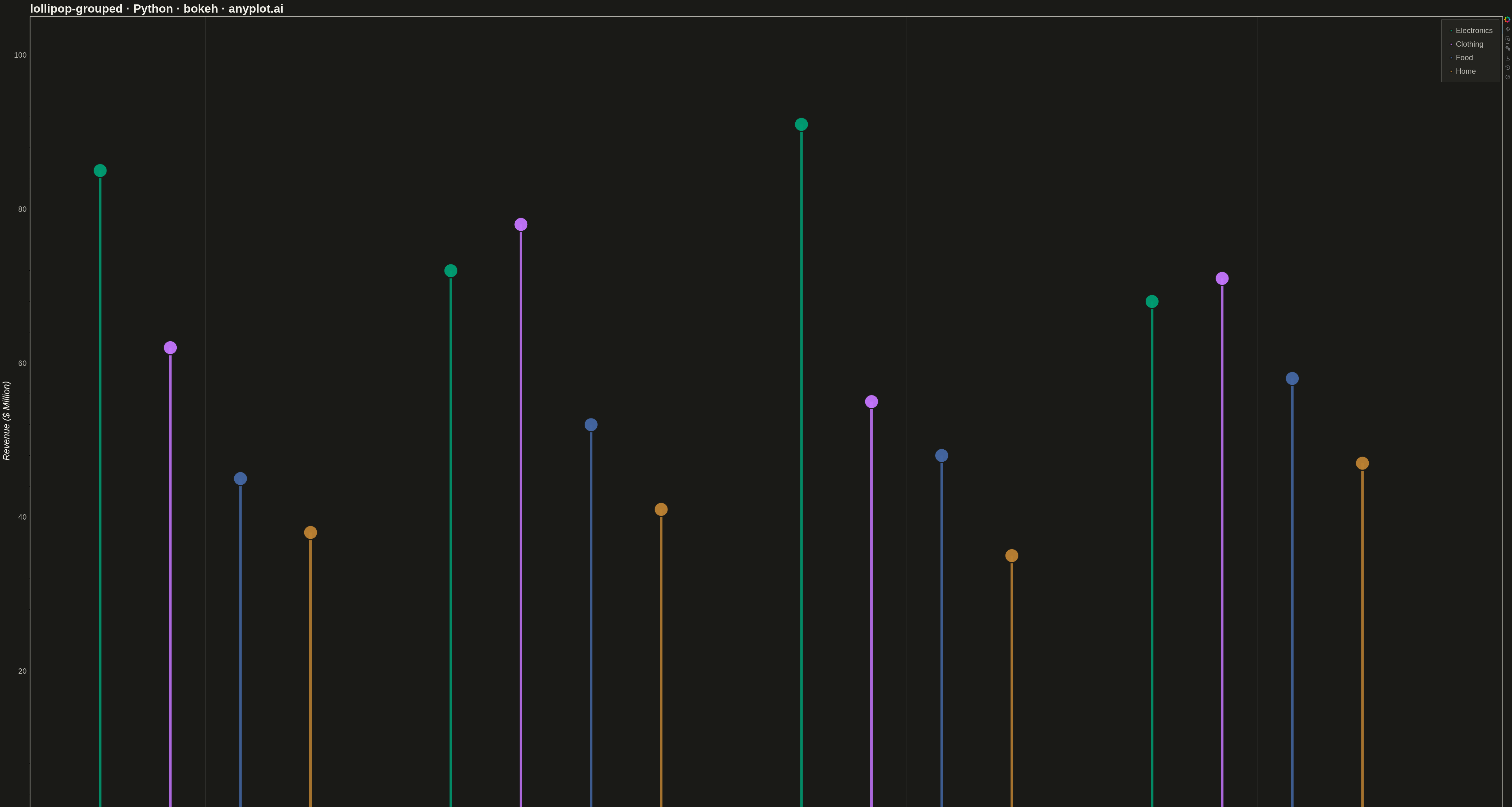
A grouped lollipop chart displays multiple series across categorical variables using thin stems and circular markers arranged in groups. Each category has multiple lollipops side by side, one for each series, enabling direct comparison of metrics across groups. It combines the clarity of dot plots with the organization of grouped bar charts while reducing visual clutter.
""" anyplot.ai
lollipop-grouped: Grouped Lollipop Chart
Library: bokeh 3.9.0 | Python 3.13.13
Quality: 86/100 | Updated: 2026-05-17
"""

import os
import sys
import time
from pathlib import Path


# Fix module shadowing: remove current directory from sys.path during imports
_orig_path = sys.path[:]
sys.path = [p for p in sys.path if p not in ("", ".", os.getcwd())]

import numpy as np
from bokeh.io import output_file, save
from bokeh.models import ColumnDataSource, Legend, LegendItem
from bokeh.plotting import figure
from selenium import webdriver
from selenium.webdriver.chrome.options import Options


# Restore original path after imports
sys.path = _orig_path

# Theme tokens
THEME = os.getenv("ANYPLOT_THEME", "light")
PAGE_BG = "#FAF8F1" if THEME == "light" else "#1A1A17"
ELEVATED_BG = "#FFFDF6" if THEME == "light" else "#242420"
INK = "#1A1A17" if THEME == "light" else "#F0EFE8"
INK_SOFT = "#4A4A44" if THEME == "light" else "#B8B7B0"

# Okabe-Ito palette (first series is ALWAYS #009E73)
IMPRINT = ["#009E73", "#C475FD", "#4467A3", "#BD8233"]

# Data - Quarterly revenue by product line across regions
np.random.seed(42)

categories = ["North", "South", "East", "West"]
series_names = ["Electronics", "Clothing", "Food", "Home"]

data = {
    "Electronics": [85, 72, 91, 68],
    "Clothing": [62, 78, 55, 71],
    "Food": [45, 52, 48, 58],
    "Home": [38, 41, 35, 47],
}

# Create figure
p = figure(
    width=4800,
    height=2700,
    title="lollipop-grouped · Python · bokeh · anyplot.ai",
    x_axis_label="Region",
    y_axis_label="Revenue ($ Million)",
    x_range=(-1, len(categories) * (len(series_names) + 1)),
    y_range=(0, 105),
)

# Plot lollipops for each series
legend_items = []

for series_idx, (series_name, color) in enumerate(zip(series_names, IMPRINT, strict=True)):
    # Calculate x positions for this series
    x_pos = [i * (len(series_names) + 1) + series_idx for i in range(len(categories))]
    y_vals = data[series_name]

    # Create stems (vertical lines from 0 to value)
    for x, y in zip(x_pos, y_vals, strict=True):
        stem_source = ColumnDataSource(data={"x": [x, x], "y": [0, y]})
        p.line(x="x", y="y", source=stem_source, line_width=8, color=color, alpha=0.85)

    # Create markers (circles)
    marker_source = ColumnDataSource(data={"x": x_pos, "y": y_vals})
    circle = p.scatter(
        x="x", y="y", source=marker_source, size=45, color=color, alpha=0.95, line_color=PAGE_BG, line_width=4
    )
    legend_items.append(LegendItem(label=series_name, renderers=[circle]))

# Add legend
legend = Legend(items=legend_items, location="top_right")
legend.label_text_font_size = "18pt"
legend.glyph_height = 20
legend.glyph_width = 20
legend.spacing = 15
legend.padding = 20
legend.background_fill_color = ELEVATED_BG
legend.background_fill_alpha = 0.95
legend.border_line_color = INK_SOFT
legend.label_text_color = INK_SOFT
p.add_layout(legend)

# Set x-axis tick labels (category names at group centers)
group_centers = [i * (len(series_names) + 1) + 1.5 for i in range(len(categories))]
p.xaxis.ticker = group_centers
p.xaxis.major_label_overrides = dict(zip(group_centers, categories, strict=True))

# Text sizing for 4800×2700 px
p.title.text_font_size = "28pt"
p.xaxis.axis_label_text_font_size = "22pt"
p.yaxis.axis_label_text_font_size = "22pt"
p.xaxis.major_label_text_font_size = "18pt"
p.yaxis.major_label_text_font_size = "18pt"

# Theme-adaptive chrome
p.background_fill_color = PAGE_BG
p.border_fill_color = PAGE_BG
p.outline_line_color = INK_SOFT
p.outline_line_width = 2

p.title.text_color = INK
p.xaxis.axis_label_text_color = INK
p.yaxis.axis_label_text_color = INK
p.xaxis.major_label_text_color = INK_SOFT
p.yaxis.major_label_text_color = INK_SOFT
p.xaxis.axis_line_color = INK_SOFT
p.yaxis.axis_line_color = INK_SOFT
p.xaxis.major_tick_line_color = INK_SOFT
p.yaxis.major_tick_line_color = INK_SOFT

p.xgrid.grid_line_color = INK
p.ygrid.grid_line_color = INK
p.xgrid.grid_line_alpha = 0.10
p.ygrid.grid_line_alpha = 0.10

# Save HTML
output_file(f"plot-{THEME}.html")
save(p)

# Screenshot with headless Chrome
W, H = 4800, 2700
opts = Options()
for arg in (
    "--headless=new",
    "--no-sandbox",
    "--disable-dev-shm-usage",
    "--disable-gpu",
    f"--window-size={W},{H}",
    "--hide-scrollbars",
):
    opts.add_argument(arg)
driver = webdriver.Chrome(options=opts)
driver.set_window_size(W, H)
driver.get(f"file://{Path(f'plot-{THEME}.html').resolve()}")
time.sleep(3)
driver.save_screenshot(f"plot-{THEME}.png")
driver.quit()
Runnable source as JSON, for any HTTP client: https://api.anyplot.ai/specs/lollipop-grouped/bokeh/code. Any spec id and library id listed in llms-full.txt fit the same URL shape; every URL below is complete and callable.
{
  "spec_id": "lollipop-grouped",
  "language": "python",
  "library": "bokeh",
  "page": "https://anyplot.ai/lollipop-grouped/python/bokeh",
  "hub": "https://anyplot.ai/lollipop-grouped",
  "code_json": "https://api.anyplot.ai/specs/lollipop-grouped/bokeh/code",
  "spec_json": "https://api.anyplot.ai/specs/lollipop-grouped",
  "render_light_png": "https://storage.googleapis.com/anyplot-images/plots/lollipop-grouped/python/bokeh/plot-light.png",
  "render_dark_png": "https://storage.googleapis.com/anyplot-images/plots/lollipop-grouped/python/bokeh/plot-dark.png",
  "interactive_light_html": "https://storage.googleapis.com/anyplot-images/plots/lollipop-grouped/python/bokeh/plot-light.html",
  "interactive_dark_html": "https://storage.googleapis.com/anyplot-images/plots/lollipop-grouped/python/bokeh/plot-dark.html",
  "quality_score": 86.0,
  "license": "MIT",
  "guide": "https://anyplot.ai/llms.txt"
}
Part of Grouped Lollipop Chart on anyplot.ai.