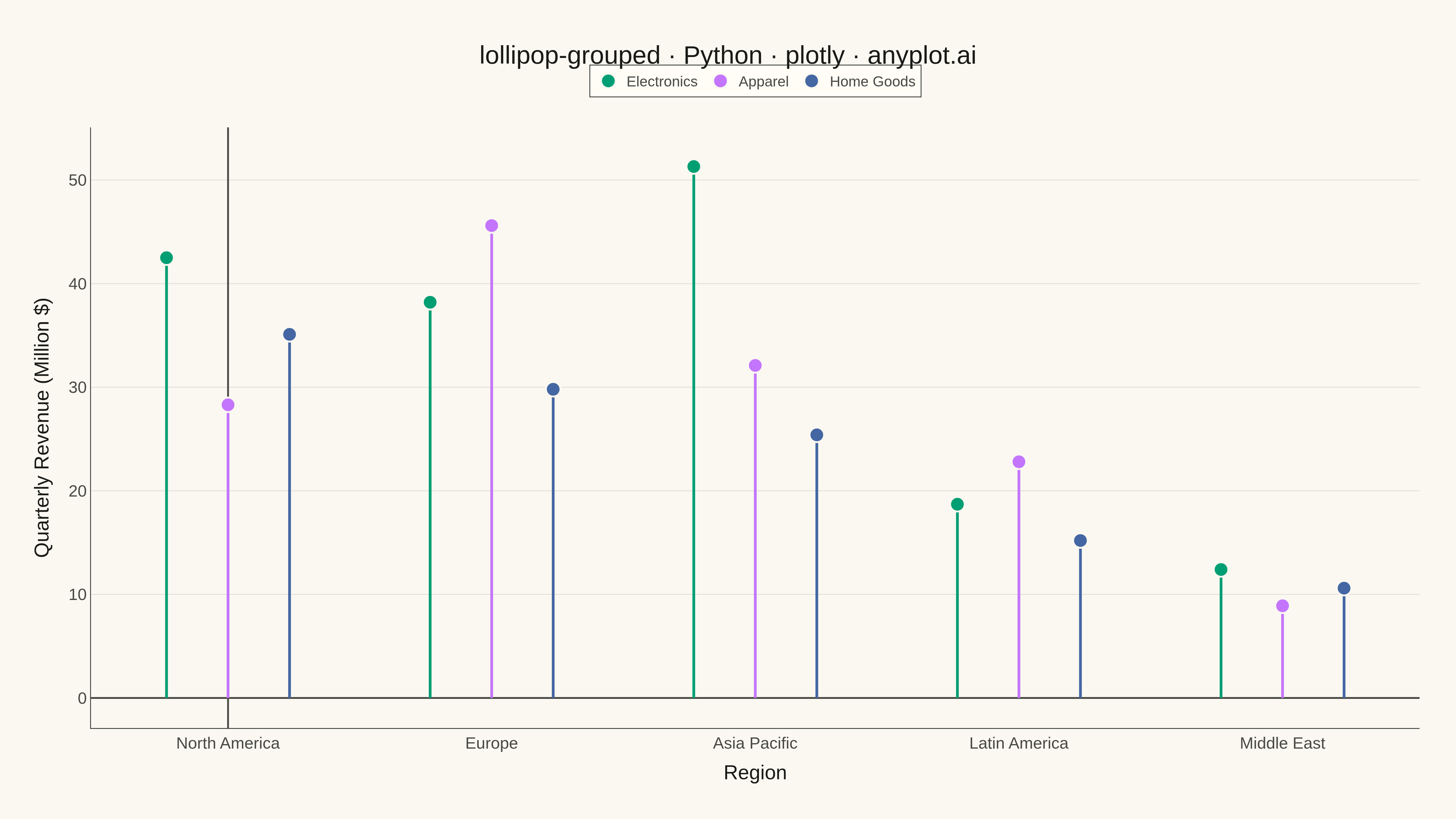
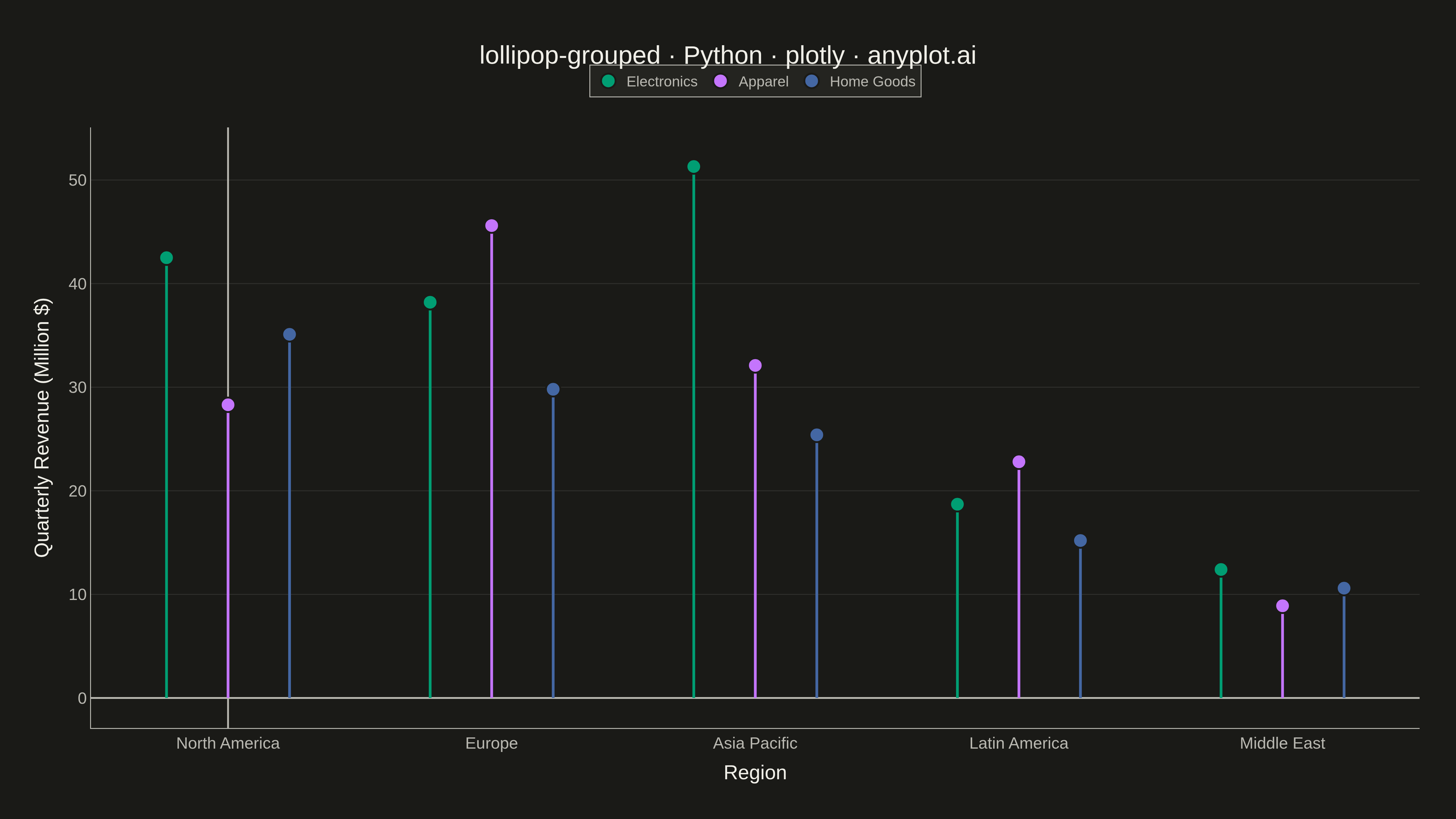
A grouped lollipop chart displays multiple series across categorical variables using thin stems and circular markers arranged in groups. Each category has multiple lollipops side by side, one for each series, enabling direct comparison of metrics across groups. It combines the clarity of dot plots with the organization of grouped bar charts while reducing visual clutter.
""" anyplot.ai
lollipop-grouped: Grouped Lollipop Chart
Library: plotly 6.7.0 | Python 3.13.13
Quality: 89/100 | Updated: 2026-05-17
"""

import os

import numpy as np
import plotly.graph_objects as go


# Theme tokens (see prompts/default-style-guide.md)
THEME = os.getenv("ANYPLOT_THEME", "light")
PAGE_BG = "#FAF8F1" if THEME == "light" else "#1A1A17"
ELEVATED_BG = "#FFFDF6" if THEME == "light" else "#242420"
INK = "#1A1A17" if THEME == "light" else "#F0EFE8"
INK_SOFT = "#4A4A44" if THEME == "light" else "#B8B7B0"
GRID = "rgba(26,26,23,0.10)" if THEME == "light" else "rgba(240,239,232,0.10)"

# Okabe-Ito palette (first series is always #009E73)
IMPRINT = ["#009E73", "#C475FD", "#4467A3"]

# Data - Quarterly revenue by product line across regions (in millions $)
np.random.seed(42)
categories = ["North America", "Europe", "Asia Pacific", "Latin America", "Middle East"]
series_names = ["Electronics", "Apparel", "Home Goods"]

# Generate realistic revenue data
revenue_data = {
    "Electronics": [42.5, 38.2, 51.3, 18.7, 12.4],
    "Apparel": [28.3, 45.6, 32.1, 22.8, 8.9],
    "Home Goods": [35.1, 29.8, 25.4, 15.2, 10.6],
}

# Create figure
fig = go.Figure()

# Calculate positions for grouped lollipops
n_categories = len(categories)
n_series = len(series_names)
group_width = 0.7
bar_width = group_width / n_series
x_base = np.arange(n_categories)

# Add stems and markers for each series
for i, (series, color) in enumerate(zip(series_names, IMPRINT, strict=False)):
    # Calculate x positions with offset for grouping
    offset = (i - (n_series - 1) / 2) * bar_width
    x_positions = x_base + offset
    values = revenue_data[series]

    # Add stems (lines from 0 to value)
    for x_pos, val in zip(x_positions, values, strict=False):
        fig.add_trace(
            go.Scatter(
                x=[x_pos, x_pos],
                y=[0, val],
                mode="lines",
                line={"color": color, "width": 3},
                showlegend=False,
                hoverinfo="skip",
            )
        )

    # Add markers (dots at the top)
    fig.add_trace(
        go.Scatter(
            x=x_positions,
            y=values,
            mode="markers",
            marker={"size": 16, "color": color, "line": {"color": PAGE_BG, "width": 2}},
            name=series,
            hovertemplate="%{text}<br>%{y:.1f}M $<extra></extra>",
            text=[f"{series} - {cat}" for cat in categories],
        )
    )

# Update layout
fig.update_layout(
    title={
        "text": "lollipop-grouped · Python · plotly · anyplot.ai",
        "font": {"size": 28, "color": INK},
        "x": 0.5,
        "xanchor": "center",
    },
    xaxis={
        "title": {"text": "Region", "font": {"size": 22, "color": INK}},
        "tickfont": {"size": 18, "color": INK_SOFT},
        "tickvals": x_base,
        "ticktext": categories,
        "showgrid": False,
        "linecolor": INK_SOFT,
        "zerolinecolor": INK_SOFT,
    },
    yaxis={
        "title": {"text": "Quarterly Revenue (Million $)", "font": {"size": 22, "color": INK}},
        "tickfont": {"size": 18, "color": INK_SOFT},
        "gridcolor": GRID,
        "gridwidth": 1,
        "zeroline": True,
        "zerolinecolor": INK_SOFT,
        "zerolinewidth": 2,
        "linecolor": INK_SOFT,
    },
    paper_bgcolor=PAGE_BG,
    plot_bgcolor=PAGE_BG,
    font={"color": INK},
    legend={
        "font": {"size": 16, "color": INK_SOFT},
        "bgcolor": ELEVATED_BG,
        "bordercolor": INK_SOFT,
        "borderwidth": 1,
        "orientation": "h",
        "yanchor": "bottom",
        "y": 1.05,
        "xanchor": "center",
        "x": 0.5,
    },
    margin={"l": 100, "r": 40, "t": 140, "b": 100},
    hovermode="closest",
)

# Save as PNG and HTML
fig.write_image(f"plot-{THEME}.png", width=1600, height=900, scale=3)
fig.write_html(f"plot-{THEME}.html", include_plotlyjs="cdn")
Runnable source as JSON, for any HTTP client: https://api.anyplot.ai/specs/lollipop-grouped/plotly/code. Any spec id and library id listed in llms-full.txt fit the same URL shape; every URL below is complete and callable.
{
  "spec_id": "lollipop-grouped",
  "language": "python",
  "library": "plotly",
  "page": "https://anyplot.ai/lollipop-grouped/python/plotly",
  "hub": "https://anyplot.ai/lollipop-grouped",
  "code_json": "https://api.anyplot.ai/specs/lollipop-grouped/plotly/code",
  "spec_json": "https://api.anyplot.ai/specs/lollipop-grouped",
  "render_light_png": "https://storage.googleapis.com/anyplot-images/plots/lollipop-grouped/python/plotly/plot-light.png",
  "render_dark_png": "https://storage.googleapis.com/anyplot-images/plots/lollipop-grouped/python/plotly/plot-dark.png",
  "interactive_light_html": "https://storage.googleapis.com/anyplot-images/plots/lollipop-grouped/python/plotly/plot-light.html",
  "interactive_dark_html": "https://storage.googleapis.com/anyplot-images/plots/lollipop-grouped/python/plotly/plot-dark.html",
  "quality_score": 89.0,
  "license": "MIT",
  "guide": "https://anyplot.ai/llms.txt"
}
Part of Grouped Lollipop Chart on anyplot.ai.