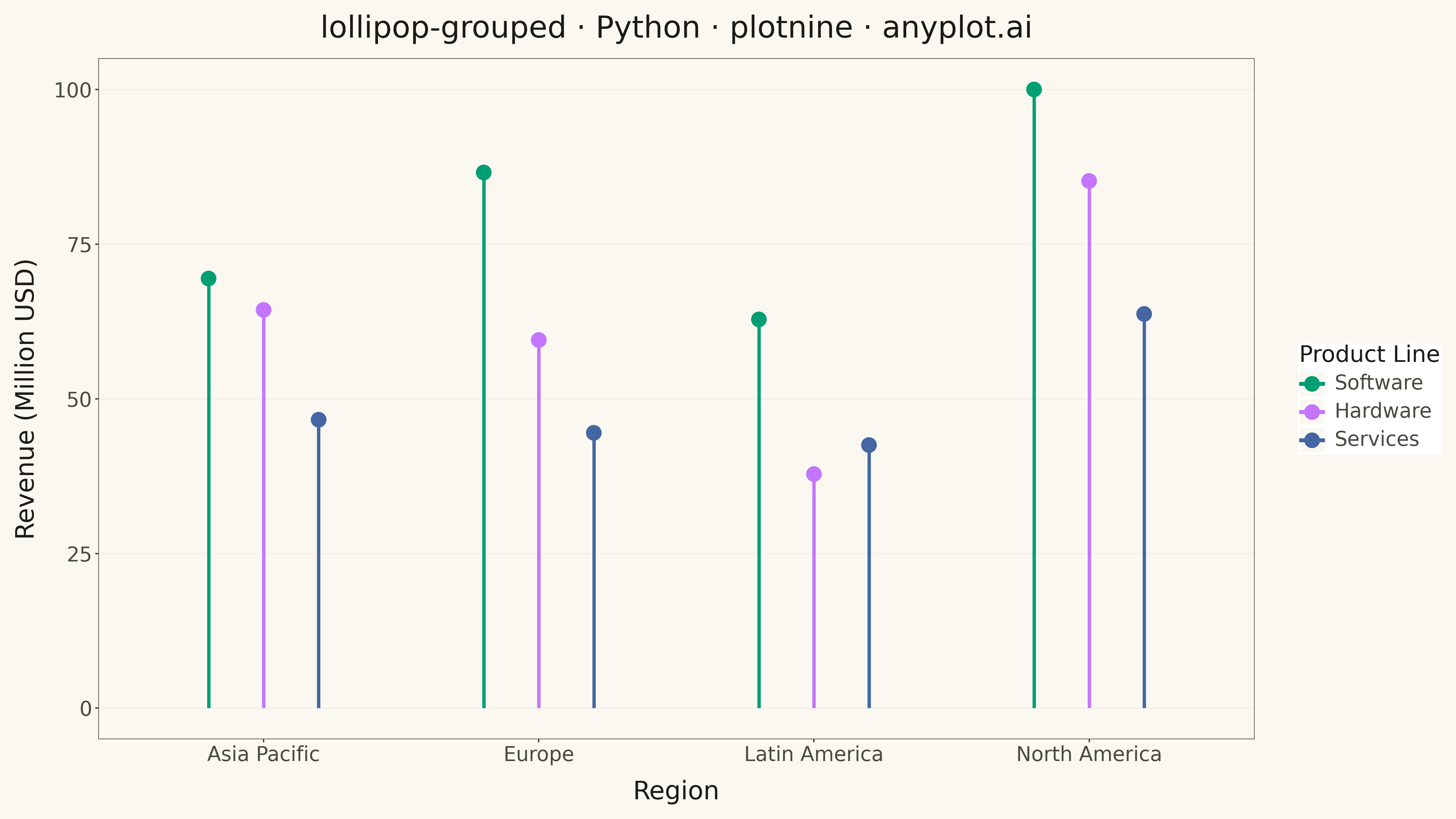
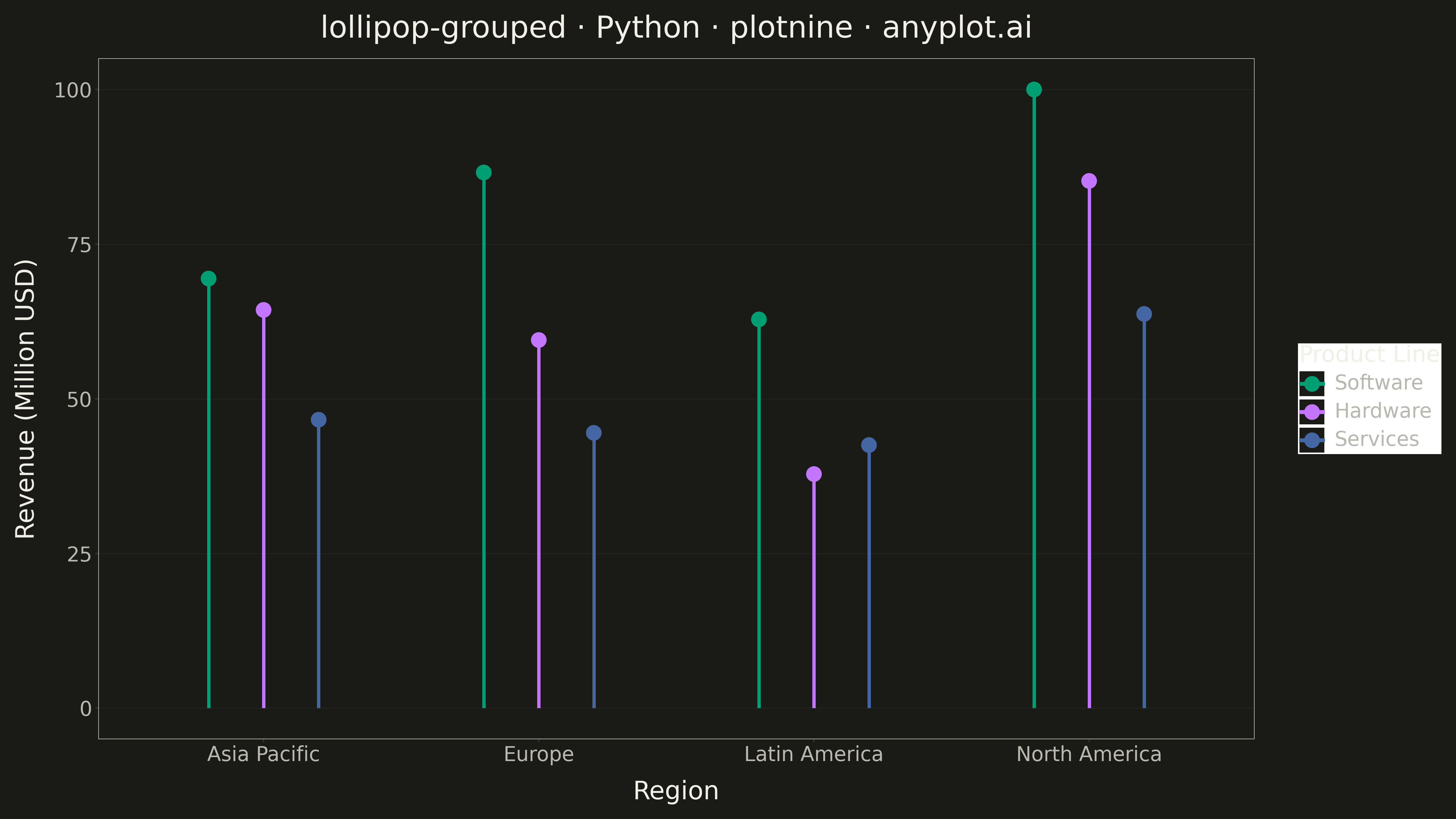
A grouped lollipop chart displays multiple series across categorical variables using thin stems and circular markers arranged in groups. Each category has multiple lollipops side by side, one for each series, enabling direct comparison of metrics across groups. It combines the clarity of dot plots with the organization of grouped bar charts while reducing visual clutter.
""" anyplot.ai
lollipop-grouped: Grouped Lollipop Chart
Library: plotnine 0.15.4 | Python 3.13.13
Quality: 92/100 | Updated: 2026-05-17
"""

import os
import sys


# Work around import shadowing from sibling library files in same directory
_script_dir = os.path.dirname(os.path.abspath(__file__))
if _script_dir in sys.path:
    sys.path.remove(_script_dir)

import numpy as np
import pandas as pd
from plotnine import (
    aes,
    element_blank,
    element_line,
    element_rect,
    element_text,
    geom_point,
    geom_segment,
    ggplot,
    labs,
    position_dodge,
    scale_color_manual,
    theme,
)


# Theme tokens
THEME = os.getenv("ANYPLOT_THEME", "light")
PAGE_BG = "#FAF8F1" if THEME == "light" else "#1A1A17"
INK = "#1A1A17" if THEME == "light" else "#F0EFE8"
INK_SOFT = "#4A4A44" if THEME == "light" else "#B8B7B0"

# Okabe-Ito palette (positions 1, 2, 3)
COLORS = ["#009E73", "#C475FD", "#4467A3"]

# Data - Quarterly revenue by product line across regions
np.random.seed(42)

categories = ["North America", "Europe", "Asia Pacific", "Latin America"]
series = ["Software", "Hardware", "Services"]

data = []
for cat in categories:
    for ser in series:
        base = {"Software": 85, "Hardware": 65, "Services": 50}[ser]
        region_factor = {"North America": 1.2, "Europe": 1.0, "Asia Pacific": 0.9, "Latin America": 0.7}[cat]
        value = base * region_factor + np.random.uniform(-8, 8)
        data.append({"Category": cat, "Series": ser, "Revenue": value})

df = pd.DataFrame(data)

# Reorder series by median value (descending) for legend order
series_order = df.groupby("Series")["Revenue"].median().sort_values(ascending=False).index.tolist()
df["Series"] = pd.Categorical(df["Series"], categories=series_order, ordered=True)
df = df.sort_values("Series")

# Create grouped lollipop chart
plot = (
    ggplot(df, aes(x="Category", y="Revenue", color="Series"))
    # Stems (segments from 0 to value)
    + geom_segment(
        aes(x="Category", xend="Category", y=0, yend="Revenue"), position=position_dodge(width=0.6), size=1.5
    )
    # Markers (dots at the top)
    + geom_point(position=position_dodge(width=0.6), size=6)
    # Okabe-Ito colors
    + scale_color_manual(values=COLORS)
    # Labels
    + labs(
        title="lollipop-grouped · Python · plotnine · anyplot.ai",
        x="Region",
        y="Revenue (Million USD)",
        color="Product Line",
    )
    # Theme
    + theme(
        figure_size=(16, 9),
        text=element_text(size=14, color=INK),
        axis_title=element_text(size=20, color=INK),
        axis_text=element_text(size=16, color=INK_SOFT),
        axis_text_x=element_text(size=16, color=INK_SOFT),
        plot_title=element_text(size=24, color=INK),
        legend_title=element_text(size=18, color=INK),
        legend_text=element_text(size=16, color=INK_SOFT),
        legend_position="right",
        plot_background=element_rect(fill=PAGE_BG, color=PAGE_BG),
        panel_background=element_rect(fill=PAGE_BG, color=PAGE_BG),
        panel_grid_major_y=element_line(color=INK, size=0.3, alpha=0.10),
        panel_grid_major_x=element_blank(),
        panel_grid_minor=element_blank(),
        panel_border=element_rect(color=INK_SOFT, fill=None, size=0.5),
        axis_line=element_line(color=INK_SOFT, size=0.5),
    )
)

# Save
plot.save(f"plot-{THEME}.png", dpi=300, verbose=False)
Runnable source as JSON, for any HTTP client: https://api.anyplot.ai/specs/lollipop-grouped/plotnine/code. Any spec id and library id listed in llms-full.txt fit the same URL shape; every URL below is complete and callable.
{
  "spec_id": "lollipop-grouped",
  "language": "python",
  "library": "plotnine",
  "page": "https://anyplot.ai/lollipop-grouped/python/plotnine",
  "hub": "https://anyplot.ai/lollipop-grouped",
  "code_json": "https://api.anyplot.ai/specs/lollipop-grouped/plotnine/code",
  "spec_json": "https://api.anyplot.ai/specs/lollipop-grouped",
  "render_light_png": "https://storage.googleapis.com/anyplot-images/plots/lollipop-grouped/python/plotnine/plot-light.png",
  "render_dark_png": "https://storage.googleapis.com/anyplot-images/plots/lollipop-grouped/python/plotnine/plot-dark.png",
  "quality_score": 92.0,
  "license": "MIT",
  "guide": "https://anyplot.ai/llms.txt"
}
Part of Grouped Lollipop Chart on anyplot.ai.