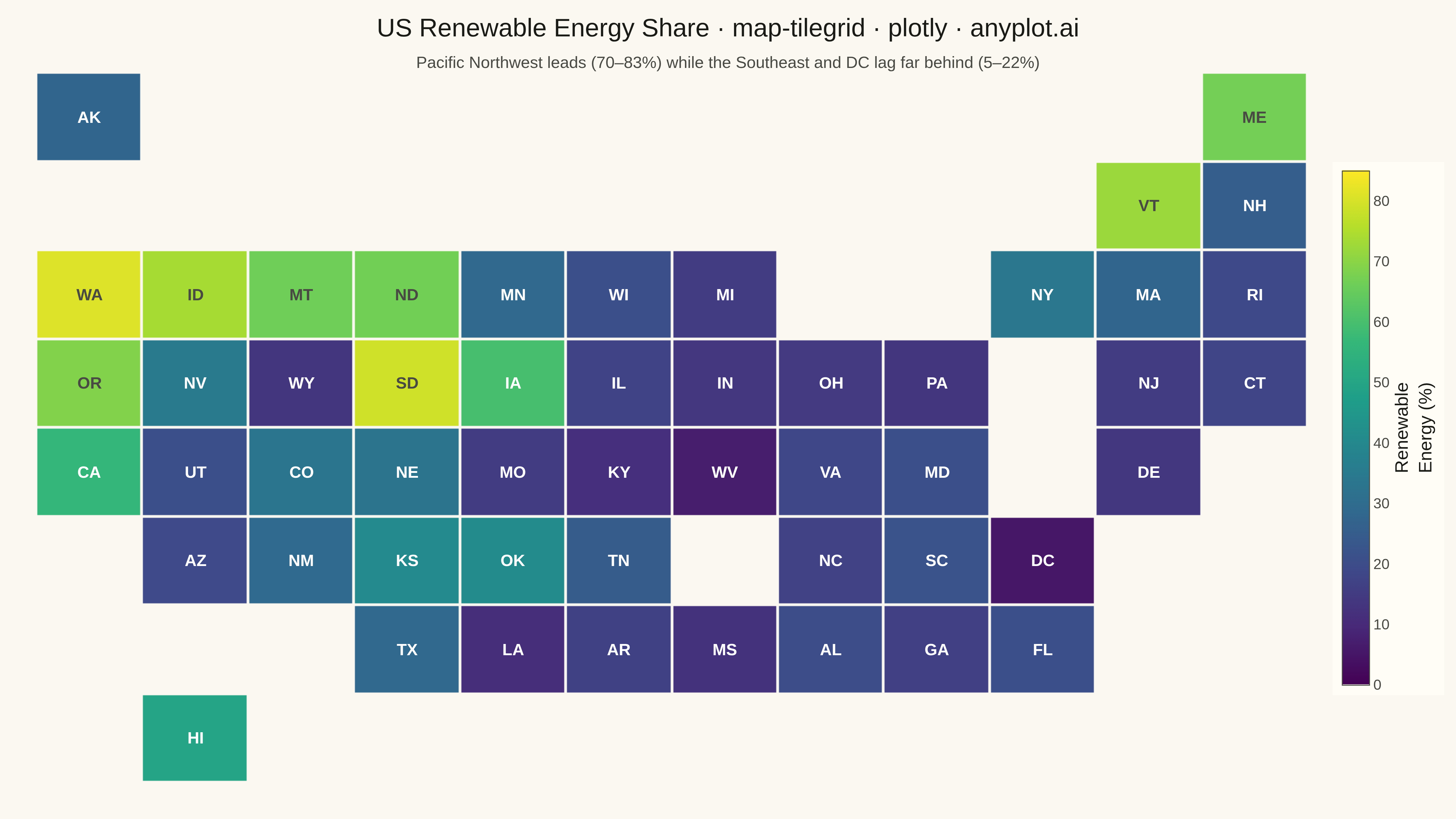
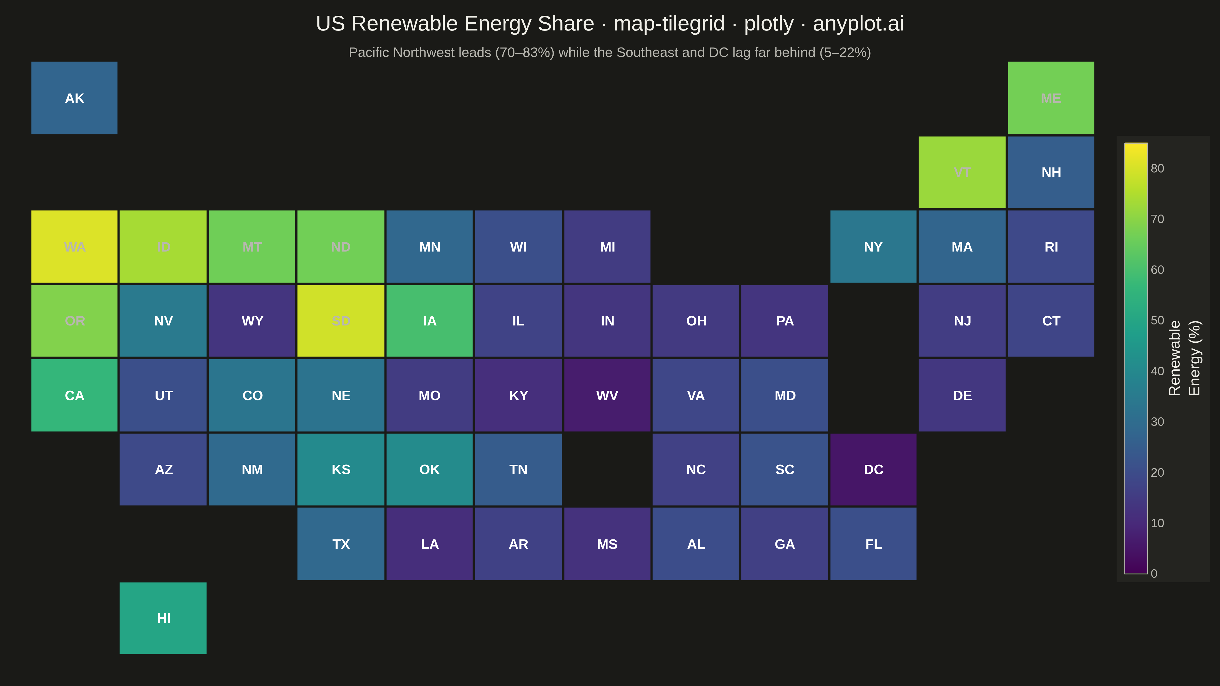
The same plot in 14 other libraries — Python: Altair, Bokeh, lets-plot, Matplotlib, plotnine, Pygal, Seaborn; R: ggplot2; Julia: Makie.jl; JavaScript: Chart.js, D3.js, Apache ECharts, Highcharts, MUI X Charts. Compare all 15 side by side: Tile Grid Map for Equal-Area Geographic Comparison in Python, R, Julia and JavaScript.
A tile grid map represents geographic regions (states, countries, provinces) as equally-sized tiles — squares or hexagons — arranged to approximate their real-world geographic positions. Unlike choropleth maps where large-area regions dominate visually, every region receives identical visual weight, making tile grid maps ideal for per-capita or per-region comparisons where the statistic matters more than physical area. Tiles are colored by a data variable and labeled with region abbreviations for identification.
""" anyplot.ai
map-tilegrid: Tile Grid Map for Equal-Area Geographic Comparison
Library: plotly 6.7.0 | Python 3.13.13
Quality: 89/100 | Created: 2026-05-14
"""

import os

import numpy as np
import plotly.graph_objects as go


# Theme tokens
THEME = os.getenv("ANYPLOT_THEME", "light")
PAGE_BG = "#FAF8F1" if THEME == "light" else "#1A1A17"
ELEVATED_BG = "#FFFDF6" if THEME == "light" else "#242420"
INK = "#1A1A17" if THEME == "light" else "#F0EFE8"
INK_SOFT = "#4A4A44" if THEME == "light" else "#B8B7B0"

# US state tile grid: (row, col), row 0 = north, col 0 = west
state_grid = {
    "AK": (0, 0),
    "ME": (0, 11),
    "VT": (1, 10),
    "NH": (1, 11),
    "WA": (2, 0),
    "ID": (2, 1),
    "MT": (2, 2),
    "ND": (2, 3),
    "MN": (2, 4),
    "WI": (2, 5),
    "MI": (2, 6),
    "NY": (2, 9),
    "MA": (2, 10),
    "RI": (2, 11),
    "OR": (3, 0),
    "NV": (3, 1),
    "WY": (3, 2),
    "SD": (3, 3),
    "IA": (3, 4),
    "IL": (3, 5),
    "IN": (3, 6),
    "OH": (3, 7),
    "PA": (3, 8),
    "NJ": (3, 10),
    "CT": (3, 11),
    "CA": (4, 0),
    "UT": (4, 1),
    "CO": (4, 2),
    "NE": (4, 3),
    "MO": (4, 4),
    "KY": (4, 5),
    "WV": (4, 6),
    "VA": (4, 7),
    "MD": (4, 8),
    "DE": (4, 10),
    "AZ": (5, 1),
    "NM": (5, 2),
    "KS": (5, 3),
    "OK": (5, 4),
    "TN": (5, 5),
    "NC": (5, 7),
    "SC": (5, 8),
    "DC": (5, 9),
    "TX": (6, 3),
    "LA": (6, 4),
    "AR": (6, 5),
    "MS": (6, 6),
    "AL": (6, 7),
    "GA": (6, 8),
    "FL": (6, 9),
    "HI": (7, 1),
}

# Synthetic renewable electricity share (%) with regional realism
np.random.seed(42)
renewable_base = {
    "WA": 82,
    "OR": 70,
    "ID": 75,
    "MT": 68,
    "VT": 71,
    "ME": 65,
    "SD": 79,
    "ND": 65,
    "IA": 60,
    "CA": 55,
    "HI": 48,
    "KS": 42,
    "OK": 40,
    "NM": 30,
    "NY": 32,
    "NE": 32,
    "CO": 33,
    "MN": 28,
    "AK": 28,
    "TX": 27,
    "MA": 26,
    "NH": 25,
    "TN": 25,
    "UT": 22,
    "FL": 22,
    "SC": 22,
    "AL": 20,
    "VA": 20,
    "WI": 20,
    "RI": 20,
    "MD": 19,
    "CT": 18,
    "AZ": 18,
    "NC": 18,
    "IL": 18,
    "MI": 17,
    "MO": 17,
    "NV": 36,
    "NJ": 16,
    "GA": 16,
    "AR": 16,
    "OH": 16,
    "PA": 14,
    "WY": 14,
    "MS": 13,
    "IN": 13,
    "DE": 12,
    "KY": 11,
    "LA": 12,
    "DC": 5,
    "WV": 8,
}

n_rows, n_cols = 8, 12
grid = np.full((n_rows, n_cols), np.nan)
hover_labels = np.full((n_rows, n_cols), "", dtype=object)

for state, (row, col) in state_grid.items():
    base = renewable_base.get(state, 25.0)
    grid[row, col] = float(np.clip(base + np.random.uniform(-2, 2), 5, 90))
    hover_labels[row, col] = state

# Tile label annotations — brightness-adaptive text color for viridis
annotations = []
for state, (row, col) in state_grid.items():
    val = grid[row, col]
    # viridis: dark purple (low) → teal (mid) → bright yellow (high)
    # switch to dark ink above ~62% where tiles become bright
    label_color = INK_SOFT if val > 62 else "white"
    annotations.append(
        {
            "x": col,
            "y": row,
            "text": f"<b>{state}</b>",
            "font": {"size": 18, "color": label_color},
            "showarrow": False,
            "xanchor": "center",
            "yanchor": "middle",
        }
    )

# Plot
fig = go.Figure()

fig.add_trace(
    go.Heatmap(
        z=grid,
        text=hover_labels,
        hovertemplate="<b>%{text}</b><br>Renewable: %{z:.1f}%<extra></extra>",
        colorscale="viridis",
        zmin=0,
        zmax=85,
        xgap=3,
        ygap=3,
        showscale=True,
        colorbar={
            "title": {"text": "Renewable<br>Energy (%)", "font": {"size": 20, "color": INK}, "side": "right"},
            "tickfont": {"size": 16, "color": INK_SOFT},
            "bgcolor": ELEVATED_BG,
            "outlinecolor": INK_SOFT,
            "outlinewidth": 1,
            "thickness": 30,
            "len": 0.75,
            "x": 1.02,
        },
        hoverlabel={"bgcolor": ELEVATED_BG, "font": {"size": 16, "color": INK}, "bordercolor": INK_SOFT},
    )
)

fig.update_layout(
    title={
        "text": "US Renewable Energy Share · map-tilegrid · plotly · anyplot.ai",
        "subtitle": {
            "text": "Pacific Northwest leads (70–83%) while the Southeast and DC lag far behind (5–22%)",
            "font": {"size": 18, "color": INK_SOFT},
        },
        "font": {"size": 28, "color": INK},
        "x": 0.5,
        "xanchor": "center",
    },
    paper_bgcolor=PAGE_BG,
    plot_bgcolor=PAGE_BG,
    font={"color": INK},
    xaxis={"showgrid": False, "showticklabels": False, "showline": False, "zeroline": False, "ticks": ""},
    yaxis={
        "showgrid": False,
        "showticklabels": False,
        "showline": False,
        "zeroline": False,
        "ticks": "",
        "autorange": "reversed",
    },
    annotations=annotations,
    margin={"l": 40, "r": 140, "t": 80, "b": 40},
)

# Save
fig.write_image(f"plot-{THEME}.png", width=1600, height=900, scale=3)
fig.write_html(f"plot-{THEME}.html", include_plotlyjs="cdn")
Runnable source as JSON, for any HTTP client: https://api.anyplot.ai/specs/map-tilegrid/plotly/code. Any spec id and library id listed in llms-full.txt fit the same URL shape; every URL below is complete and callable.
{
  "spec_id": "map-tilegrid",
  "language": "python",
  "library": "plotly",
  "page": "https://anyplot.ai/map-tilegrid/python/plotly",
  "hub": "https://anyplot.ai/map-tilegrid",
  "code_json": "https://api.anyplot.ai/specs/map-tilegrid/plotly/code",
  "spec_json": "https://api.anyplot.ai/specs/map-tilegrid",
  "render_light_png": "https://storage.googleapis.com/anyplot-images/plots/map-tilegrid/python/plotly/plot-light.png",
  "render_dark_png": "https://storage.googleapis.com/anyplot-images/plots/map-tilegrid/python/plotly/plot-dark.png",
  "interactive_light_html": "https://storage.googleapis.com/anyplot-images/plots/map-tilegrid/python/plotly/plot-light.html",
  "interactive_dark_html": "https://storage.googleapis.com/anyplot-images/plots/map-tilegrid/python/plotly/plot-dark.html",
  "quality_score": 89.0,
  "license": "MIT",
  "guide": "https://anyplot.ai/llms.txt"
}
Part of Tile Grid Map for Equal-Area Geographic Comparison on anyplot.ai.