The same plot in 14 other libraries — Python: Altair, Bokeh, lets-plot, Matplotlib, Plotly, plotnine, Seaborn; R: ggplot2; Julia: Makie.jl; JavaScript: Chart.js, D3.js, Apache ECharts, Highcharts, MUI X Charts. Compare all 15 side by side: Tile Grid Map for Equal-Area Geographic Comparison in Python, R, Julia and JavaScript.
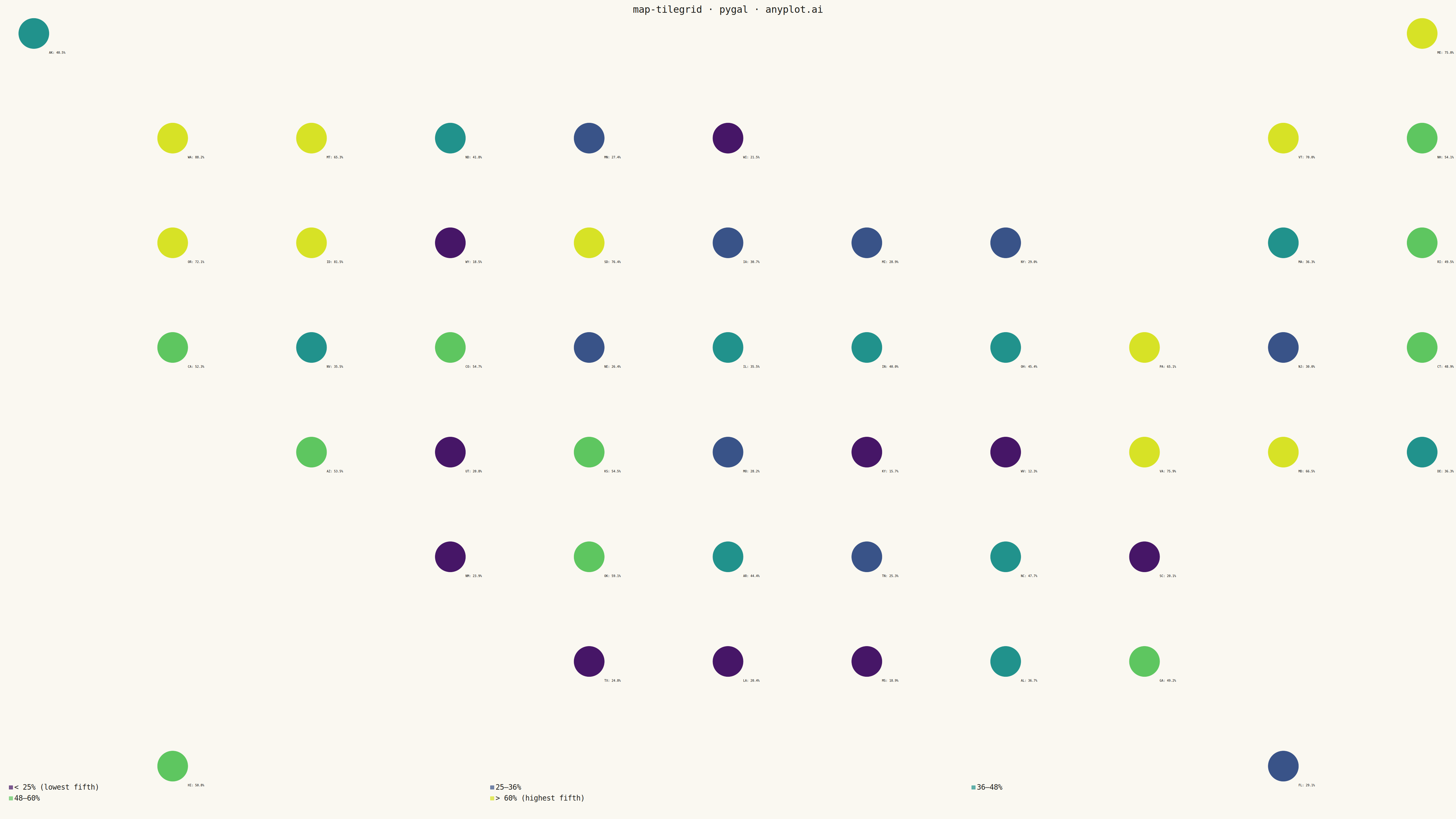
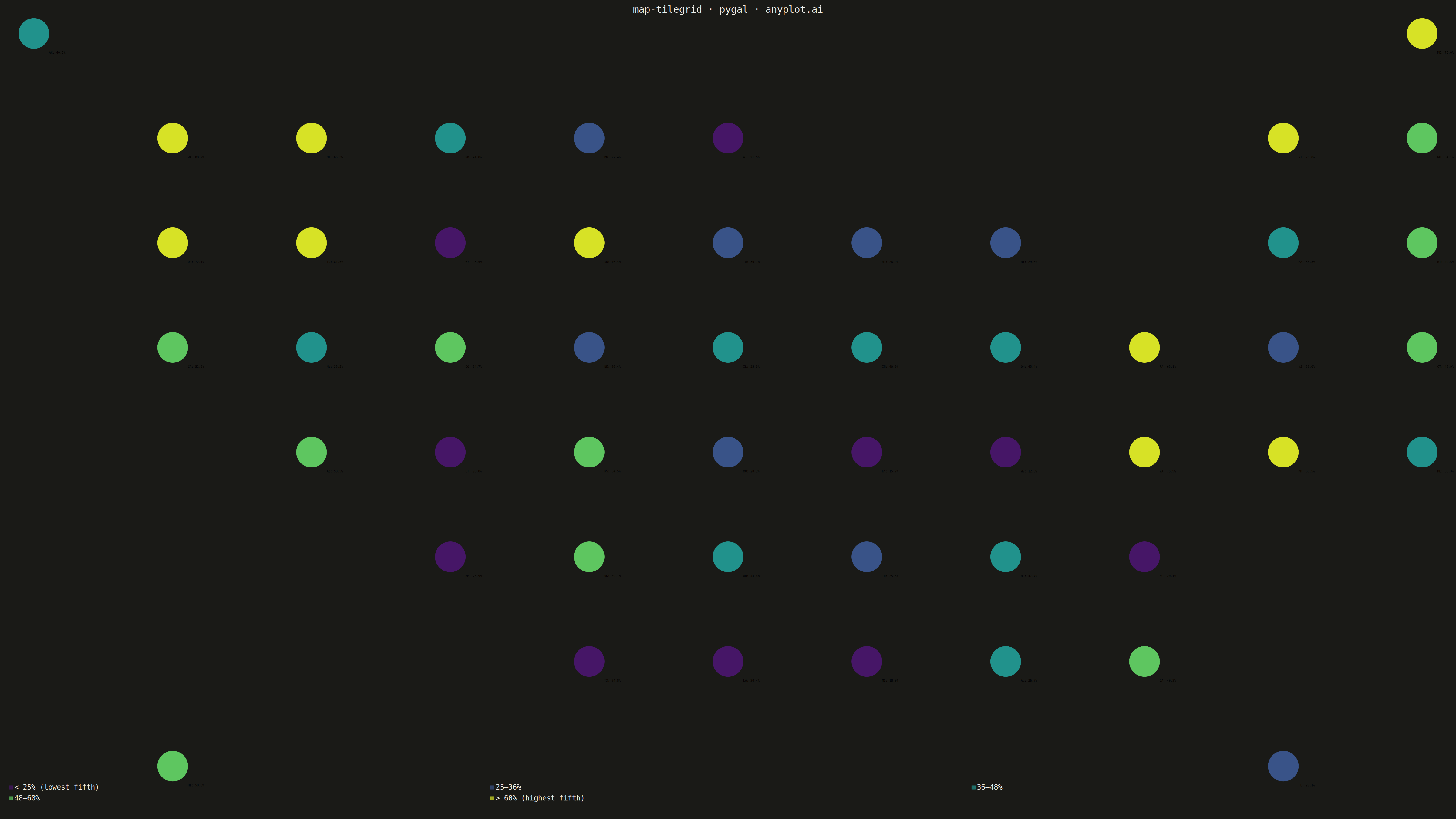
A tile grid map represents geographic regions (states, countries, provinces) as equally-sized tiles — squares or hexagons — arranged to approximate their real-world geographic positions. Unlike choropleth maps where large-area regions dominate visually, every region receives identical visual weight, making tile grid maps ideal for per-capita or per-region comparisons where the statistic matters more than physical area. Tiles are colored by a data variable and labeled with region abbreviations for identification.
""" anyplot.ai
map-tilegrid: Tile Grid Map for Equal-Area Geographic Comparison
Library: pygal 3.1.0 | Python 3.13.13
Quality: 74/100 | Created: 2026-05-14
"""

import os
import sys


sys.path.pop(0)  # remove script dir so "import pygal" finds the installed package, not this file

import matplotlib.colors as mcolors
import numpy as np
import pygal
from pygal.style import Style


THEME = os.getenv("ANYPLOT_THEME", "light")
PAGE_BG = "#FAF8F1" if THEME == "light" else "#1A1A17"
INK = "#1A1A17" if THEME == "light" else "#F0EFE8"
INK_MUTED = "#6B6A63" if THEME == "light" else "#A8A79F"

# US state tile grid positions (row, col) — geographic approximation
STATE_GRID = {
    "AK": (0, 0),
    "ME": (0, 10),
    "WA": (1, 1),
    "MT": (1, 2),
    "ND": (1, 3),
    "MN": (1, 4),
    "WI": (1, 5),
    "VT": (1, 9),
    "NH": (1, 10),
    "OR": (2, 1),
    "ID": (2, 2),
    "WY": (2, 3),
    "SD": (2, 4),
    "IA": (2, 5),
    "MI": (2, 6),
    "NY": (2, 7),
    "MA": (2, 9),
    "RI": (2, 10),
    "CA": (3, 1),
    "NV": (3, 2),
    "CO": (3, 3),
    "NE": (3, 4),
    "IL": (3, 5),
    "IN": (3, 6),
    "OH": (3, 7),
    "PA": (3, 8),
    "NJ": (3, 9),
    "CT": (3, 10),
    "AZ": (4, 2),
    "UT": (4, 3),
    "KS": (4, 4),
    "MO": (4, 5),
    "KY": (4, 6),
    "WV": (4, 7),
    "VA": (4, 8),
    "MD": (4, 9),
    "DE": (4, 10),
    "NM": (5, 3),
    "OK": (5, 4),
    "AR": (5, 5),
    "TN": (5, 6),
    "NC": (5, 7),
    "SC": (5, 8),
    "TX": (6, 4),
    "LA": (6, 5),
    "MS": (6, 6),
    "AL": (6, 7),
    "GA": (6, 8),
    "HI": (7, 1),
    "FL": (7, 9),
}

# Synthetic renewable energy % of total electricity generation
np.random.seed(42)
state_values = {s: round(float(np.random.uniform(18, 78)), 1) for s in STATE_GRID}
state_values.update(
    {
        "WA": 88.2,  # Pacific Northwest hydropower
        "OR": 72.1,
        "ID": 81.5,
        "MT": 65.3,
        "WY": 18.5,  # Coal-heavy states
        "WV": 12.3,
        "KY": 15.7,
        "TX": 24.8,
        "LA": 20.4,
        "MS": 18.9,
        "CA": 52.3,
        "ND": 41.8,
        "SD": 76.4,  # High hydro + wind
    }
)

# Quintile assignment using numpy digitize
values_array = np.array(list(state_values.values()))
quintile_bins = np.percentile(values_array, [20, 40, 60, 80])
quintile_assignments = {state: int(np.digitize(val, quintile_bins)) for state, val in state_values.items()}

# Viridis colors for 5 quintiles (dark purple = low, bright yellow = high)
viridis = mcolors.LinearSegmentedColormap.from_list(
    "viridis_approx", ["#440154", "#482475", "#355f8d", "#21918c", "#44bf70", "#bddf26", "#fde725"]
)
quintile_hex = tuple(mcolors.to_hex(viridis(t)) for t in (0.1, 0.3, 0.5, 0.7, 0.9))

# Quintile legend labels
b = quintile_bins
quintile_labels = [
    f"< {b[0]:.0f}%  (lowest fifth)",
    f"{b[0]:.0f}–{b[1]:.0f}%",
    f"{b[1]:.0f}–{b[2]:.0f}%",
    f"{b[2]:.0f}–{b[3]:.0f}%",
    f"> {b[3]:.0f}%  (highest fifth)",
]

# Organise data by quintile — offset grid by 1 to prevent edge clipping
quintile_data = [[] for _ in range(5)]
for state, (row, col) in STATE_GRID.items():
    q = quintile_assignments[state]
    quintile_data[q].append({"value": (col + 1, -(row + 1)), "label": f"{state}: {state_values[state]:.1f}%"})

# Pygal style
custom_style = Style(
    background=PAGE_BG,
    plot_background=PAGE_BG,
    foreground=INK,
    foreground_strong=INK,
    foreground_subtle=INK_MUTED,
    colors=quintile_hex,
    title_font_size=32,
    label_font_size=22,
    major_label_font_size=22,
    legend_font_size=24,
    value_font_size=50,
)

# Chart
chart = pygal.XY(
    width=4800,
    height=2700,
    title="map-tilegrid · pygal · anyplot.ai",
    stroke=False,
    dots_size=50,
    print_labels=True,
    show_x_labels=False,
    show_y_labels=False,
    show_x_guides=False,
    show_y_guides=False,
    legend_at_bottom=True,
    style=custom_style,
)

for q_data, q_label in zip(quintile_data, quintile_labels, strict=False):
    chart.add(q_label, q_data)

# Save
chart.render_to_png(f"plot-{THEME}.png")
with open(f"plot-{THEME}.html", "wb") as f:
    f.write(chart.render())
Runnable source as JSON, for any HTTP client: https://api.anyplot.ai/specs/map-tilegrid/pygal/code. Any spec id and library id listed in llms-full.txt fit the same URL shape; every URL below is complete and callable.
{
  "spec_id": "map-tilegrid",
  "language": "python",
  "library": "pygal",
  "page": "https://anyplot.ai/map-tilegrid/python/pygal",
  "hub": "https://anyplot.ai/map-tilegrid",
  "code_json": "https://api.anyplot.ai/specs/map-tilegrid/pygal/code",
  "spec_json": "https://api.anyplot.ai/specs/map-tilegrid",
  "render_light_png": "https://storage.googleapis.com/anyplot-images/plots/map-tilegrid/python/pygal/plot-light.png",
  "render_dark_png": "https://storage.googleapis.com/anyplot-images/plots/map-tilegrid/python/pygal/plot-dark.png",
  "interactive_light_html": "https://storage.googleapis.com/anyplot-images/plots/map-tilegrid/python/pygal/plot-light.html",
  "interactive_dark_html": "https://storage.googleapis.com/anyplot-images/plots/map-tilegrid/python/pygal/plot-dark.html",
  "quality_score": 74.0,
  "license": "MIT",
  "guide": "https://anyplot.ai/llms.txt"
}
Part of Tile Grid Map for Equal-Area Geographic Comparison on anyplot.ai.