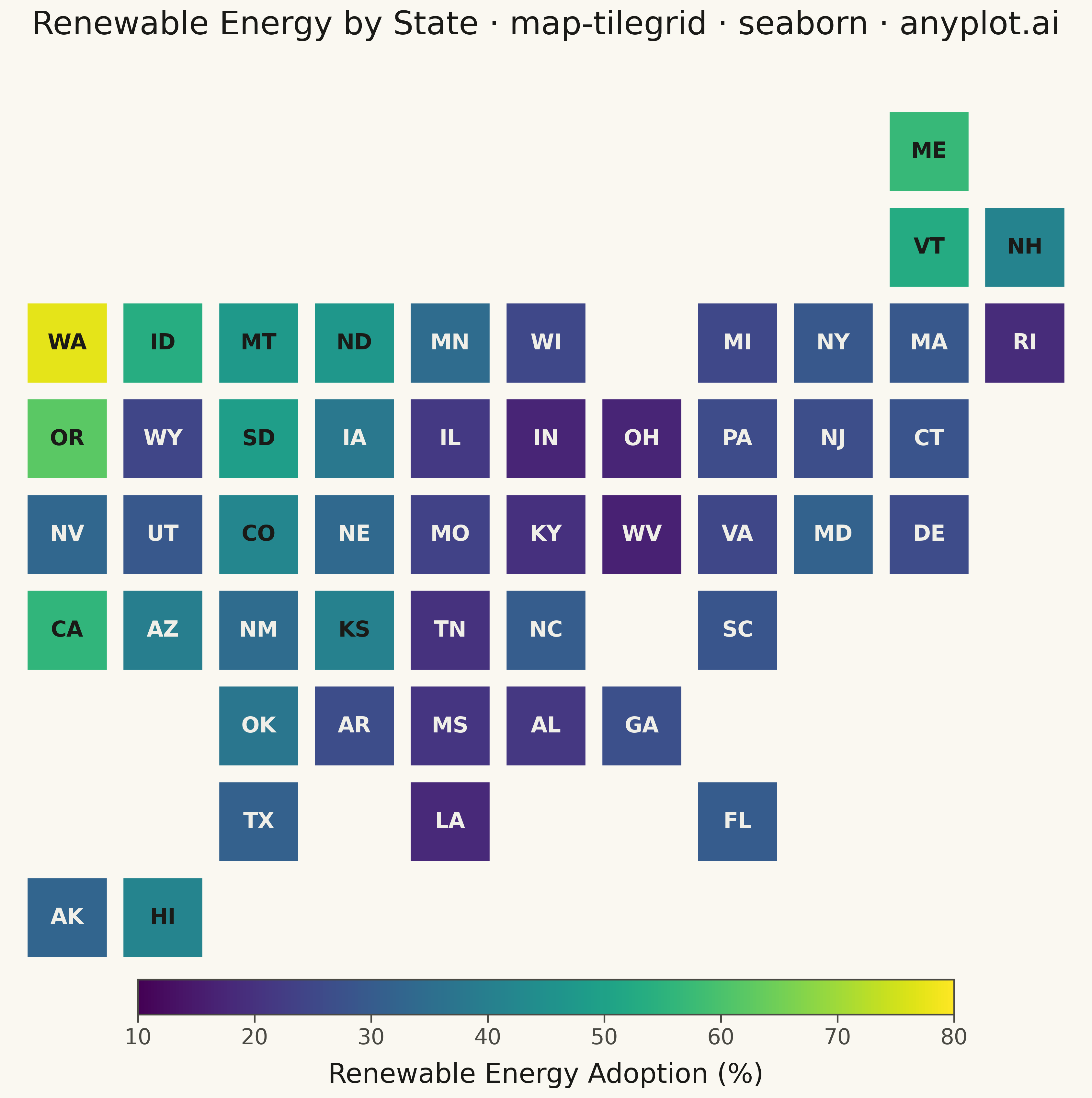
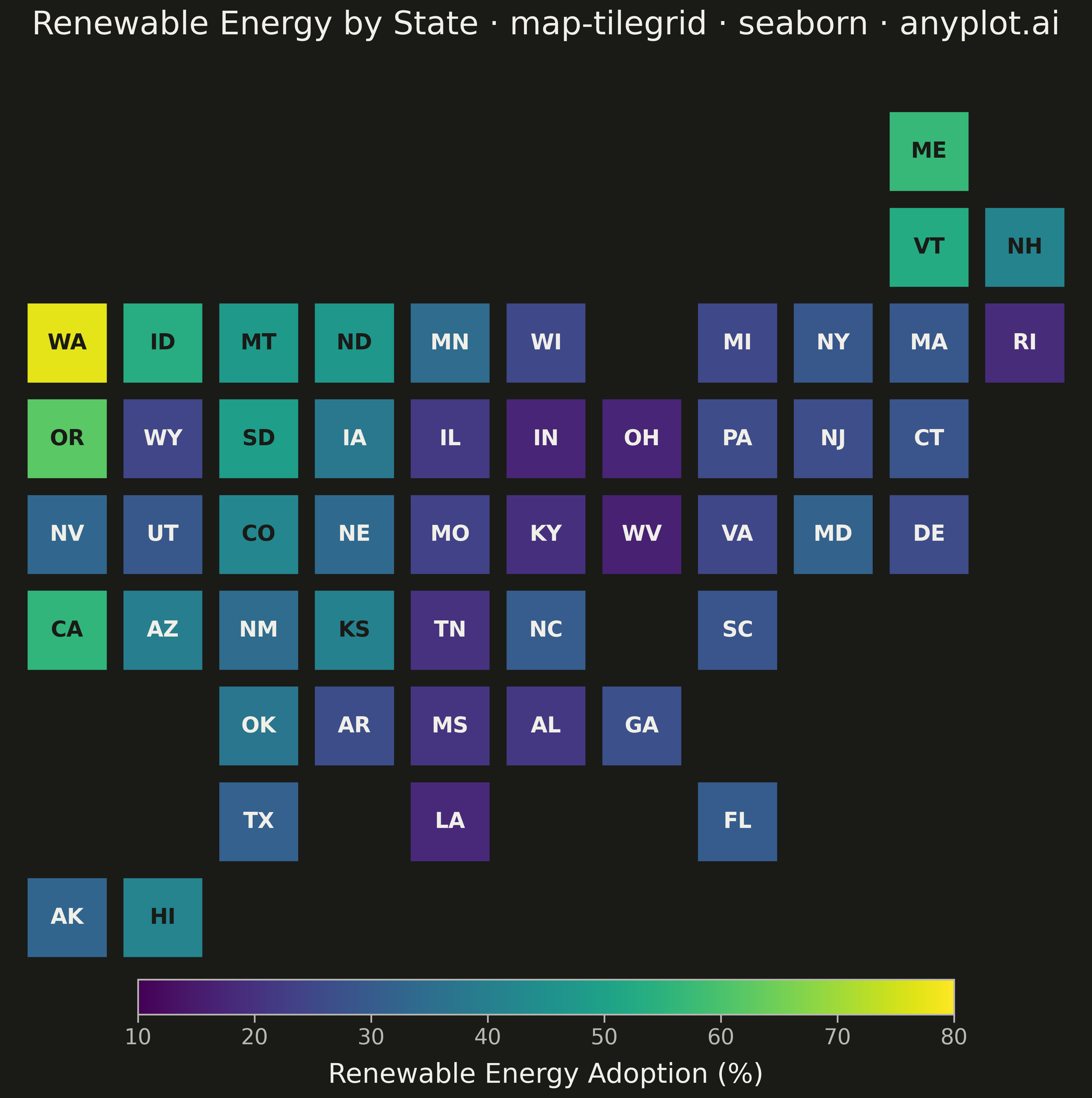
The same plot in 14 other libraries — Python: Altair, Bokeh, lets-plot, Matplotlib, Plotly, plotnine, Pygal; R: ggplot2; Julia: Makie.jl; JavaScript: Chart.js, D3.js, Apache ECharts, Highcharts, MUI X Charts. Compare all 15 side by side: Tile Grid Map for Equal-Area Geographic Comparison in Python, R, Julia and JavaScript.
A tile grid map represents geographic regions (states, countries, provinces) as equally-sized tiles — squares or hexagons — arranged to approximate their real-world geographic positions. Unlike choropleth maps where large-area regions dominate visually, every region receives identical visual weight, making tile grid maps ideal for per-capita or per-region comparisons where the statistic matters more than physical area. Tiles are colored by a data variable and labeled with region abbreviations for identification.
""" anyplot.ai
map-tilegrid: Tile Grid Map for Equal-Area Geographic Comparison
Library: seaborn 0.13.2 | Python 3.13.13
Quality: 86/100 | Created: 2026-05-14
"""

import os
import sys


sys.path.insert(0, "/home/runner/work/anyplot/anyplot/.venv/lib/python3.13/site-packages")

import matplotlib.colors as mcolors
import matplotlib.patches as mpatches
import matplotlib.pyplot as plt
import numpy as np
import seaborn as sns


THEME = os.getenv("ANYPLOT_THEME", "light")
PAGE_BG = "#FAF8F1" if THEME == "light" else "#1A1A17"
ELEVATED_BG = "#FFFDF6" if THEME == "light" else "#242420"
INK = "#1A1A17" if THEME == "light" else "#F0EFE8"
INK_SOFT = "#4A4A44" if THEME == "light" else "#B8B7B0"

sns.set_theme(
    style="ticks",
    rc={
        "figure.facecolor": PAGE_BG,
        "axes.facecolor": PAGE_BG,
        "axes.edgecolor": INK_SOFT,
        "axes.labelcolor": INK,
        "text.color": INK,
        "xtick.color": INK_SOFT,
        "ytick.color": INK_SOFT,
        "grid.color": INK,
        "grid.alpha": 0.10,
        "legend.facecolor": ELEVATED_BG,
        "legend.edgecolor": INK_SOFT,
    },
)

# US state tile grid positions: (row, col), row 0 = top
state_grid = {
    "ME": (0, 9),
    "VT": (1, 9),
    "NH": (1, 10),
    "WA": (2, 0),
    "ID": (2, 1),
    "MT": (2, 2),
    "ND": (2, 3),
    "MN": (2, 4),
    "WI": (2, 5),
    "MI": (2, 7),
    "NY": (2, 8),
    "MA": (2, 9),
    "RI": (2, 10),
    "OR": (3, 0),
    "WY": (3, 1),
    "SD": (3, 2),
    "IA": (3, 3),
    "IL": (3, 4),
    "IN": (3, 5),
    "OH": (3, 6),
    "PA": (3, 7),
    "NJ": (3, 8),
    "CT": (3, 9),
    "NV": (4, 0),
    "UT": (4, 1),
    "CO": (4, 2),
    "NE": (4, 3),
    "MO": (4, 4),
    "KY": (4, 5),
    "WV": (4, 6),
    "VA": (4, 7),
    "MD": (4, 8),
    "DE": (4, 9),
    "CA": (5, 0),
    "AZ": (5, 1),
    "NM": (5, 2),
    "KS": (5, 3),
    "TN": (5, 4),
    "NC": (5, 5),
    "SC": (5, 7),
    "OK": (6, 2),
    "AR": (6, 3),
    "MS": (6, 4),
    "AL": (6, 5),
    "GA": (6, 6),
    "TX": (7, 2),
    "LA": (7, 4),
    "FL": (7, 7),
    "AK": (8, 0),
    "HI": (8, 1),
}

# Renewable energy adoption (%) — structured synthetic data by US state
regional_base = {
    "WA": 74,
    "OR": 66,
    "CA": 58,
    "ID": 54,
    "MT": 48,
    "WY": 28,
    "NV": 36,
    "UT": 30,
    "CO": 42,
    "AZ": 38,
    "NM": 37,
    "ND": 44,
    "SD": 50,
    "NE": 36,
    "KS": 40,
    "MN": 33,
    "IA": 40,
    "MO": 23,
    "IL": 21,
    "WI": 26,
    "MI": 24,
    "IN": 19,
    "OH": 20,
    "WV": 17,
    "KY": 21,
    "TN": 24,
    "NC": 33,
    "SC": 28,
    "GA": 30,
    "AL": 22,
    "MS": 21,
    "FL": 28,
    "TX": 33,
    "LA": 19,
    "AR": 26,
    "OK": 36,
    "NY": 30,
    "PA": 23,
    "NJ": 27,
    "CT": 28,
    "MA": 30,
    "VT": 53,
    "NH": 40,
    "ME": 56,
    "MD": 28,
    "DE": 26,
    "VA": 26,
    "RI": 18,
    "HI": 45,
    "AK": 32,
}

np.random.seed(42)
states = list(state_grid.keys())
values = {s: float(np.clip(regional_base.get(s, 30) + np.random.normal(0, 2), 10, 80)) for s in states}

# Plot
MAX_ROW = 8
TILE = 0.86

fig = plt.figure(figsize=(12, 12), facecolor=PAGE_BG)
ax = fig.add_axes([0.04, 0.12, 0.92, 0.78])
ax.set_facecolor(PAGE_BG)

cmap = plt.colormaps["viridis"]
norm = mcolors.Normalize(vmin=10, vmax=80)

for state, (gr, gc) in state_grid.items():
    y = MAX_ROW - gr
    rgba = cmap(norm(values[state]))
    luma = 0.299 * rgba[0] + 0.587 * rgba[1] + 0.114 * rgba[2]

    offset = (1 - TILE) / 2
    ax.add_patch(
        mpatches.Rectangle(
            (gc + offset, y + offset), TILE, TILE, facecolor=rgba, edgecolor=PAGE_BG, linewidth=2.5, zorder=2
        )
    )
    ax.text(
        gc + 0.5,
        y + 0.5,
        state,
        ha="center",
        va="center",
        fontsize=15,
        fontweight="bold",
        color="#1A1A17" if luma > 0.40 else "#F0EFE8",
        zorder=3,
    )

ax.set_xlim(-0.2, 11.2)
ax.set_ylim(-0.8, 9.5)
ax.set_aspect("equal")
ax.axis("off")
ax.set_title(
    "Renewable Energy by State · map-tilegrid · seaborn · anyplot.ai",
    fontsize=22,
    fontweight="medium",
    color=INK,
    pad=16,
)

# Colorbar
cax = fig.add_axes([0.15, 0.05, 0.70, 0.026])
sm = plt.cm.ScalarMappable(cmap=cmap, norm=norm)
sm.set_array([])
cbar = fig.colorbar(sm, cax=cax, orientation="horizontal")
cbar.set_label("Renewable Energy Adoption (%)", fontsize=20, color=INK, labelpad=10)
cbar.ax.tick_params(labelsize=16, colors=INK_SOFT)
cbar.outline.set_edgecolor(INK_SOFT)

plt.savefig(f"plot-{THEME}.png", dpi=300, bbox_inches="tight", facecolor=PAGE_BG)
Runnable source as JSON, for any HTTP client: https://api.anyplot.ai/specs/map-tilegrid/seaborn/code. Any spec id and library id listed in llms-full.txt fit the same URL shape; every URL below is complete and callable.
{
  "spec_id": "map-tilegrid",
  "language": "python",
  "library": "seaborn",
  "page": "https://anyplot.ai/map-tilegrid/python/seaborn",
  "hub": "https://anyplot.ai/map-tilegrid",
  "code_json": "https://api.anyplot.ai/specs/map-tilegrid/seaborn/code",
  "spec_json": "https://api.anyplot.ai/specs/map-tilegrid",
  "render_light_png": "https://storage.googleapis.com/anyplot-images/plots/map-tilegrid/python/seaborn/plot-light.png",
  "render_dark_png": "https://storage.googleapis.com/anyplot-images/plots/map-tilegrid/python/seaborn/plot-dark.png",
  "quality_score": 86.0,
  "license": "MIT",
  "guide": "https://anyplot.ai/llms.txt"
}
Part of Tile Grid Map for Equal-Area Geographic Comparison on anyplot.ai.