The same plot in 14 other libraries — JavaScript: Chart.js, D3.js, Apache ECharts, MUI X Charts; Python: Altair, Bokeh, lets-plot, Matplotlib, Plotly, plotnine, Pygal, Seaborn; R: ggplot2; Julia: Makie.jl. Compare all 15 side by side: Mohr's Circle for Stress Analysis in Python, R, Julia and JavaScript.
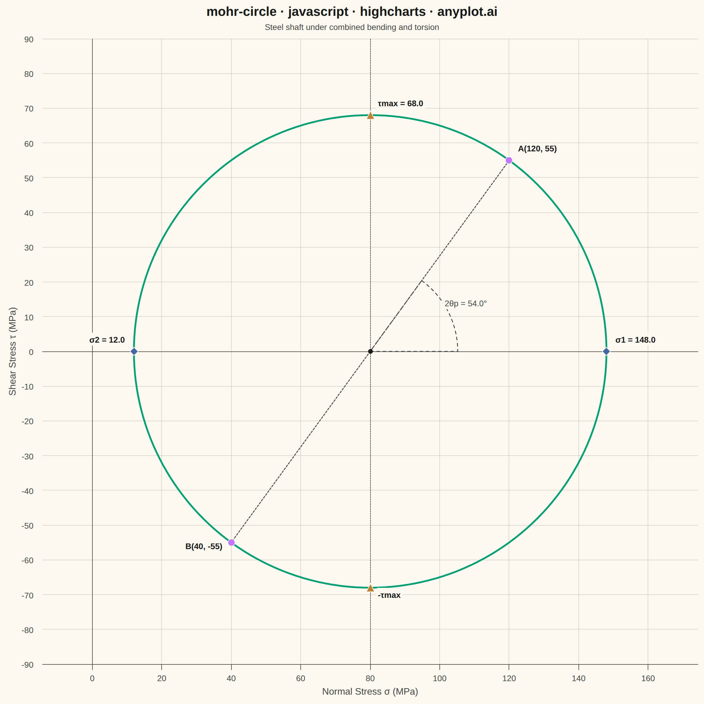
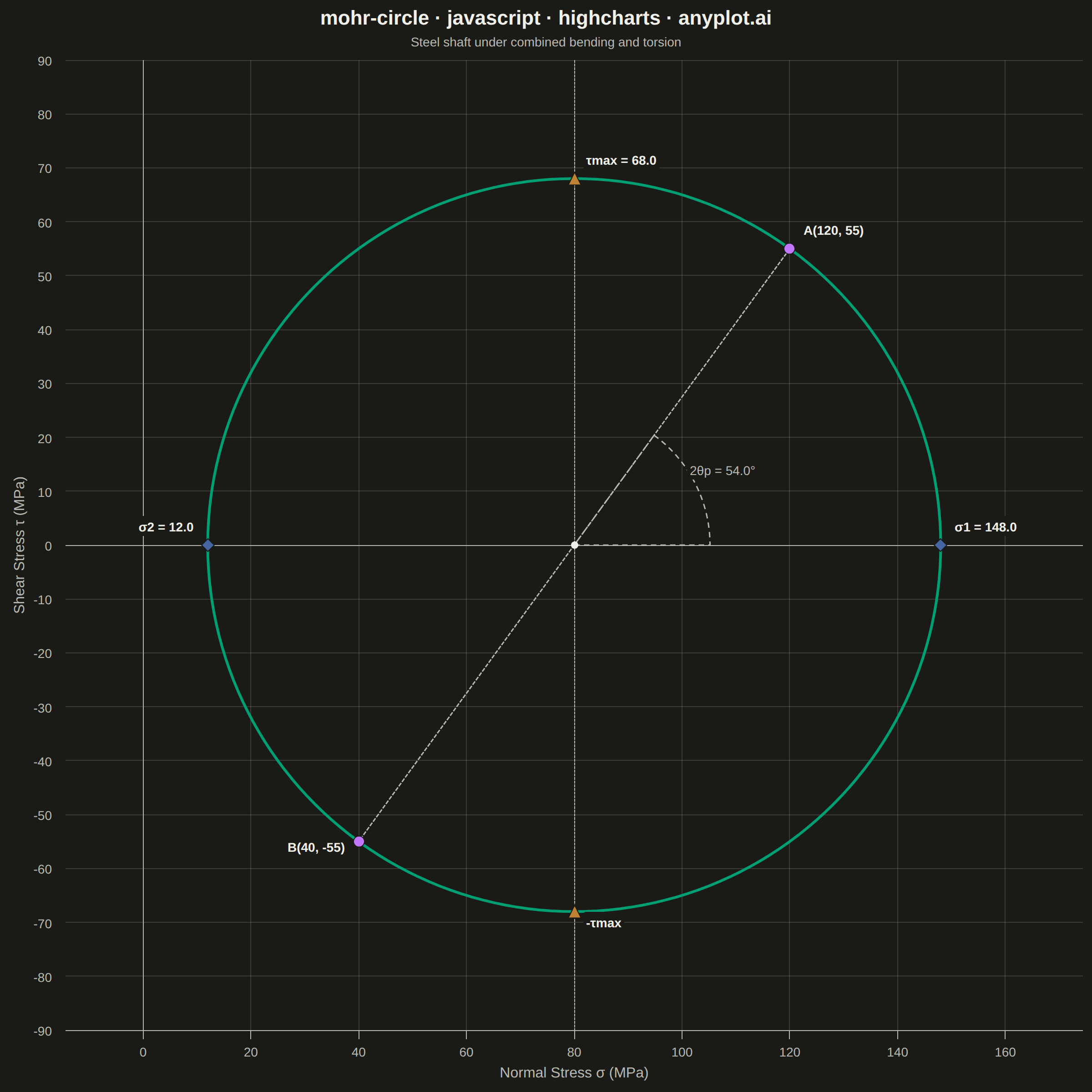
Mohr's Circle is a graphical method used to determine principal stresses, maximum shear stress, and stress transformations from a given 2D stress state. A circle is drawn on a normal stress (σ) vs. shear stress (τ) plane, with the center at ((σx + σy) / 2, 0) and a radius derived from the stress components. It is an essential tool in mechanical and civil engineering for visualizing how stress components change under coordinate rotation.
// anyplot.ai
// mohr-circle: Mohr's Circle for Stress Analysis
// Library: highcharts 12.6.0 | JavaScript 22.23.2
// Quality: 92/100 | Created: 2026-08-26

//# anyplot-orientation: square

const t = window.ANYPLOT_TOKENS;

// --- Data: 2D stress state on a steel shaft under combined bending + torsion (MPa) ---
const sigmaX = 120;
const sigmaY = 40;
const tauXY = 55;

const center = (sigmaX + sigmaY) / 2;
const radius = Math.sqrt(((sigmaX - sigmaY) / 2) ** 2 + tauXY ** 2);
const sigma1 = center + radius;
const sigma2 = center - radius;
const tauMax = radius;
const twoThetaPRad = Math.atan2(tauXY, (sigmaX - sigmaY) / 2);
const twoThetaPDeg = (twoThetaPRad * 180) / Math.PI;

// Circle outline, traced parametrically around the center
const STEPS = 200;
const circlePoints = [];
for (let i = 0; i <= STEPS; i++) {
  const angle = (2 * Math.PI * i) / STEPS;
  circlePoints.push([center + radius * Math.cos(angle), radius * Math.sin(angle)]);
}

const pointA = [sigmaX, tauXY];
const pointB = [sigmaY, -tauXY];

// --- Chart -------------------------------------------------------------------
Highcharts.chart("container", {
  chart: {
    type: "line",
    backgroundColor: "transparent",
    animation: false,
    style: { fontFamily: "inherit" },
    events: {
      load: function () {
        // Force equal pixel-per-unit scale on both axes so the circle renders
        // as a true circle instead of stretching to the plot area's aspect ratio.
        const chart = this;
        const xAxis = chart.xAxis[0];
        const yAxis = chart.yAxis[0];
        const scale = Math.min(chart.plotWidth / (xAxis.max - xAxis.min), chart.plotHeight / (yAxis.max - yAxis.min));
        const xMid = (xAxis.max + xAxis.min) / 2;
        const yMid = (yAxis.max + yAxis.min) / 2;
        xAxis.setExtremes(xMid - chart.plotWidth / (2 * scale), xMid + chart.plotWidth / (2 * scale), false);
        yAxis.setExtremes(yMid - chart.plotHeight / (2 * scale), yMid + chart.plotHeight / (2 * scale), false);
        chart.redraw();

        // Angle arc for the principal-plane rotation 2θp, swept from the
        // positive-σ direction (toward σ1) to the radius line center → A.
        const cx = xAxis.toPixels(center);
        const cy = yAxis.toPixels(0);
        const ax = xAxis.toPixels(pointA[0]);
        const ay = yAxis.toPixels(pointA[1]);
        const arcR = Math.min(chart.plotWidth, chart.plotHeight) * 0.14;
        // Highcharts renderer.arc angles: 0 rad = 3 o'clock (right), increasing clockwise.
        const angleToA = Math.atan2(ay - cy, ax - cx);
        const startAngle = Math.min(0, angleToA);
        const endAngle = Math.max(0, angleToA);
        chart.renderer
          .arc(cx, cy, arcR, 0, startAngle, endAngle)
          .attr({ stroke: t.inkSoft, "stroke-width": 1.5, fill: "none", dashstyle: "Dash" })
          .add();
        const midAngle = (startAngle + endAngle) / 2;
        const labelR = arcR + 34;
        // Use renderer.label (not .text) so the halo matching the page background
        // sits behind the glyphs, keeping the dashed arc from cutting through them.
        const angleLabel = chart.renderer
          .label(`2θp = ${twoThetaPDeg.toFixed(1)}°`, 0, 0)
          .attr({ fill: t.pageBg, padding: 3, zIndex: 6 })
          .css({ color: t.inkSoft, fontSize: "14px" })
          .add();
        const labelBox = angleLabel.getBBox();
        angleLabel.attr({
          x: cx + labelR * Math.cos(midAngle) - labelBox.width / 2,
          y: cy + labelR * Math.sin(midAngle) - labelBox.height / 2,
        });
      },
    },
  },
  credits: { enabled: false },
  colors: t.palette,
  title: {
    text: "mohr-circle · javascript · highcharts · anyplot.ai",
    style: { color: t.ink, fontSize: "22px", fontWeight: "600" },
  },
  subtitle: {
    text: "Steel shaft under combined bending and torsion",
    style: { color: t.inkSoft, fontSize: "14px" },
  },
  xAxis: {
    title: { text: "Normal Stress σ (MPa)", style: { color: t.inkSoft, fontSize: "16px" } },
    min: center - radius * 1.3,
    max: center + radius * 1.3,
    lineColor: t.inkSoft,
    tickColor: t.inkSoft,
    gridLineColor: t.grid,
    gridLineWidth: 1,
    labels: { style: { color: t.inkSoft, fontSize: "14px" } },
    plotLines: [
      { value: 0, color: t.inkSoft, width: 1, zIndex: 2 },
      { value: center, color: t.inkSoft, width: 1, dashStyle: "ShortDash", zIndex: 2 },
    ],
  },
  yAxis: {
    title: { text: "Shear Stress τ (MPa)", style: { color: t.inkSoft, fontSize: "16px" } },
    min: -radius * 1.3,
    max: radius * 1.3,
    lineColor: t.inkSoft,
    tickColor: t.inkSoft,
    gridLineColor: t.grid,
    gridLineWidth: 1,
    labels: { style: { color: t.inkSoft, fontSize: "14px" } },
    plotLines: [{ value: 0, color: t.inkSoft, width: 1, zIndex: 2 }],
  },
  legend: { enabled: false },
  tooltip: {
    pointFormat: "σ = {point.x:.1f} MPa<br/>τ = {point.y:.1f} MPa",
  },
  plotOptions: {
    series: { animation: false },
  },
  series: [
    {
      name: "Mohr's Circle",
      type: "line",
      data: circlePoints,
      color: t.palette[0],
      lineWidth: 3,
      marker: { enabled: false },
      enableMouseTracking: false,
    },
    {
      name: "Diameter (A-B)",
      type: "line",
      data: [pointA, pointB],
      color: t.inkSoft,
      dashStyle: "ShortDash",
      lineWidth: 1.5,
      marker: { enabled: false },
      enableMouseTracking: false,
    },
    {
      name: "Stress Points",
      type: "scatter",
      color: t.palette[1],
      marker: { symbol: "circle", radius: 6, lineWidth: 1, lineColor: t.pageBg },
      dataLabels: {
        enabled: true,
        style: { color: t.ink, fontSize: "14px", textOutline: "none" },
        formatter: function () {
          return this.point.label;
        },
      },
      data: [
        { x: pointA[0], y: pointA[1], label: `A(${sigmaX}, ${tauXY})`, dataLabels: { align: "left", x: 10, y: -8 } },
        { x: pointB[0], y: pointB[1], label: `B(${sigmaY}, -${tauXY})`, dataLabels: { align: "right", x: -10, y: 18 } },
      ],
    },
    {
      name: "Principal Stresses",
      type: "scatter",
      color: t.palette[2],
      marker: { symbol: "diamond", radius: 7, lineWidth: 1, lineColor: t.pageBg },
      dataLabels: {
        enabled: true,
        style: { color: t.ink, fontSize: "14px", textOutline: "none" },
        backgroundColor: t.pageBg,
        borderWidth: 0,
        borderRadius: 3,
        padding: 3,
        formatter: function () {
          return this.point.label;
        },
      },
      // σ1/σ2 sit at the circle's extreme left/right points, where the tangent
      // is near-vertical — push the labels outward (away from the circle body)
      // instead of straight up, so the stroke doesn't cut through the text.
      data: [
        { x: sigma1, y: 0, label: `σ1 = ${sigma1.toFixed(1)}`, dataLabels: { align: "left", x: 12, y: -10 } },
        { x: sigma2, y: 0, label: `σ2 = ${sigma2.toFixed(1)}`, dataLabels: { align: "right", x: -12, y: -10 } },
      ],
    },
    {
      name: "Max Shear Stress",
      type: "scatter",
      color: t.palette[3],
      marker: { symbol: "triangle", radius: 7, lineWidth: 1, lineColor: t.pageBg },
      dataLabels: {
        enabled: true,
        style: { color: t.ink, fontSize: "14px", textOutline: "none" },
        backgroundColor: t.pageBg,
        borderWidth: 0,
        borderRadius: 3,
        padding: 3,
        formatter: function () {
          return this.point.label;
        },
      },
      // τmax/-τmax sit on the dashed σ=center reference line — offset the
      // labels sideways (not centered on x=center) so the dashed line doesn't
      // run straight through the text.
      data: [
        { x: center, y: tauMax, label: `τmax = ${tauMax.toFixed(1)}`, dataLabels: { align: "left", x: 10, y: -10 } },
        { x: center, y: -tauMax, label: `-τmax`, dataLabels: { align: "left", x: 10, y: 22 } },
      ],
    },
    {
      name: "Center",
      type: "scatter",
      color: t.ink,
      marker: { symbol: "circle", radius: 4 },
      enableMouseTracking: false,
      showInLegend: false,
      dataLabels: { enabled: false },
      data: [{ x: center, y: 0 }],
    },
  ],
});
Runnable source as JSON, for any HTTP client: https://api.anyplot.ai/specs/mohr-circle/highcharts/code. Any spec id and library id listed in llms-full.txt fit the same URL shape; every URL below is complete and callable.
{
  "spec_id": "mohr-circle",
  "language": "javascript",
  "library": "highcharts",
  "page": "https://anyplot.ai/mohr-circle/javascript/highcharts",
  "hub": "https://anyplot.ai/mohr-circle",
  "code_json": "https://api.anyplot.ai/specs/mohr-circle/highcharts/code",
  "spec_json": "https://api.anyplot.ai/specs/mohr-circle",
  "render_light_png": "https://storage.googleapis.com/anyplot-images/plots/mohr-circle/javascript/highcharts/plot-light.png",
  "render_dark_png": "https://storage.googleapis.com/anyplot-images/plots/mohr-circle/javascript/highcharts/plot-dark.png",
  "interactive_light_html": "https://storage.googleapis.com/anyplot-images/plots/mohr-circle/javascript/highcharts/plot-light.html",
  "interactive_dark_html": "https://storage.googleapis.com/anyplot-images/plots/mohr-circle/javascript/highcharts/plot-dark.html",
  "quality_score": 92.0,
  "license": "MIT",
  "guide": "https://anyplot.ai/llms.txt"
}
Part of Mohr's Circle for Stress Analysis on anyplot.ai.