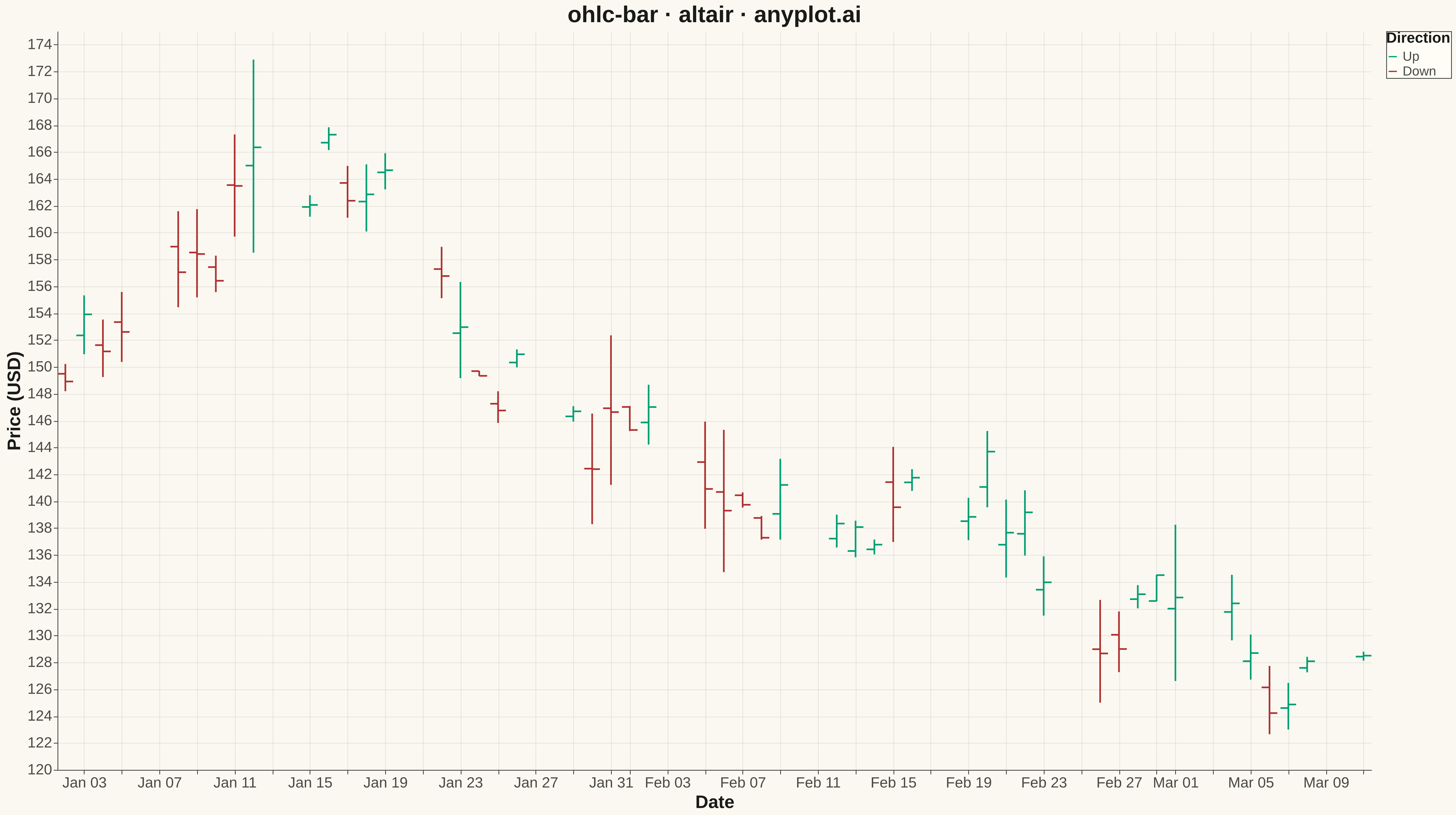
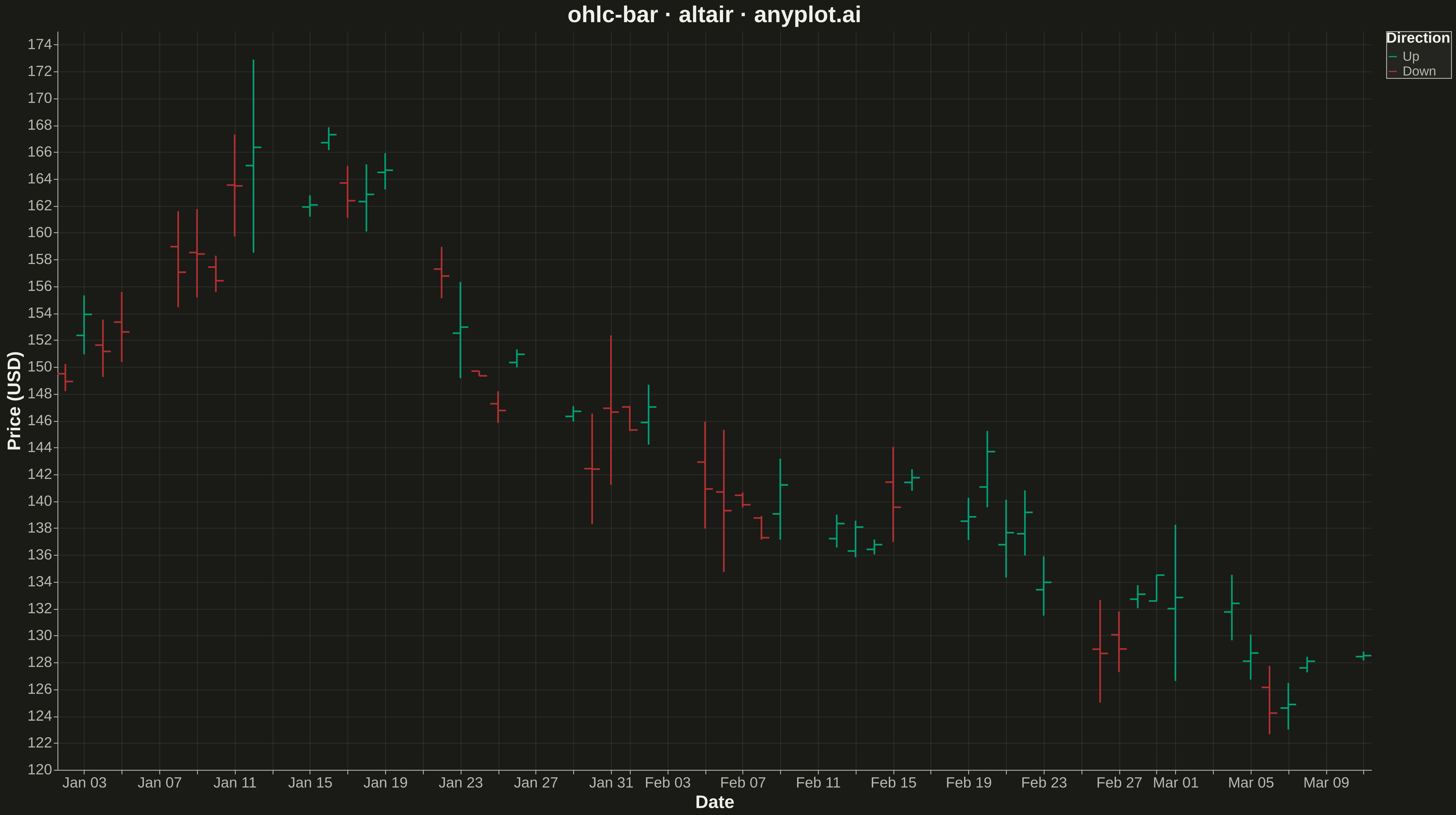
An OHLC (Open-High-Low-Close) bar chart displays financial price data using vertical bars with horizontal tick marks. Each bar shows the price range from high to low as a thin vertical line, with a left tick indicating the opening price and a right tick indicating the closing price. Unlike candlestick charts that use colored bodies, OHLC bars provide a cleaner, less cluttered view favored by technical analysts who prefer to focus on price levels rather than visual patterns.
""" anyplot.ai
ohlc-bar: OHLC Bar Chart
Library: altair 6.1.0 | Python 3.13.13
Quality: 94/100 | Updated: 2026-05-17
"""

import os

import altair as alt
import numpy as np
import pandas as pd


# Theme tokens
THEME = os.getenv("ANYPLOT_THEME", "light")
PAGE_BG = "#FAF8F1" if THEME == "light" else "#1A1A17"
ELEVATED_BG = "#FFFDF6" if THEME == "light" else "#242420"
INK = "#1A1A17" if THEME == "light" else "#F0EFE8"
INK_SOFT = "#4A4A44" if THEME == "light" else "#B8B7B0"

# Okabe-Ito palette
UP_COLOR = "#009E73"  # Okabe-Ito position 1 (brand green)
DOWN_COLOR = "#AE3030"  # imprint red — down days

# Data - Generate 50 trading days of OHLC data
np.random.seed(42)
n_days = 50
dates = pd.date_range("2024-01-02", periods=n_days, freq="B")  # Business days

# Start price and random walk
start_price = 150.0
returns = np.random.normal(0.001, 0.02, n_days)

# Generate OHLC data
prices = [start_price]
for r in returns[:-1]:
    prices.append(prices[-1] * (1 + r))

opens = []
highs = []
lows = []
closes = []

for base_price in prices:
    daily_volatility = abs(np.random.normal(0, 0.015))
    intraday_move = np.random.normal(0, 0.01)

    open_price = base_price * (1 + np.random.normal(0, 0.005))
    close_price = open_price * (1 + intraday_move)
    high_price = max(open_price, close_price) * (1 + daily_volatility)
    low_price = min(open_price, close_price) * (1 - daily_volatility)

    opens.append(open_price)
    highs.append(high_price)
    lows.append(low_price)
    closes.append(close_price)

df = pd.DataFrame({"date": dates, "open": opens, "high": highs, "low": lows, "close": closes})

# Add direction indicator
df["direction"] = ["Up" if c >= o else "Down" for o, c in zip(df["open"], df["close"], strict=True)]

# High-Low vertical lines
hl_lines = (
    alt.Chart(df)
    .mark_rule(strokeWidth=2)
    .encode(
        x=alt.X("date:T", title="Date", axis=alt.Axis(labelFontSize=18, titleFontSize=22, format="%b %d")),
        y=alt.Y(
            "low:Q", title="Price (USD)", scale=alt.Scale(zero=False), axis=alt.Axis(labelFontSize=18, titleFontSize=22)
        ),
        y2="high:Q",
        color=alt.Color(
            "direction:N",
            scale=alt.Scale(domain=["Up", "Down"], range=[UP_COLOR, DOWN_COLOR]),
            legend=alt.Legend(title="Direction", titleFontSize=18, labelFontSize=16),
        ),
    )
)

# Open ticks (left side)
open_rules = (
    alt.Chart(df)
    .transform_calculate(
        open_start="datum.date - 10*60*60*1000"  # 10 hours offset in milliseconds
    )
    .mark_rule(strokeWidth=2)
    .encode(
        x="open_start:T",
        x2="date:T",
        y="open:Q",
        color=alt.Color(
            "direction:N", scale=alt.Scale(domain=["Up", "Down"], range=[UP_COLOR, DOWN_COLOR]), legend=None
        ),
    )
)

# Close ticks (right side)
close_rules = (
    alt.Chart(df)
    .transform_calculate(
        close_end="datum.date + 10*60*60*1000"  # 10 hours offset in milliseconds
    )
    .mark_rule(strokeWidth=2)
    .encode(
        x="date:T",
        x2="close_end:T",
        y="close:Q",
        color=alt.Color(
            "direction:N", scale=alt.Scale(domain=["Up", "Down"], range=[UP_COLOR, DOWN_COLOR]), legend=None
        ),
    )
)

# Layer all components and apply theme-adaptive styling
chart = (
    alt.layer(hl_lines, open_rules, close_rules)
    .properties(
        width=1600,
        height=900,
        background=PAGE_BG,
        title=alt.Title("ohlc-bar · altair · anyplot.ai", fontSize=28, anchor="middle", color=INK),
    )
    .configure_axis(
        domainColor=INK_SOFT,
        tickColor=INK_SOFT,
        gridColor=INK_SOFT,
        gridOpacity=0.10,
        labelColor=INK_SOFT,
        titleColor=INK,
    )
    .configure_title(color=INK)
    .configure_view(strokeWidth=0, fill=PAGE_BG)
    .configure_legend(fillColor=ELEVATED_BG, strokeColor=INK_SOFT, labelColor=INK_SOFT, titleColor=INK)
    .interactive()
)

# Save as PNG and HTML with theme-suffixed filenames
chart.save(f"plot-{THEME}.png", scale_factor=3.0)
chart.save(f"plot-{THEME}.html")
Runnable source as JSON, for any HTTP client: https://api.anyplot.ai/specs/ohlc-bar/altair/code. Any spec id and library id listed in llms-full.txt fit the same URL shape; every URL below is complete and callable.
{
  "spec_id": "ohlc-bar",
  "language": "python",
  "library": "altair",
  "page": "https://anyplot.ai/ohlc-bar/python/altair",
  "hub": "https://anyplot.ai/ohlc-bar",
  "code_json": "https://api.anyplot.ai/specs/ohlc-bar/altair/code",
  "spec_json": "https://api.anyplot.ai/specs/ohlc-bar",
  "render_light_png": "https://storage.googleapis.com/anyplot-images/plots/ohlc-bar/python/altair/plot-light.png",
  "render_dark_png": "https://storage.googleapis.com/anyplot-images/plots/ohlc-bar/python/altair/plot-dark.png",
  "interactive_light_html": "https://storage.googleapis.com/anyplot-images/plots/ohlc-bar/python/altair/plot-light.html",
  "interactive_dark_html": "https://storage.googleapis.com/anyplot-images/plots/ohlc-bar/python/altair/plot-dark.html",
  "quality_score": 94.0,
  "license": "MIT",
  "guide": "https://anyplot.ai/llms.txt"
}
Part of OHLC Bar Chart on anyplot.ai.